You guys want to see something wild?
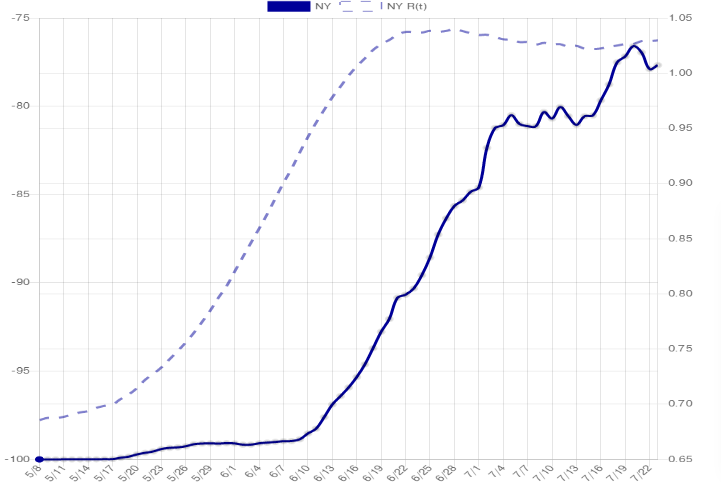
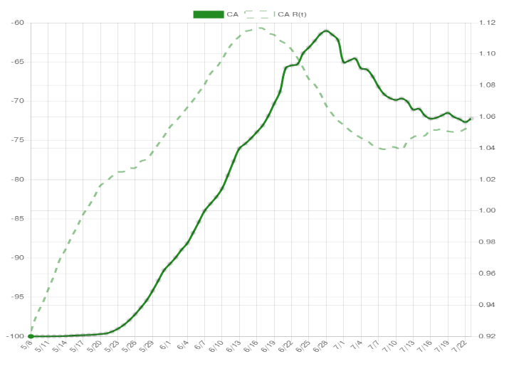
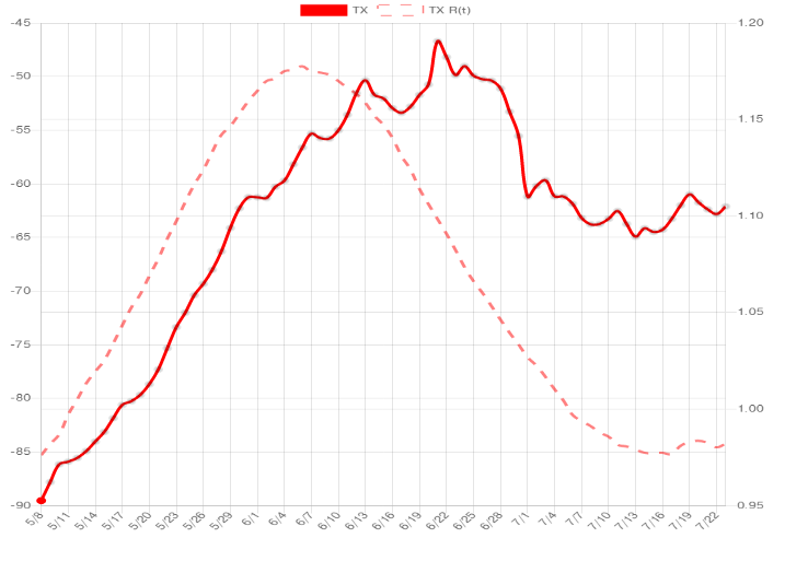
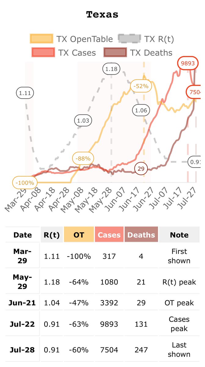
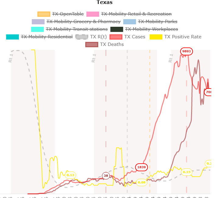
Check out the OpenTable activity trend (solid line) vs. estimated rate of transmission (dashed line) in NY, CA, TX. The curves between ‘change in social distancing’ and ‘change in cases’ are so similar it almost looks like a mistake.
Check out the OpenTable activity trend (solid line) vs. estimated rate of transmission (dashed line) in NY, CA, TX. The curves between ‘change in social distancing’ and ‘change in cases’ are so similar it almost looks like a mistake.
I am making this a dashboard, should be live in a couple days.
To me this info seems useful beyond the social distancing/transmission correlation:
1. Shows behavior as somewhat separate from regulation
2. Shows behavior changes over time
3. Approximate cross-state comparisons
To me this info seems useful beyond the social distancing/transmission correlation:
1. Shows behavior as somewhat separate from regulation
2. Shows behavior changes over time
3. Approximate cross-state comparisons
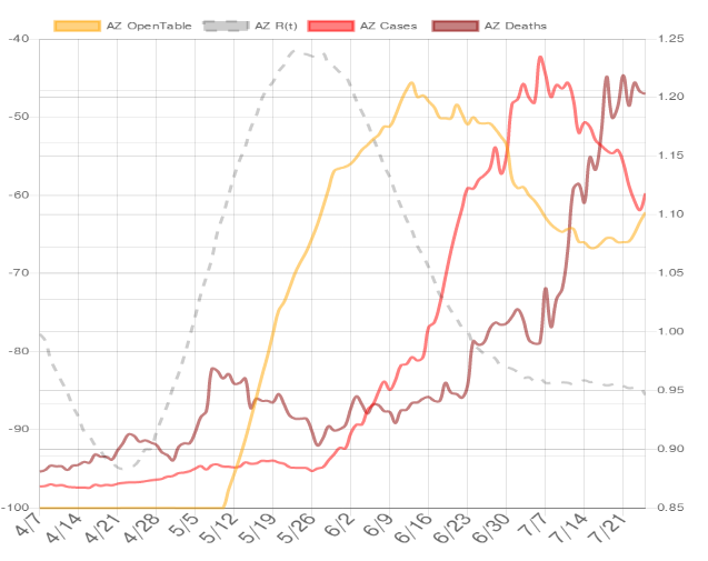
Added cases and deaths (might add Google mobility info). Trends in AZ:
May 25: Estimated R(t) peak
June 15: OpenTable activity peak
July 6: Cases peak
July 23: Potential deaths peak?
Two months cycle from the estimated top of transmission rate to the top of the death count...
May 25: Estimated R(t) peak
June 15: OpenTable activity peak
July 6: Cases peak
July 23: Potential deaths peak?
Two months cycle from the estimated top of transmission rate to the top of the death count...
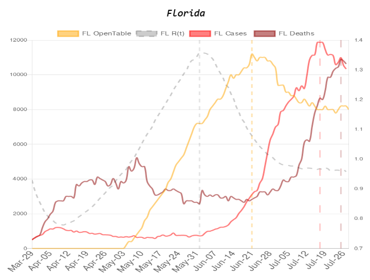
Seeing a similar 'clean' pattern in Florida.. again a 2 month cycle.
June 1: R(t) peak
June 21: Opentable peak
July 17: Cases peak
July 25: (Potential) Deaths peak
June 1: R(t) peak
June 21: Opentable peak
July 17: Cases peak
July 25: (Potential) Deaths peak
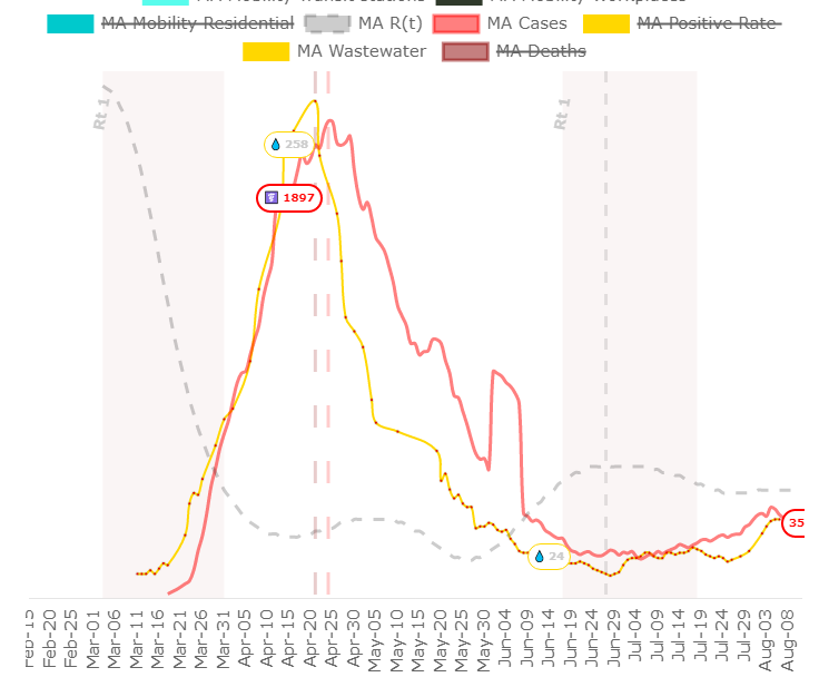
Latest mobile screenshot... you guys like? Includes automatic ‘peak detection’ (I think I can make that work for multiple waves too.)
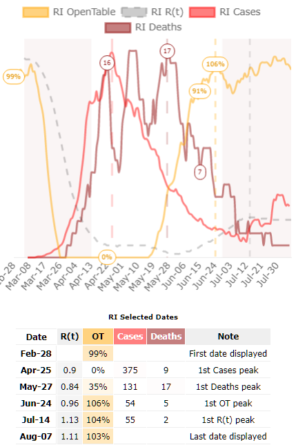
Rhode Island is by far the most YOLO state when it comes to restaurant activity... they are repeatedly going above 100% (ie. seated diners on the same date an year ago). Maybe cause of travelers from nearby states?
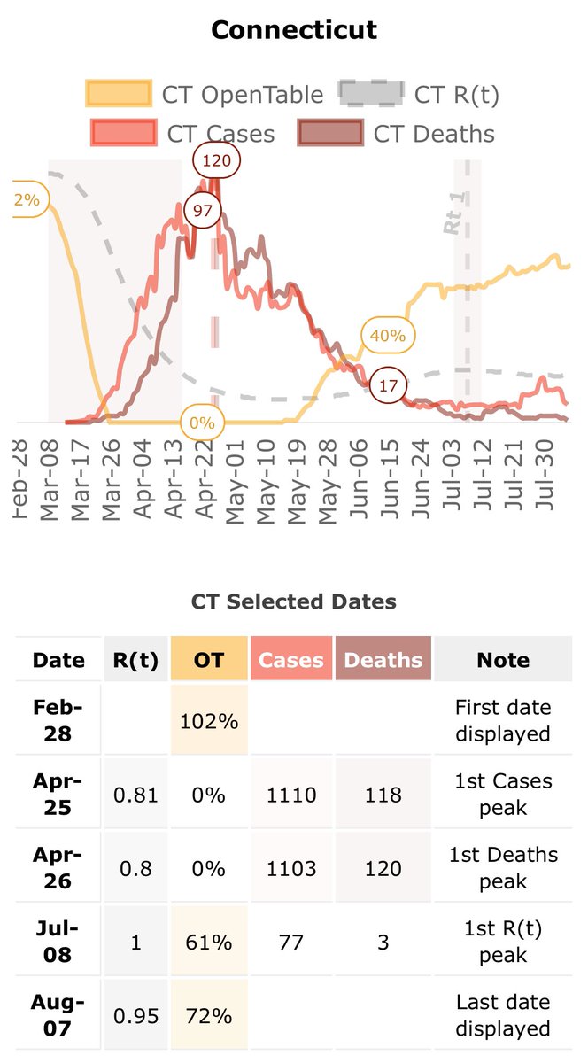
Connecticut seems to have successfully disconnected the link between restaurant activity and case trends. Apparently they allow max 25 people indoors.
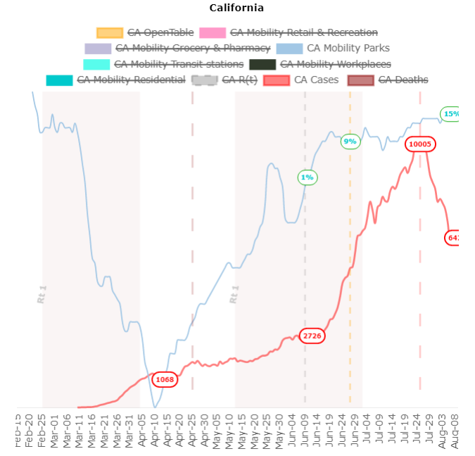
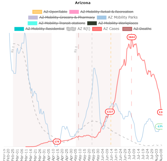
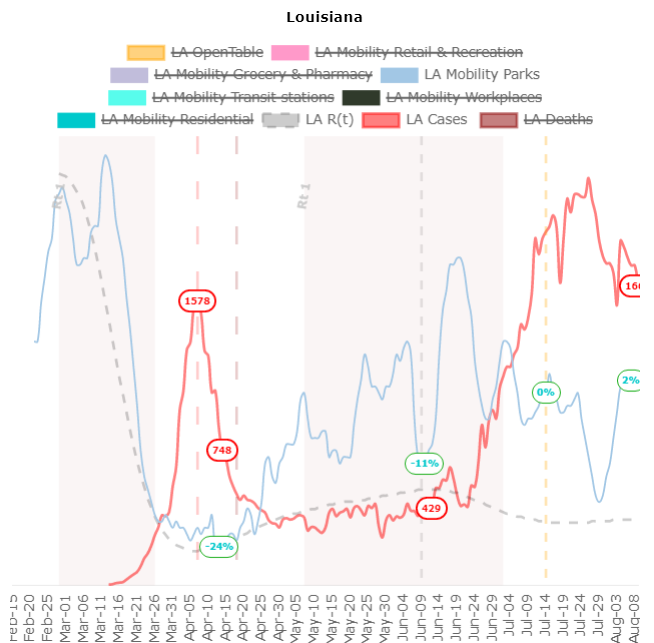
Adding Google Mobility. Strange: out of their categories, the curve that seems most correlated with cases is... Parks?
Maybe "local parks, national parks, public beaches, marinas, dog parks, plazas, and public gardens" is just a good proxy for distancing...
Graphs: CA, AZ, LA
Maybe "local parks, national parks, public beaches, marinas, dog parks, plazas, and public gardens" is just a good proxy for distancing...
Graphs: CA, AZ, LA
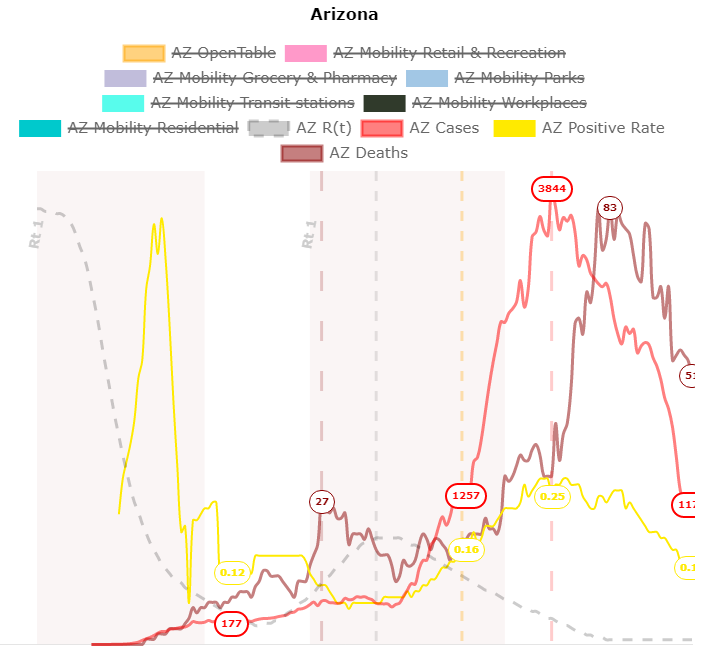
Added test positive rate (yellow)... I think it can show some subtleties. eg. AZ's downwards case trend is probably genuine, but people are worried about what's going on in TX.

 Read on Twitter