Apparently my county in CA, @PlacerCA, is giving up
It LOOKS like things are getting better
But, that's only because they just changed their reporting criteria
Let me show you...
/1
It LOOKS like things are getting better
But, that's only because they just changed their reporting criteria
Let me show you...
/1
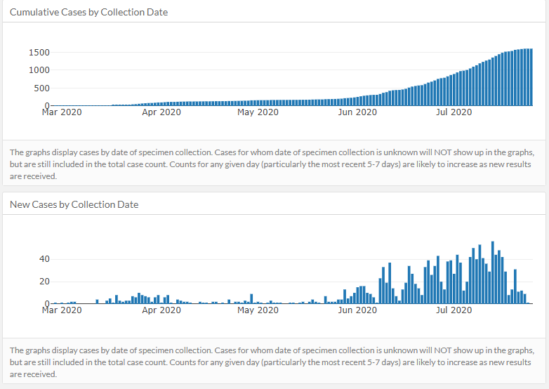
The top chart makes it look like the total number of cases has finally leveled off. Barely 20 new cases in the last 5 days, which is great news.
The bottom chart clearly shows the number of new cases is starting to decline dramatically
Except, that's not what's happening
/2
The bottom chart clearly shows the number of new cases is starting to decline dramatically
Except, that's not what's happening
/2
The old website for displaying county information was suddenly taken down yesterday, without advance notice
This is a screenshot I took 6 days ago
https://twitter.com/MakerBlock/status/1285051457264214016
/3
This is a screenshot I took 6 days ago
https://twitter.com/MakerBlock/status/1285051457264214016
/3
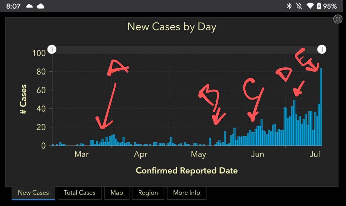
The darker chart (with some notes I wrote) from six days ago shows a very sharp increase in new cases - while the new bottom chart shows cases dropping!
Why do these two charts took so different?
/4
Why do these two charts took so different?
/4
My county just changed to displaying positive cases by "collection date"
This has two INCREDIBLY bad effects...
/5
This has two INCREDIBLY bad effects...
/5
A) Updating/backdating new cases to when they were collected, the last 5-7 days always appears improving (since no new inf for the last week)
That's why the top chart leveled off & bottom chart drops off
B/c even though new cases spiked, they're added to the prior week
/6
That's why the top chart leveled off & bottom chart drops off
B/c even though new cases spiked, they're added to the prior week
/6
B) The *slower* the county tests, the more these charts level and drop off
/7
/7
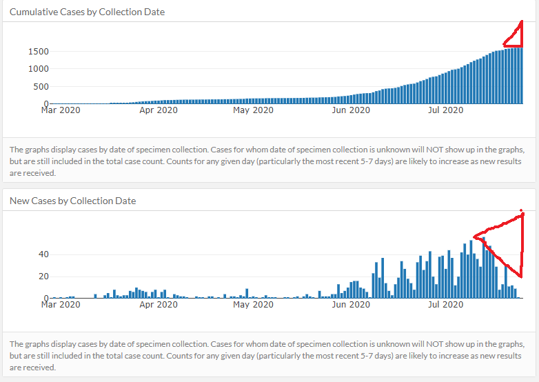
After a week of ~40 cases/day, my county reported a record newly discovered 83 cases on 7/19 with the second highest day being 52 new cases on 7/23
But you wouldn't know that from this chart
/8
But you wouldn't know that from this chart
/8
What will this chart look like in a week's time?
Unfortunately, once the numbers roll in next week, like this:
/9
Unfortunately, once the numbers roll in next week, like this:
/9
After getting placed on the state's watch list, @PlacerCA apparently decided to rearrange deck chairs instead of dealing with a pandemic
/10
/10
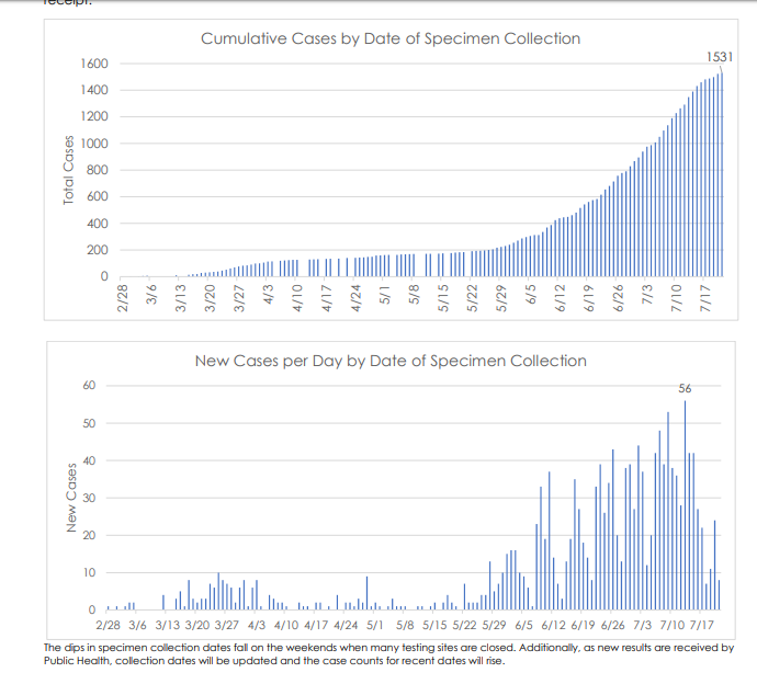
My county publishes this update, side by side, once a week. This one is from 7/24.
Top chart shows a sharp increase in June
bottom shows the same data, backdated / updated by the date the COVID test was performed / "specimen collection"
Notice anything @PlacerCA?
/11
Top chart shows a sharp increase in June
bottom shows the same data, backdated / updated by the date the COVID test was performed / "specimen collection"
Notice anything @PlacerCA?
/11
The second chart shows a spike of 56 cases backdated ~2 weeks ago
If COVID symptoms take 2 weeks and this chart lags by 1 week (time b/t test & result), a spike 2 weeks ago
...is really REALLY bad for today and probably a LOT worse a week from now
/12
If COVID symptoms take 2 weeks and this chart lags by 1 week (time b/t test & result), a spike 2 weeks ago
...is really REALLY bad for today and probably a LOT worse a week from now
/12

 Read on Twitter


