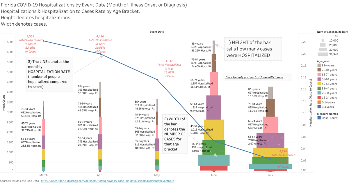
Team Apocalypse keeps moving the #COVID19 goalposts. Cases one day, deaths another, now their focus is on hospitalizations. Fine. Let's use our Florida Case Line data to examine that.
This is a meaty chart but if you take 30 seconds to follow the 1,2,3 I think you'll get it.
1/
This is a meaty chart but if you take 30 seconds to follow the 1,2,3 I think you'll get it.
1/
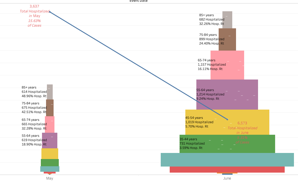
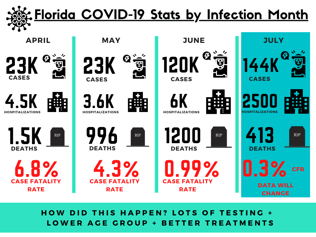
If you look at JUST May and June you can see how much testing was done in June to find more cases. The story here though is HOW MUCH BETTER we are at treatments and HOW MANY FEWER cases need hospitalization.
MORE testing + YOUNGER cases + BETTER treatments = success!
2/
MORE testing + YOUNGER cases + BETTER treatments = success!
2/
Unfortunately, dates are lacking for hospitalization and death of the case but the case "anchored" to its illness month.
Next, let's do some infographics. Lots of new people who may have missed these!
Start with: knock, knock who's there?
4/
Next, let's do some infographics. Lots of new people who may have missed these!
Start with: knock, knock who's there?
4/
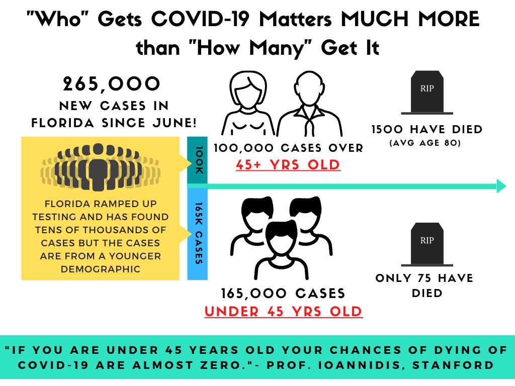
Here's another way to look at it. Age matters in this. Unlike the 1918 pandemic which took the lives of many, many young people, COVID-19 largely spares our youth.
Unless C19 figures out how to kill 20 and 30 year olds Florida will be just fine.
5/
Unless C19 figures out how to kill 20 and 30 year olds Florida will be just fine.
5/
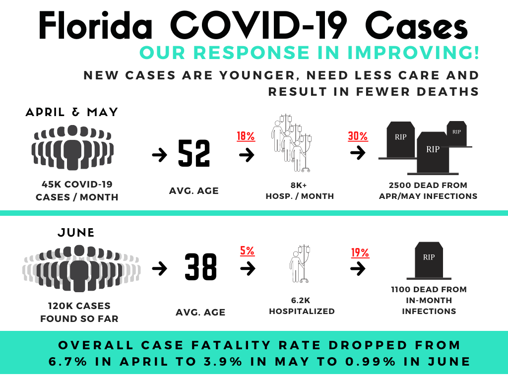
Here's the same data from above but put into a quick info graphic. As you can see... the overall fatality rate from April to May and May to June is doing very well on better treatments and younger cohorts.
6/
6/
I keep coming back to FL for my charts. Most states provide cases, hospitalizations and deaths in 3 separate tables. FL provides cases with the earliest date of illness onset (or diagnosis) and a toggle for whether THAT SPECIFIC case was hosp. or died.
https://open-fdoh.hub.arcgis.com/datasets/florida-covid19-case-li
7/
https://open-fdoh.hub.arcgis.com/datasets/florida-covid19-case-li
7/

 Read on Twitter