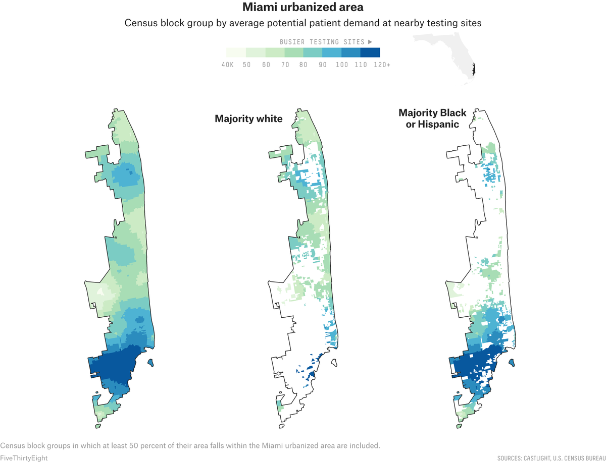
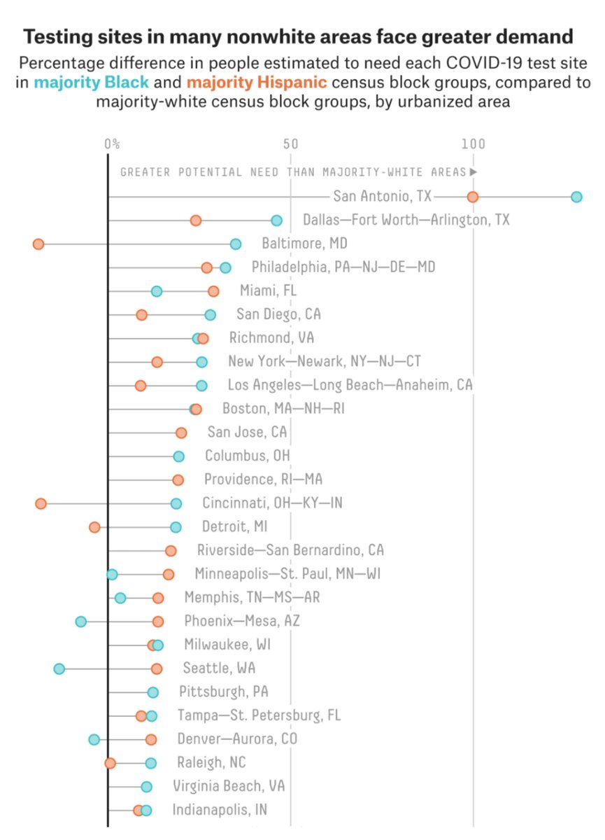
"The novel coronavirus itself does not distinguish between Black and white Americans. But virtually every other aspect of U.S. society does, including the nation’s response to COVID-19." @FiveThirtyEight & @abcnews on testing access is a must-read: https://fivethirtyeight.com/features/white-neighborhoods-have-more-access-to-covid-19-testing-sites/amp/
. @laurabronner, @SooRinKimm, @MPVann and @GraceMarie_35 spent weeks analyzing this data, which underlies Google Maps, and reporting out trends. This piece asks a question that can get lost in logistics: How do you serve people, rather than an area?
The findings aren't, on their face, surprising. They result in part from long-standing inequalities in our country's health care system. But the points made here, aided by phenomenal visuals from @ryanabest and @_schem, are important to understanding these last few months.

 Read on Twitter


