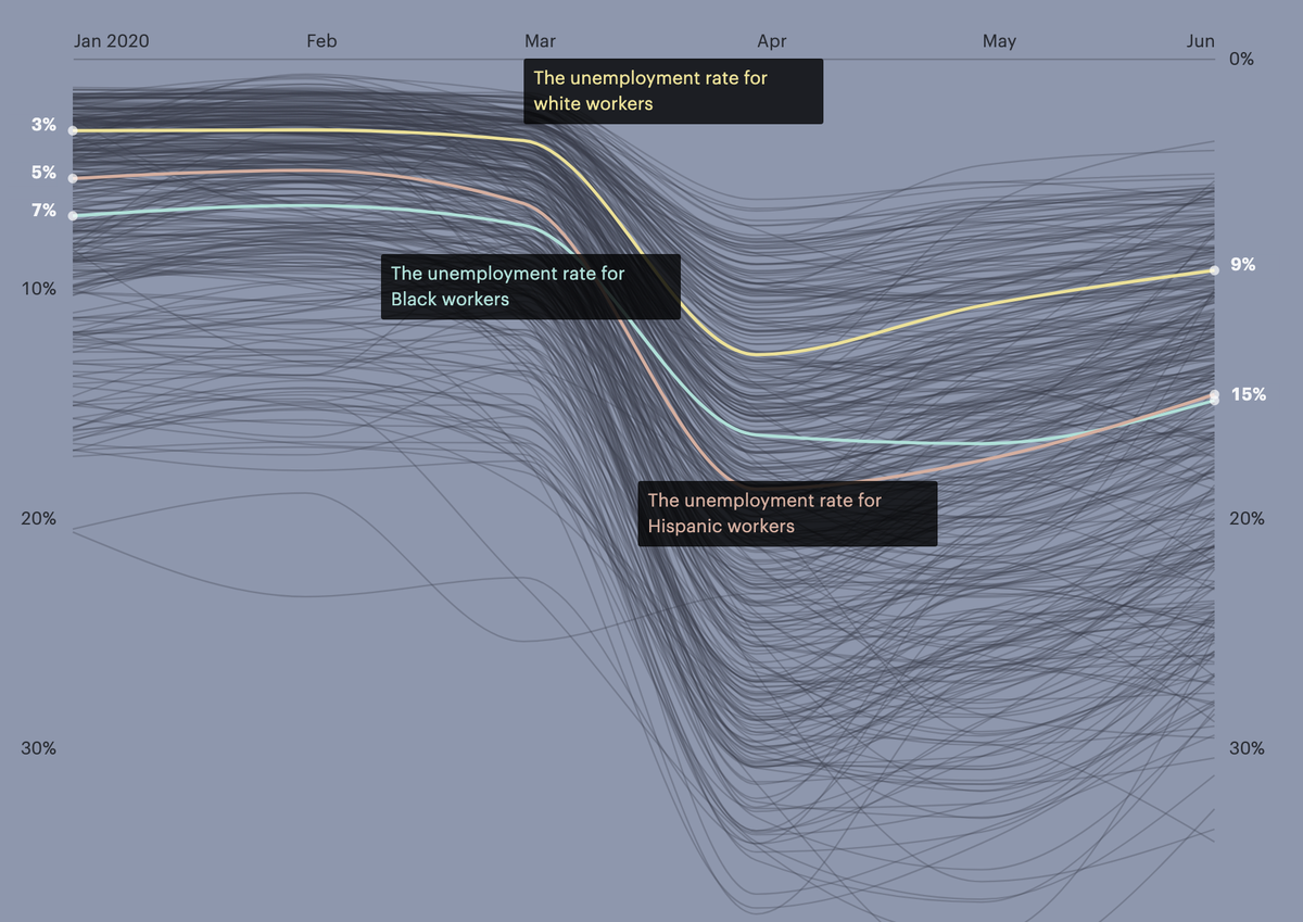
We hear a lot about the unemployment rate as one number.
But it’s not: It can be wildly different depending on your age, gender, education, income — and race.
We made a chart that lets you explore each of those variables.
But it’s not: It can be wildly different depending on your age, gender, education, income — and race.
We made a chart that lets you explore each of those variables.
The devastating impact of the pandemic on jobs in this country has prompted trillions of dollars of aid.
*But* not only are Black Americans and other workers of color getting hit harder now, they were long before the virus took its toll.
*But* not only are Black Americans and other workers of color getting hit harder now, they were long before the virus took its toll.
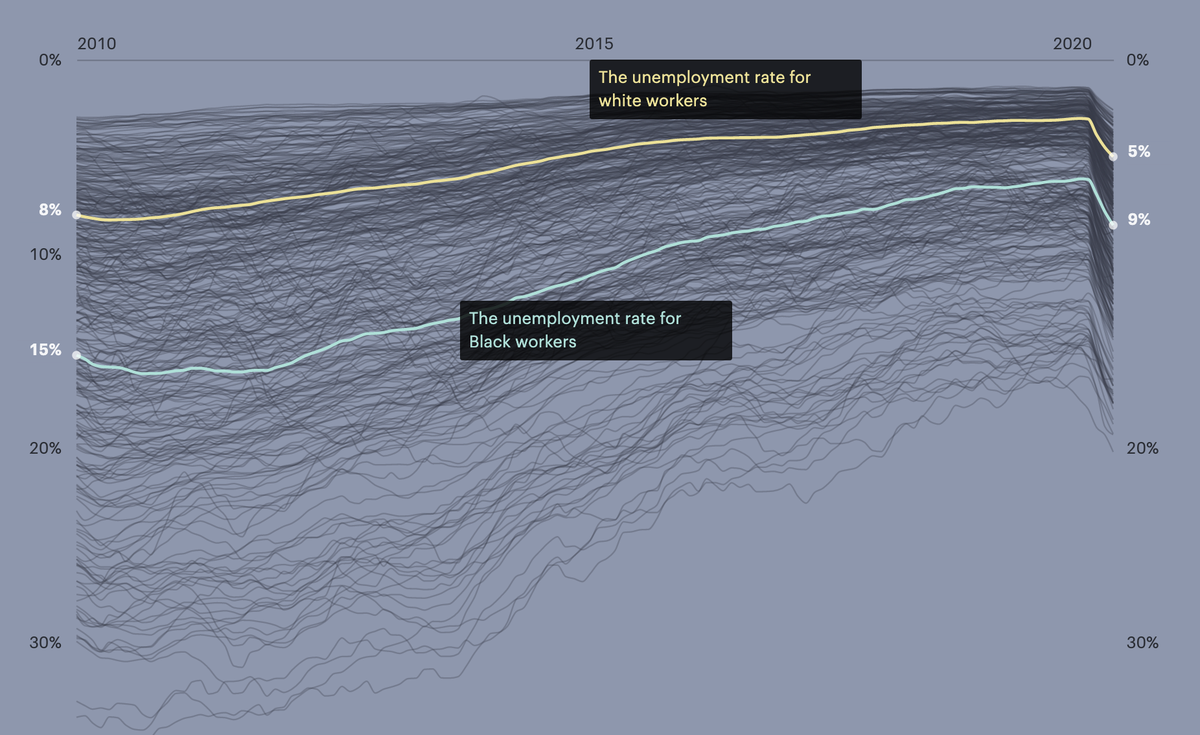
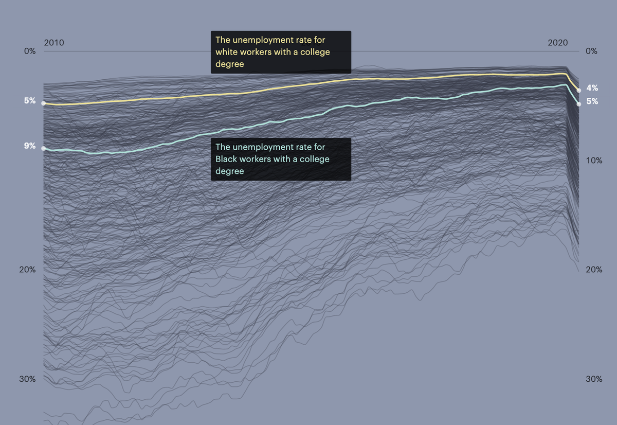
The Black-white gap in unemployment is unbelievably persistent: across time (it’s existed since we started measuring it, as @SandyDarity puts it), location, income, age and education. Here’s what it looks like over the past decade:
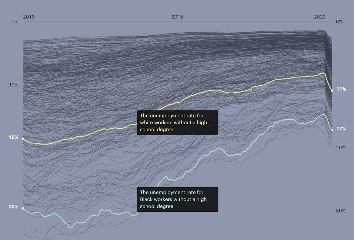
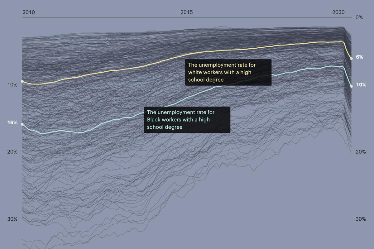
Contrary to popular belief, education does not level the playing field.
The gap exists at every education level, as this report by @ValerieRWilson and @jhacova makes clear: https://www.epi.org/publication/labor-day-2019-racial-disparities-in-employment/
The gap exists at every education level, as this report by @ValerieRWilson and @jhacova makes clear: https://www.epi.org/publication/labor-day-2019-racial-disparities-in-employment/
The reason for this disparity is no mystery: It’s racism.
It manifests in the labor market in many ways, but for one, Black job candidates are just less likely to get hired than white ones: https://www.pnas.org/content/early/2017/09/11/1706255114 (via @JessicaJFulton)
It manifests in the labor market in many ways, but for one, Black job candidates are just less likely to get hired than white ones: https://www.pnas.org/content/early/2017/09/11/1706255114 (via @JessicaJFulton)
Now, to the data itself. The unemployment rates, while based on the best available current data from the @uscensusbureau via @ipums, are still just estimates. So these numbers are correct as trends but not precise to the decimal.
That said, it’s likely that these #'s actually make the unemployment picture look *better* than it really is.
That’s bc of ambiguity in who was classified as unemployed at the start of the pandemic & bc many people have left the workforce (so don’t count in the official rate)
That’s bc of ambiguity in who was classified as unemployed at the start of the pandemic & bc many people have left the workforce (so don’t count in the official rate)
One major limitation of the data: small sample sizes.
There were lots of segments of the population that we couldn’t show because the numbers would have been too unreliable. Thanks to my colleague @HannahFresques for all her help with these calculations.
There were lots of segments of the population that we couldn’t show because the numbers would have been too unreliable. Thanks to my colleague @HannahFresques for all her help with these calculations.
Relatedly, we thought it was important to show Native Americans, Asians and people of 2+ races in distinct categories.
But that means that you quickly get small samples if you divide by gender or age, for example. So a lot of those groups are missing fine-grained detail.
But that means that you quickly get small samples if you divide by gender or age, for example. So a lot of those groups are missing fine-grained detail.
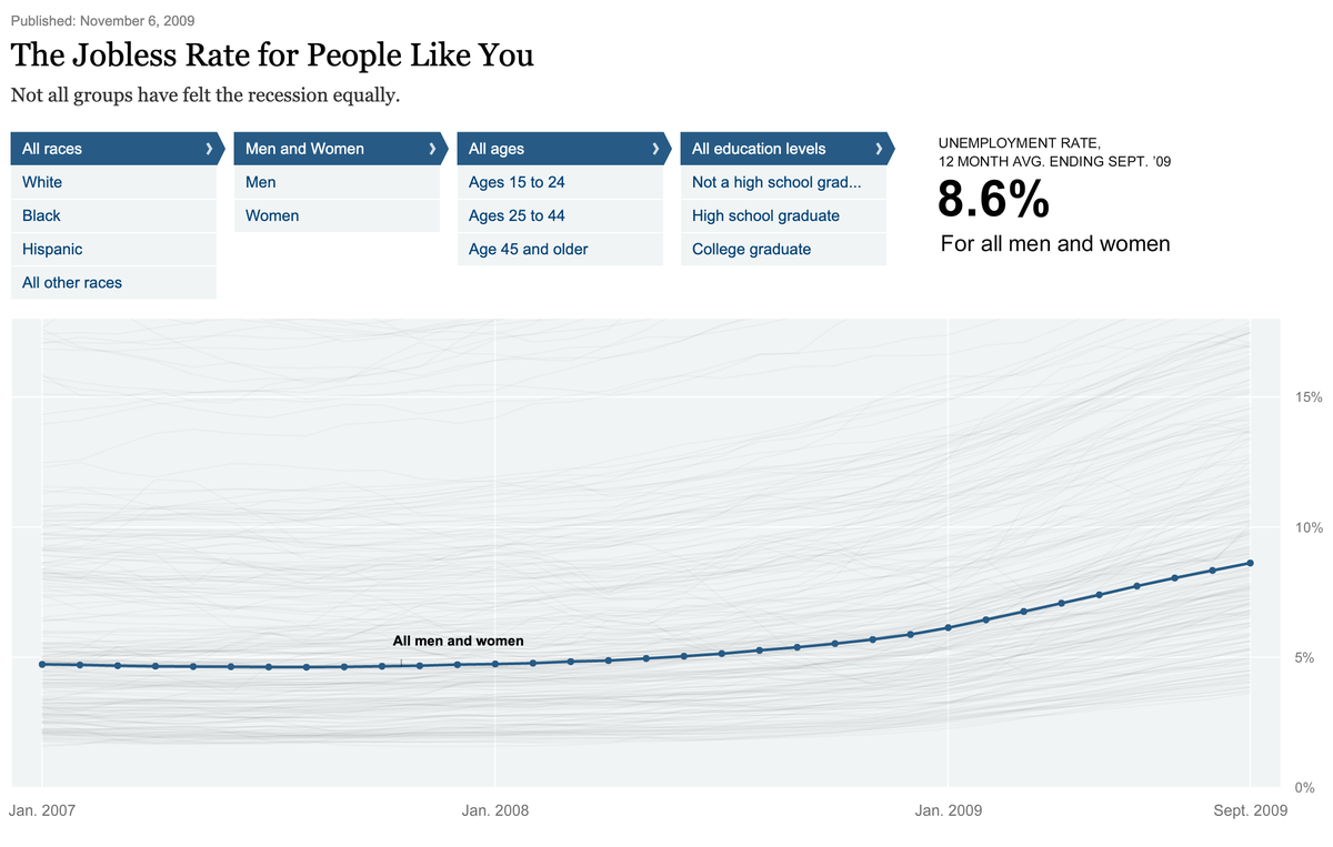
Finally, this piece is heavily inspired by a classic data visualization the @nytimes put out after the 2008 recession, called “A Jobless Rate for People Like You.” It’s Flash, but you can still see it here: https://archive.nytimes.com/www.nytimes.com/interactive/2009/11/06/business/economy/unemployment-lines.html?country=884
Explore the data for yourself and read more here:
https://projects.propublica.org/coronavirus-unemployment/
https://projects.propublica.org/coronavirus-unemployment/
PS: Get notified whenever ProPublica drops a major investigation: https://propub.li/2LdoRh6

 Read on Twitter