Many people (including @matthematician) are dunking on this data visualization from Georgia DPH. Past visualizations of theirs have had issues, but in this case the criticism is misguided. (1/n) https://twitter.com/andishehnouraee/status/1284237474831761408
The two images shown are screenshots taken on different days. They are not intended to be compared side to side, nor are they presented that way by DPH (at least when I view the site). (2/n)
Furthermore, when the July 2 map was made, it would have been difficult to predict the peak case count for two weeks later and adjust the scale based on that. The image is meant to capture spatial distribution at an instant in time, not trends with time. (3/n)
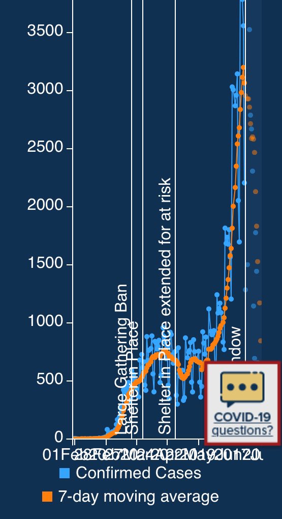
Here’s how they present the time trend. Not mobile optimized, but otherwise clear. Certainly it doesn’t cover up the recent growth. One can even click the map and get per-county trends! (4/n)
In summary, I do not believe the visualization is misleading, and the criticism likely stems from preexisting views of the agency, which, even if accurate, do not justify this accusation. (5/5)
Addendum that, although I do work for the University System of Georgia, these are my own views, as always on this personal and unofficial account.

 Read on Twitter


