A small rant: I realize this was just a marketing post. I love Microsoft and have built my career using their technologies, and there are many people working there that I admire and respect. But I wish data viz tool vendors would make demos that use accessible design practices. https://twitter.com/OpenAtMicrosoft/status/1281619220040683520
Red-green & rainbow color palettes aren't usable by people w/ color vision deficiency, AKA color blindness. Rainbow color palettes aren't perceptually uniform anyway ( https://www.climate-lab-book.ac.uk/2016/why-rainbow-colour-scales-can-be-misleading/). Here's what that looks like with a deuteranopia simulation.
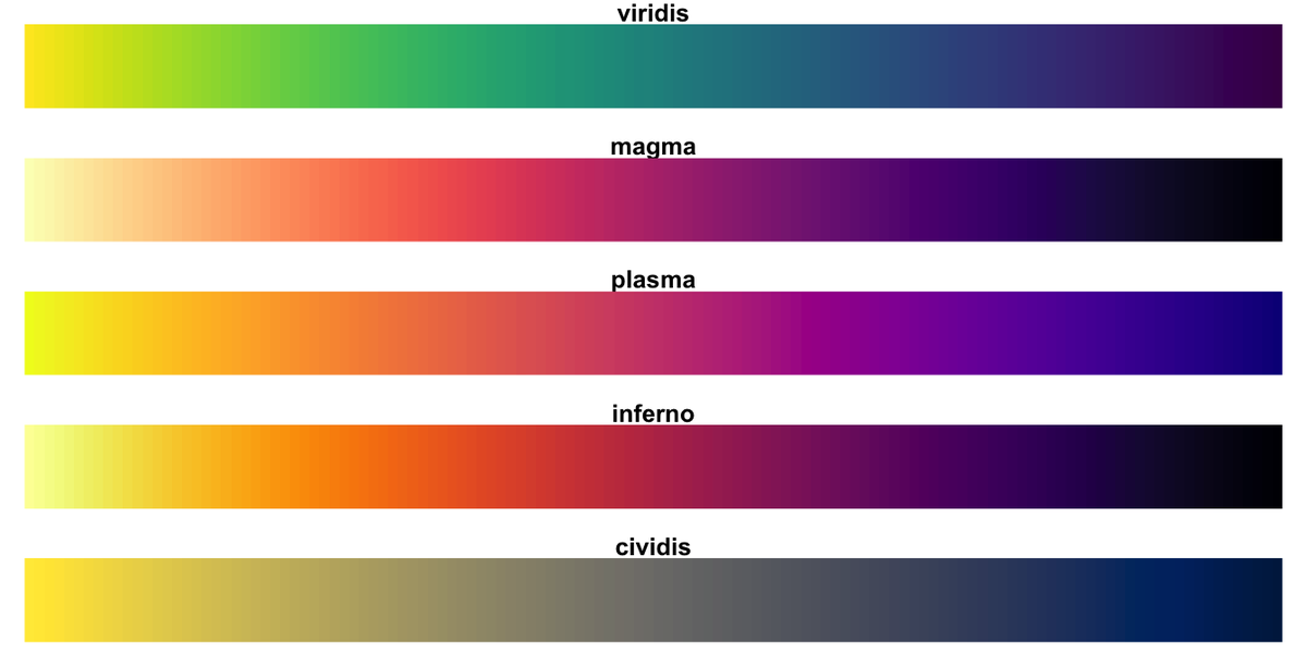
There are color palettes out there that are designed to be "colorblind friendly". One example is viridis ( https://cran.r-project.org/web/packages/viridis/vignettes/intro-to-viridis.html), but there are others.
Many vendors have this habit of saying "look at this shiny thing" from one part of the org and also "we support inclusive design and here are all the best practices" from another part ( https://www.microsoft.com/design/inclusive/)
But until we treat accessibility and inclusive design as normal, required parts of design and not "other", we won't get products that can create accessible viz, much less accessible demos.
So some people made (in my opinion) poor color choices. So what? I think there are two main reasons this matters.
1) You've probably heard some people from URMs say they didn't know they could do that thing or have that career until they saw someone like them do it. I think that is true about the products and services we create as well.
Some person is out there learning a technology or attending conferences, and seeing every data viz demo and knowing it doesn't work for them because they are colorblind or can't use a mouse or [insert a condition that deviates from the use cases the devs commonly design for].
Think about how happy and inspired that person would be if they saw a cool demo that had easily distinguishable colors or working keyboard accessibility, etc. And think about how many other people they would tell about it.
2) The other part, is that devs/creators like to emulate the demos provided by their vendors. So when a vendor makes a demo, lots of people assume it is designed well and mimic the design choices in their work
They don't think about the fact that someone made that demo to show off feature X and didn't put a disclaimer that this isn't fully polished nor accessible. And the demo creator may not have been familiar with inclusive design practices.
But what if the demos were made to be accessible to more people? And then the people who copied them made things that were more more inclusive just because they copied them, even if they didn't really know/appreciate that the design choices they copied were inclusive?
I get that demos get made in a hurry (I know some of mine do). And my designs are not always perfect. And we can't make a thing that is accessible for everyone because people and their abilities and preferences are diverse.
But we can form some basic accessible design habits so that our design choices work for more people. Right now it just feels like we aren't trying that hard, even though some small changes could make a big difference to some people.

 Read on Twitter


