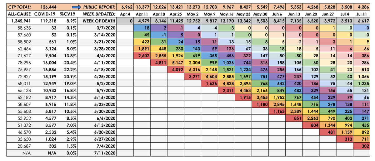
With a huge assist from @tlowdon who let me use his data to fill in gaps I had missing for early June, I am putting together a multi-dimensional date of death chart which will show deaths by week occurred, publicly reported deaths by week and weeks when CDC updated the deaths.
Top row: Deaths reported publicly by week
West to East: Provisional death counts by CDC when death occurred, columns representing the week when CDC added them.
Color striping indicates a way to track trends based reporting week. First red = 1st week of data, Orange = 2nd, etc.
West to East: Provisional death counts by CDC when death occurred, columns representing the week when CDC added them.
Color striping indicates a way to track trends based reporting week. First red = 1st week of data, Orange = 2nd, etc.
Most recent four week sum of deaths by reporting week:
July 11: 2,340
July 4: 2,868
June 27: 3,064
June 20: 5,226
June 13: 5,665
June 6: 6,809
May 30: 7,769
May 23: 10,960
May 16: 11,545
May 9: 9,387
May 2: 12,590
July 11: 2,340
July 4: 2,868
June 27: 3,064
June 20: 5,226
June 13: 5,665
June 6: 6,809
May 30: 7,769
May 23: 10,960
May 16: 11,545
May 9: 9,387
May 2: 12,590

 Read on Twitter


