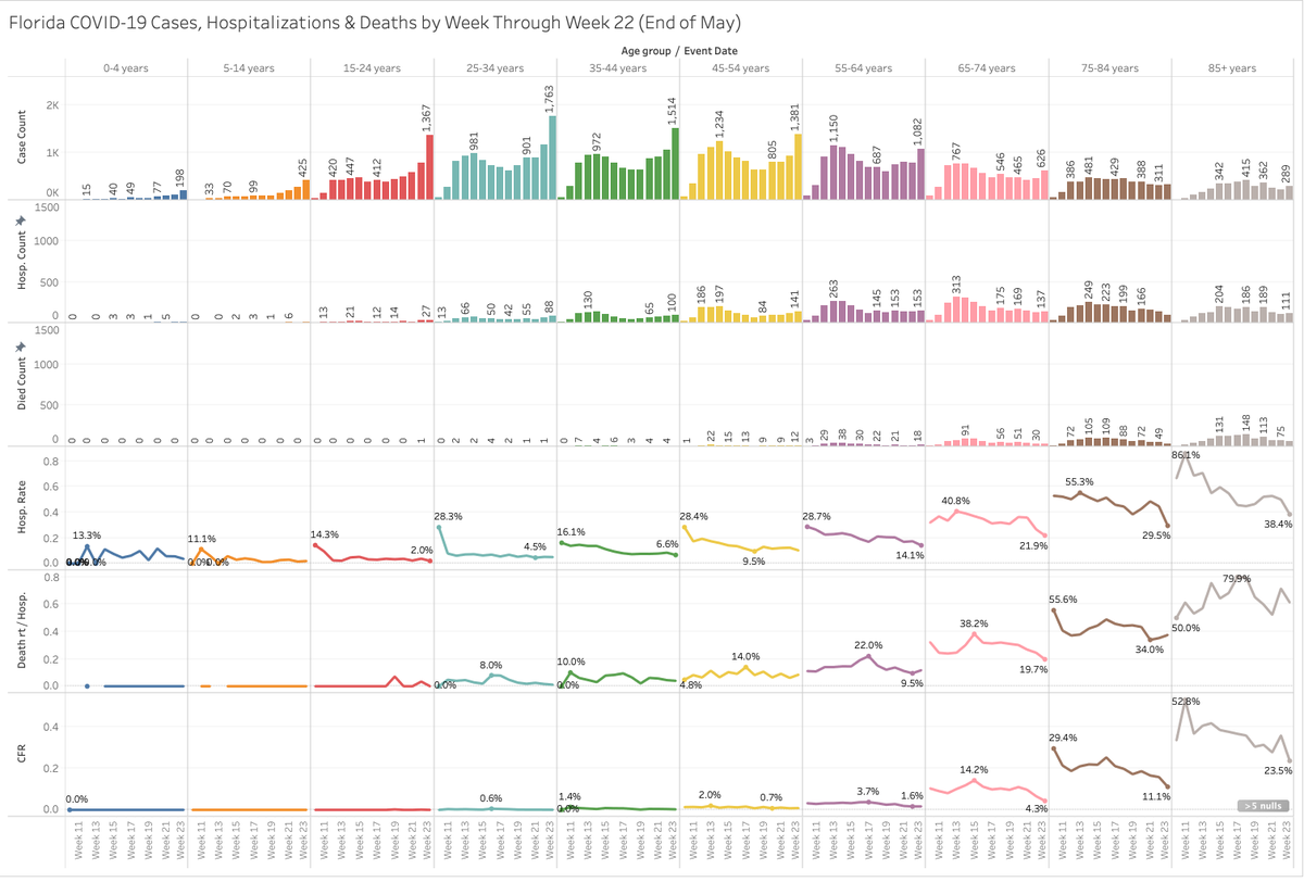
Take a look at Fl #COVID19 again - it's a microcosm for the other handful of hotspots and also their data gives me an "anchor" by "infection date" (or as close as they can get). What this means is that we can take a group of people at, say, Week 23 and see what happened
1/
1/
I've limited the chart through the end of May. As FL adds new updated batched I notice that May data has normalized - what happened to people who got sick in may is already known. So anyone with a case on Week 17 is also listed as a hosp or death on Week 17 if that occurred.
2/
2/
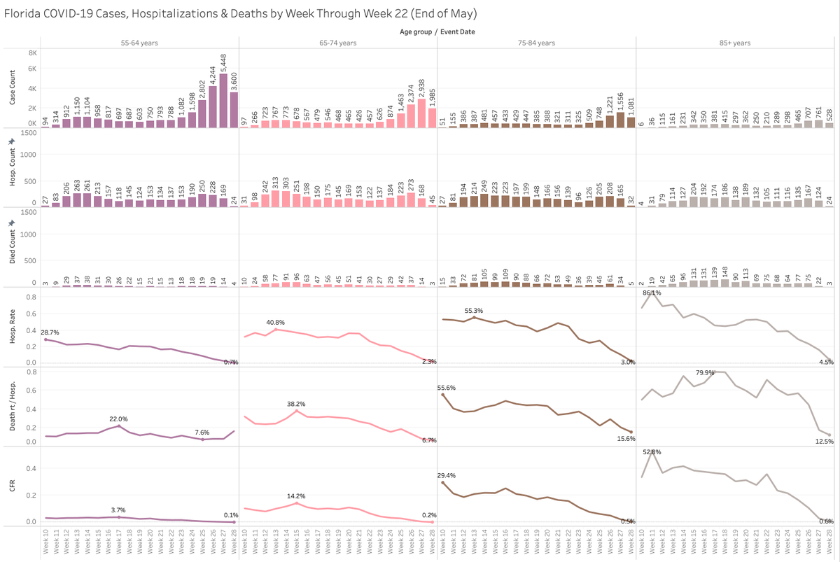
As we've seen the IFR for the lower age bracket is basically non-existent. For the older brackets you can see that the rates have fallen dramatically from the beginning of the epidemic. Look close at those top graphics and let's blow it out to June and July as well.
3/
3/
Now June and July data still needs to go through the motions but the CFRs alone should lend some serious relief to big concerns. You can find all this data online here: https://open-fdoh.hub.arcgis.com/datasets/florida-covid19-case-line-data?selectedAttribute=EventDate

 Read on Twitter


