/1 A thread of some takeaways from the new @TOPublicHealth dataset, released today:
Of 287 patients ever intubated, 33 are currently vented, 133 are resolved or no longer vented, and 121 are dead.
That means about 48% of COVID-19 patients died after being intubated.
Of 287 patients ever intubated, 33 are currently vented, 133 are resolved or no longer vented, and 121 are dead.
That means about 48% of COVID-19 patients died after being intubated.
2/ Seven of Toronto's worst-hit neighbourhoods by overall cases are designated Neighbourhood Improvement Areas.
NIAs make up just 31 of the city's 140 neighbourhoods.
NIAs make up just 31 of the city's 140 neighbourhoods.
3/ These poorer Neighbourhood Improvement Areas account for about 38% of the city's cases.
In them, the per capita rate of infection is 922 cases per 100,000.
Outside of these neighbourhoods, it's 403 per 100,000.
In them, the per capita rate of infection is 922 cases per 100,000.
Outside of these neighbourhoods, it's 403 per 100,000.
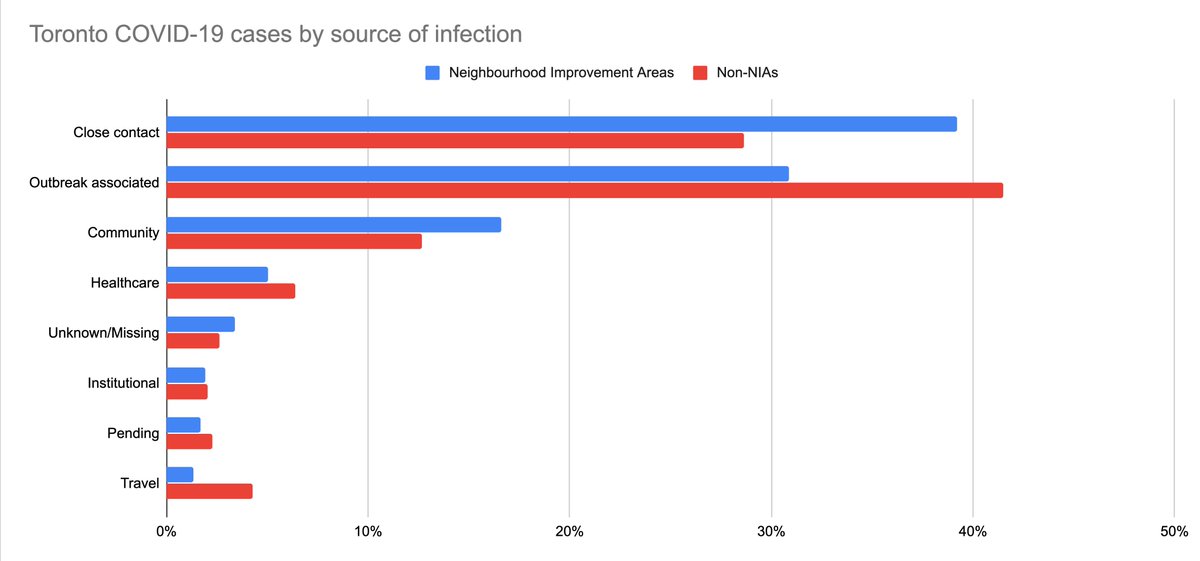
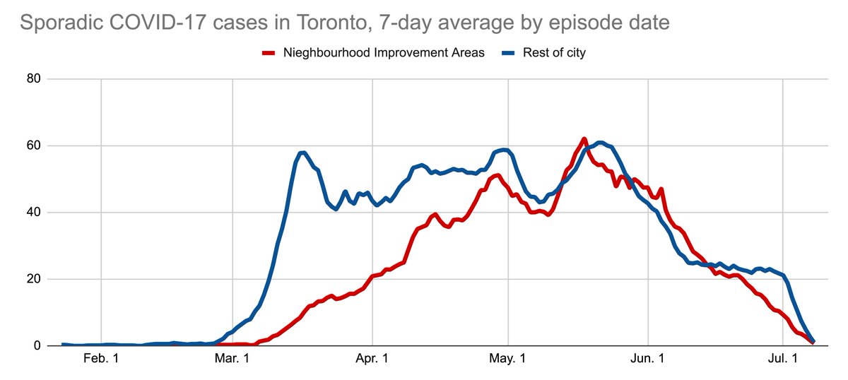
4/ Comparing COVID-19 cases from the poorer neighbourhoods to the rest of the city:
Cases in the NIAs are more likely to be from close contact or community spread, less likely to be from outbreaks and healthcare settings, and much less likely to be from travel.
Cases in the NIAs are more likely to be from close contact or community spread, less likely to be from outbreaks and healthcare settings, and much less likely to be from travel.
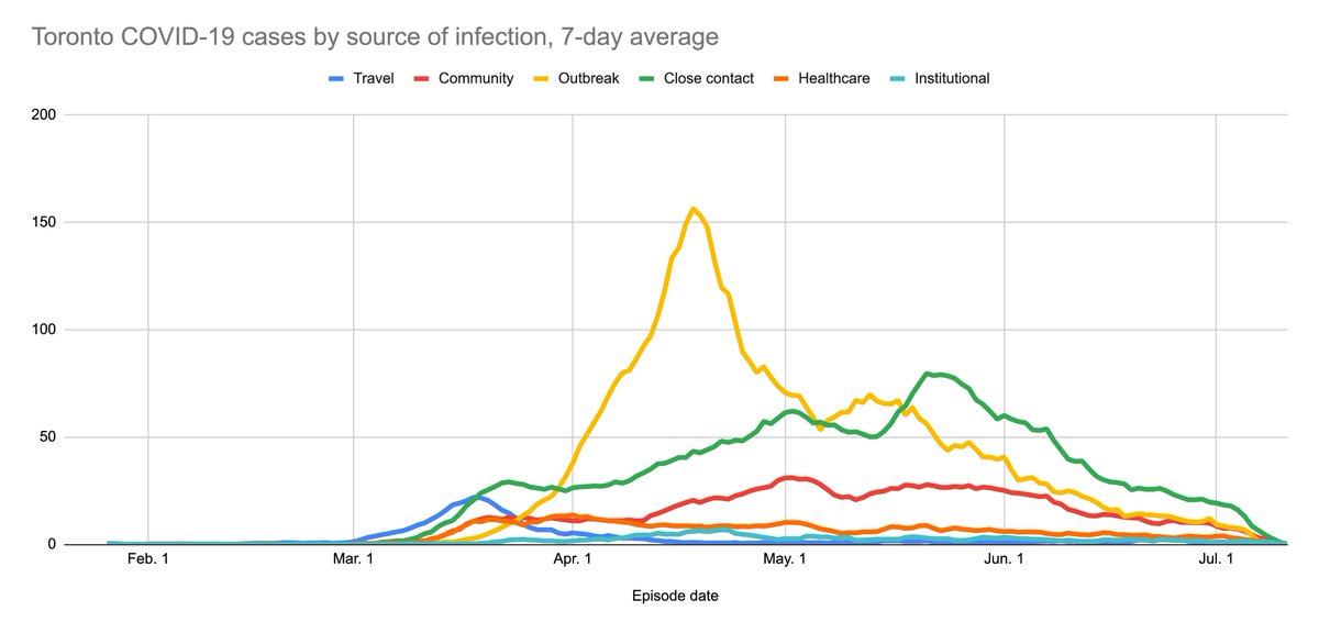
5/ Here's a favourite chart of mine: Cases by source of infection over time.
I like this because it shows phases of spread:
First travel cases arrive, then close contacts get ill, then healthcare and community spread starts, and only then do nursing home outbreaks take off.
I like this because it shows phases of spread:
First travel cases arrive, then close contacts get ill, then healthcare and community spread starts, and only then do nursing home outbreaks take off.
6/ Also, I mean: It's no small point that Toronto's first significant wave of COVID-19 infection was travel cases with symptom onset on or soon after March Break.
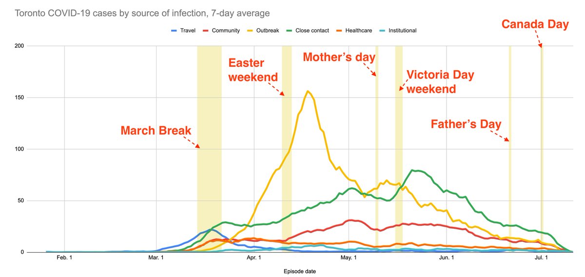
7/ Here's the same chart with notable dates highlighted.
Does this reveal anything profound? Maybe not.
That probably depends on whether "episode date" is mostly symptom onset (a lag of about ~5 days) or test/report date (longer).
It's defined as the earliest of those.
Does this reveal anything profound? Maybe not.
That probably depends on whether "episode date" is mostly symptom onset (a lag of about ~5 days) or test/report date (longer).
It's defined as the earliest of those.
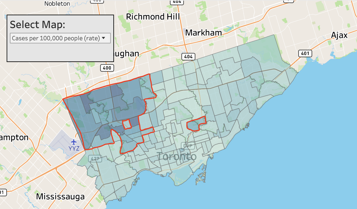
8/ The 17 worst-hit Toronto neighbourhoods for sporadic cases (excluding outbreaks) per capita are all in the city's northwest.
Of the worst-hit 25 neighbourhoods, all but 2 are in or adjacent to the area bounded by Steeles and Eglinton, and Hwy 427 and Dufferin.
Of the worst-hit 25 neighbourhoods, all but 2 are in or adjacent to the area bounded by Steeles and Eglinton, and Hwy 427 and Dufferin.
9/ That part of the data is not actually new, @jyangstar, @katecallen, @rachelmendleson and @primarydata wrote in detail on this part of the city a couple of weeks ago. https://www.thestar.com/news/gta/2020/06/28/torontos-covid-19-divide-the-citys-northwest-corner-has-been-failed-by-the-system.html

 Read on Twitter