Charts speak volumes. Interesting charts on a handful of digital assets/metrics.
Filters:
a) Liquid Marketcap > $50mm, as defined on @MessariCrypto
b) Is on my current watchlist (<30 names as of now)
Charts below <top 10 for each factor>
Filters:
a) Liquid Marketcap > $50mm, as defined on @MessariCrypto
b) Is on my current watchlist (<30 names as of now)
Charts below <top 10 for each factor>

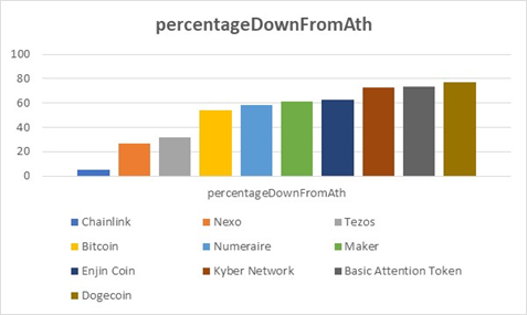
1. Percentage down from All Time Highs is an interesting metric and can be translated into how resilient a digital asset is. Lower the better.
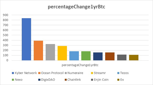
2. Percentage change against #BTC  is a litmus test if you are considering diversifying into other digital assets.
Outperforming #Bitcoin over long time horizon & especially in bear markets is very difficult. This 1 year chart is interesting because BTC last topped in June 2019.
 is a litmus test if you are considering diversifying into other digital assets.
 Outperforming #Bitcoin
 over long time horizon & especially in bear markets is very difficult. This 1 year chart is interesting because BTC last topped in June 2019.
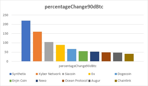
3. Percentage change against BTC in the short term can identify what themes are in fashion. This is a 90d chart. Clearly, you see #DeFi outperforming BTC handsomely.
$SNX $KNC $ZRX
$SNX $KNC $ZRX
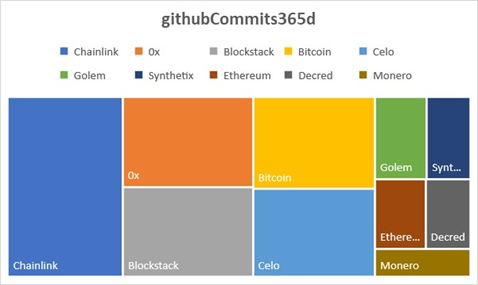
4. If github commits are a rough proxy for dev activity and if dev activity could be a harbinger of a project's success then this chart might be interesting. Again, I have chosen a longer time frame than a few months. It is 1 year.
$LINK $STX $CELO $ZRX
$LINK $STX $CELO $ZRX
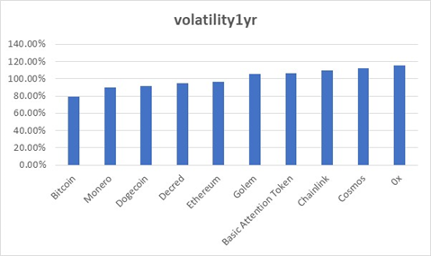
5. #volatility Go where you wish, but you can hardly escape from it. This chart can have multitudes of interpretations. So, I will just share it as it is. 10 lowest volatility names (based on above filters) in last 1 year.
$BTC $XMR $DCR $DOGE $ETH
$BTC $XMR $DCR $DOGE $ETH
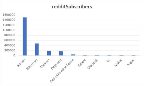
7. You can have a high number of subscribers because of the protocol age. Activity matters. A few names outside the usual suspects are $BAT $GNT $MKR $REP.
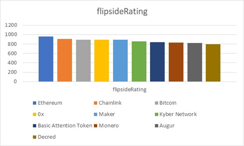
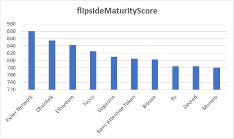
8. @flipsidecrypto @TokenInsight are interesting teams working on bringing transparency to digital assets space.
Flipside Ratings -
Flipside Ratings -
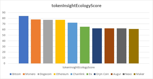
9. @TokenInsight Ecology score -
10. What I do not understand is the rationale behind this chart. How on earth are all these projects more "mature" than Bitcoin? Would like to get an explanation @flipsidecrypto !
That was a wrap! You could derive meaningful insights by combining charts and testing several hypotheses.
P.S. These charts can also use normalization - but this is the raw output for now.
Datasource: @MessariCrypto
Would love to hear comments @cburniske @sethginns
P.S. These charts can also use normalization - but this is the raw output for now.
Datasource: @MessariCrypto
Would love to hear comments @cburniske @sethginns

 Read on Twitter