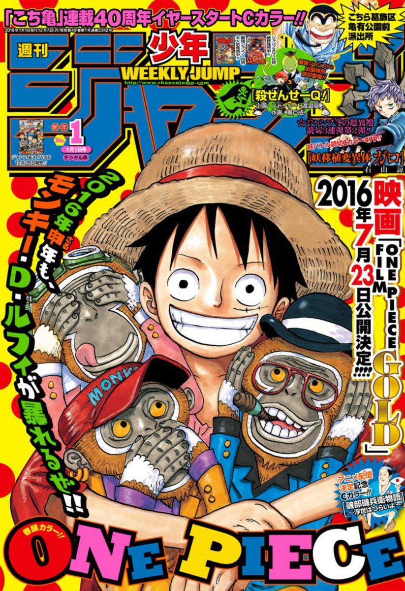
ranking every year's #1 issue of Weekly Shonen Jump, a thread!
(this just means the first issue of the year, not the "top" issue or anything)
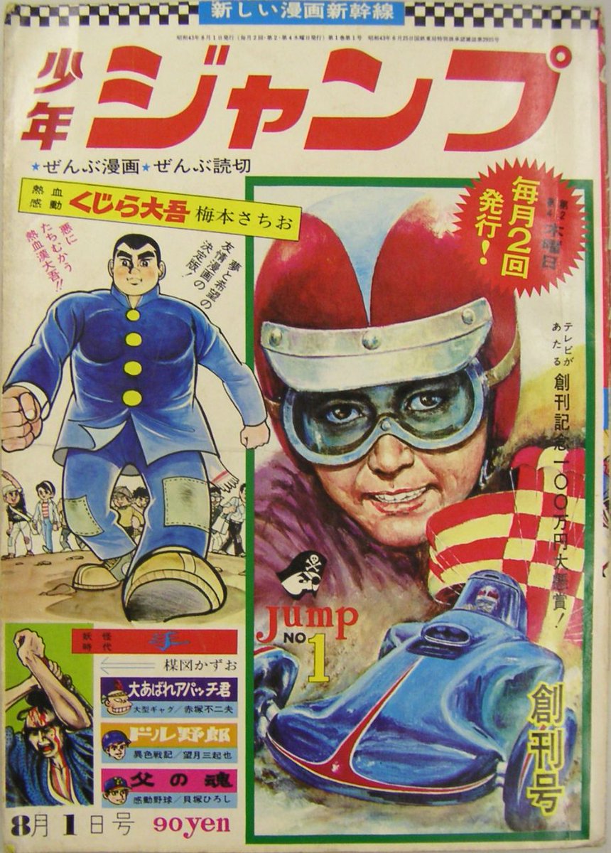
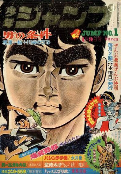
Starting with the very first, 1968. Impressively ugly cover, but I can't blame them that much. It's only uphill from here.
(this just means the first issue of the year, not the "top" issue or anything)
Starting with the very first, 1968. Impressively ugly cover, but I can't blame them that much. It's only uphill from here.
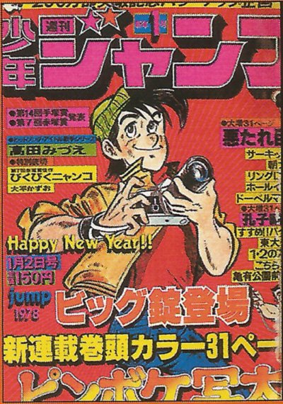
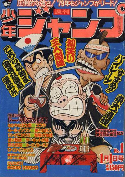
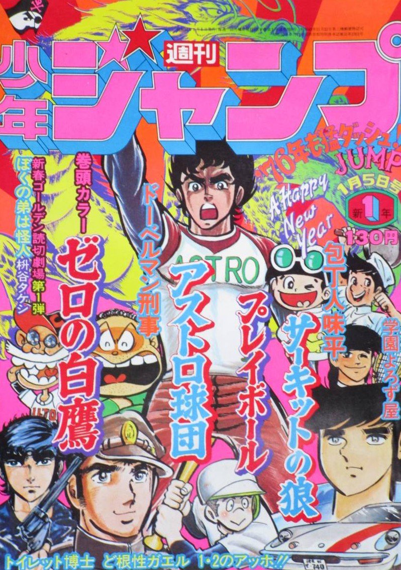
1978's cover, a decade later, at least shows better design sense. But for some reason I hate this character, he looks like a dipshit. Never heard of Pinboke Shutter before, but I don't want to read it.
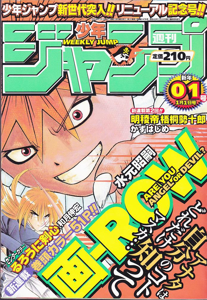
and 20 years after that in 1998, it's Ei-Row. A series nobody has ever heard of, who couldn't even manage a decent close-up and was only trusted with less than a third of the actual cover.
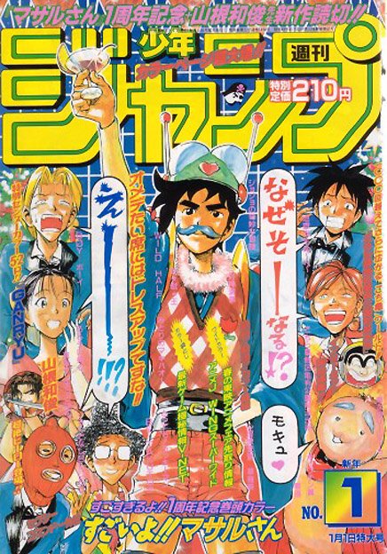
Easily the worst two-year span, 1997 is only slightly better because it's got proper composition. But Sexy Commando Gaiden: Sugoi yo!! Masaru-san isn't exactly making me want to pick up the magazine, here.
Is he wearing a bra AND panties on his head?
Is he wearing a bra AND panties on his head?
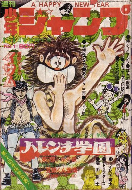
Go Nagai's 1972 Harenchi Gakuen is often credited as the first ecchi series, but instead of featuring one of its attractive heroines, we got some random caveman. no thanks
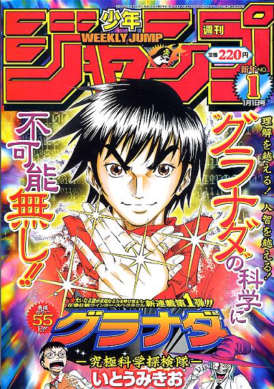
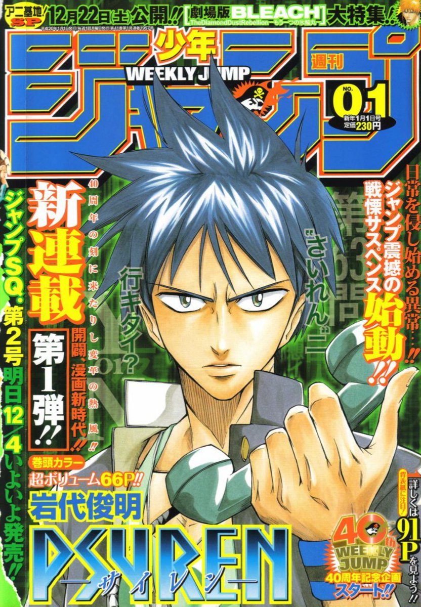
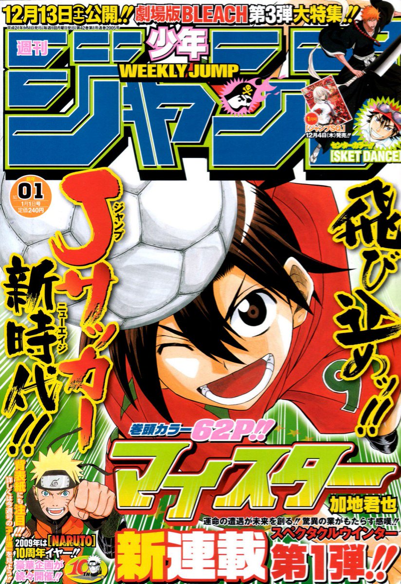
These four from 1969, 2003, 2008, and 2009 share a similar theme and fault. it's just a giant protagonist face. And none of these characters are iconic enough to pull that off.
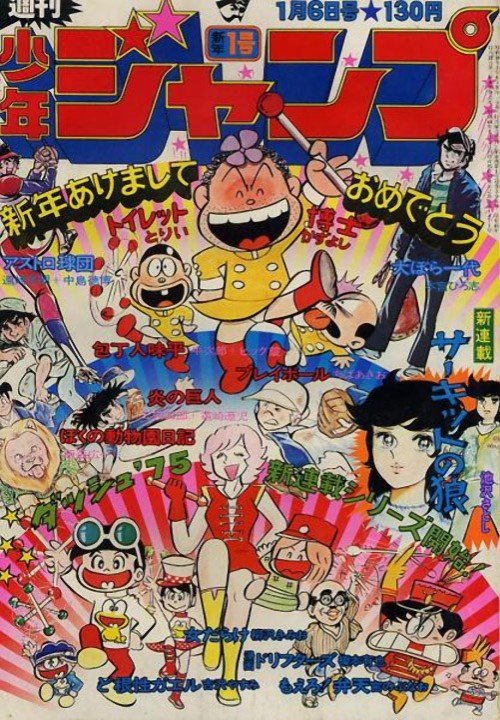
and rounding out the bottom 10, we have 1975. For a period in the 70s, Jump was trying to put all its stars on its #1 issue. That's not a bad idea, (though later they'd reserve that for the end of the year) but the presentation here does no one any favors.
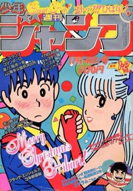
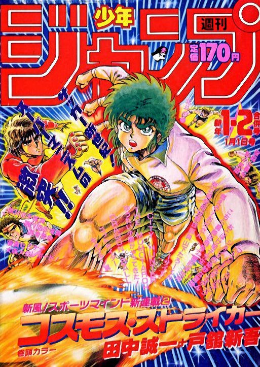
1982's Stop!! Hibaru-kun! has a cute artstyle but this cover looks like they zoomed in on a larger drawing. The thick lines and solid colors come off as amateurish, rather than stylized. Just not a good fit for cover duty.
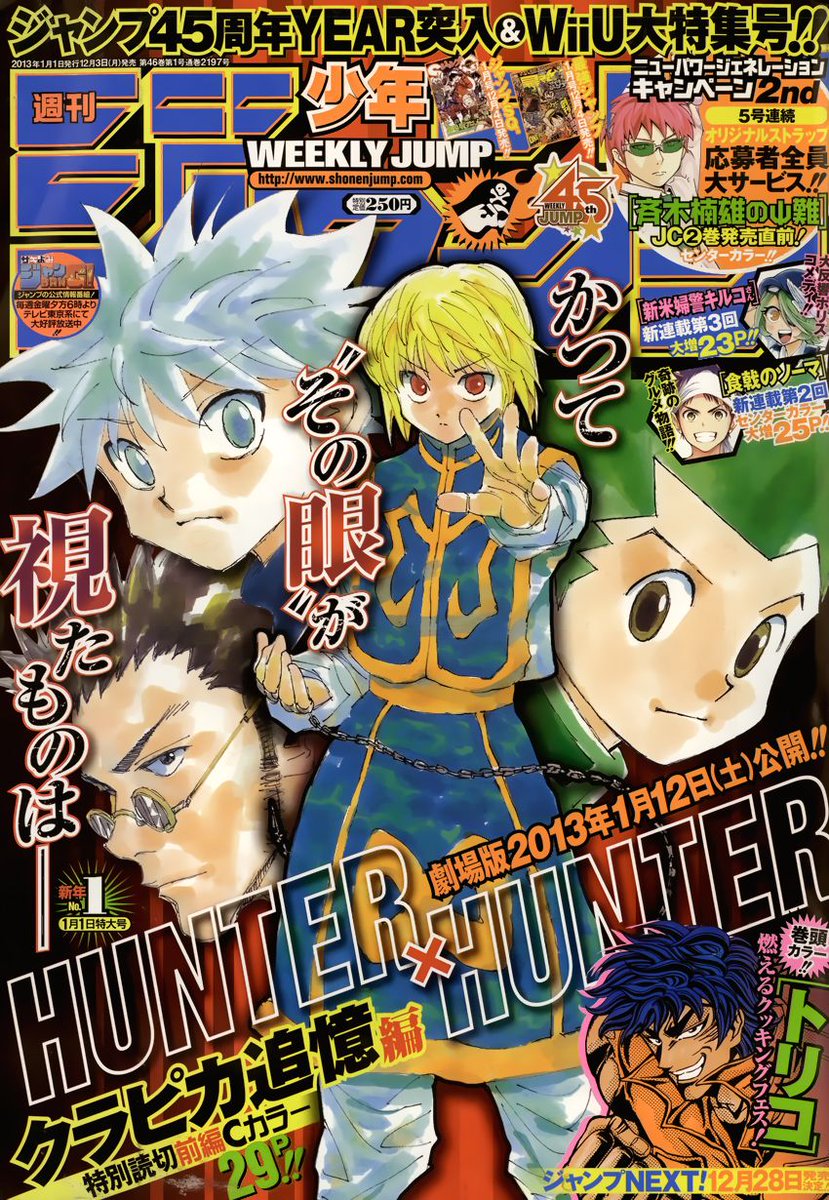
speaking of poor artwork, HxH graced the cover of 2013 and Togashi really phoned this one in. It's just the protagonists' faces hovering around, and sloppy watercolors. He can do better, and has.
(again, this is a ranking of the covers, not the series itself)
(again, this is a ranking of the covers, not the series itself)
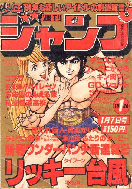
1979 has Kochikame's bastards hogging the spotlight, and mainly I'm distracted by the flat background. This artwork feels like it needs more context than a blue void.
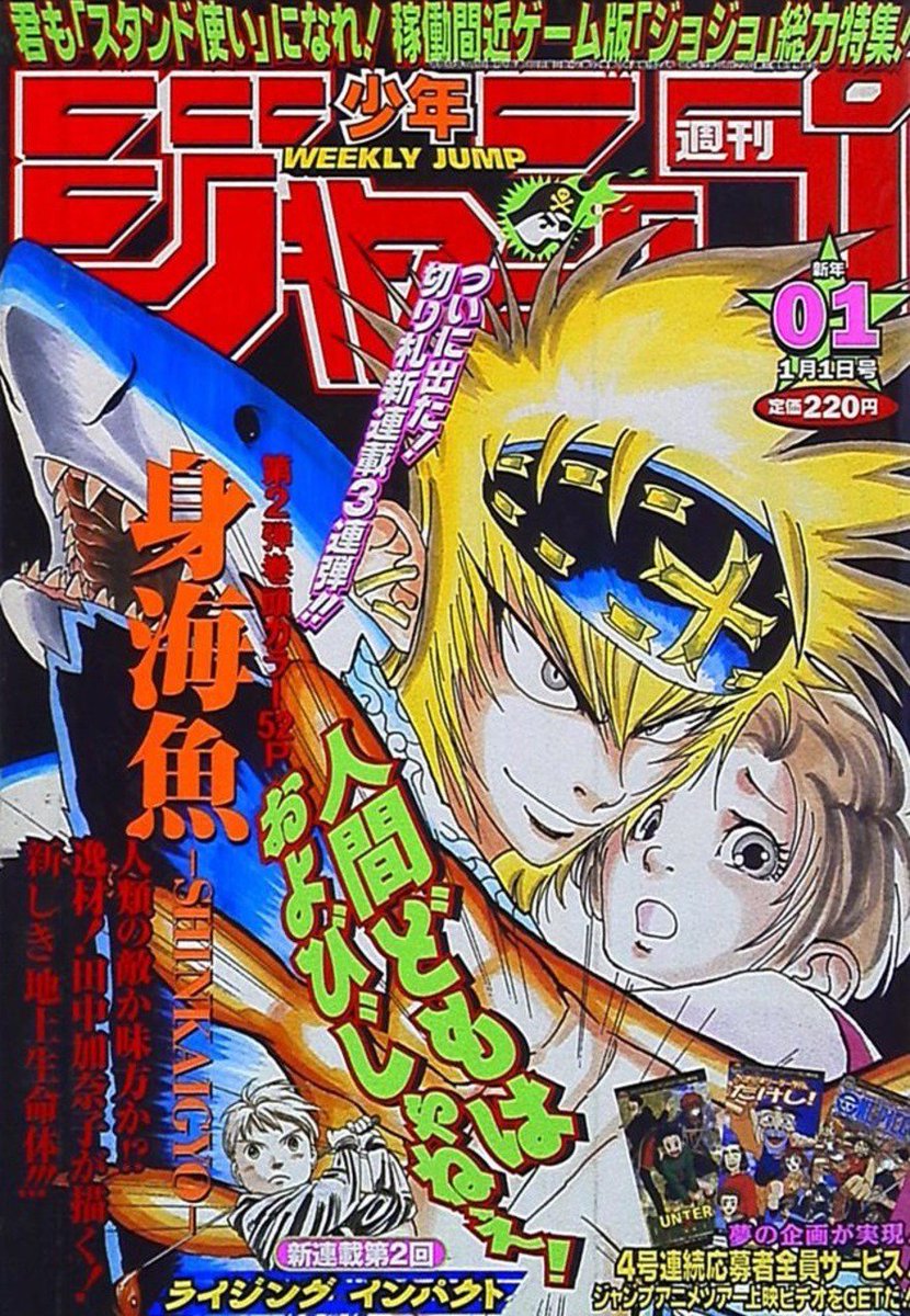
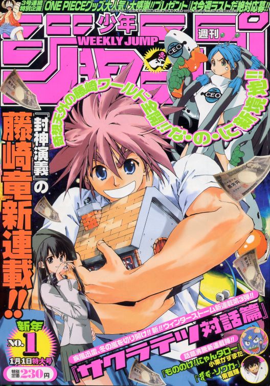
1999's Shinkaigyo and 2002's Sakuratetsu Taiwahen suffer from clumsy composition, but I'm at least intrigued by both of them. What's the shark about? Why is he stealing a house?
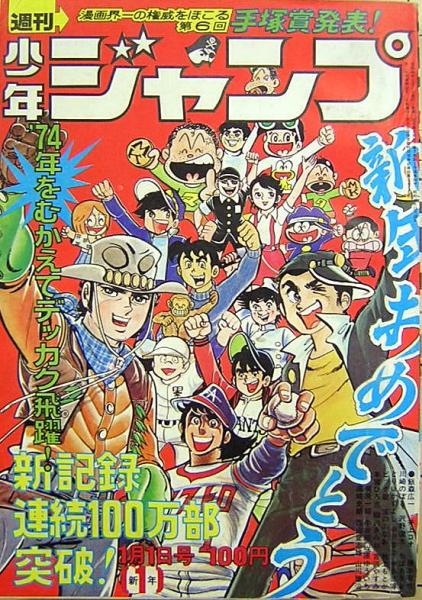
1976 and 1974 are more "everybody everybody" covers, that do their job. If I knew more of these series, I might care more about them.
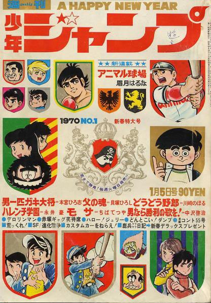
1970 has a very unique design that seems so out of place with Jump's brand that I can't rank it any higher, but I have to admire what it's going for.
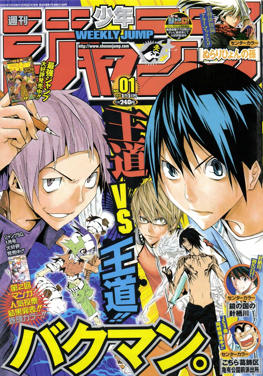
2012's Bakuman cover has a solid (if standard) concept, but I kinda wish the fictional manga got larger billing than the boring character's heads. Or maybe make the cover look like a fake in-universe Jump? but Obata on an off day is still better than most.
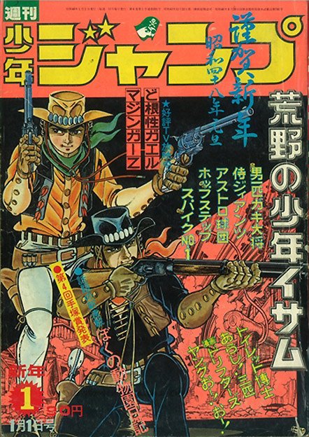
I know it's not really fair to complain about these artworks being ruined by tons of text, that's the nature of a magazine cover. But 1973's Koya no Shonen Isamu feels like it got hit extra hard, the stark background makes all the writing seem so out of place.
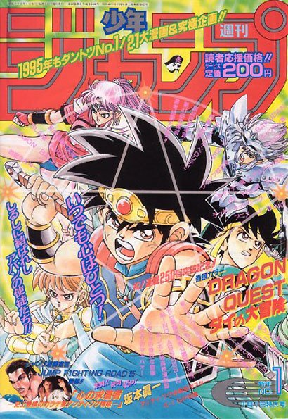
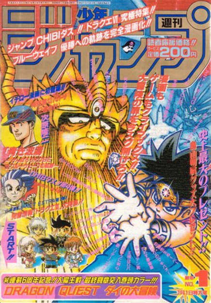
Dai no Daibouken got #1 duty two years in a row in 1995 and 1996, and they're both pretty solid! Exciting covers that make me want to open it up.
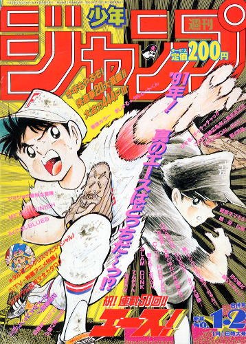
Ace! also got back-to-back #1 covers, but 1991's outing is much worse than 1990. You'll see the other later, but know that this is still pretty neat, just pales in comparison.
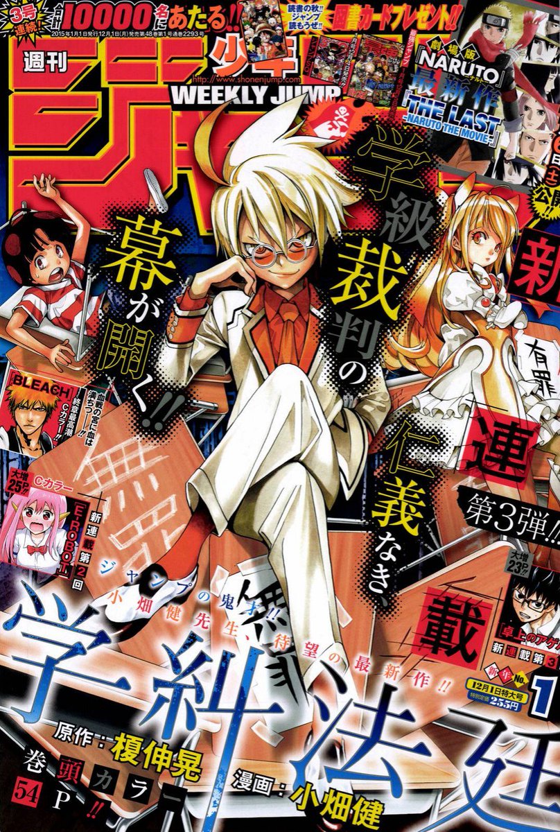
2015 is another Obata cover, with Gakkyu Hotei. The series didn't last, but the cover is pretty cool. Also suffers from being suffocated by text, though.
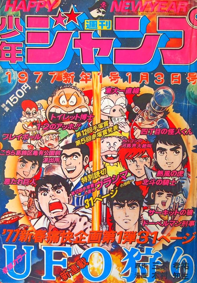
1977 is yet another "cram all the main characters on there" cover, but for some reason they're all inside a sunburst or exploding volcano or something. I don't know. I love it.
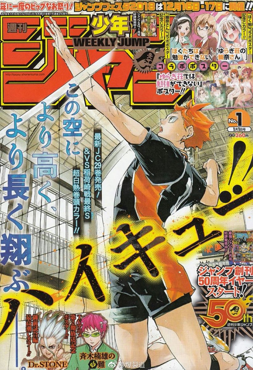
2018's Haikyuu cover uses the text to frame the action well. A solid effort, though the shot is a little generic for the series.
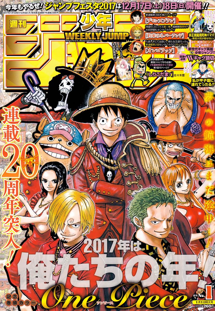
One Piece is back in 2017, and gets the whole crew on the cover for its 20th anniversary. Average by Oda's colorspread standards, it still makes for a very handsome cover.
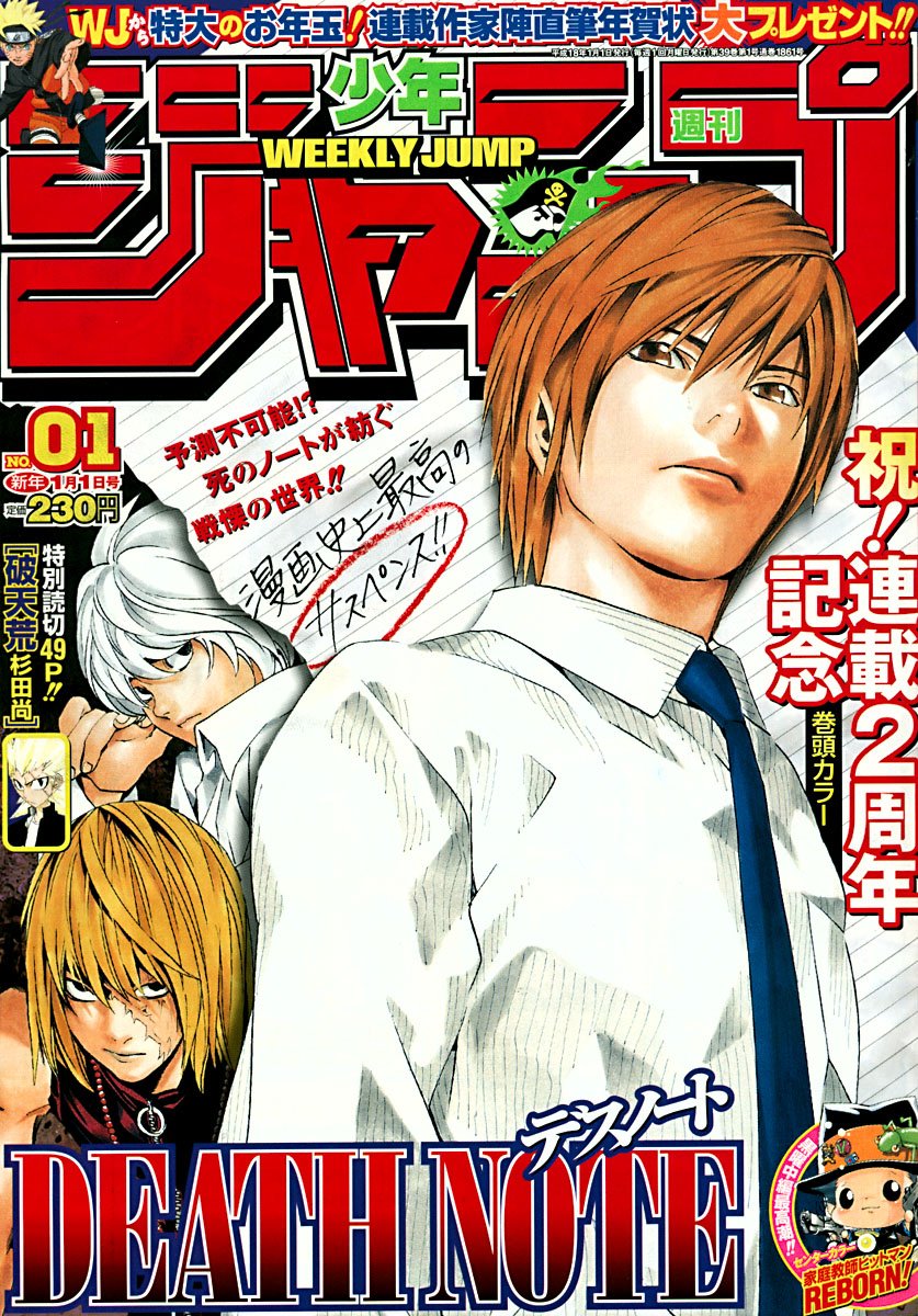
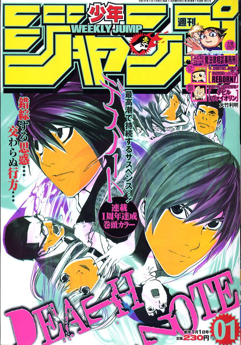
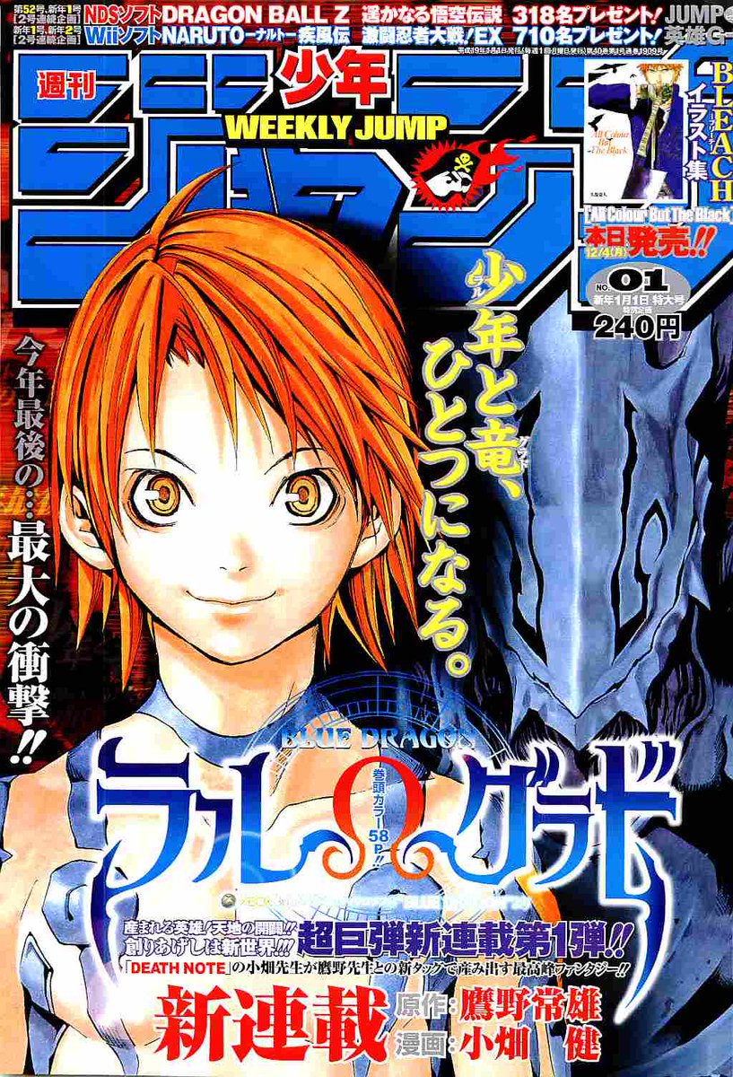
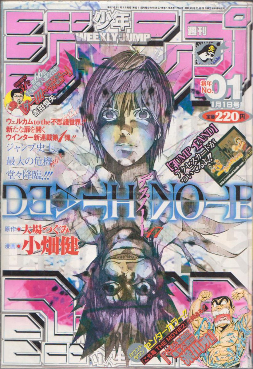
From 2004-2007, Obata was on the first cover of the year, 3 times with Death Note and once with Blue Dragon Ral Grad.
I'd place rank them 2006 < 2005 < 2007 < 2004, but all are good.
2004 would be especially great without that extra overlay, the mirror effect is plenty gimmick.
I'd place rank them 2006 < 2005 < 2007 < 2004, but all are good.
2004 would be especially great without that extra overlay, the mirror effect is plenty gimmick.

 Read on Twitter