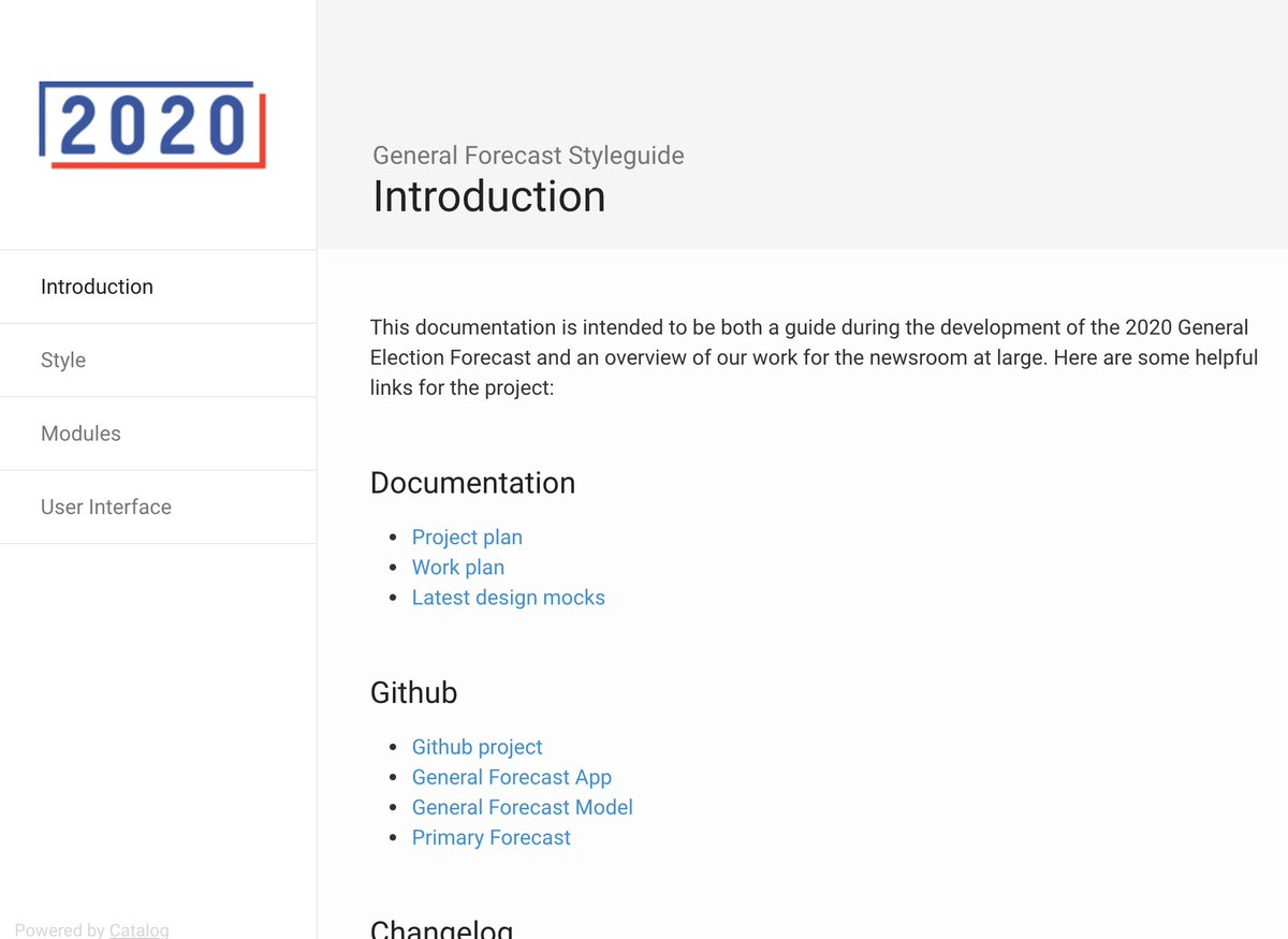
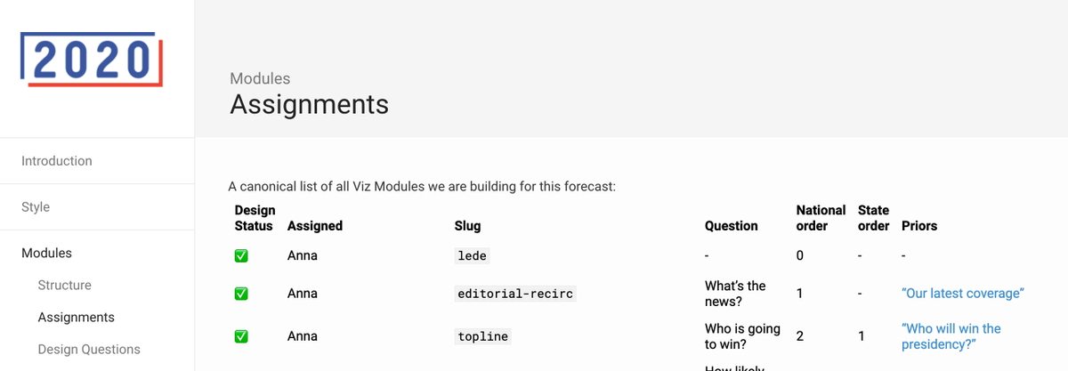
Time for a lil background on the concept process of our interactive forecast (YES IT'S COMING!!!)
Bc my brain is fried (who's isn't?), I do not promise a SUPER coherent Also please note: it's all
  FAKE DATA
 – leggo!
Bc my brain is fried (who's isn't?), I do not promise a SUPER coherent
 Also please note: it's all
  FAKE DATA
 – leggo!
So back around the dawn of time, we kicked off the concept phase. Thx to @onyxfish , we built in time to think differently ab the UX of the site compared to the past.
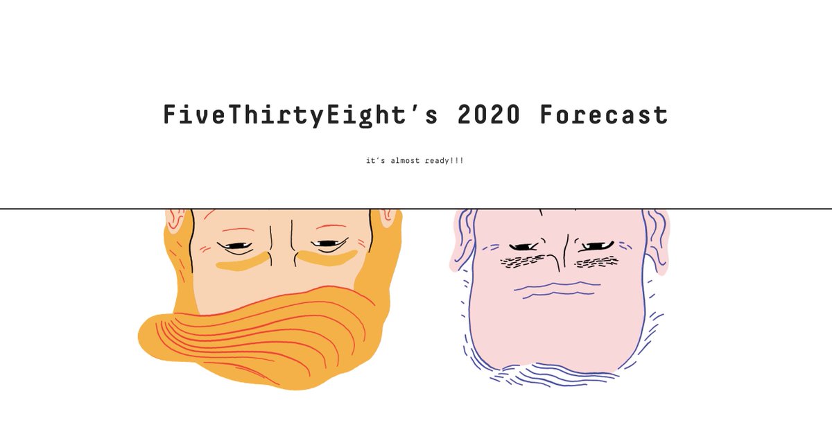
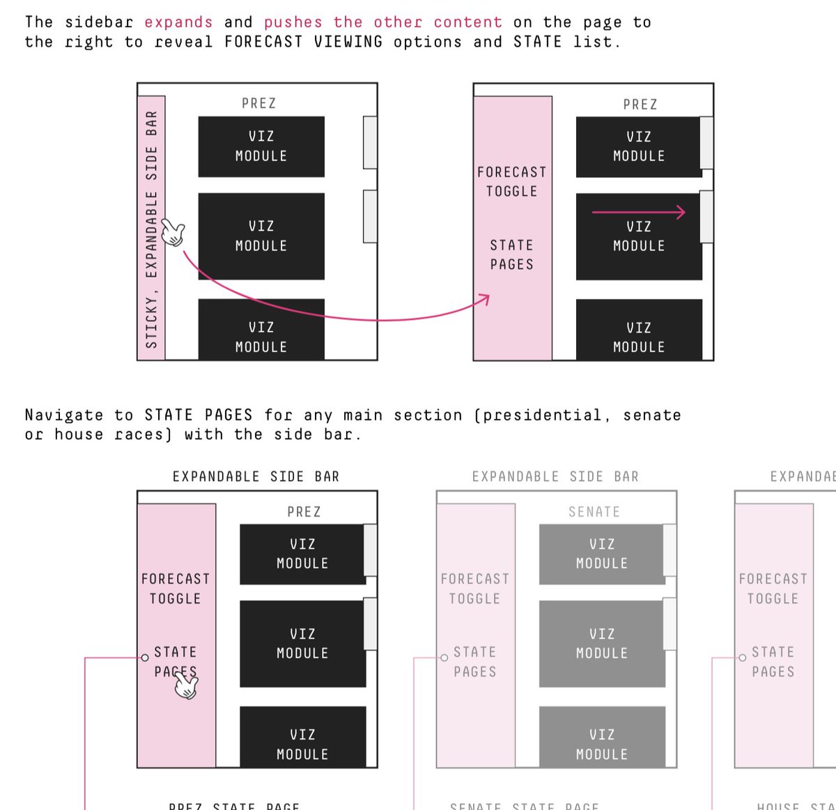
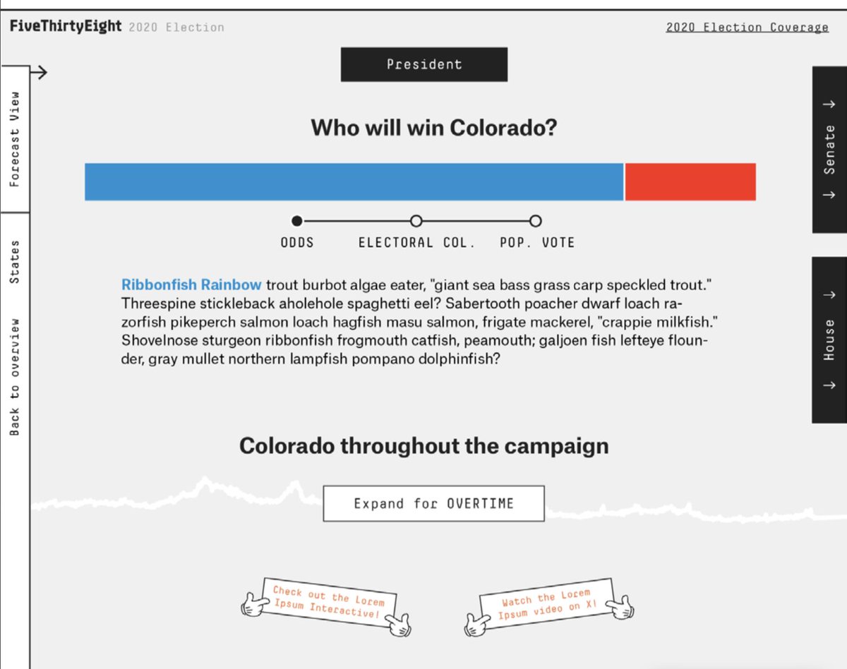
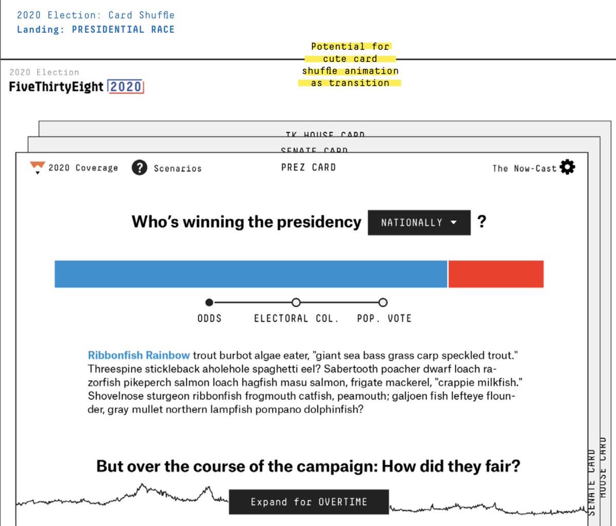
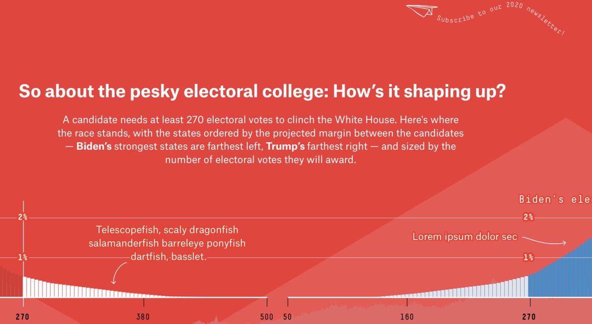
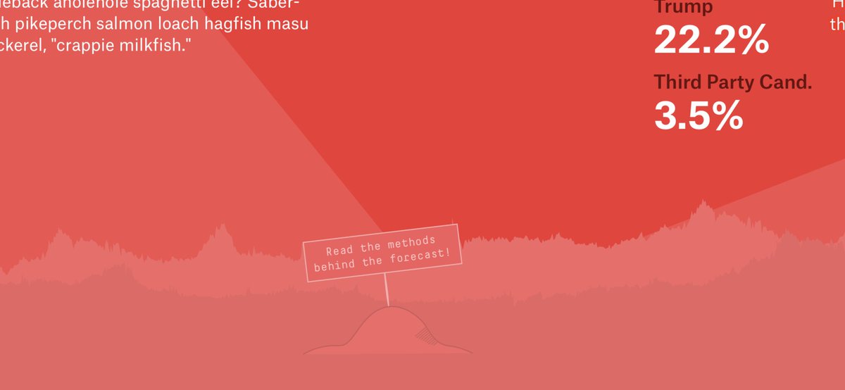
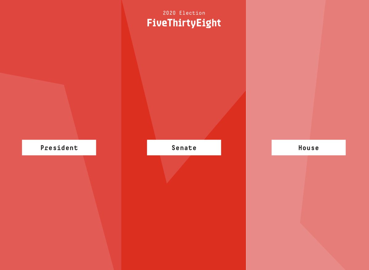
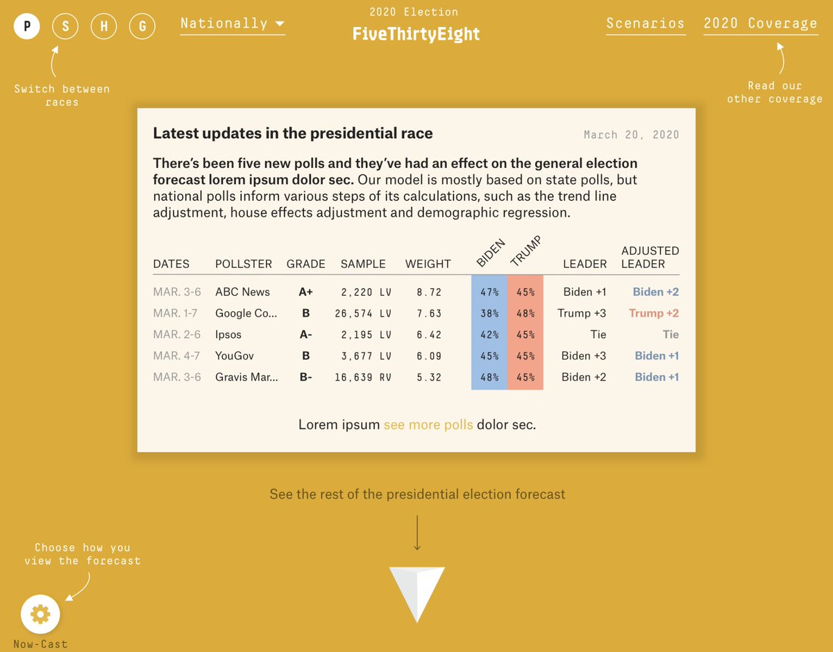
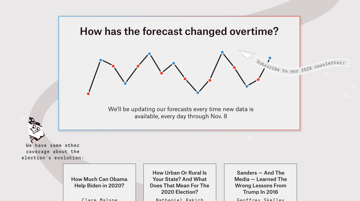
I did a low-key & v inconsistent skinning for a first design pass. Inconsistency in mocks is a n00b move, but we all do it OK.  Anyway look at these ~fun mocks~
 Anyway look at these ~fun mocks~
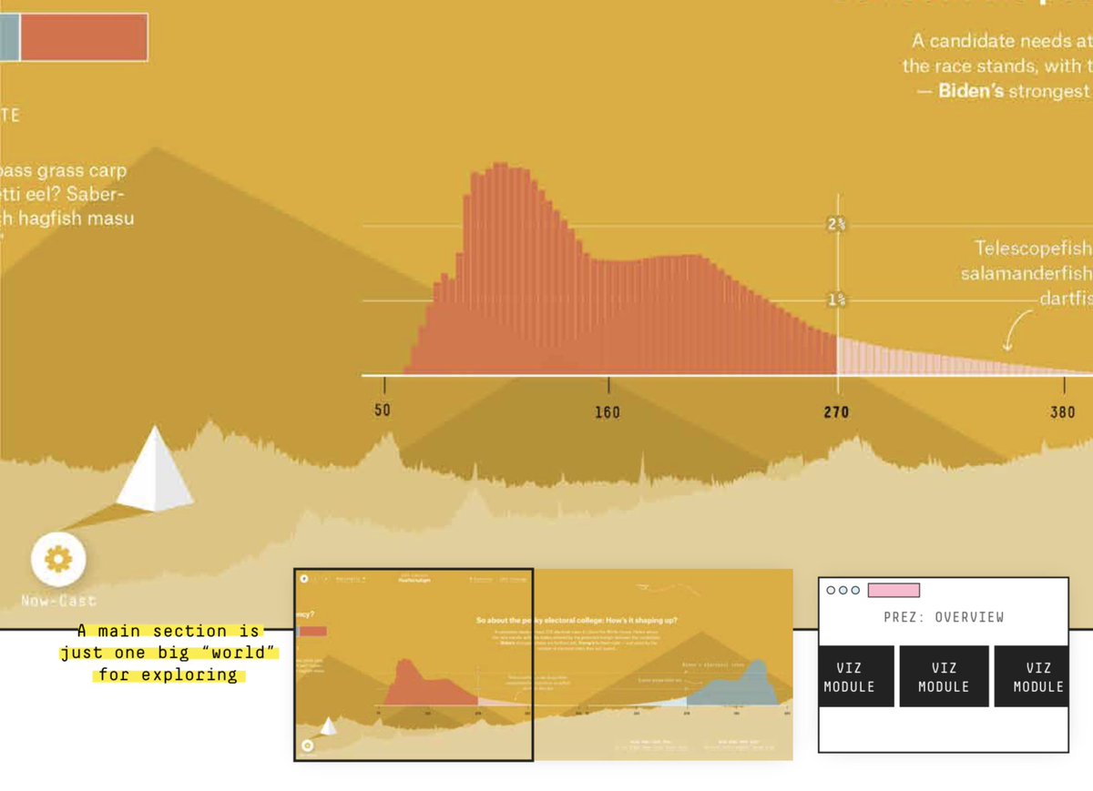
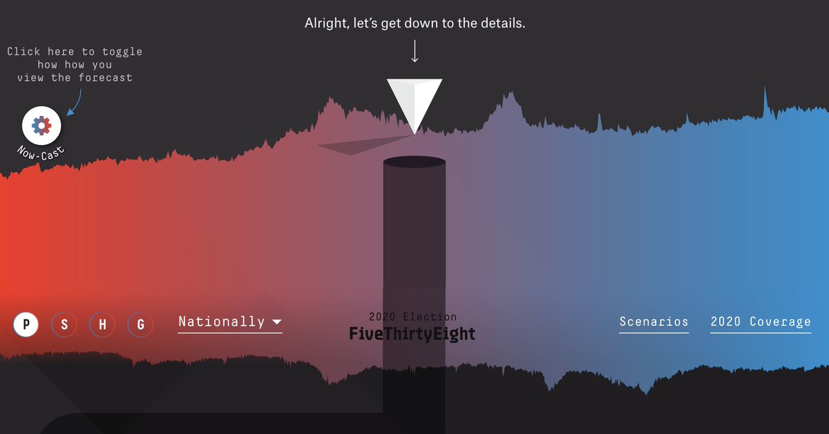
I'll come out & say my fav idea swiftly drew the most skepticism ( I'll pitch again in 4 yrs LOL, c u soon
 ).
).
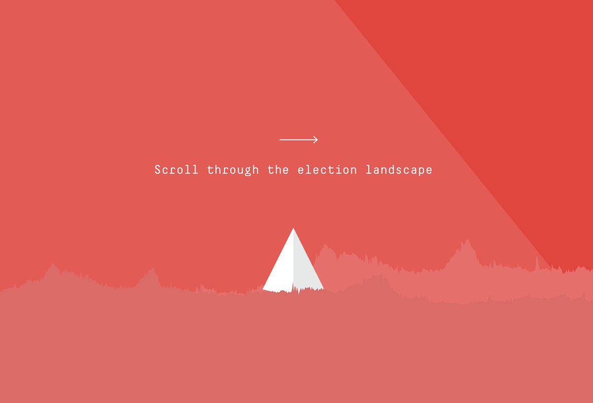
But seriously y'all, how cute is this scrollable hellscape?
 I'll pitch again in 4 yrs LOL, c u soon
 ).
).But seriously y'all, how cute is this scrollable hellscape?

We DID choose to go vaguely in this direction but toned down how exploratory the look/feel by  lopping off some darlings
Best/worst part of the process , some shots:
 lopping off some darlings
Best/worst part of the process
 , some shots:
None of the forecast's moving parts were designed in this phase (later  ) but boy are there feels ab UX at FTE!
Let's leave hell(election)scape behind (i'm bitter!), a few notes on process:
 ) but boy are there feels ab UX at FTE!
 Let's leave hell(election)scape behind
 (i'm bitter!), a few notes on process:
 Everyone was involved in critique
Which meant all had a voice & all feedback was *considered* There's a whole
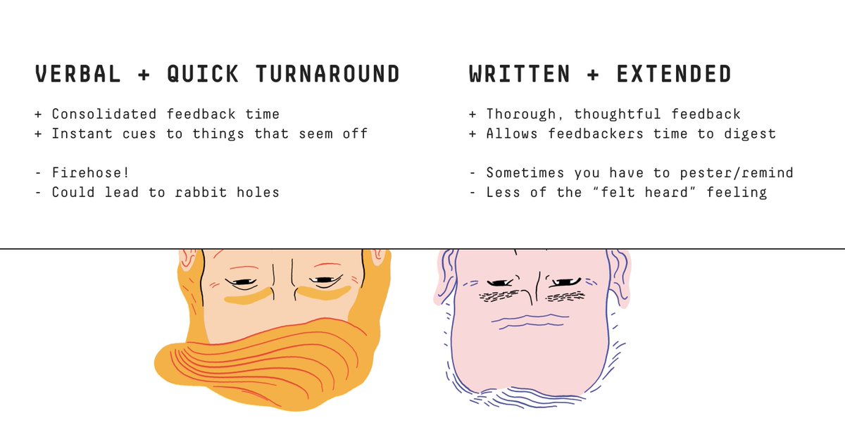
 just for this but: we tried VERBAL + QUICK TURN and we tried WRITTEN + EXTENDED. V basic notes:
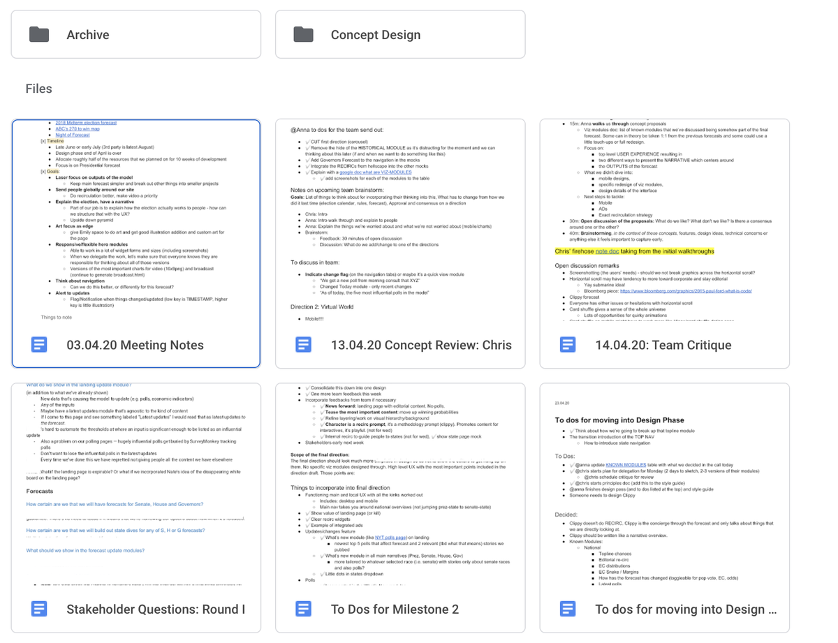
All of the mocks from every iteration (8!) were available at all times via Drive  as were feedback Docs and notes from every meeting.
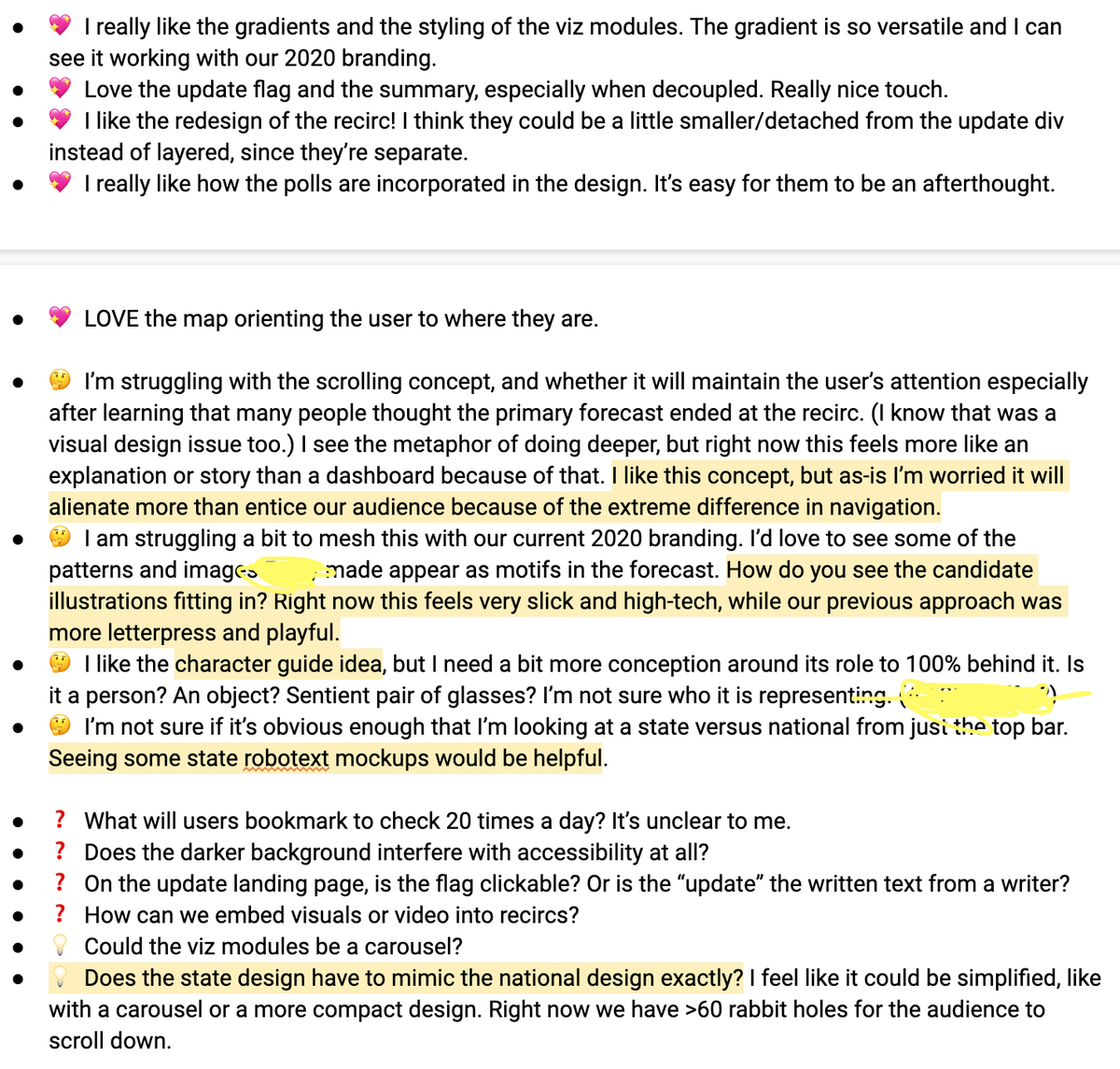
I highly recommend THIS emoji system for written, extended feedback forms:
 as were feedback Docs and notes from every meeting.
 I highly recommend THIS emoji system for written, extended feedback forms:
(btw We did try Slack + it wasn't great. DMs worked wonders for those who don't want to share aloud, otherwise group-Slack sometimes led to group-think & I felt burnt into a pile of ashes  - excellent learning experience, though!)
 - excellent learning experience, though!)

 Read on Twitter






 of a legacy, bbl!
