I cannot emphasize how important scale is when looking at COVID numbers.
It looks very much like we're entering a death surge in a few states. But we do need perspective.
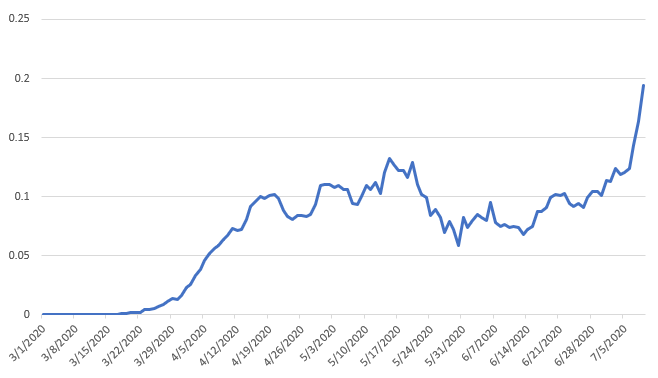
Here is TX deaths per capita. Looks like they got hit, did better, & now it's getting much worse
It looks very much like we're entering a death surge in a few states. But we do need perspective.
Here is TX deaths per capita. Looks like they got hit, did better, & now it's getting much worse
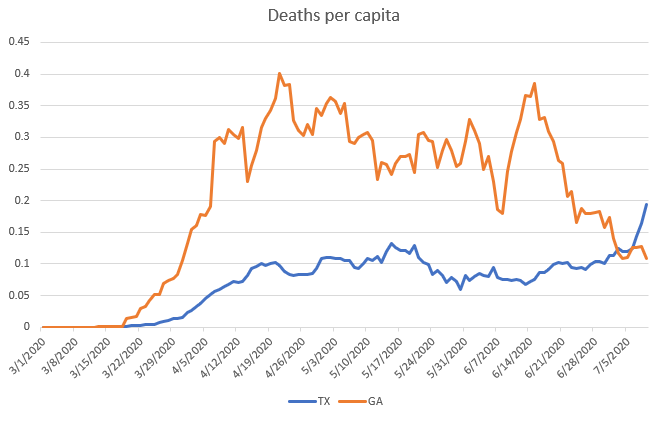
Then you compare TX to GA and realize that GA has has surges steeper than this
(could still get v bad in TX, it's going to be a hard month)
(could still get v bad in TX, it's going to be a hard month)
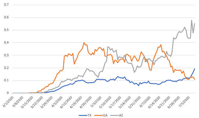
Then we add AZ and we see why people are getting very worried about AZ.
The data is bumpy but we're seeing a substantially higher rise in deaths in AZ, higher than GA ever had
The data is bumpy but we're seeing a substantially higher rise in deaths in AZ, higher than GA ever had
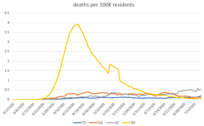
Now add NY into the mix.
The reason I haven't added NY to my charts for *weeks* is b/c things got so bad there that it completely messes up the scale to a point where it is simply unhelpful to compare it to the current situation
The reason I haven't added NY to my charts for *weeks* is b/c things got so bad there that it completely messes up the scale to a point where it is simply unhelpful to compare it to the current situation
I don't want people to think "oh at least we're not NY" and feel like they don't need to be careful. And those from the NYC area are *exhausted* with people pointing this out. It is an impediment to moving forward, so I tend to leave it out.
Just be careful when you see a metric or a state in relative isolation, you can get a very different vibe off the data without a solid comparative grounding

 Read on Twitter


