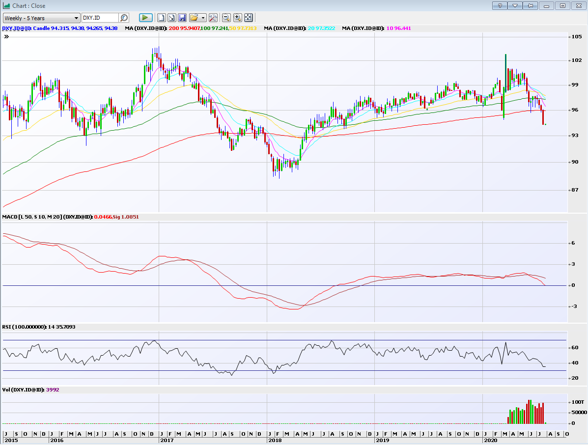
Normal chart for those interested
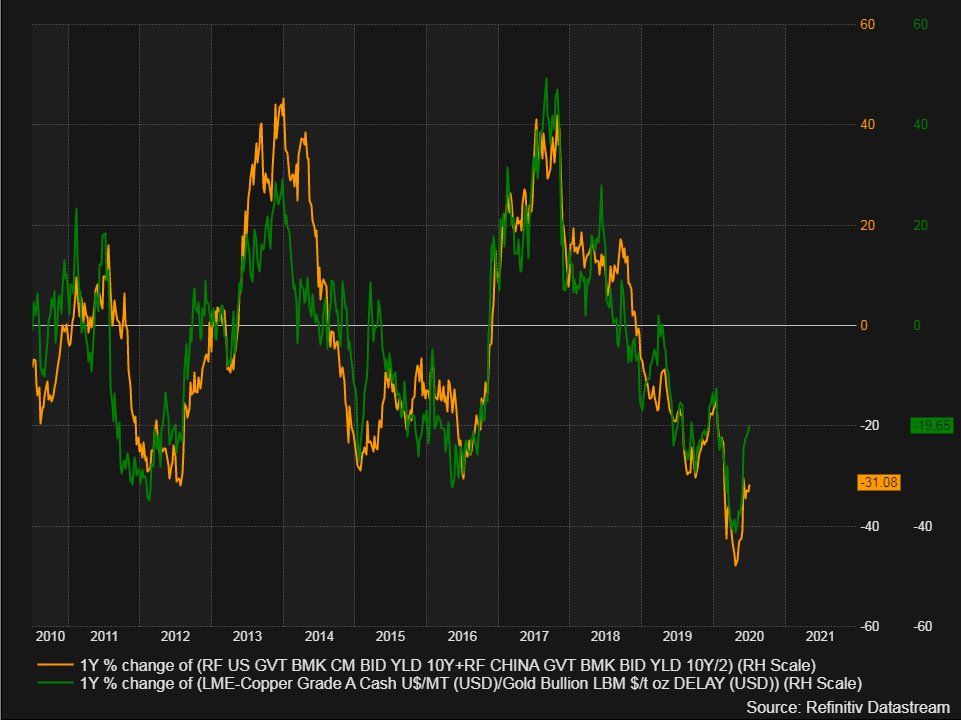
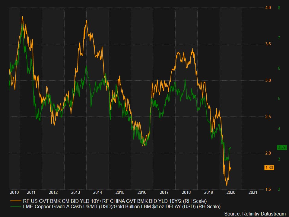
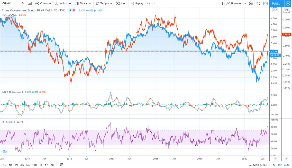
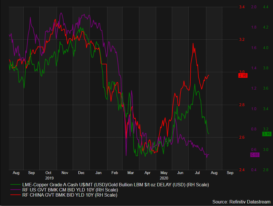
#Copper #gold ratio (green)
Average #China #US 10 Year Yield (yellow)
#Copper #gold ratio (green)
Average #China #US 10 Year Yield (yellow)
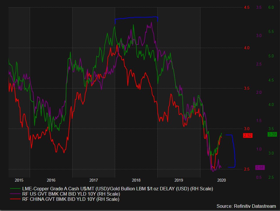
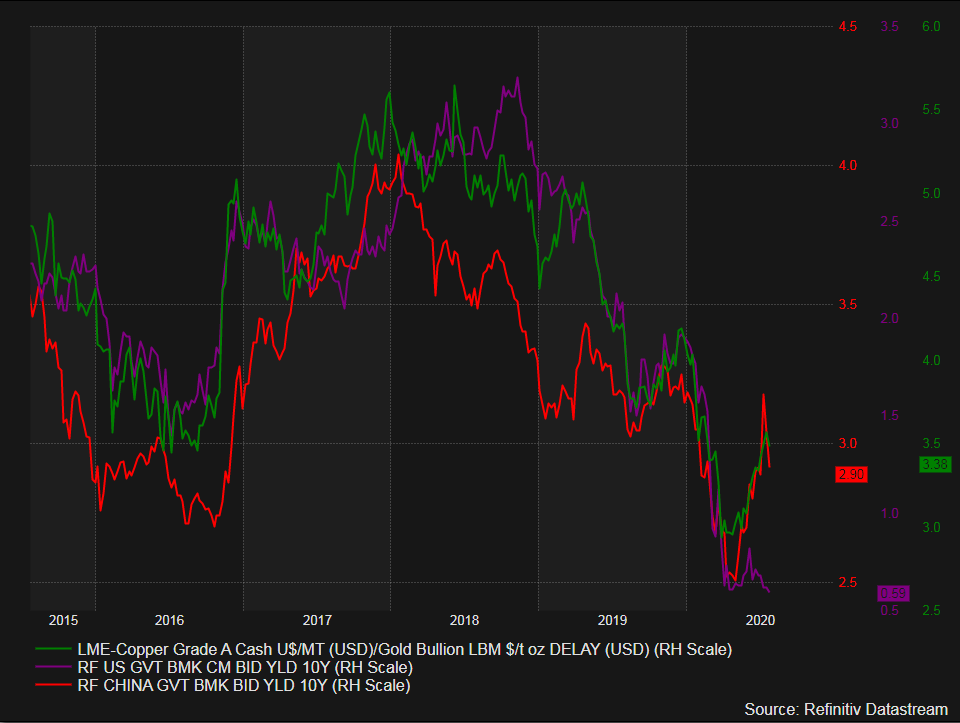
#Copper #gold ratio (green) tracking China 10 Year Yield (red) higher, while US 10 Year Yield (purple) lags. Note the divergence during 2018.
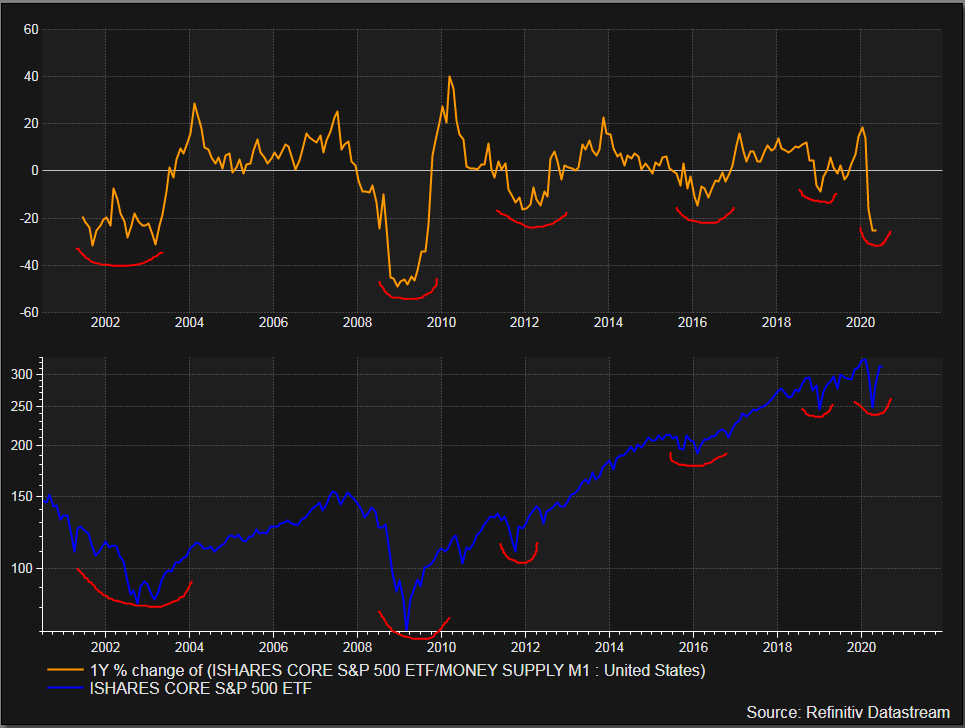
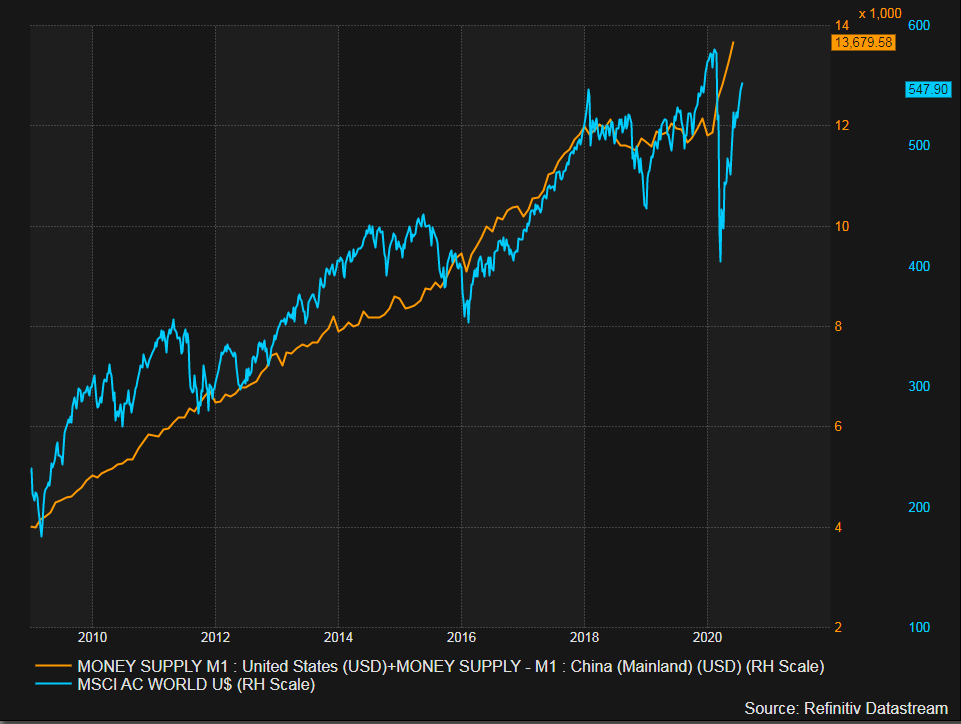
Top chart - $IVV ishares S&P 500 ETF YoY% relative to #US Money Supply M1 YoY%
Bottom chart - $IVV ishares S&P 500 ETF
Hmm...


Bottom chart - $IVV ishares S&P 500 ETF
Hmm...


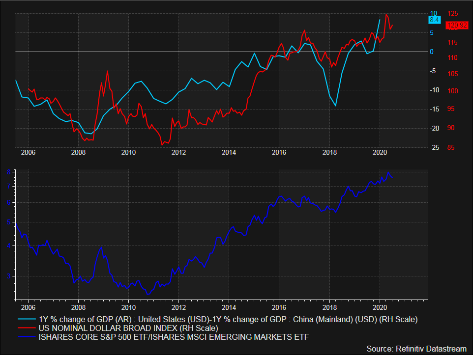
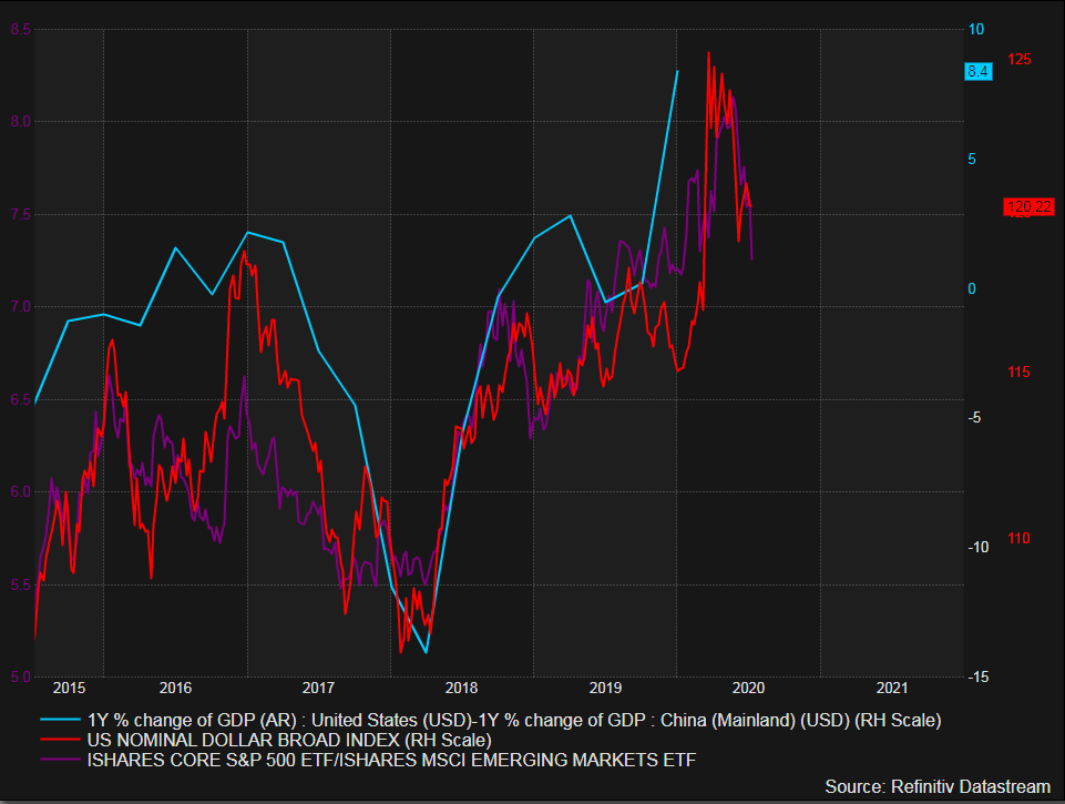
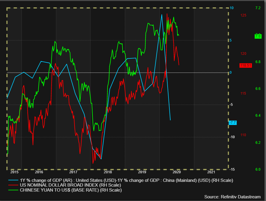
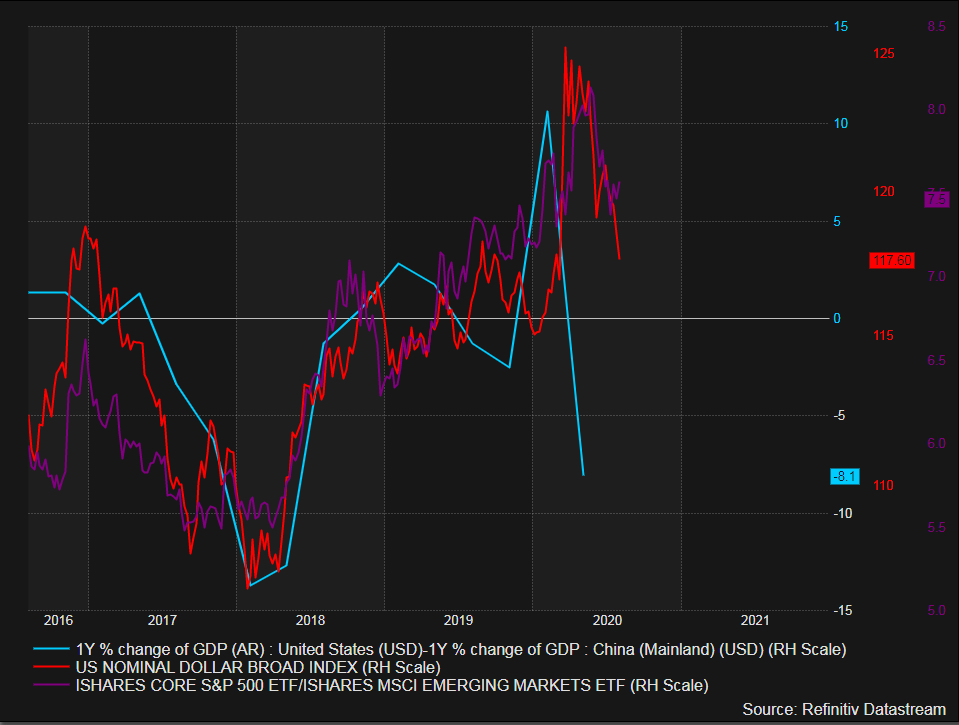
Top chart - $USD Real GDP growth rate differential between #US & #China vs. Broad US Dollar Index
Bottom chart - $IVV relative to $EEM
Bottom chart - $IVV relative to $EEM
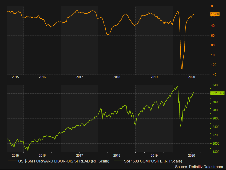
LIBOR OIS (inverted) vs. $SPY
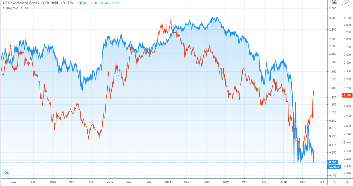
#Copper #gold ratio (green) still tracking China 10 Year Yield (red). US 10 Year Yield (purple) breaking lower. Note the divergence during 2018.
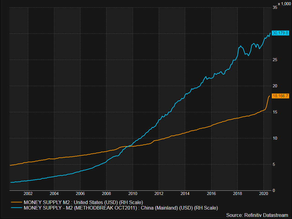
Big relative economic outperformance from #China relative to the #US. Does it continue and does the Broad Dollar Index & $USDCNY follow...


Very interesting - #China 10 yr yield pushing higher despite the move lower in the #US 10 yr yield and #copper/ #gold ratio 


 Read on Twitter