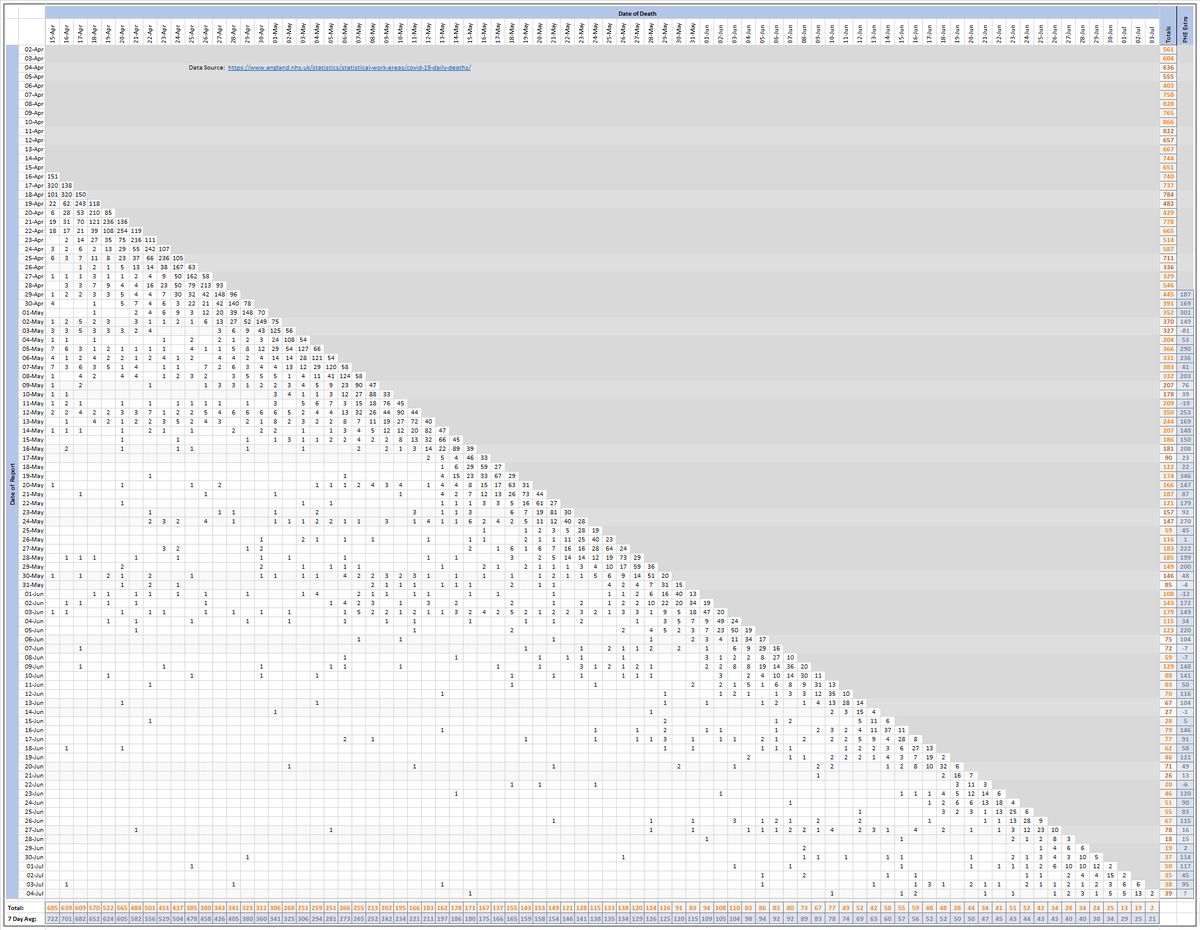
Pivot-table for Saturday 04-July to break down NHS England's #covid19 hospital death count of 39 by the days they actually occurred. 8 of the deaths (21%) occurred more than 7 days ago.
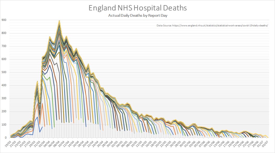
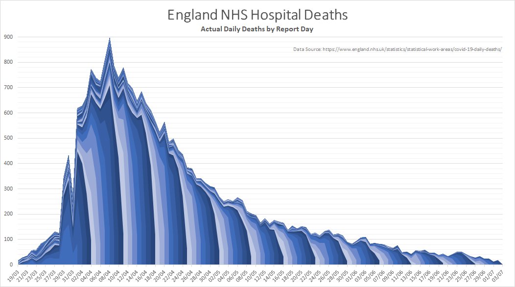
Chart of same data (getting very busy now but convergence of lines does indicate when the reports have settled).
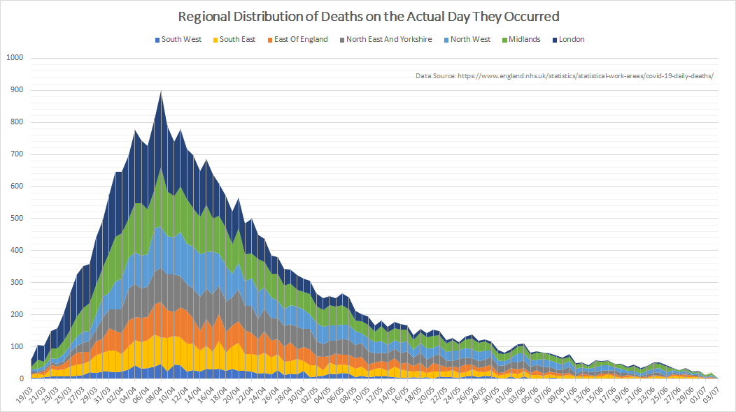
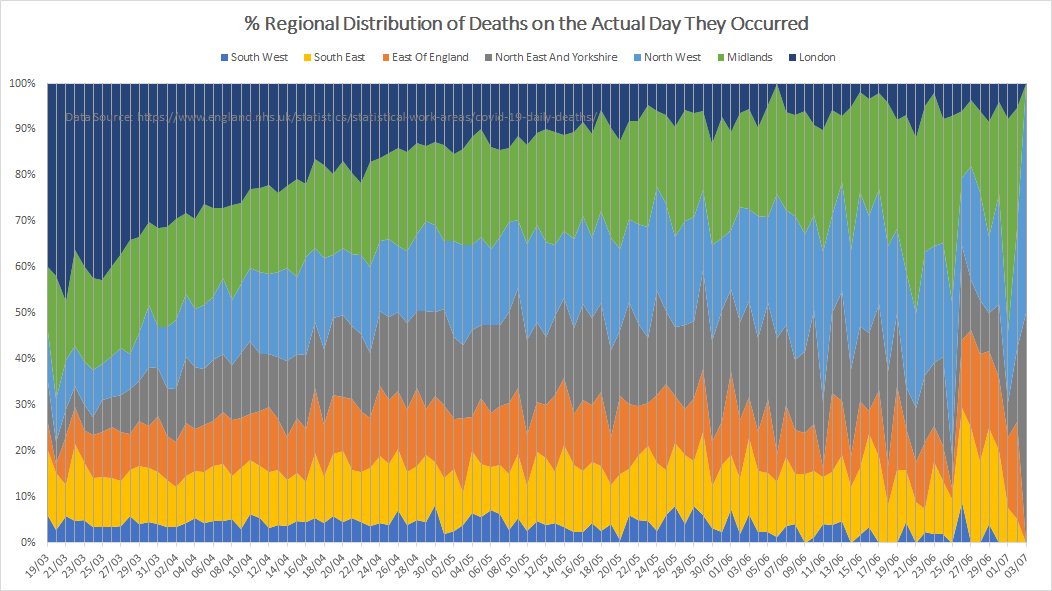
England regional distribution chart. Numbers are so low now that there aren't really enough pixels to show them!
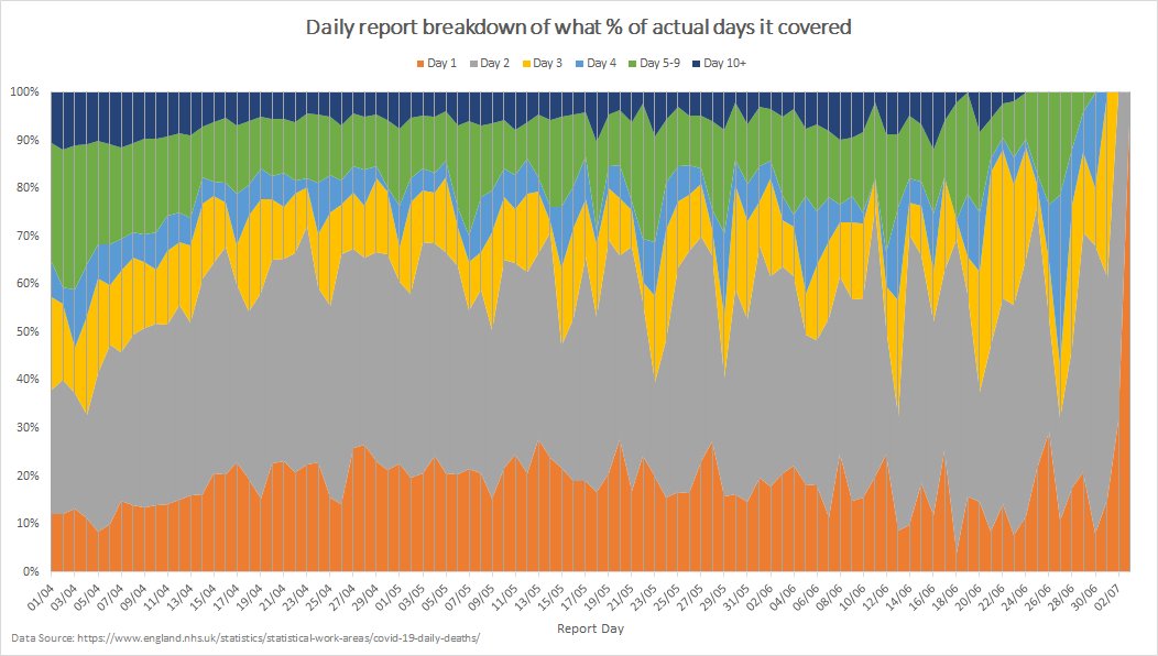
Reporting time visualisation of each of the reports themselves, with % spread over a range of the preceding days of actual deaths they cover.
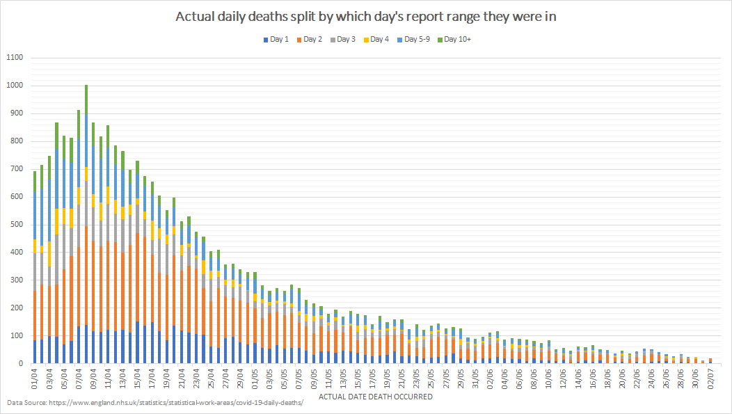
Plus the other angle of the dates of deaths, broken down by which preceding day's reports contribute to it.
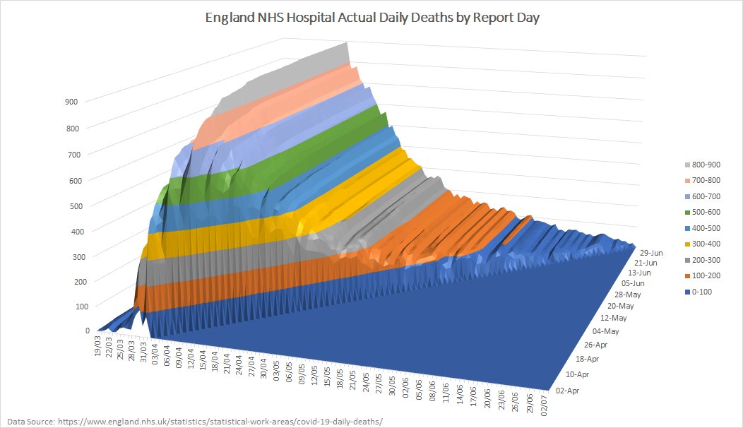
Animation of actual England hospital daily deaths as they have been reported over the past few weeks. Now a bit faster as it was getting a bit sluggish!
Extended version of the date-of-death animation to include the total announced number in orange to compare.

 Read on Twitter