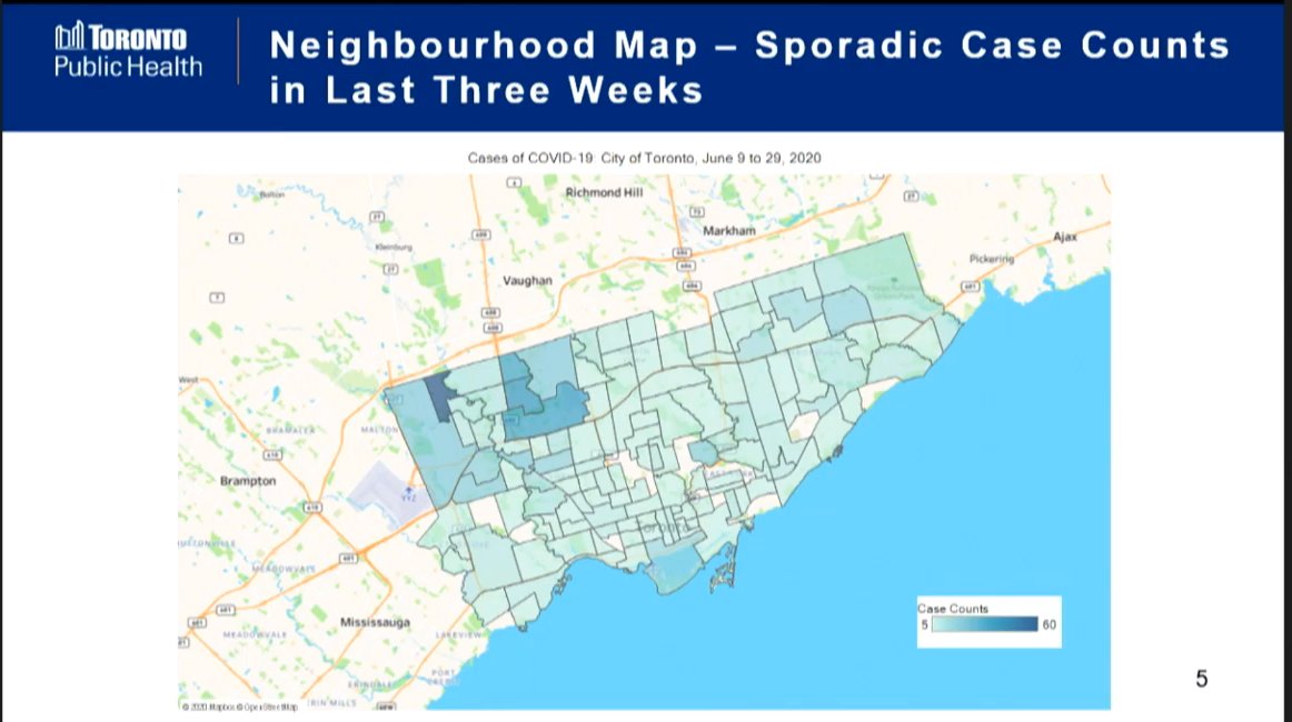
Map presented at this morning’s meeting of the Board of Health shows sporadic (community spread) COVID-19 cases over the last three weeks. Very concentrated in northwest area of the city.
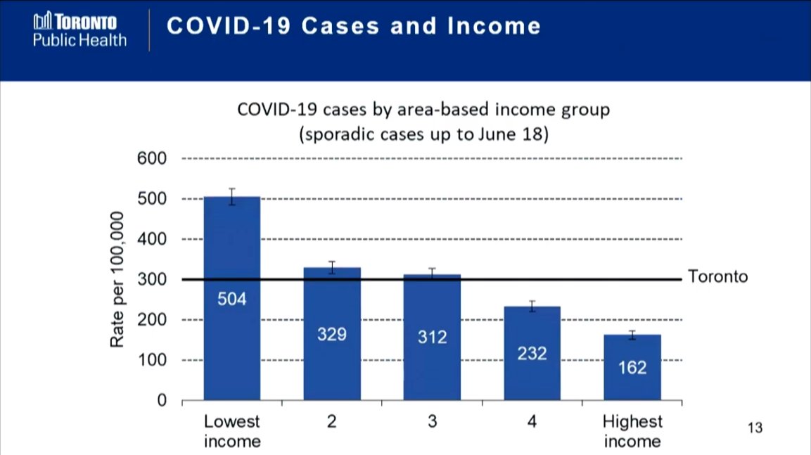
Another chart from the Board of Health: COVID-19 cases and income in Toronto. Rate is more than three times higher among lowest income group versus highest income.
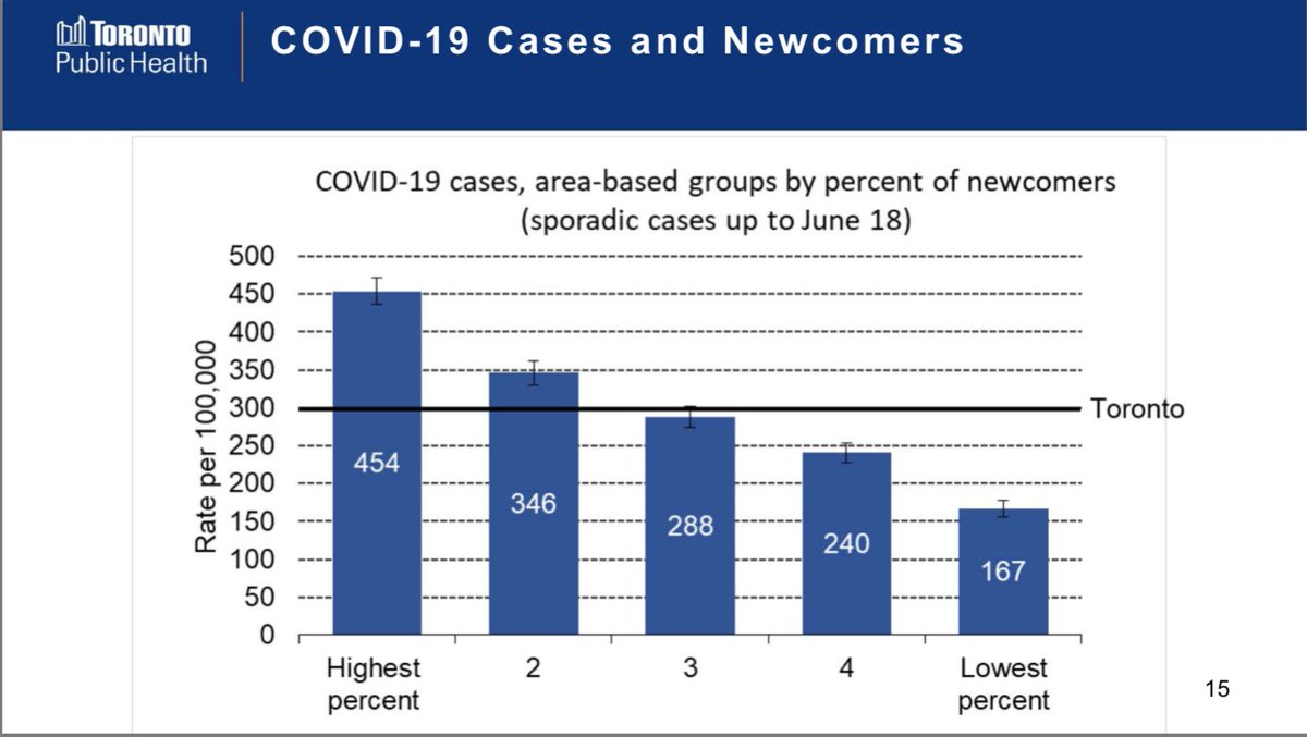
Here’s COVID-19 cases grouped by areas with percentage of newcomers. (Immigrants within last five years.)
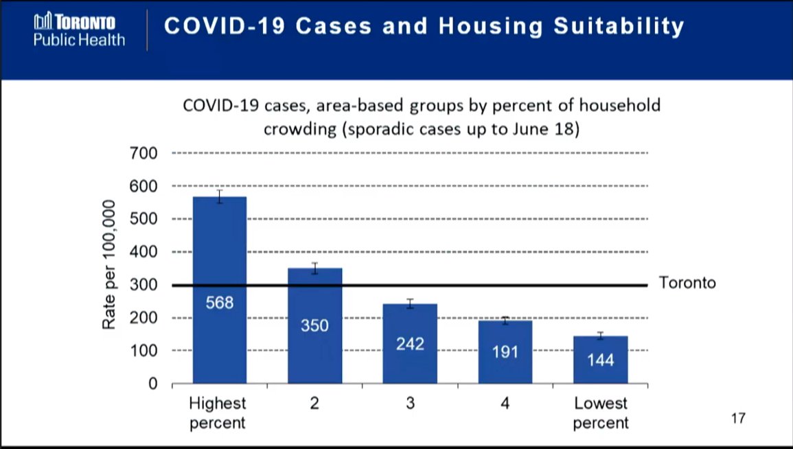
And here’s COVID-19 cases based on suitability of housing. Strong correlation in number of cases and places where people in living in crowded homes.
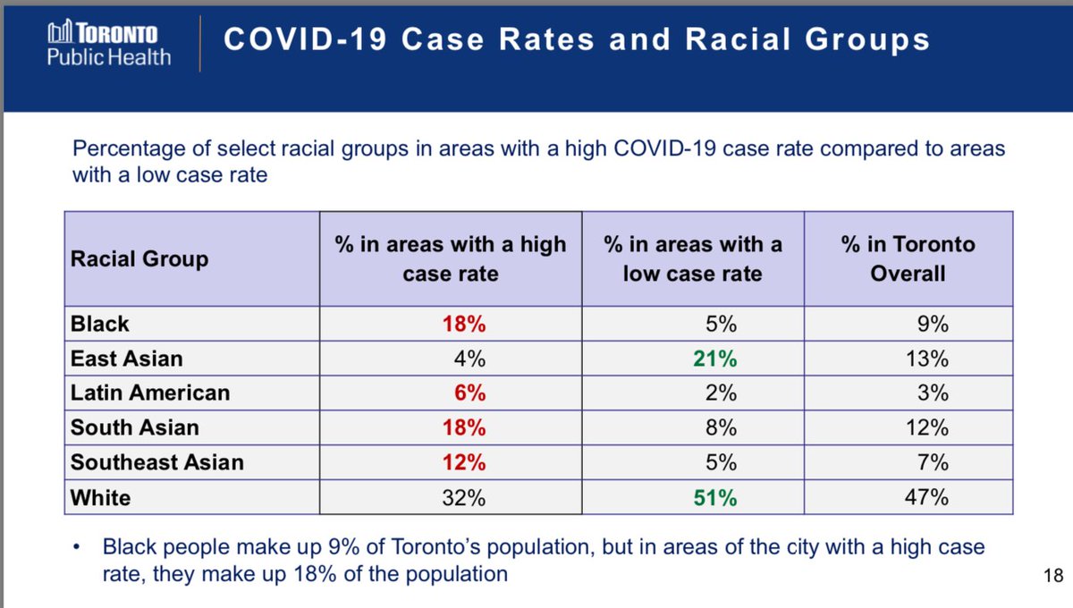
Here’s some data on racial groups in areas of Toronto with high COVID-19 case rates. “Black people make up 9% of Toronto’s population, but in areas of the city with a high case rate, they make up 18% of the population.”
All these charts are in this presentation document presented to the Board of Health: https://www.toronto.ca/legdocs/mmis/2020/hl/bgrd/backgroundfile-148594.pdf (PDF)

 Read on Twitter