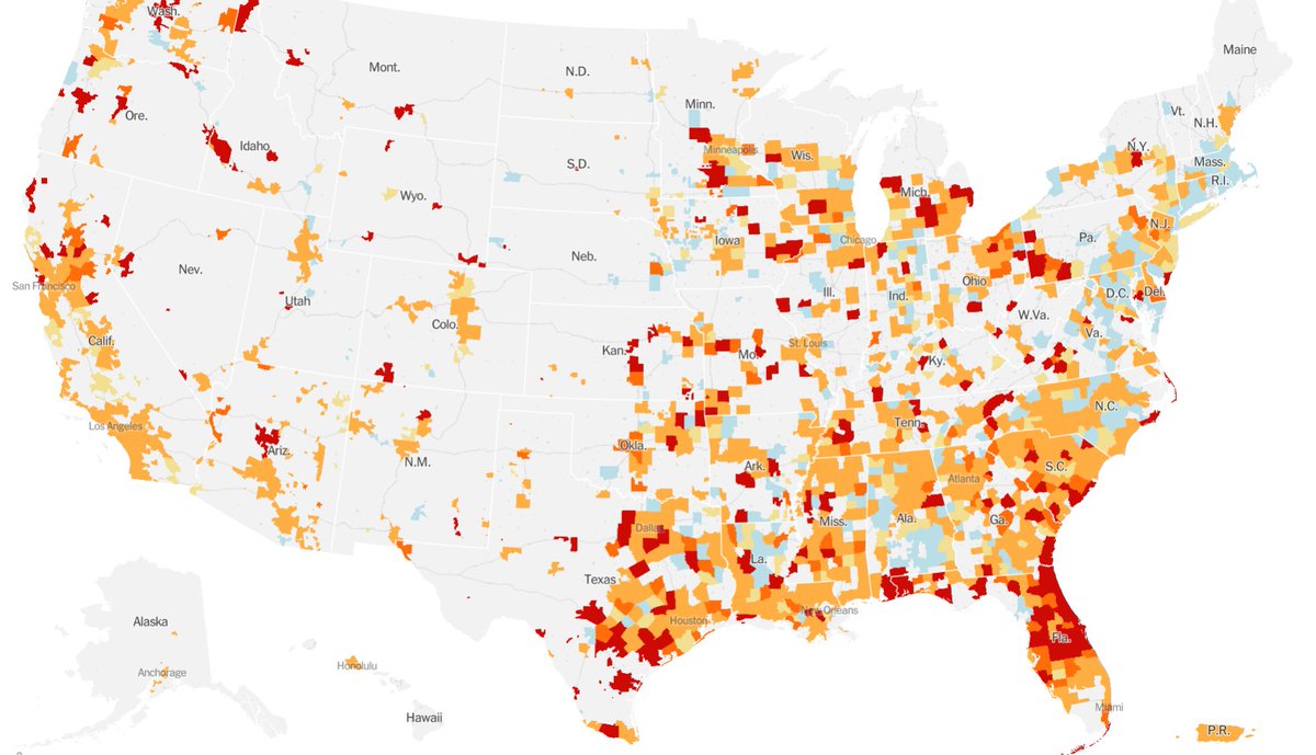
Quick thread about a mapping trick the @nytimes has adopted in the last few weeks that have dramatically improved their coronavirus maps.
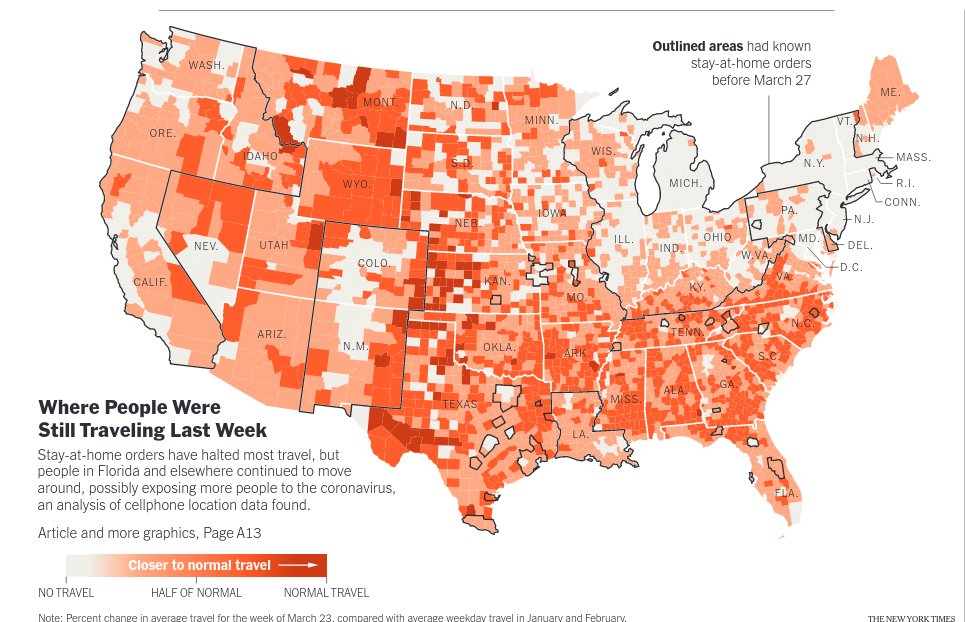
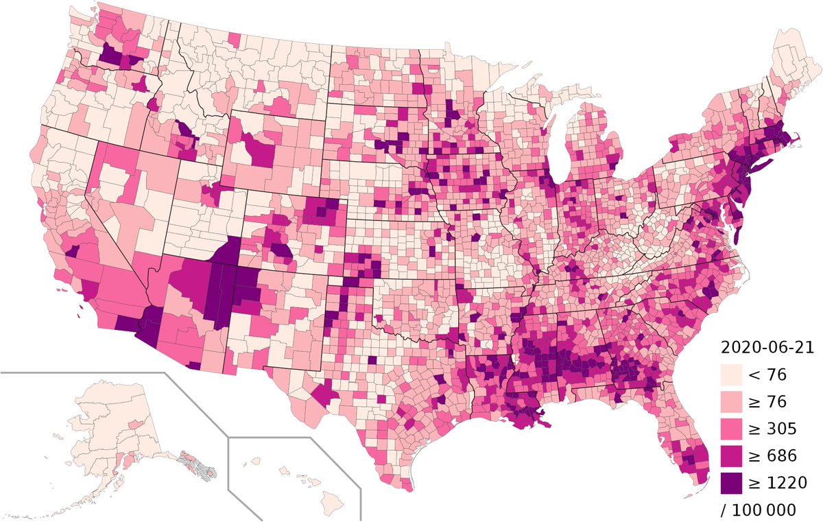
The maps are about different topics, but note one other key diff. between maps on left (April 3), middle (wikipedia) & right (NYT today) 1/
The maps are about different topics, but note one other key diff. between maps on left (April 3), middle (wikipedia) & right (NYT today) 1/
all three are county level maps of the US -- made with county level data.
what makes the last map on the right different?
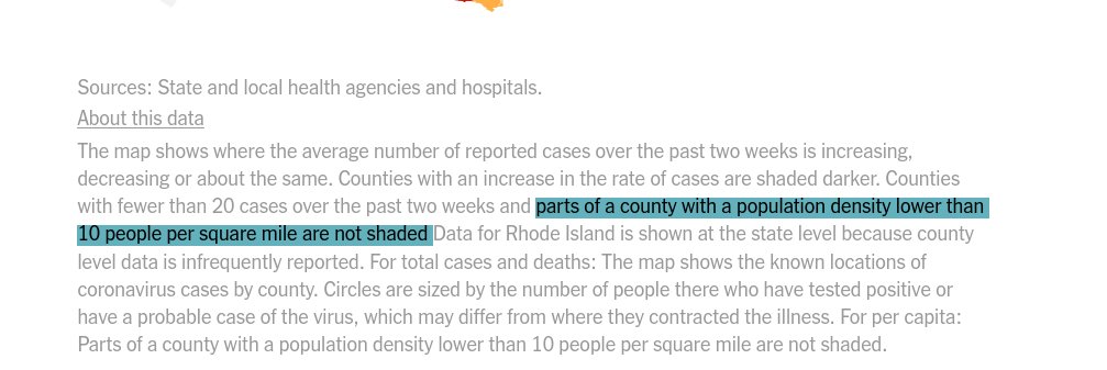
one key design choice highlighted in the footnote:
"parts of a county with a population density lower than 10 people per square mile are not shaded" 2/
what makes the last map on the right different?
one key design choice highlighted in the footnote:
"parts of a county with a population density lower than 10 people per square mile are not shaded" 2/
Its clear that with more granular data (say census block level), you can ignore areas with basically zero human population - but the NYT does not have more granular data & yet they pull off this trick.
how? simple: do not "shade" portions of a county below minimum pop density 3/
how? simple: do not "shade" portions of a county below minimum pop density 3/
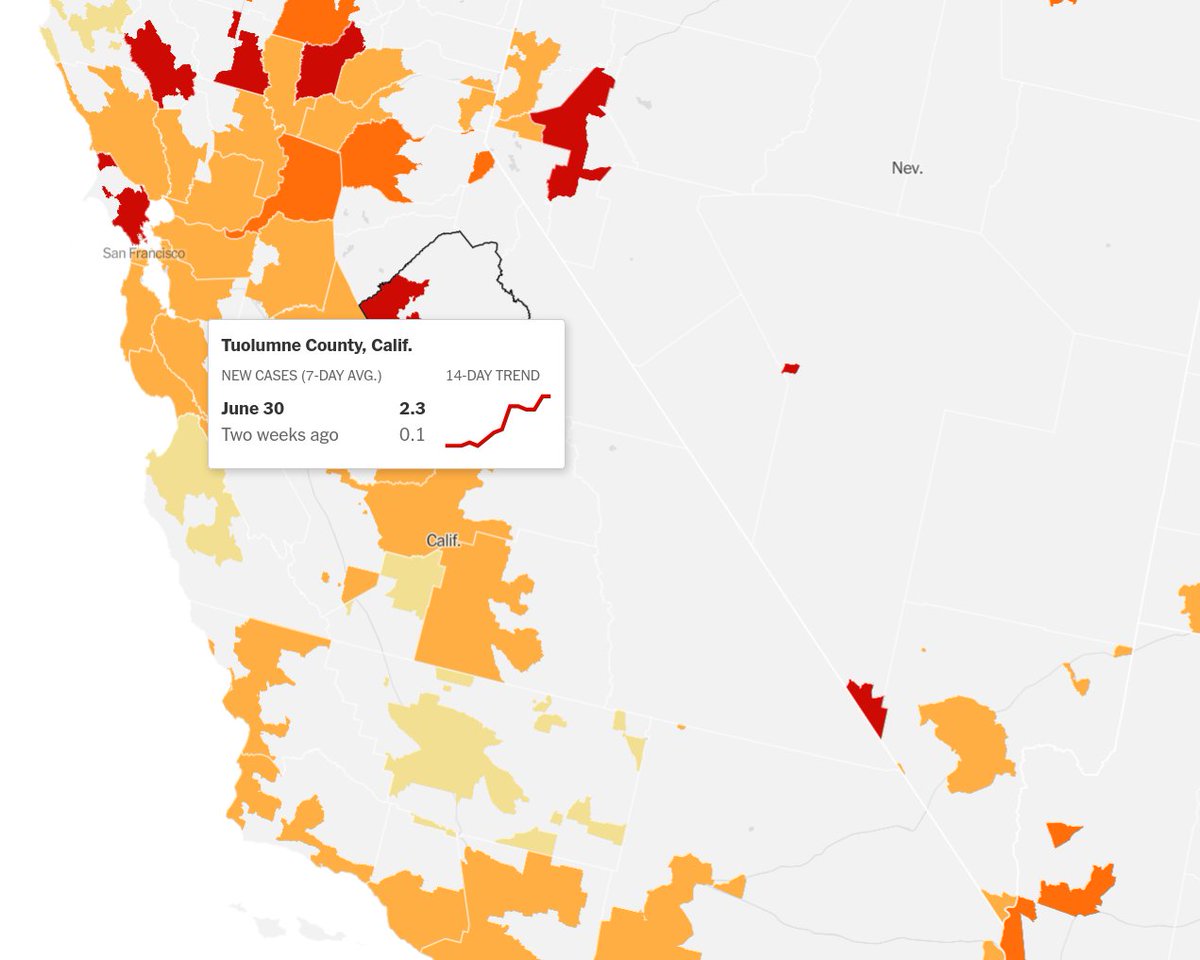
here's this trick in action for Tuolumne County, CA -- pop 50k but which occupies 10X the area as SF county with pop. of ~1 million.
Most of Tuolumne is wilderness (Yosemite!) and things here are "dark red" by the NYT scale (since 2.3 cases/0.1 cases is ginormous!) ... 4/
Most of Tuolumne is wilderness (Yosemite!) and things here are "dark red" by the NYT scale (since 2.3 cases/0.1 cases is ginormous!) ... 4/
But at least now, only 20% of this county is shaded, which does not make you think immediately that "things are terrible in this big part of California"
That read of the data would be wrong, but that is precisely what a county-level map like this one on the right would tell 5/
That read of the data would be wrong, but that is precisely what a county-level map like this one on the right would tell 5/

 Read on Twitter