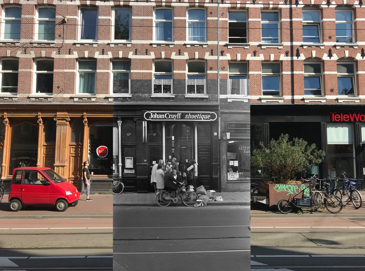
On December 3, 1969, Johan Cruijff and his wife Danny openened up a shoe store at Kinkerstraat 12a, called ‘Johan Cruijff shoetique’. Johan dressed up elegantly for this publicity shot. It was a cold, wet and cloudy day. The holiday lights are not on yet. Photo: Evers, Joost.
In the far background there is a building with the words: ‘LEES DE BIJBEL HET BOEK VOOR U’ (‘Read The Bible The Book For You’). It’s still there.
The shop was not a succes. This is a photo of the extermination sale on October 5, 1971. On the street some lookers-on and too many empty shoe boxes for the little garbage can. Photo: Punt, […]
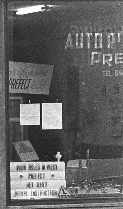
Next to the Shoetique was a driving school called ‘Autorijschool Prefect’ (‘Voor Rijles In West * Prefect * Het best’). On this photo we can also see that they had what seems like beautiful window lettering. I couldn’t find a picture with the whole sign visible though.
This type of shop window lettering is also called ‘Spiegelglas’, a term coined by Piet Schreuders. He has a nice collection over here: https://tinyurl.com/ybo3tf68
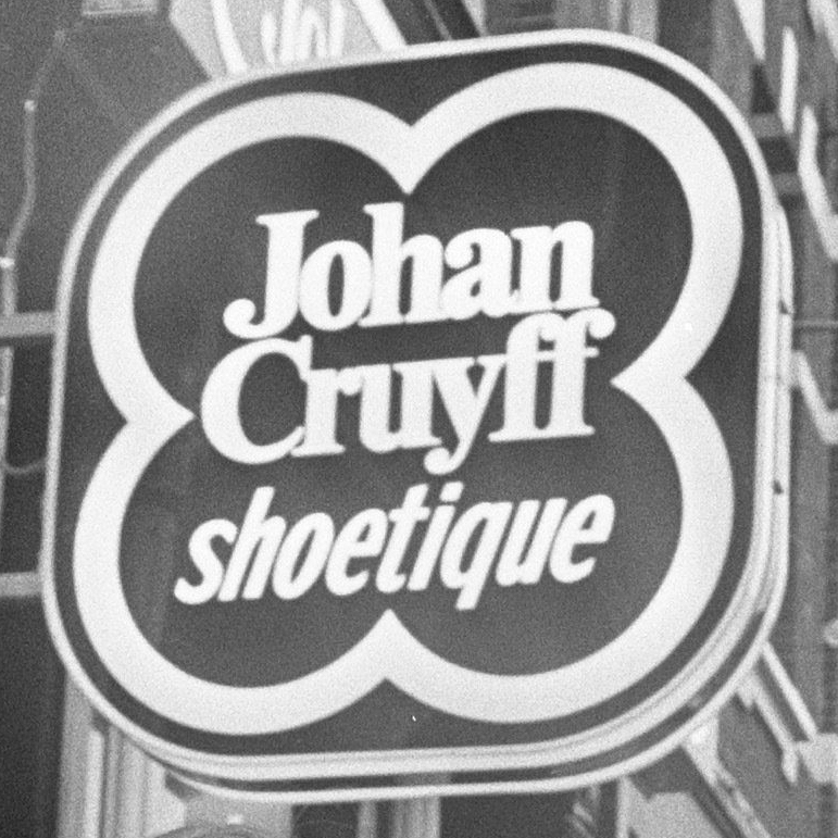
And finally: the sign. I have no idea who made it, what the concept was, and what fonts were used. On the shop we see 2 ‘lockups’: one square (the original I imagine) and one horizontal.
What stands out is the use of different fonts for ‘shoetique’. The type used in the square version was probably considered too condensed too fill up enough space in the horizontal version.
Note: Johan decided early on, when he got more internationally famous, that it would be commercially wise to spell his name with y instead of ij (the ij is a digraph unknown outside the Dutch language).
It would be great to see some other examples of the identity, like letterheads and businesscards etc. If they exist. And what happened to the signage?

 Read on Twitter


![The shop was not a succes. This is a photo of the extermination sale on October 5, 1971. On the street some lookers-on and too many empty shoe boxes for the little garbage can. Photo: Punt, […] The shop was not a succes. This is a photo of the extermination sale on October 5, 1971. On the street some lookers-on and too many empty shoe boxes for the little garbage can. Photo: Punt, […]](https://pbs.twimg.com/media/EboDeJIXkAEvIJ8.jpg)


