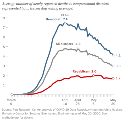
If CNN doesn't understand the data, they shouldn't be reporting on it. There is so much wrong with this chart that it's hard to know where to begin. https://twitter.com/AZBrianAnderson/status/1277262549667377154
First, if you break it down by counties instead of states, the differentiation in the current trend for blue vs red practically disappears: https://twitter.com/JedKolko/status/1276508023087788032
Second, what you're seeing is spiking occurring directly correlated to areas that didn't have large outbreaks before. In that chart, you're basically punishing red states for not having massive virus spread before lockdowns. https://twitter.com/NateSilver538/status/1273391254005600256
Lastly, the early parts of the chart are nowhere near accurate because testing was limited. The lines and gaps were actually significantly higher, but we weren't catching those cases. That chart doesn't reflect just how bad the outbreaks were at that time, esp in blue states.
A far more accurate metric to compare over time would be COVID-19 deaths, but betting CNN won't be showing that chart any time soon because the narrative would be very different.

 Read on Twitter


