Good morning everyone.
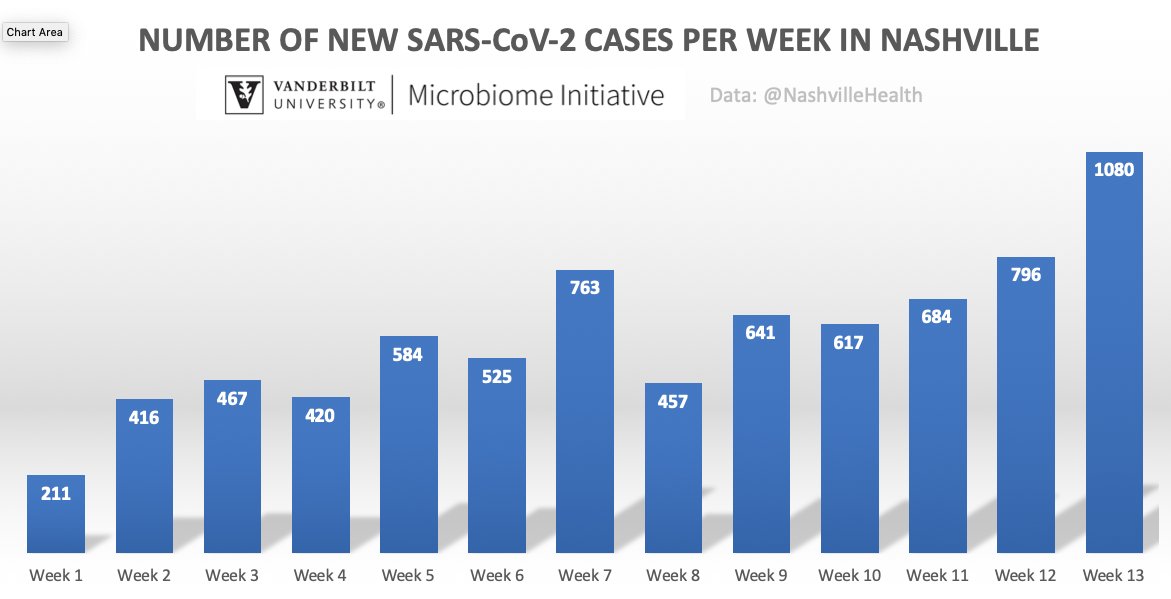
Chart shows the weekly cases of SARS-CoV-2 #coronavirus in #Nashville over 13 weeks, ENDING ON JUNE 19.
Week 7 in early May was the 1st peak.
The city now has a new peak with 42% more cases Numbers look better over the past few days. See below.
Chart shows the weekly cases of SARS-CoV-2 #coronavirus in #Nashville over 13 weeks, ENDING ON JUNE 19.
Week 7 in early May was the 1st peak.
The city now has a new peak with 42% more cases
 Numbers look better over the past few days. See below.
The daily #coronavirus cases in #Nashville (orange bars) show more detail.
The city has seen a drop in the moving average (black line) over the last few days, but the moving average is higher than the previous peak in early May and trending up.
Important to watch this trend.
The city has seen a drop in the moving average (black line) over the last few days, but the moving average is higher than the previous peak in early May and trending up.
Important to watch this trend.
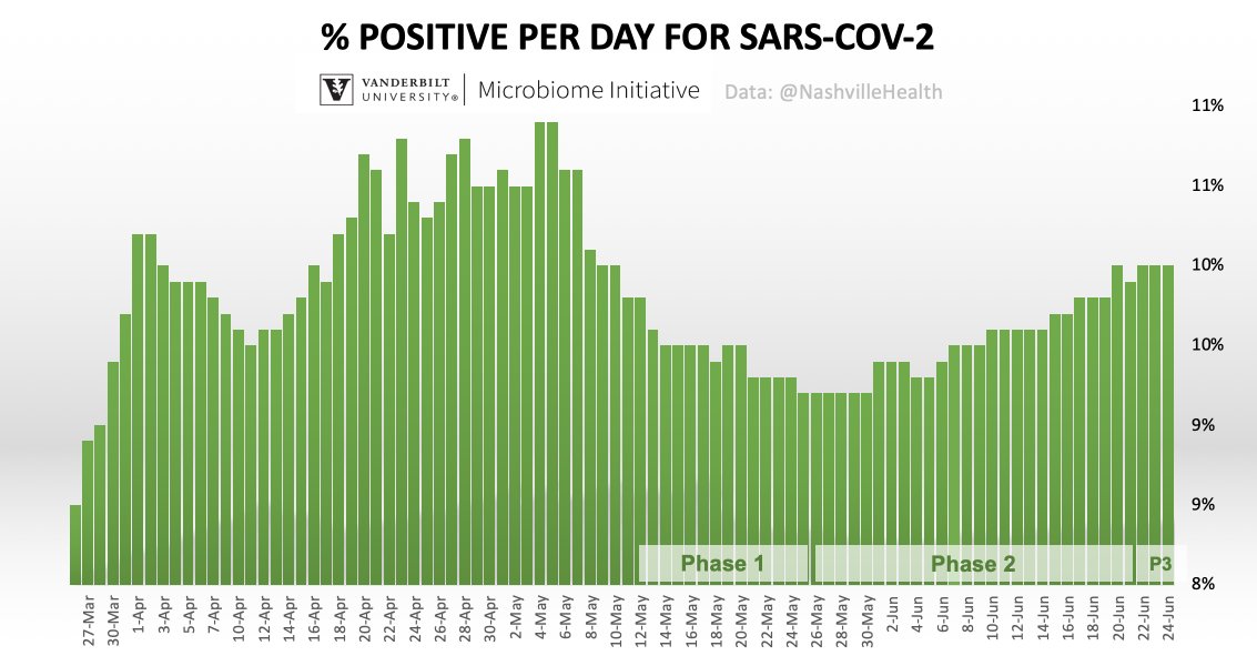
As we've reported over the last couple of weeks, the percent positive for SARS-CoV-2 #coronavirus in #Nashville has steadily increased. Thus, despite testing capacity holding in the same range (see below), Nashvillians who are tested now tend to have the virus more often 

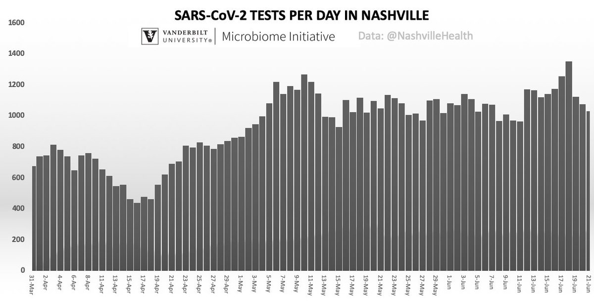
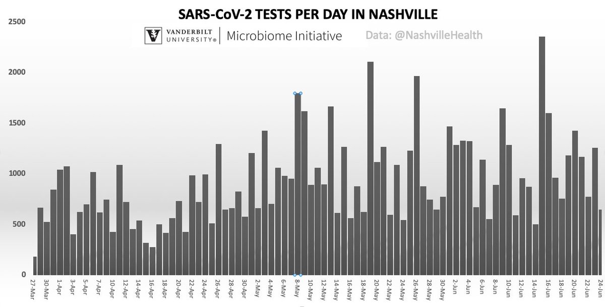
2 charts of the same data could lead some to very different interpretations. 
One on the left is the 7-day moving average of testing capacity. It smooths the wide variation in daily tests on the right and shows a city testing capacity that is holding steady


One on the left is the 7-day moving average of testing capacity. It smooths the wide variation in daily tests on the right and shows a city testing capacity that is holding steady


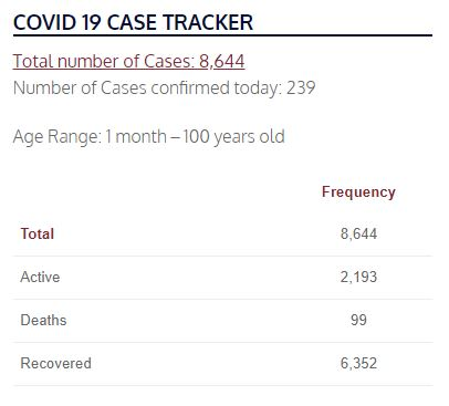
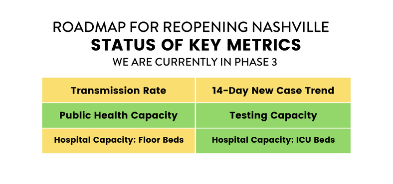
239 new cases today. That's a big number, one that we are seeing every few days now. Available ICU/hospital beds are trending lower at 20%. If the virus continues to surge, the available beds will decline. Metro just changed the warning level from green to yellow for beds 


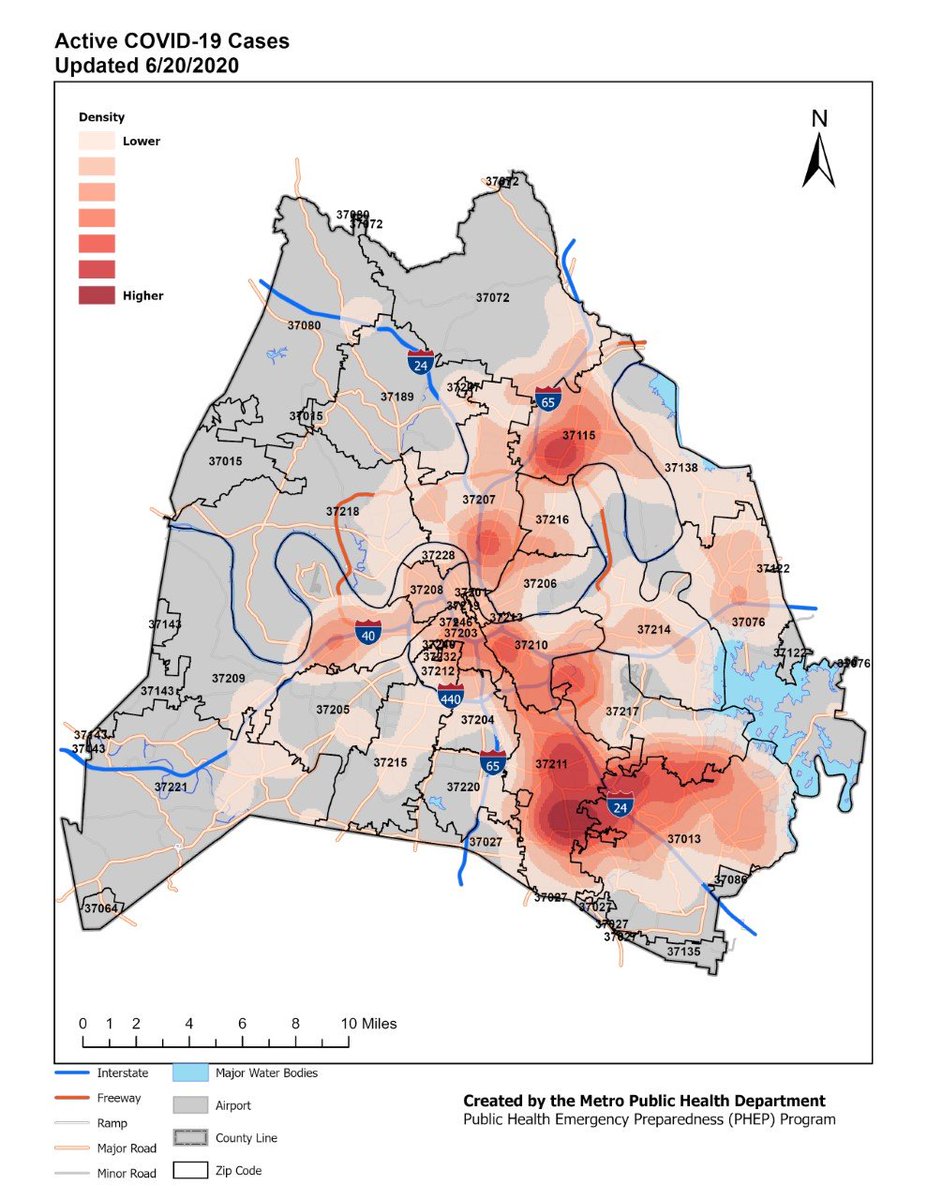
Metro heatmap of SARS-CoV-2 #coronavirus cases in #Nashville show many zip codes are handling the virus. Data for this map were compiled a few days ago. Concentrations are clearly in the Northeast and Southeast.
 Mask Up
 Physically Distance
 Great Hygiene
 Mask Up
 Physically Distance
 Great Hygiene

 Read on Twitter