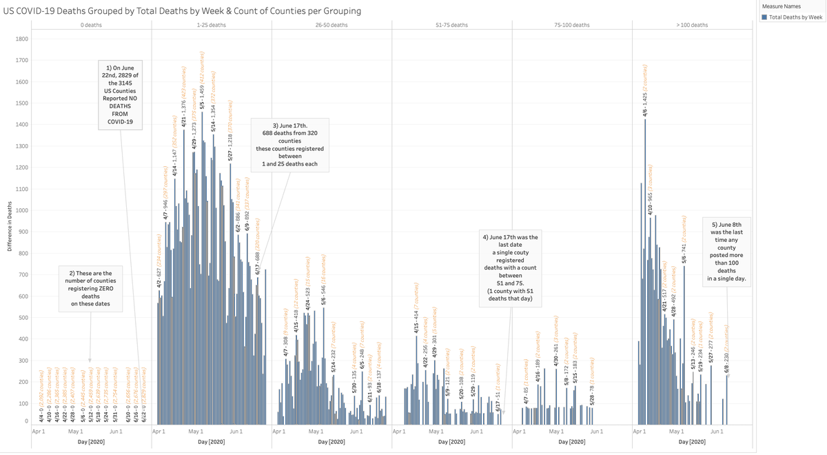
1/ Look, the county data is where it's at! Think of the counties like 3,141 beacons broadcasting cases & deaths of #COVID19.
What if I told you that a bunch of beacons have suddenly going silent? Like, they have no deaths to report!
2,829 of them reported no deaths on 6/22.
What if I told you that a bunch of beacons have suddenly going silent? Like, they have no deaths to report!
2,829 of them reported no deaths on 6/22.
2/ Almost every state uses counties as the reporting entity. These counties then send their numbers up the state, the state numbers then get picked up by the dashboards.
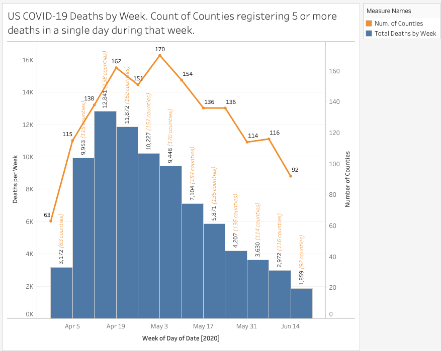
Next chart: by week, deaths from counties who reported 5 or more deaths in a single day that week.
Next chart: by week, deaths from counties who reported 5 or more deaths in a single day that week.
3/ And note on the first chart.
- No single county has posted more than 50 deaths since last week
- Just 4 counties have reported between 25 and 50 deaths in the past week
- The number of counties having reported 5 or more deaths in a single day is down to pre-April levels!
- No single county has posted more than 50 deaths since last week
- Just 4 counties have reported between 25 and 50 deaths in the past week
- The number of counties having reported 5 or more deaths in a single day is down to pre-April levels!

 Read on Twitter


