A UI thread on iOS 14 and Big Sur.
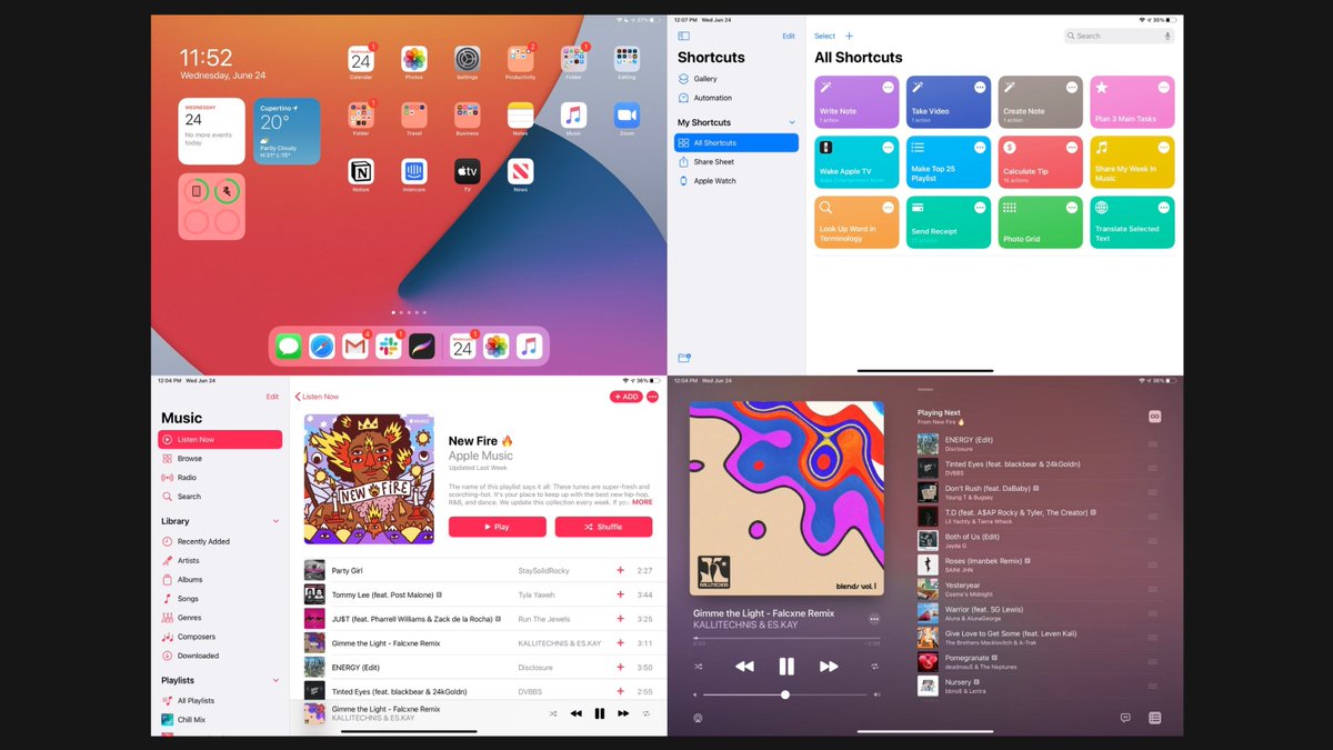
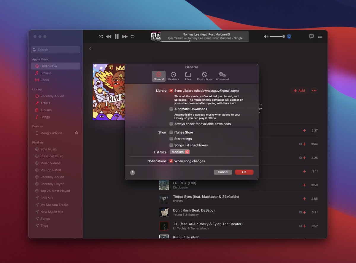
First, it’s clear that the Tab bar/Nav bar will be replaced by Sidebar/Toolbar on iPad and Mac. Tab bar is great for small screens, one-tap navigation and thumb reach.
First, it’s clear that the Tab bar/Nav bar will be replaced by Sidebar/Toolbar on iPad and Mac. Tab bar is great for small screens, one-tap navigation and thumb reach.
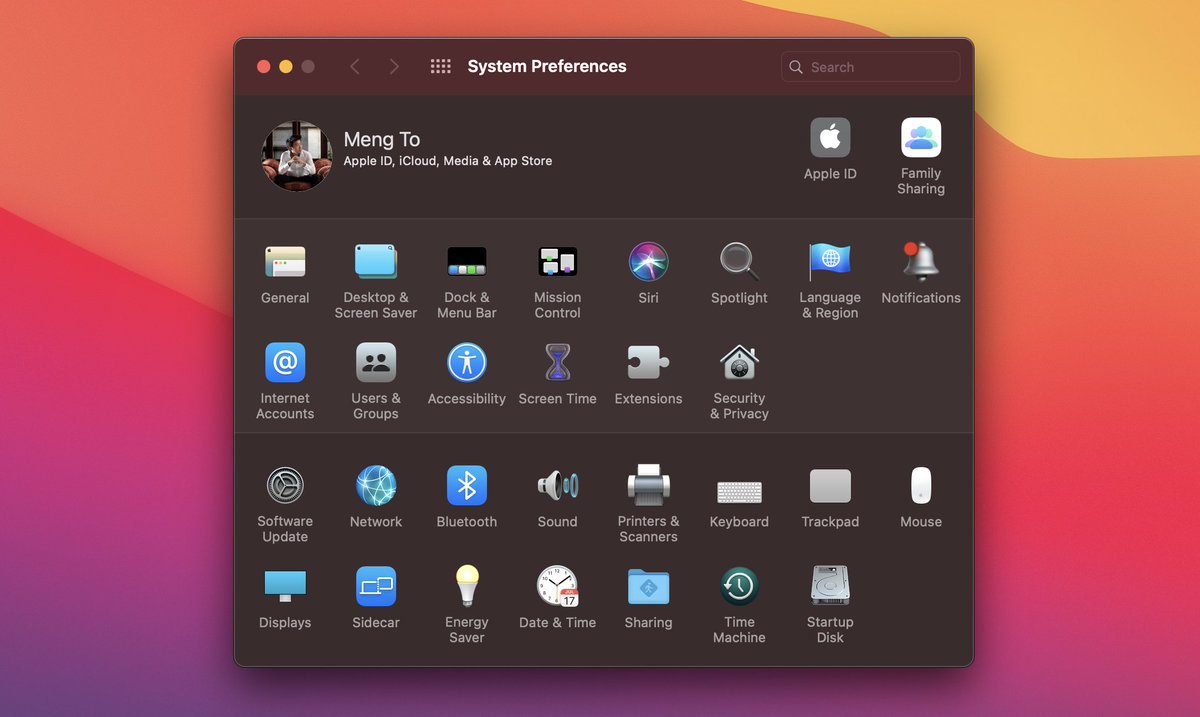
Skeuomorphism isn’t fully back yet, but the Mac has been persistent at keeping it. 7 years ago, it was way too flat and with each year, we’ve been unflattening with more shadows, gradients and blur. For icons, that’s another story.
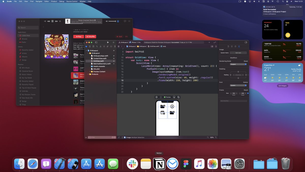
SwiftUI is making it effortless to develop for iOS/iPad/Mac with virtually no code change thanks to these design patterns. An iPad app will almost look exactly like a Big Sur native app. Side bar, touch-friendly tool bar, buttons. I wouldn’t be surprised if touch Macs are coming.
App-store/Music app like transitions will be easier than ever with matchedGeometryEffect in SwiftUI. When iPad/iPhone apps will widely run on Apple Silicon Macs, smooth transitions between UI elements will be more common for Web/Desktop.
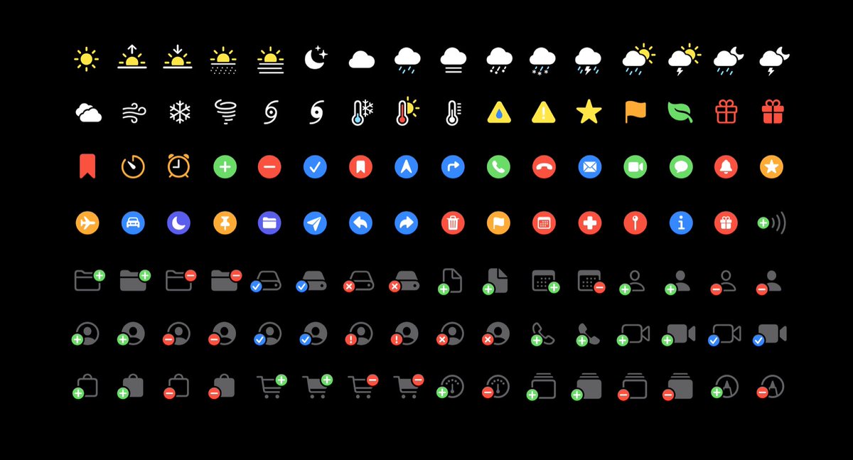
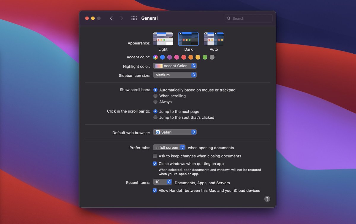
App tinting will be a pretty big deal. Even on Big Sur, every app have their own highlight/brand colors. Also, SF Symbols 2 will have multiple colors, usable on all Apple platforms for free with a single line of code.

 Read on Twitter
