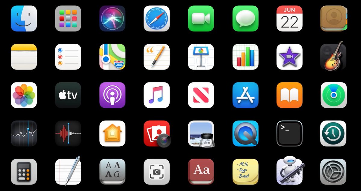
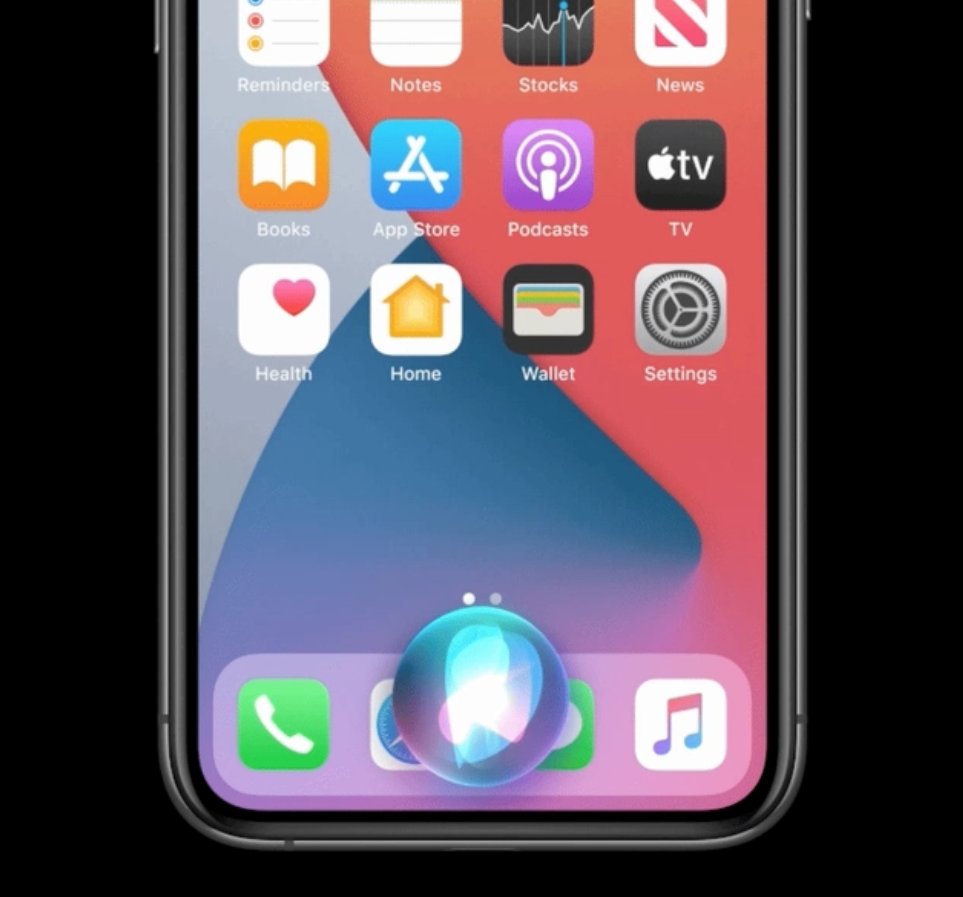
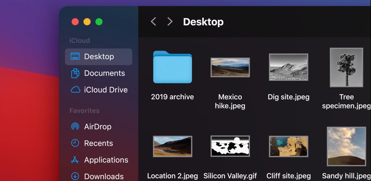
Most people missed this, but @apple's design overhaul is all about preparing for Augmented Reality.
1) Icons now look 3D & possess shadows
2) Siri is an outright 3D object now
3) Windows are now rounded given that sharp objects look threatening in AR
The list goes on #WWDC20
1) Icons now look 3D & possess shadows
2) Siri is an outright 3D object now
3) Windows are now rounded given that sharp objects look threatening in AR
The list goes on #WWDC20

So some of it may not look great now, but it will in 2 years once you see it all IRL.
For those who are still skeptical of this, @Microsoft has done this a few years ago with the Fluent Design System.
Bending your visual language years in advance to something more AR-friendly prepares audiences so the device feels less disorienting.
Bending your visual language years in advance to something more AR-friendly prepares audiences so the device feels less disorienting.
@JesseDamiani elaborates on this thread further with some other obvious AR indicators https://twitter.com/JesseDamiani/status/1275840204973076480
For those still discovering this now, you may want to take a look at my article on how Apple is approaching AR: https://medium.com/futurepi/apples-ar-play-isn-t-just-a-device-it-s-their-ecosystem-296807950e7b

 Read on Twitter


