This is amazing.
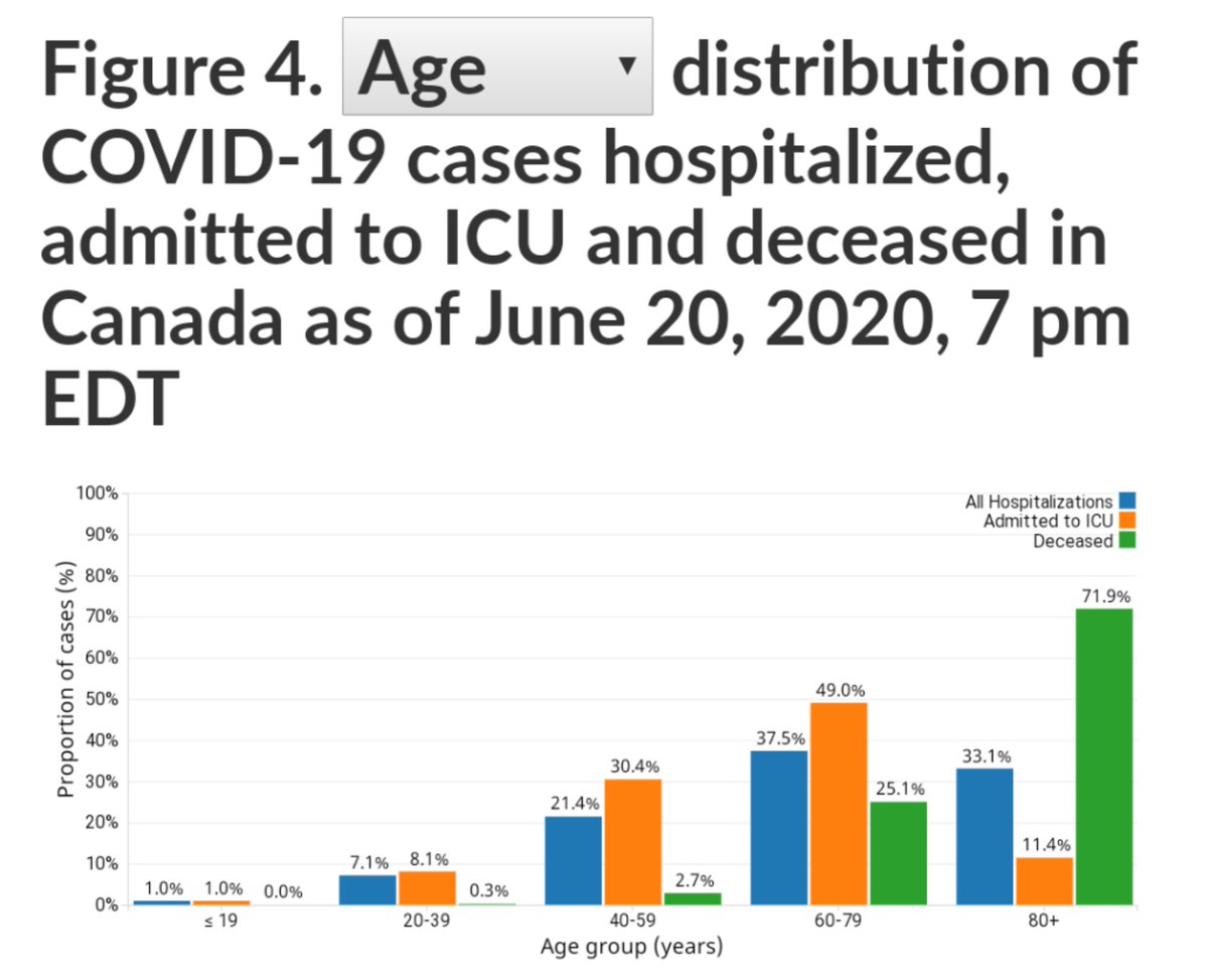
The distribution of covid-19 deaths by age group looks suspiciously like that for overall deaths (life expectancy).
Compare the green bars in the first chart to the green line in the second chart (the most recent I've found is 2011).
Let's look more closely.
The distribution of covid-19 deaths by age group looks suspiciously like that for overall deaths (life expectancy).
Compare the green bars in the first chart to the green line in the second chart (the most recent I've found is 2011).
Let's look more closely.
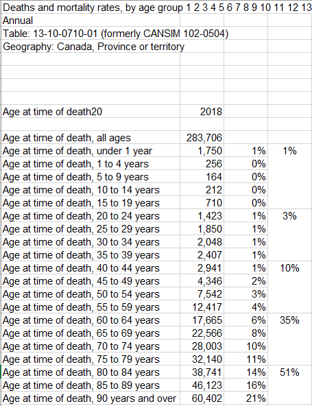
Let's compare with 2018 overall deaths in Canada, rolling up age groups to match those in the Canadian covid-19 chart:
So let's compare each age group -
% of overall deaths vs. % of covid-19 deaths:
<20: 1% vs.0.0%
20-39: 3% vs. 0.3%
40-59: 10% vs. 2.7%
60-79: 35% vs. 25.1%
80+: 51% vs. 71.9%
% of overall deaths vs. % of covid-19 deaths:
<20: 1% vs.0.0%
20-39: 3% vs. 0.3%
40-59: 10% vs. 2.7%
60-79: 35% vs. 25.1%
80+: 51% vs. 71.9%
If we treat those who have died of covid-19 as a sample of the larger Canadian population, then they are actually living longer than the average Canadian.
Most people dying of covid-19 in Canada are near the end of their natural life.
We are being bamboozled.
Most people dying of covid-19 in Canada are near the end of their natural life.
We are being bamboozled.

 Read on Twitter


