For my today's webinar at Universidad de Chile, I prepared a few additional slides that include Chile.
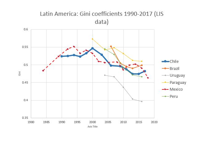
First , the evolution of inequality. Chilean inequality (thick blue line) has gone down since 2000 (like in many LatAm countries) but after 2013 it is on the rise again.
First , the evolution of inequality. Chilean inequality (thick blue line) has gone down since 2000 (like in many LatAm countries) but after 2013 it is on the rise again.
The % of people who are both labor-rich (in top decile of labor incomes) and capital-rich (in top decile by K incomes) is 18% in Chile (dark blue bar). This means that 1 out of each 5 rich capitalists are also drawing large salaries that put them among the top 10% labor earners.
Chile differs, in terms of homoploutia, from other LatAm countries which are closer to "classical capitalist" model: rich capitalists do not have labor incomes.
This explains the positions of Mexico and Brazil in the previous graph (with homoploutia shares of 8%).
This explains the positions of Mexico and Brazil in the previous graph (with homoploutia shares of 8%).
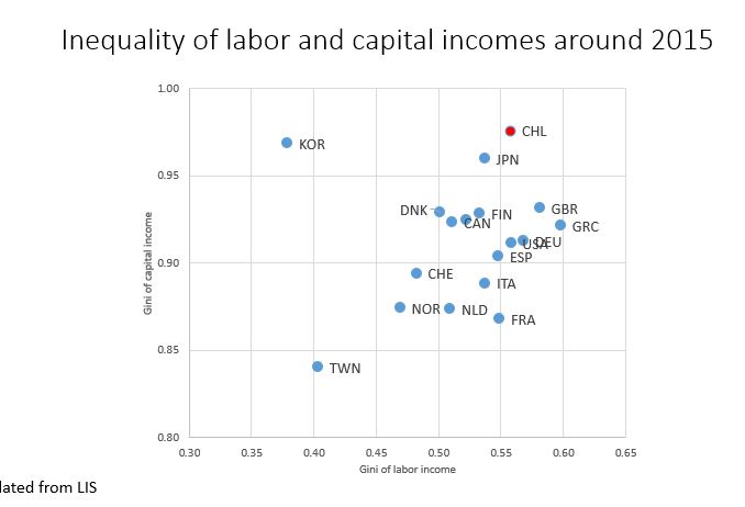
Chile (red dot) displays high inequality of pre-tax labor incomes (Gini of 55); this is not too different from other OECD countries.
But Chile has also an extremely high inequality of capital incomes with a Gini of 0.95 (highest among countries shown here).
But Chile has also an extremely high inequality of capital incomes with a Gini of 0.95 (highest among countries shown here).
This high inequality of K incomes is derived from high inequality in wealth.
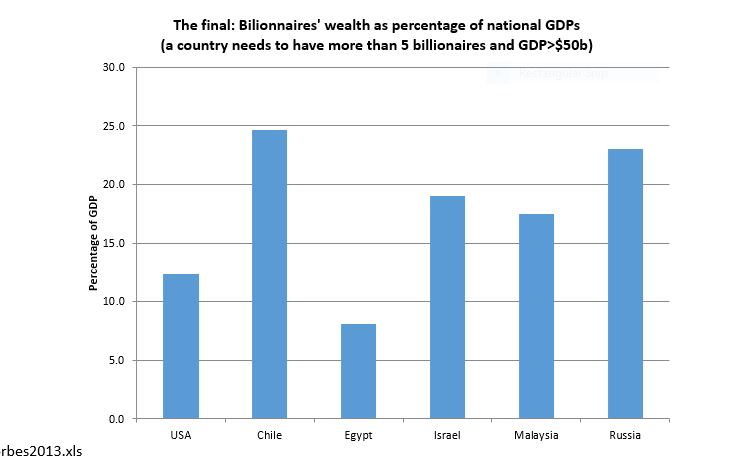
One indicator is the ratio of billionaires' wealth to GDP. I did this calculation some time ago, based on Forbes 2013 list. (It should be updated.)
But then Chile had the highest ratio in the world.
One indicator is the ratio of billionaires' wealth to GDP. I did this calculation some time ago, based on Forbes 2013 list. (It should be updated.)
But then Chile had the highest ratio in the world.
Chile was ahead of Russia, Ukraine, USA, Israel. Note that all these countries (except USA) had large-scale privatizations.
Privatizations, unlike what was claimed, have generally led to very high concentrations of wealth.
Privatizations, unlike what was claimed, have generally led to very high concentrations of wealth.

 Read on Twitter


