One of the things I’ve “made” over the years are documents. A tweet exchange w/
@LindsayMasland reminded me that some people may mistake visually appealing docs as a waste of time or somehow assume they lack quality. First some examples.
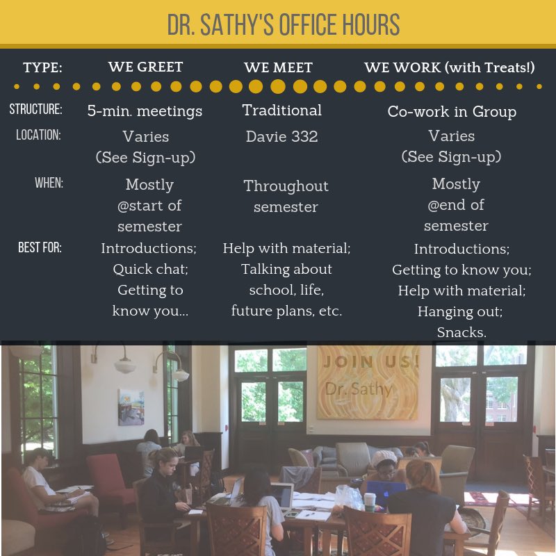
Info on how office hours are structured:
@LindsayMasland reminded me that some people may mistake visually appealing docs as a waste of time or somehow assume they lack quality. First some examples.
Info on how office hours are structured:
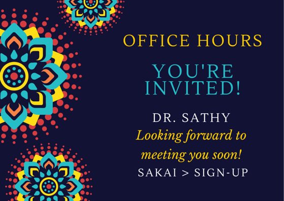
Or even a simple invitation to office hours to post on my LMS home screen. Both made on @canva. This one on my mobile app:
Or syllabi. These are @powerpoint @piktochart and @InDesign respectively. (These are on my website for closer details: http://www.vijisathy.com )
This was my most recent creation: my dossier. I used @canva to make title pages and interleaved many of my classroom photographs throughout. (This is also posted on my website for those who are going through this process and looking for examples.)
As a statistician & scientist I appreciate #dataviz and #scicomm. In many ways, our documents tell a story too. This is work I enjoy AND it’s my approach to communication more broadly: to aim to be effective.
When my syllabi began to resemble the iTunes terms and conditions, I felt I was not achieving my goal of having students engage with it. Since then, I’ve designed many docs. There are fabulous (& free) tools that even non-designers like myself can get the hang of fairly quickly.
So rather than assume the person sunk countless wasteful hours creating a document that’s visually appealing, examine the content of the work. Consider the care with which it was organized. What is emphasized? Why? These all help communicate a story by the storyteller.
They were not made to make you feel less than, or to somehow infer you’re doing it wrong. (Well, assuming that’s not the story they are telling.) Examine the work. Don’t assume it’s wasted time. Engage with the creator to learn more about the choices they made.

 Read on Twitter


