 iOS Design and UX Tips
I’ll be extrapolating out things I’ve learned, read from the HIG and have seen that make an iOS app look and feel good.
Tip 1) Make a table view row animate its selection state as it’s popping and pushing on the nav Stack.
Tip 1 Continued:
UITableViewControllers get this behavior for free. If you roll your own table view you’ll need to do it yourself. You can do so by grabbing the controller’s transition coordinator as seen in this (gasp!) Objective-C code here called in viewWillAppear
UITableViewControllers get this behavior for free. If you roll your own table view you’ll need to do it yourself. You can do so by grabbing the controller’s transition coordinator as seen in this (gasp!) Objective-C code here called in viewWillAppear

 Tip 2
Tip 2 
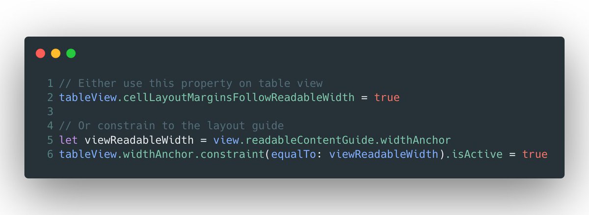
If you've got text whose primary function is long-form reading, make it easy to parse it by using the view's readableContentGuide.
 Tip 2 Cont.
You can do this by constraining the text container’s width to the view’s readableContentGuide’s width.
Or, on table view there is a property that will do much of the same thing to the cell’s contentView.
 Tip 3
Tip 3 
Users expect Dynamic Type to be supported, and an app feels off if your text doesn't respond to their settings.
While table or collection views coalesce this behavior for you in most cases, other times you'll need to use the UIContentSizeCategoryAdjusting protocol.
 Tip 3 Continued
Luckily, most UIKit text controls adopt that protocol, so it's typically just a case of setting the protocol's only required boolean value to true.
Plus, pairing these with stack views makes adapting to any text need a bit easier.
 Tip 4
Tip 4
As mentioned above when designing for dynamic type, you'll often be dealing with UIStackView in these scenarios.
In most cases, it makes sense to flip content from a horizontal to a vertical axis when accessibility content sizes are active.
 Tip 4 Continued
There are many ways to achieve this, but a very painless route is to leverage Combine and NotificationCenter's easy to use publishers.
Just sprinkle in some operators, and then you've only got one line to manage things.
 Tip 5
Tip 5 
You want to utilize the margins guide of your superview with exceptions. Some developers are unaware of them, and fall into using magic numbers for padding.
That should be the exception rather than the rule. Notice how the first label has no leading padding.
 Tip 6 Continued
From a layout standpoint, you need to constrain your leading and trailing edges to the layout margins guide.
Also, you likely want to avoid an explicit left and right anchor constraint for internationalization purposes.
 Tip 7
Tip 7 
With many iOS devices using the home indicator these days, there are times when you want a rounded view to hug the edges near the top or bottom.
For this, use the right rounded corner style. In this case, you want a continuous corner curve, *not* a circular one.
 Tip 7 Continued
This is hard to see in the image, but there are two views overlaid here. The top black one has the correct corner curve, and the bottom red view has the wrong one.
You can see the outlines of the red view, they don't match the rounded corner of the device.
 Tip 7 Continued
Thankfully, this is just a "the more you know" situation.
You can get a continious corner curve by setting the RoudnedCornerStyle property of a CALayer.
The default is circular.
 Tip 8
Tip 8 
SF Symbols have a lot of utility, and one advantage is they are easily made "adaptive".
Continuing with accessibility sizes, you'll often want to make glyphs more prominent in these scenarios. Notice the right glyph is heavier matching the text, while the left isn't.
 Tip 8 Continued
This is a matter of responding to the content size changes as we previously covered, and while it may depend largely on your code structure - I personally solve this using Combine as well.
 Tip 9
Tip 9 
Responding to accessibility & device needs on the fly not only promotes user empathy - it also produces a more polished experience. One example?
Using blur effects.
Users may not want these if they have reduced transparency on, or the device is in low power mode.
 Tip 9 Continued
In the image above, imagine the device is in low power mode or reduced transparency is on. We forgo the blurred background & custom transition animation. Instead, we use an opaque background and a standard transition.
Here's one way you can go about this:
 Tip 10
When using context menus (or pull-down menus for UIButton) it's easy to throw a bunch of actions in them without proper grouping.
Always logically group them by job (sharing, editing, etc.). Here, the menu on the left is harder to grasp than the one on the right.
 Tip 10 Continued
*credit to @jsngr for the Twitter UI used above*
API wise, this is trivial in SwiftUI - just provide a Divider(). In UIKit, you do this using a parent-child setup using a UIMenu with .displayInline as an option.
 Tip 11
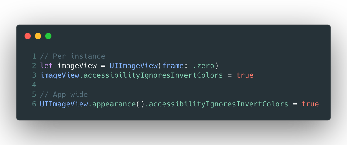
Many users invert iOS' colors to help with light & color sensitivities. But, ensure you aren't degrading rich media in your app, which users likely expect to remain at their true fidelity.
For images & media, you'll likely want them to forgo this setting.
 Tip 11 Continued
This requires almost zero effort to support - simply set accessibilityIgnoresInvertColors to false (which also will do the same thing for subviews of that view):
 Tip 12
Since iOS 13, users can enable Voice Control which allows one to navigate iOS by calling out prompts on screen.
By default, iOS vends your accessibilityLabel and in some cases, this might be too verbose. Instead, leverage the accessibilityUserInputLabel array.
 Tip 12 Continued
To tackle this, go through your app with Voice Control on and see which parts are too verbose to speak out.
Then, assign something that makes a bit more sense to the control's accessibilityUserInputLabels property:
 Tip 13
Here's a remix of our very first tip, since with iOS 13 UICollectionView now supports a list style.
As with a table view, you'll want to animate a selection when popping and pushing on the navigation stack:
 Tip 13 Continued
The good news is that the technique is extremely similar to how it works with a table view. For my projects, I use an extension to achieve this:
 Tip 14
When using the iPadOS hover pointer effect, ensure it looks correct and doesn't expand in unexpected ways.
This can happen, for example, in scenarios where your view's bounds expands out larger than its visible contents.
 Tip 14 Continued
To fix this, utilize UIPreviewParameters's visiblePath property to customize the effect's look.
For the example above, I calculate the size of the actual text and apply some padding, and then center it within the control itself.
 Tip 15
Sometimes it's contextually relevant for Voice Over to read punctuation literally. For example, when viewing a code sample snippet. You can do this using an attributed string and the accessibilitySpeechPunctuation key.
Here is what happens with and without it:
 Tip 15 Continued
Instead of assigning to the label's text property directly, here we create an attributed string that contains the accessibilitySpeechPunctuation key with an NSNumber with a true boolean value (i.e. 1).
Then, we assign to the attributedText of the label.
 Tip 16
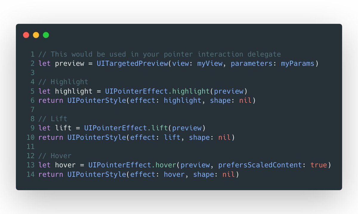
Take the time to evaluate which content pointer effect is appropriate for controls in your app.
These effects change the pointer's shape or augment the views it interacts with, so knowing which fit where makes your app feel at home.
Here's a general guide:
 Tip 16 Continued
The code for this changes depending on the content effect you are after. In broad strokes, you'd use one of these within the pointer interaction delegate method that asks for the UIPointerStyle.
 Tip 17
In general, avoid truncation on interactive controls. If you can't expand views, consider variable width strings.
These use a .stringsdict lookup to vend a string based on width. Here, we use "Templates" instead of "Choose from Templates" when the width is tighter.
 Tip 17 Continued
If you use NSLocalizedString() along with UIKit controls, they'll choose the right one for you based on the presentation width measured in EMs.
If you want to vend one of these to some other component, varirantFittingPresentationWidth() is here.
 Tip 17 Continued
Following the example above, here is what our .stringsdict entry might look like.
The key NSStringVariableWidthRuleType has a dictionary of EM values, which correspond to the string you want used in such an environment.
 Tip 18
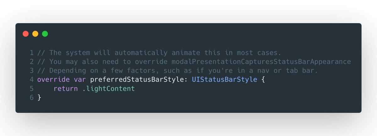
Moving on to view controller considerations. Ensure you're using the correct UIStatusBarStyle for modally presented controllers.
For example, don't use a dark status bar for a dark interface, which will obscure it:
 Tip 18 Continued
There are a number of properties that control the status bar, but the most common one is preferredStatusBarStyle.
If you find a scenario where the status bar appears hidden and it shouldn't be due to your chrome, return the correct value here:
 Tip 19
It can be easy to get tripped up when implementing common accessibility practices.
Accessibility label, value and hint? When do you use which?
The graphic below demonstrates this:

 Read on Twitter


