should i rank all the wayside school art styles
but FIRST a disclaimer: please know that this is a ranking based on personal preference. i mean no ill will towards any of these artists, i understand what it's like, as an artist myself. however, i also just want to rank all the art styles for wayside school. so here i go.
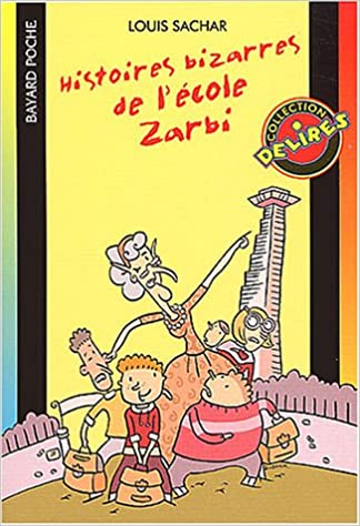
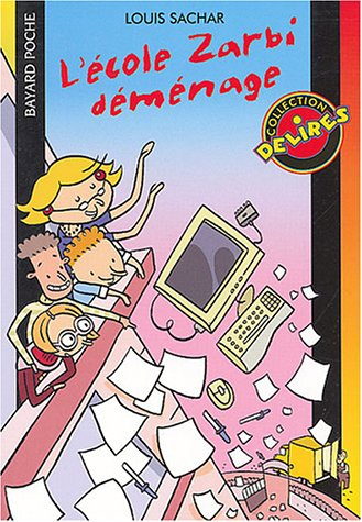
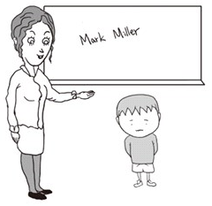
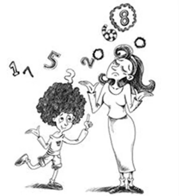
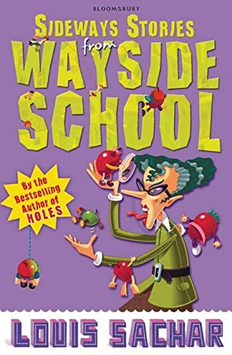
so starting off in worst place is this french edition, which unfortunately just looks kinda like clip art to me
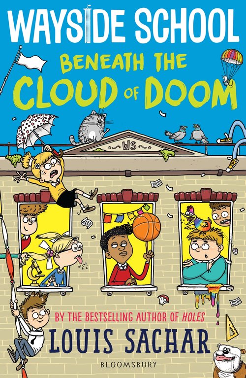
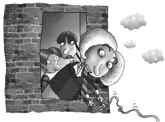
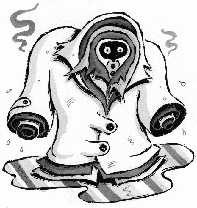
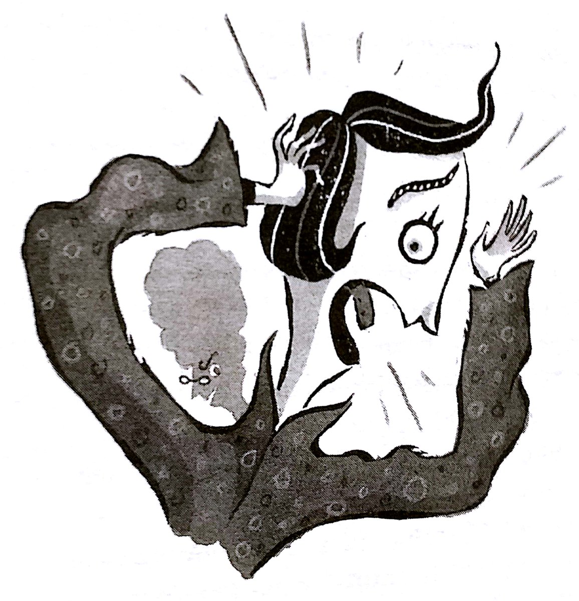
i hate being mean to British Cloud of Doom but when i compare it to every other art style the series has had, i'm just not that big a fan of it. sharie is just not sharie without a massive coat.
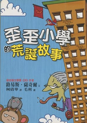
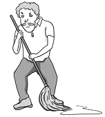
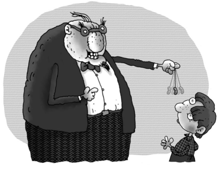
traditional chinese mostly gets ahead of the previous two, because some of the illustrations for it just convey really relatable feelings that are tough to put into words. but in the long run it feels like it's... missing something
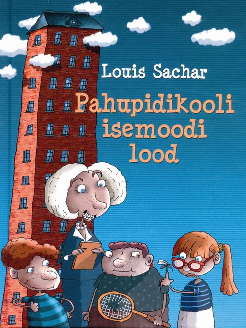
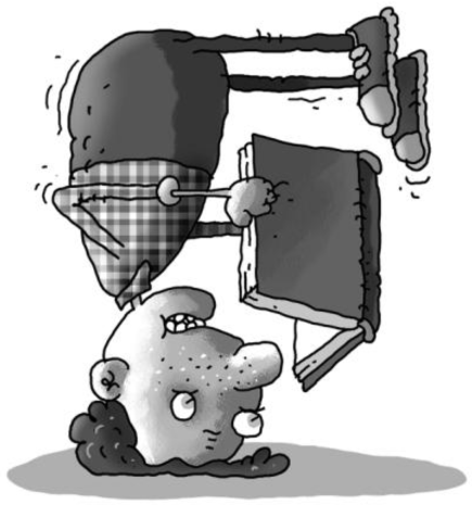
once we get to the estonian edition i start liking them a little more. this edition looks ugly, but i think it's like... a charming sort of ugliness. it feels fitting for a children's book. feels somewhat fitting for this series.
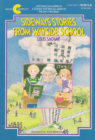
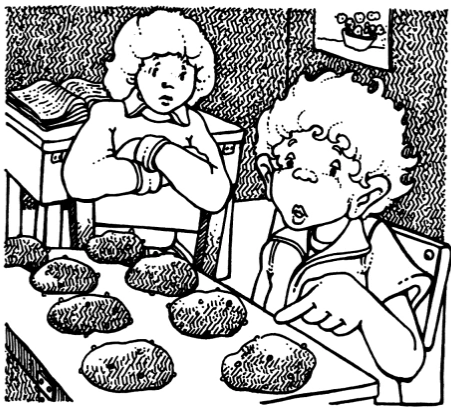
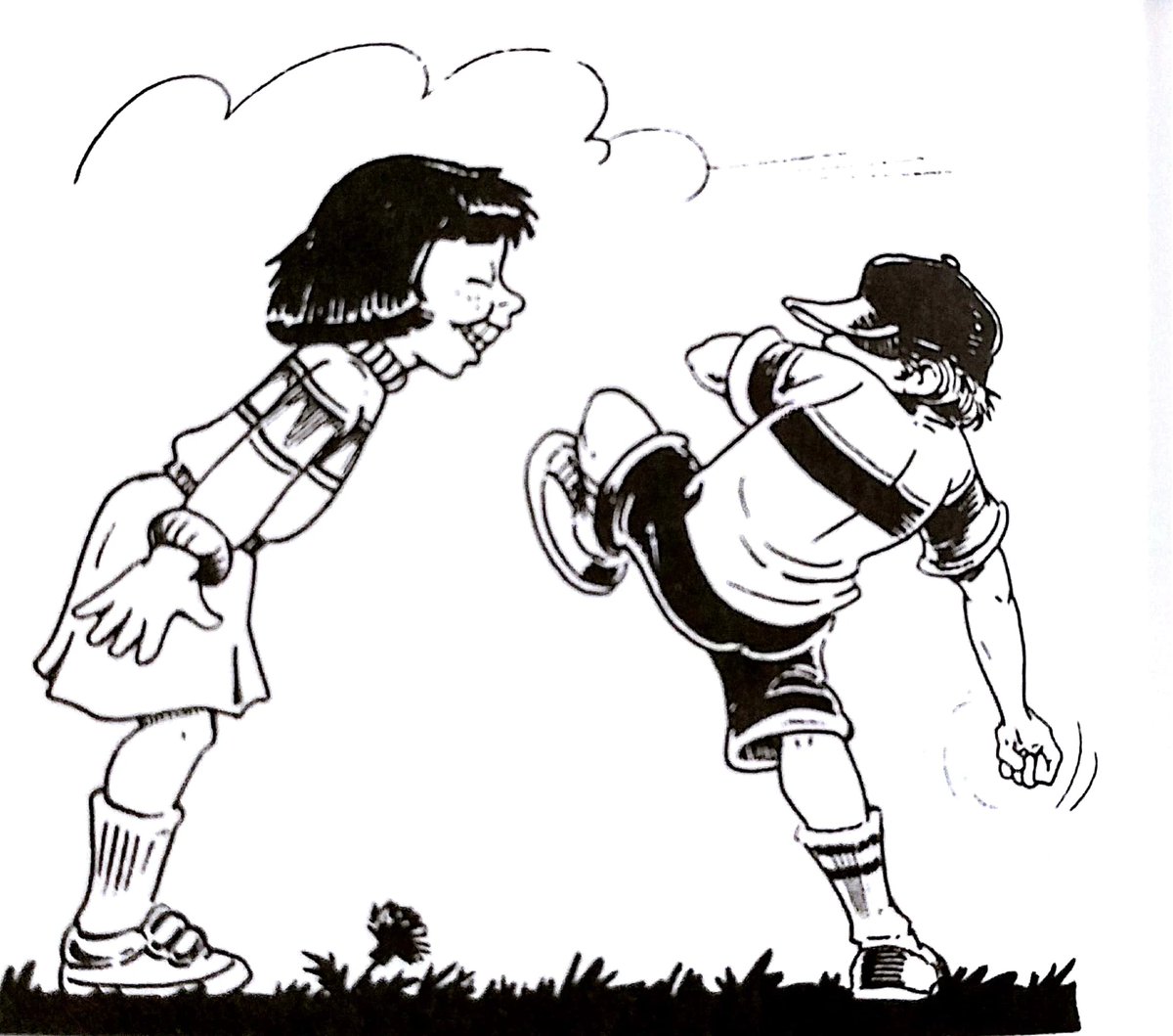
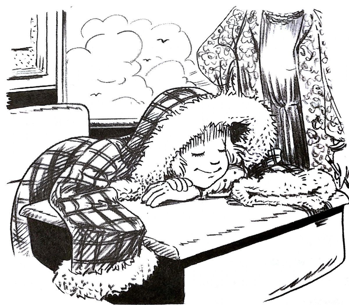
a controversial move on my part is putting julie brinckloe relatively low on this list, but it is a move i am going to make. i have some nostalgia for it, as the first edition of wayside i ever read, and i do think it has a nice children's book vibe but... it's just worse schick.
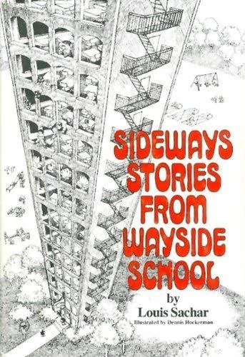
speaking of controversial decisions, putting dennis hockerman one tier higher. dennis hockerman SPECIFICALLY has the vibes of "1970s Children's Book" which i just like a bit more. this style feels more... defined to me.
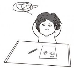
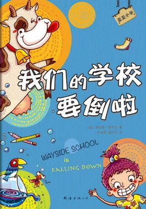
simplified chinese-edition wayside was probably the toughest to rank, in comparison to the others. i don't really have much to say about it. looks nice, but nothing too noteworthy in the long run.
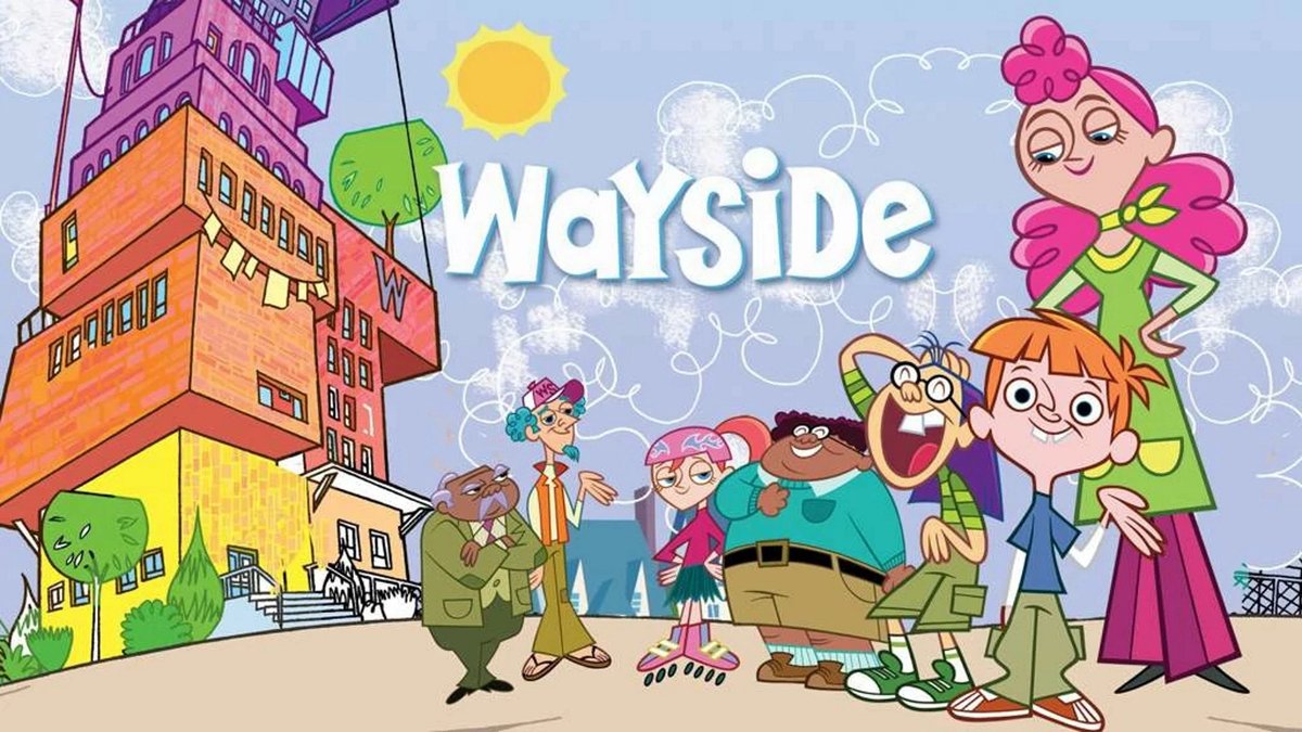
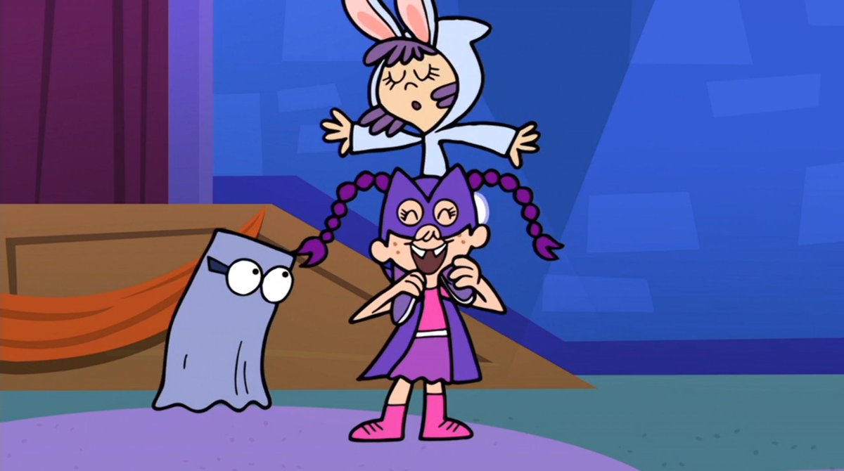
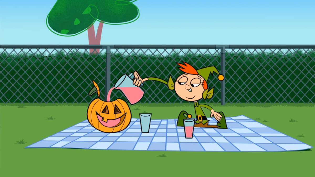
i have many, many problems with wayside 07, but its art style actually isn't really one of them. by the standards of canadian animation it actually looks pretty decent," and while obviously it takes a hit after the switch to flash, i'd say the style was preserved well enough
i'll give next to the OTHER british illustrator, peter allen. his style is simplistic, but really charming to me. it looks... cute, which i think works pretty well, in the long run.
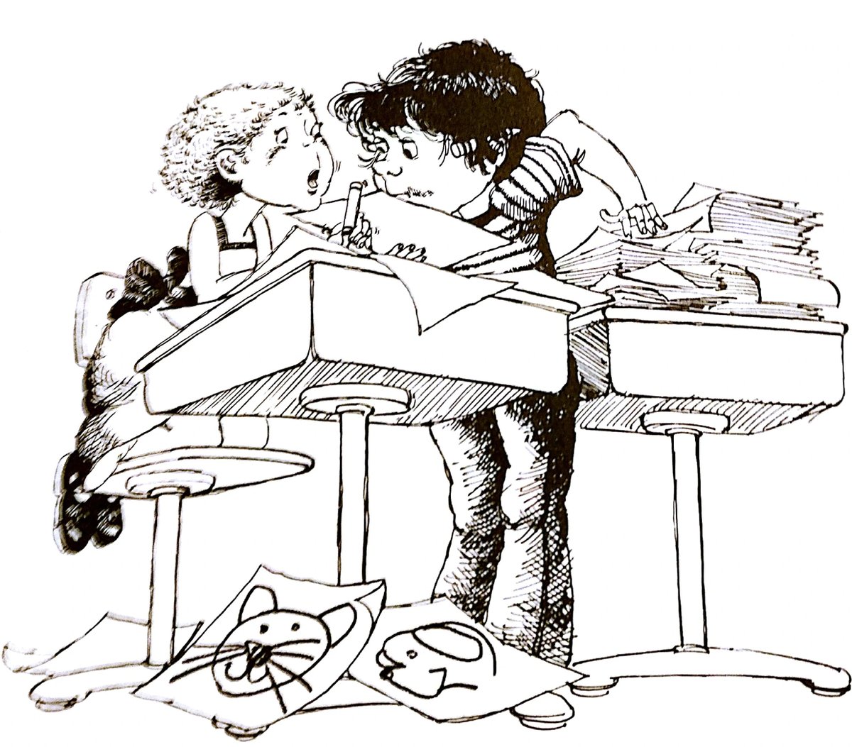
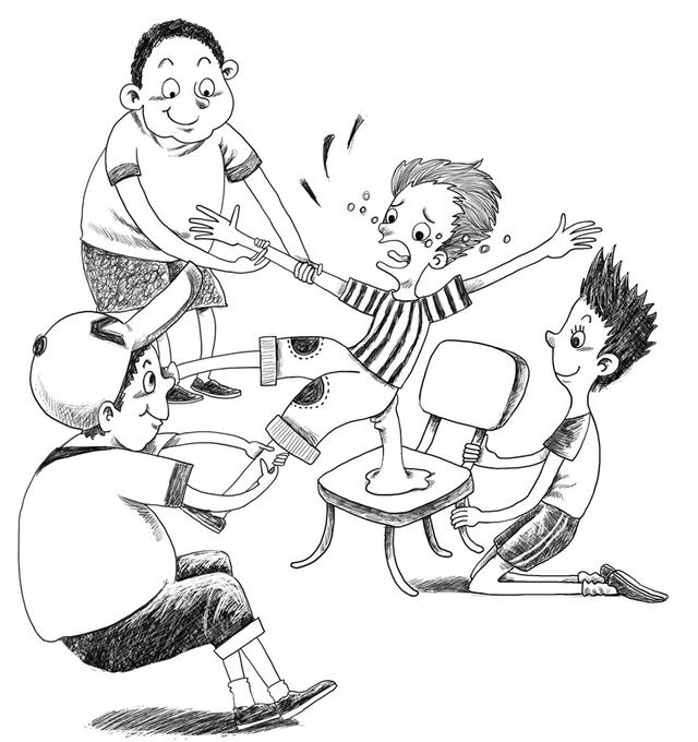
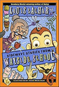
MORE CONTROVERSY: i'm putting adam mccauley this high up. i wasn't really expecting to, but looking at his illustrations more and more, i've realized that i really kinda dig their style. i feel we should probably appreciate them a little more.
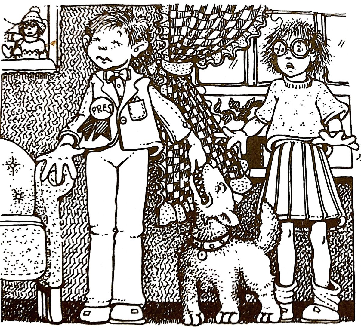
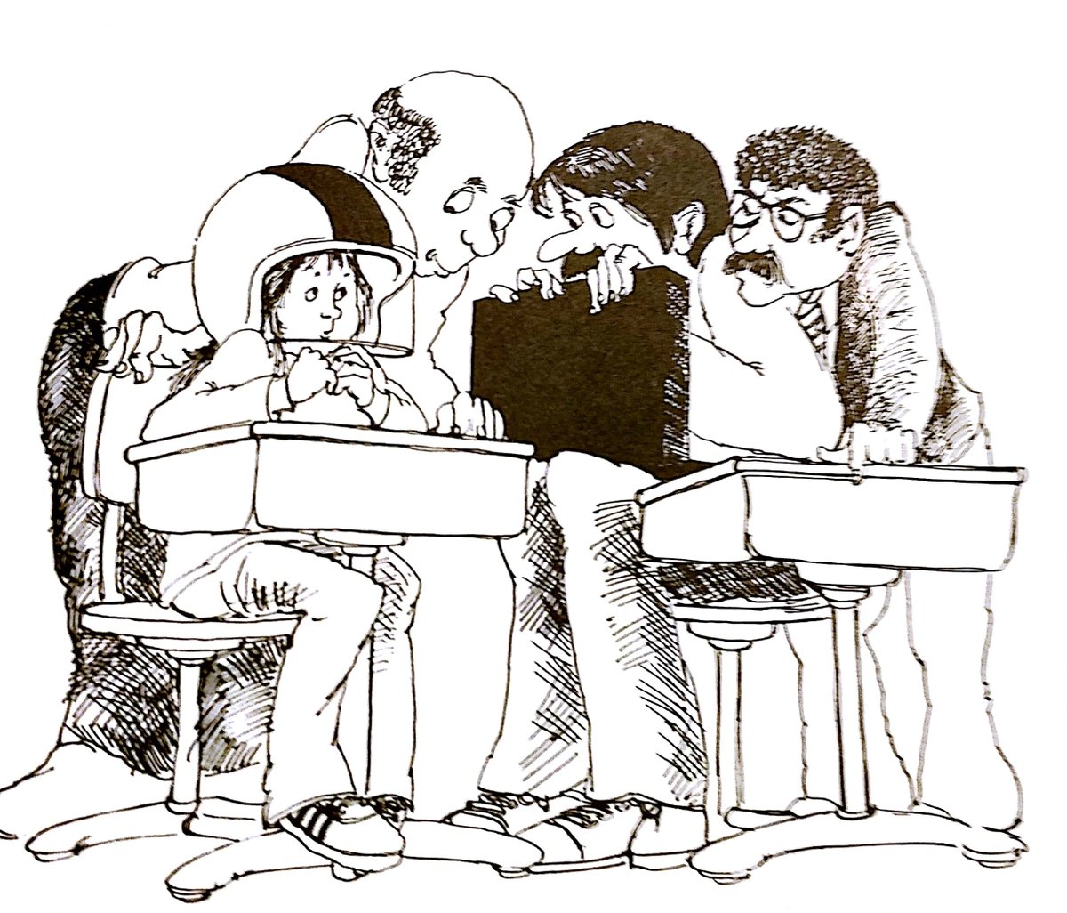
but NO ONE has mastered the Realistic Wayside Art Style better than joel schick, whose illustrations i may have more nostalgia for than brinckloe. the realism sets a nice contrast to the Strangeness of the text, and i can see WHY mccauley replacing them could be controversial.
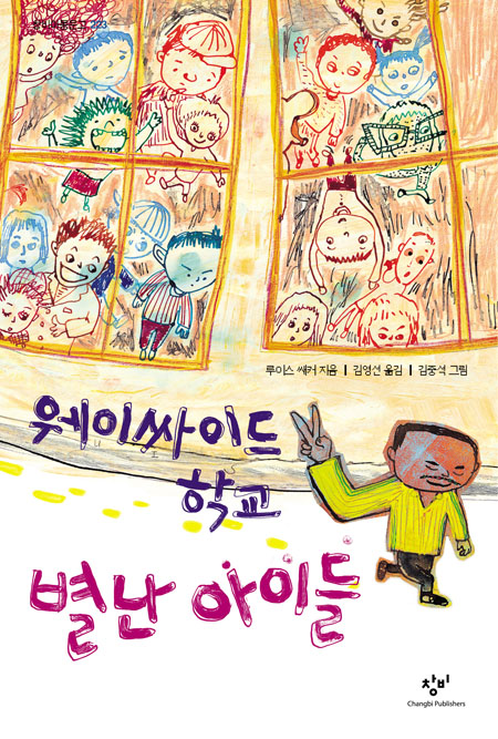
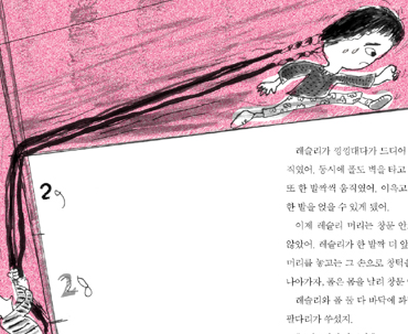
time for the top three. third place i'm giving to the korean editions of the series. got a really snazzy style with a really, REALLY nice usage of color. i unfortunately haven't seen much of them, but i really dig everything that i currently have seen a whole awful lot.
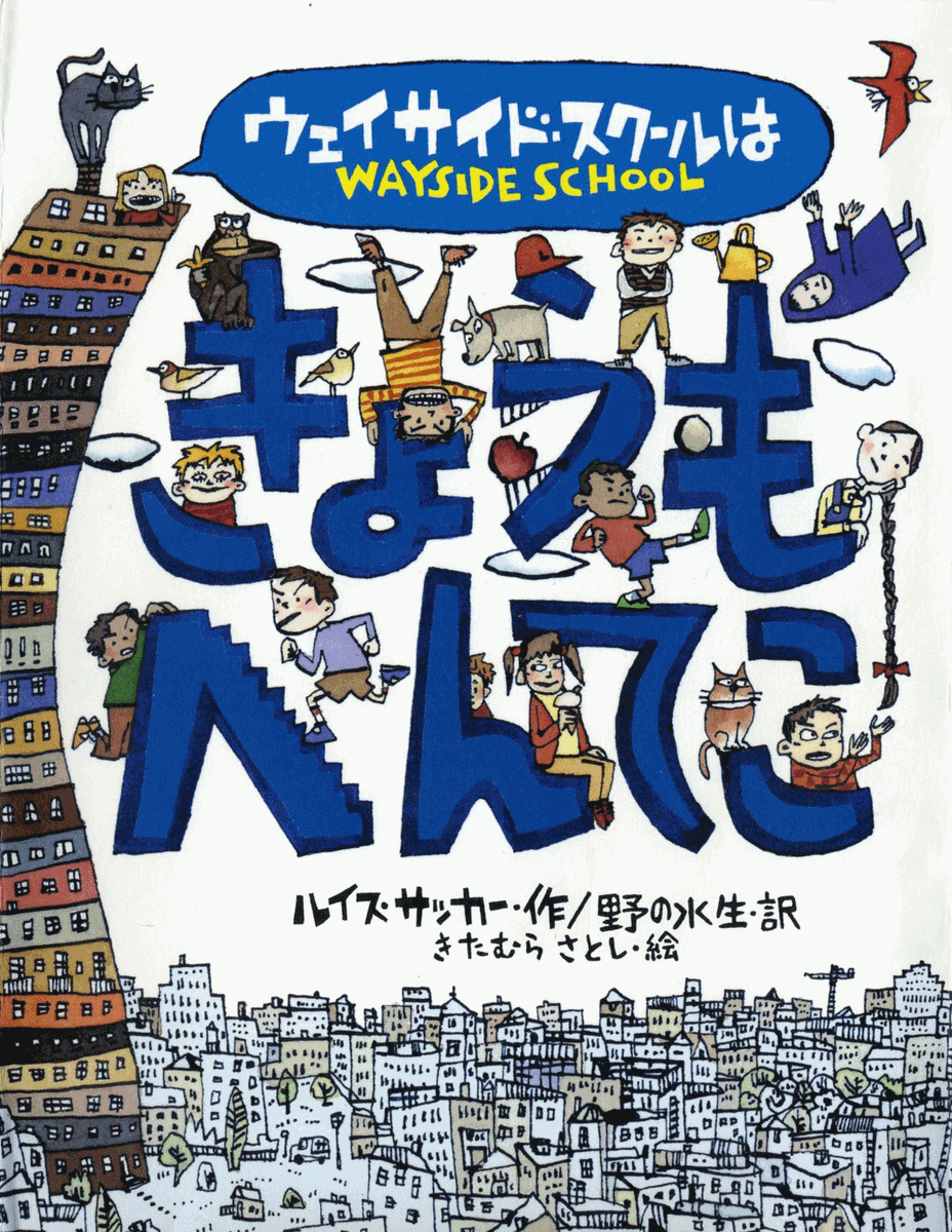
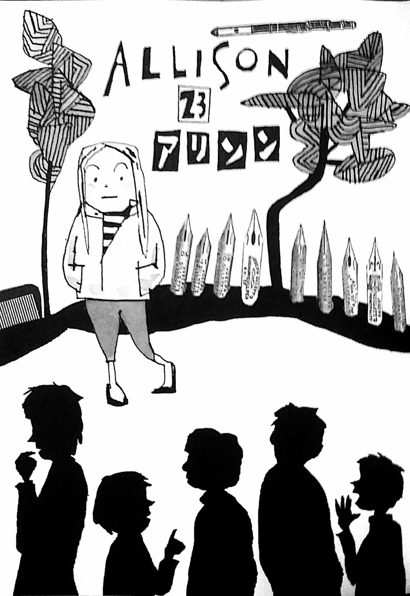
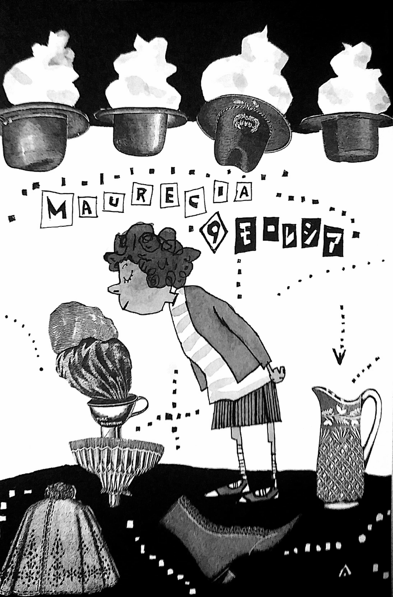
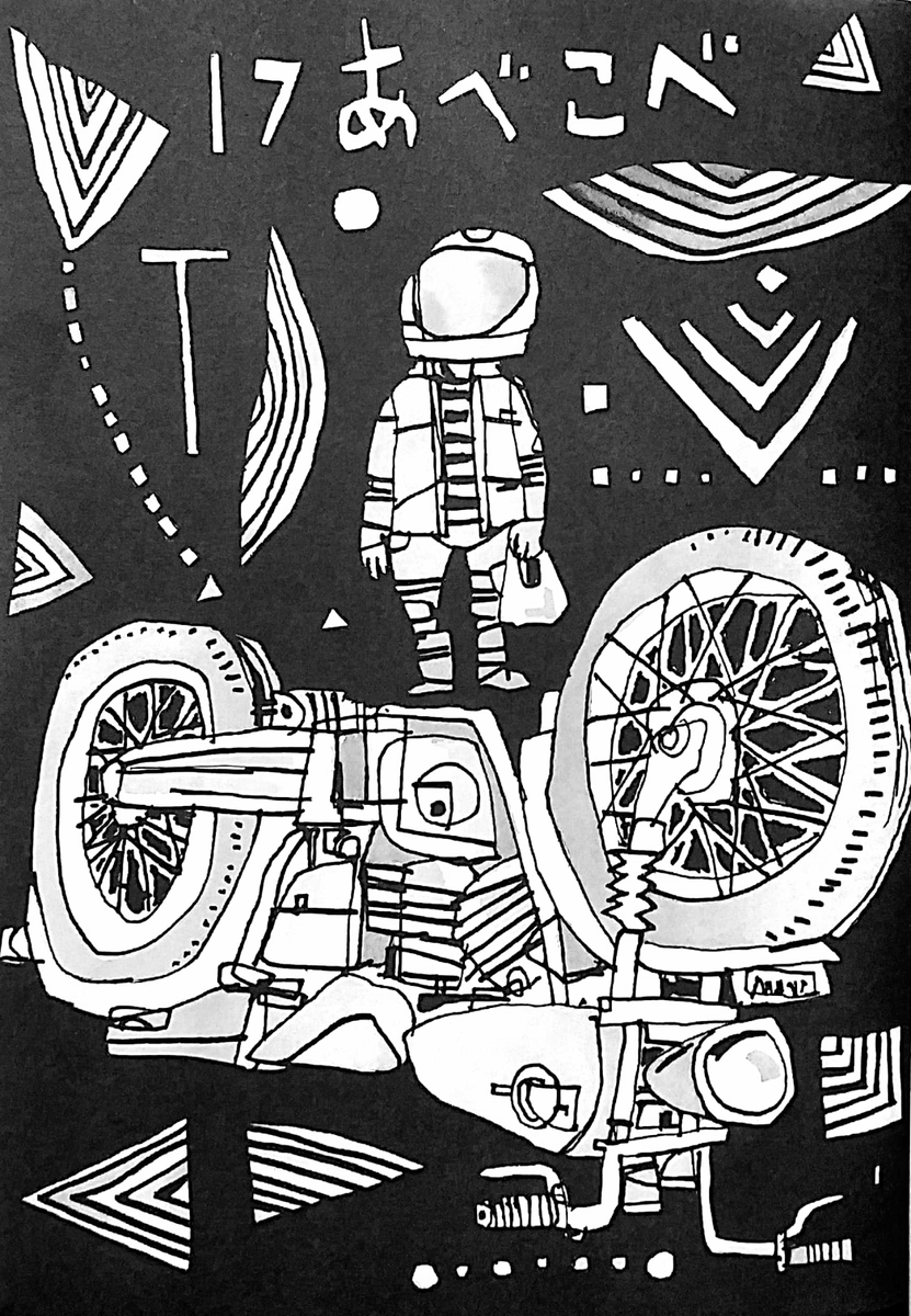
second place goes to satoshi kitamura's illustrations for the japanese editions of the series, which once again have a really fun style while also being almost legitimately. aesthetic. this wins the award for "most aesthetic wayside art style"
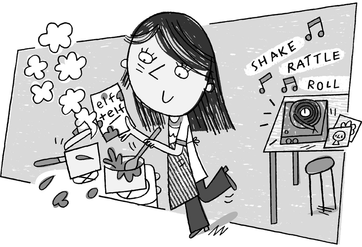
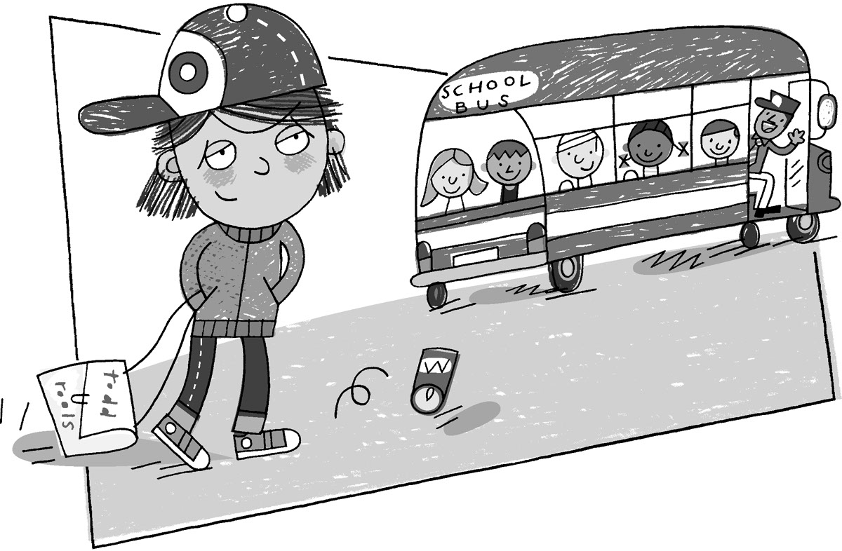
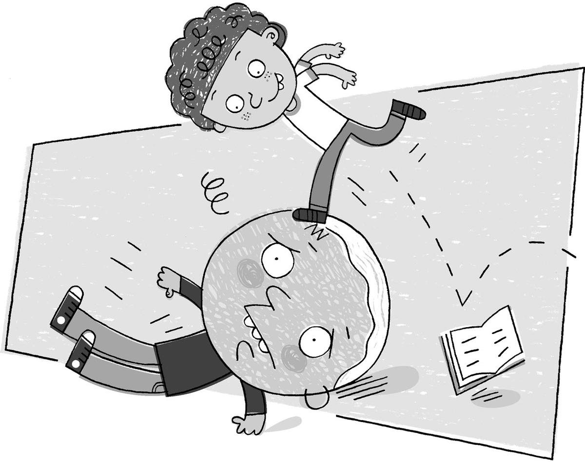
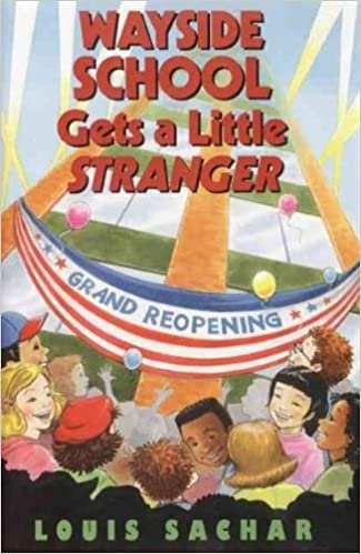
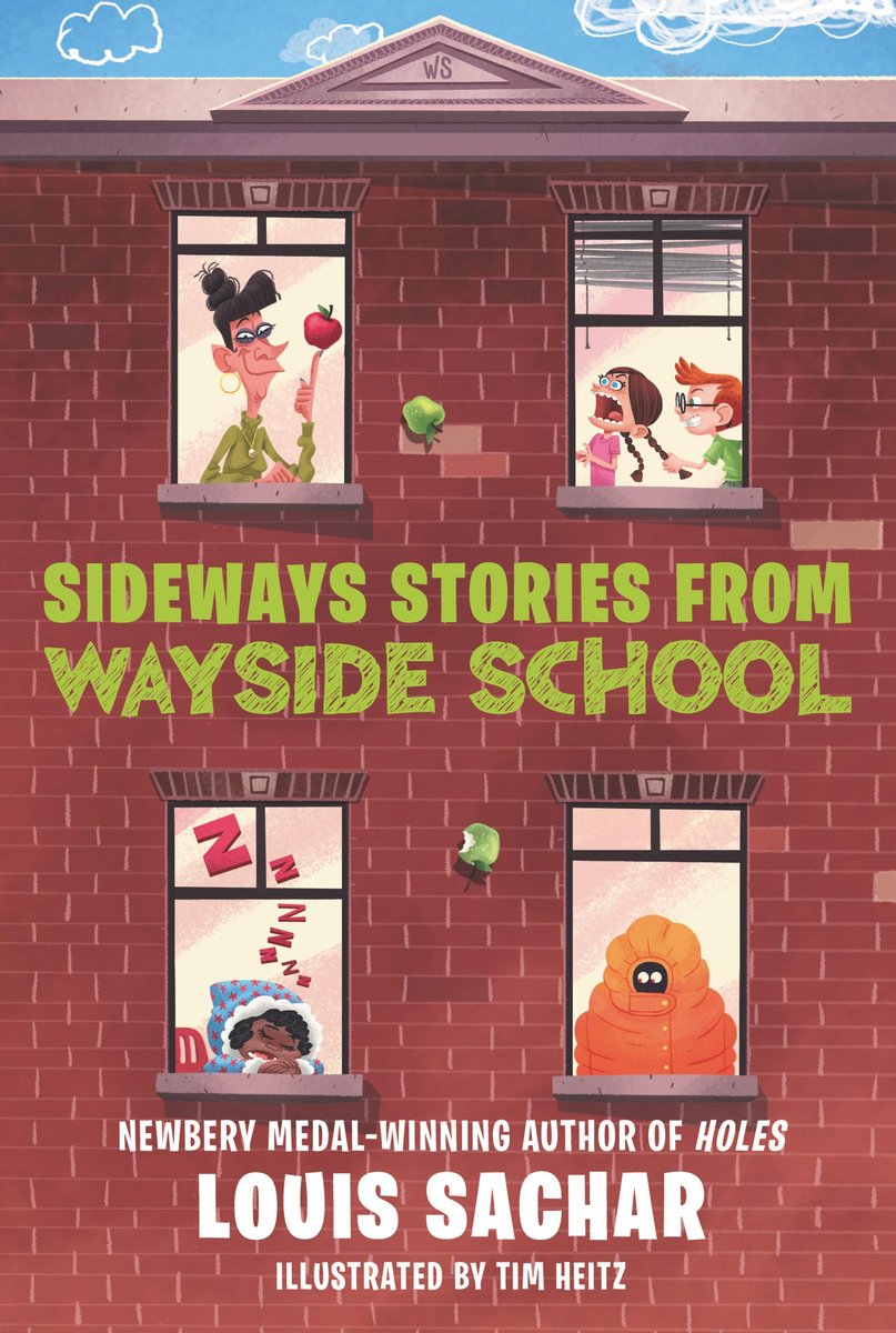
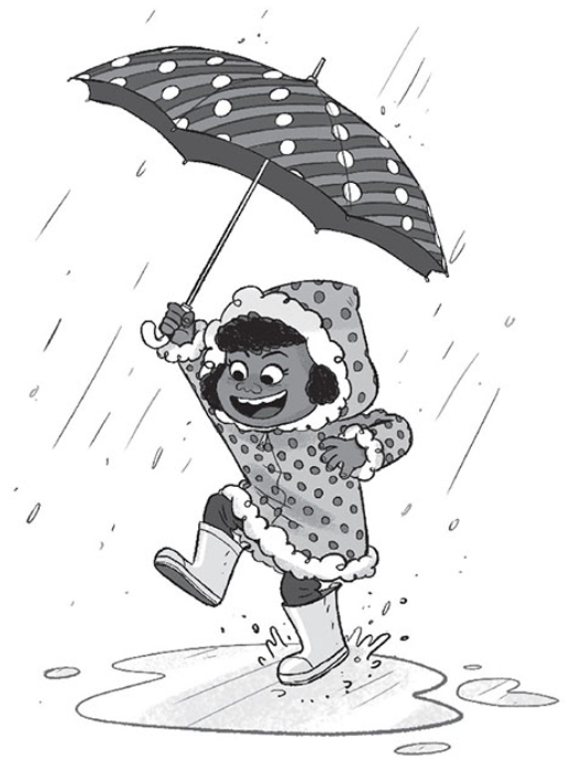
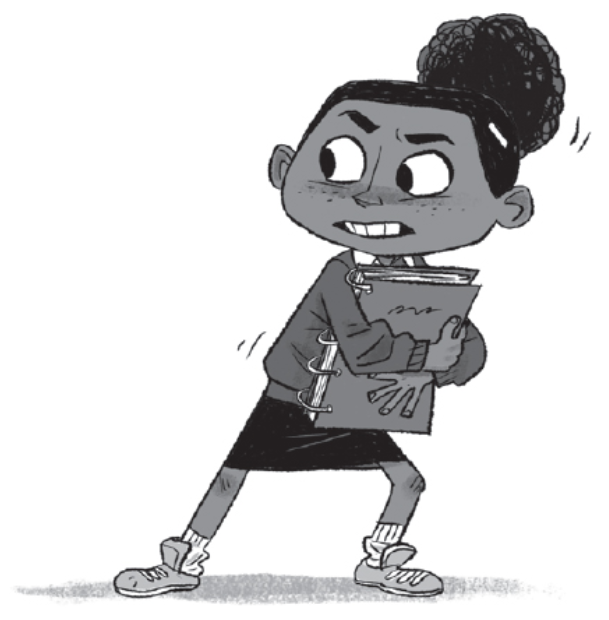
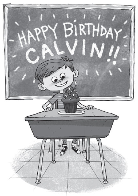
and first place? YOU KNOW IT! TIM HEITZ STAYS WINNING! BEST ILLUSTRATOR OF WAYSIDE EVER!!!
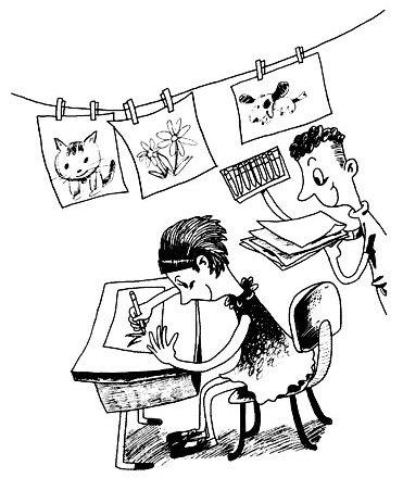
for real, though, this really just feels like the art style that "fits" most to wayside to me. plus the diversity of the characters in this round is just. it's nice. good style.
for real, though, this really just feels like the art style that "fits" most to wayside to me. plus the diversity of the characters in this round is just. it's nice. good style.
so yeah that's about it
feel free to criticize my bad takes in the comments below

 Read on Twitter