Good(ish) morning! I'd like to share this paper we wrote that came out yesterday in @NatureEnergyJnl . It's one of the proudest moments in my academic life and I think it will change the way we see the world. 1/ https://www.nature.com/articles/s41560-020-0579-8
Let's start with credit to first author Yannick Oswald (you want to watch out for this one! it's not so often someone's first paper from their PhD makes it to such an illustrious journal), and to our partner in crime, his co-supervisor @dr_anneowen . 2/
https://environment.leeds.ac.uk/see/pgr/2222/yannick-oswald
https://environment.leeds.ac.uk/see/pgr/2222/yannick-oswald
What did we do in this paper? Quite simply, we measured energy footprints (the energy not just used directly, but embodied in goods & services) over 3 dimensions:
* across 86 countries;
* divided by income classes within these countries;
* and disaggregated by type of product. 4/
* across 86 countries;
* divided by income classes within these countries;
* and disaggregated by type of product. 4/
The energy footprints are trade-corrected: they include the energy used to manufacture & transport traded products.
What did we find? Well the @BBC 's @RHarrabin summarized quite forcefully as "Climate change: the rich are to blame" 5/ https://www.bbc.co.uk/news/business-51906530
What did we find? Well the @BBC 's @RHarrabin summarized quite forcefully as "Climate change: the rich are to blame"
 5/ https://www.bbc.co.uk/news/business-51906530
Indeed, our first headline finding is that the higher the expenditure of an income group, the higher their energy footprint tends to be (with some variation). That by iself is not surprising: it's what we expect from many past studies. 1 point = 1 income class. 6/
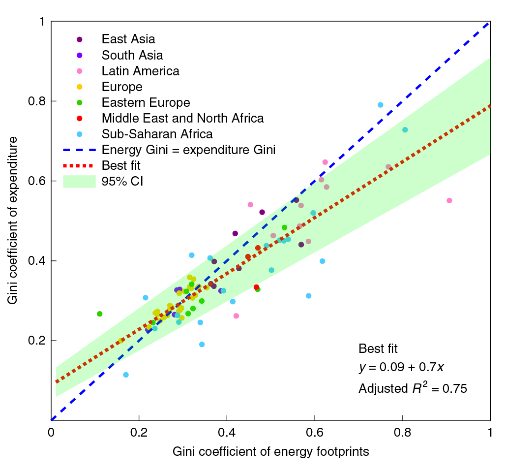
The next thing we looked at was how the inequality in energy footprints compares to the inequality in expenditure. The Gini coefficient is 0 at full equality, 1 at full inequality, so here we see that energy footprints tend to be more unequally distributed. 1 point =1 country. 7/
To compare how different product categories , we focused on two metrics:
* their energy intensities = the energy consumed for each $ spent on that product; and
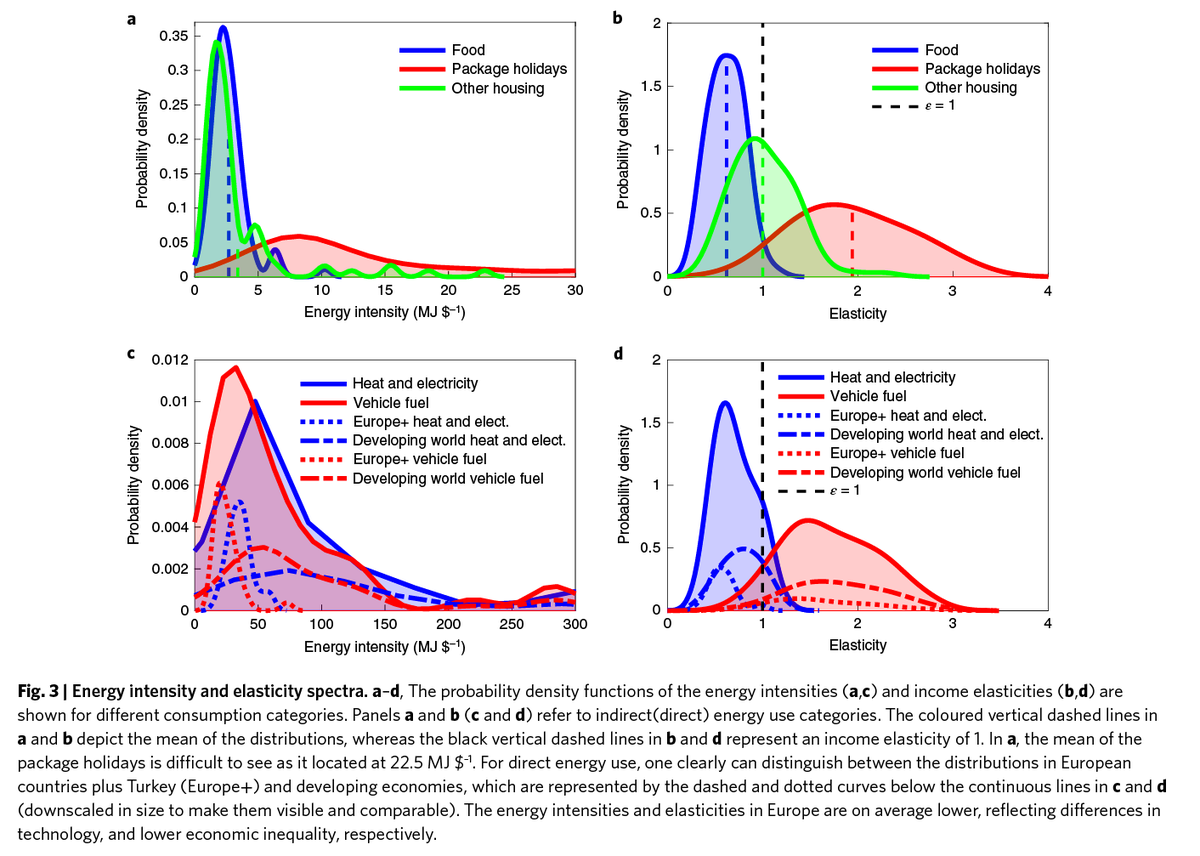
* their income elasticity: if a household earns 1% more $, how much more do they spend on that product? 8/
* their energy intensities = the energy consumed for each $ spent on that product; and
* their income elasticity: if a household earns 1% more $, how much more do they spend on that product? 8/
An elasticity > 1 means rich households consume a product disproportionately: as they get 1% richer, they consume more than 1% more of that product. <1 means poorer households consume it disproportionately. Economists call >1 "luxury" and <1 "basic." Think of brioche vs bread. 9/
As you can see, there is quite a large variation in international energy intensities and elasticities for various products, which is why we show our results as a probability density spectrum. Each product has a relatively well defined peak value, though. 10/
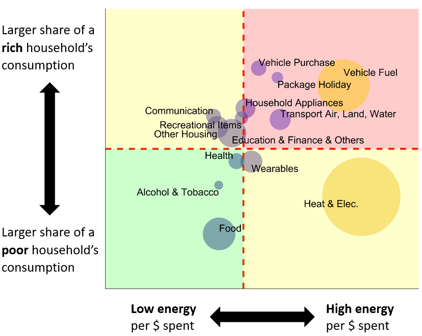
Then we get to the truly exciting part, 11 tweets in, doing #scicomm twitter right as usual: we map products using their energy intensities vs. their income elasticies. The upper-right-hand quadrant shows high energy products that the rich consume disproportionately.11/
The lower-right-hand quadrant shows high energy products that the poor consume disproportionately. Btw, the consumption of every product we observe increases with income, so the rich consume more "Heat & Elec" as their incomes grow: just not _as much as_ their income grows. 12/
I hope you like this figure (I love it!). This is the most important (to me) result of our work. We see that richer households, around the world, tend to spend their extra $ on energy intensive products (urh quadrant). And more specifically? TRANSPORT: land, air and water. 13/
In contrast, poorer households tend to overconsume (proportional to income) only 1 big category of energy intensive products: heat and electricity, i.e. the energy used in homes. There is obviously more interesting stuff going on here, but that's the big take-home message. 14/
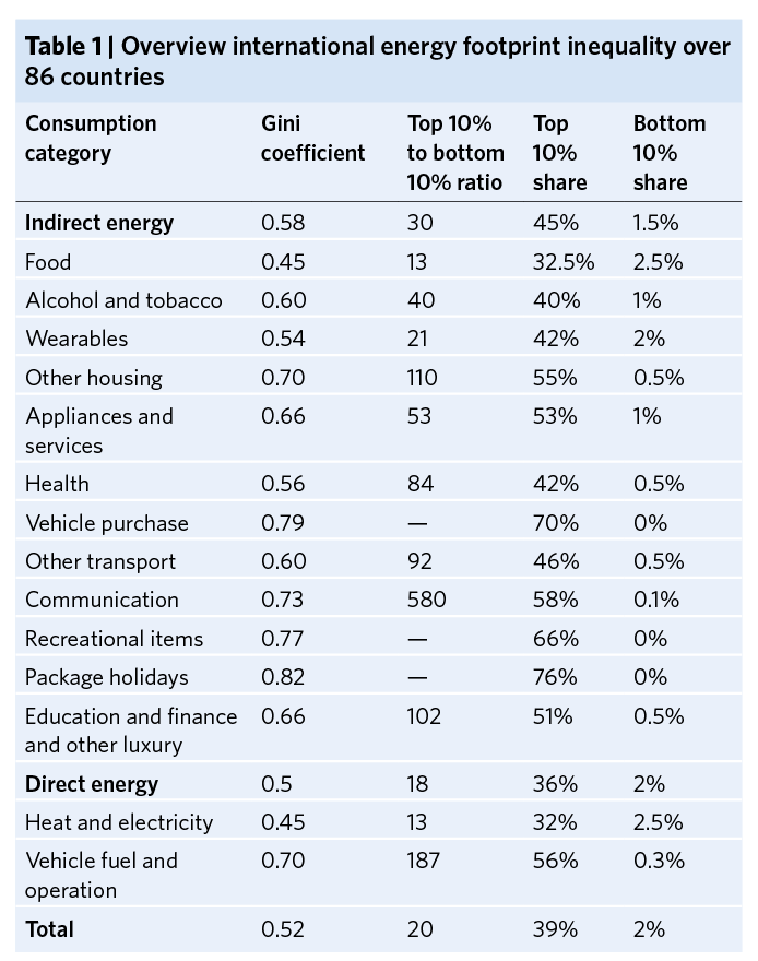
Poorer households are reliant on energy intensive consumption in their homes, whereas richer households spend their larger incomes on energy-intensive transport. We see this reflected in the international inequality of different product categories  . 15/
. 15/
 . 15/
. 15/
The top 10% consume 56% of vehicle fuel, 70% of vehicle purchases, 76% of package holidays. The ratio of the energy use of the top 10% to bottom 10% for vehicle fuel is a whopping 187, but for many categories we simply can't measure it, because the poor consume too little. 16/
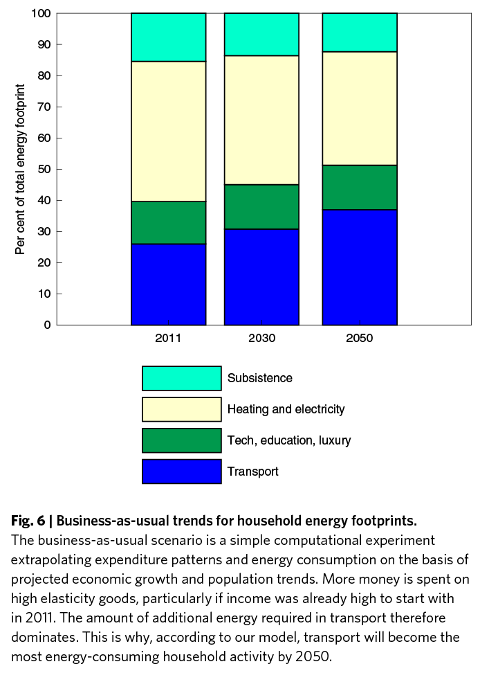
We also ran scenarios based on economic growth projections of the OECD (pre #COVID19 crisis obviously), and found that even with energy efficiency improvements, total footprints would double by 2050, with transport an ever larger share of consumption. 17/
So those are our headline results from the paper. You can find the press release from our amazing @UniversityLeeds press team here (shout-out to @AnaMarvellous!). The photograph Yannick chose to accompany is Mumbai from Johnny Miller's Unequal Scenes. 18/ https://www.leeds.ac.uk/news/article/4562/shining_a_light_on_international_energy_inequality
There is a link to #COVID19 I've been constantly thinking about: how international governments prioritized the air travel of the rich over the health of everyone. Most contagion from country to country happened via flights. Our economies are prioritizing the wrong things. End/
PS: I know the article is behind a paywall: sadly the Nature family doesn't allow open access. However, I'll happily share it with anyone who wants to see the whole thing. Just email me! (email address can be found here
https://environment.leeds.ac.uk/see/staff/1553/professor-julia-steinberger )
https://environment.leeds.ac.uk/see/staff/1553/professor-julia-steinberger )
PPS: 4am first email from the fan club with some truly trenchant criticism, lol. 
No, honey, not blah blah blah: data, data, data.

No, honey, not blah blah blah: data, data, data.
PPPS: free link from @NatureEnergyJnl (thanks!) in tweet below. https://twitter.com/NatureEnergyJnl/status/1240335902725099520

 Read on Twitter
