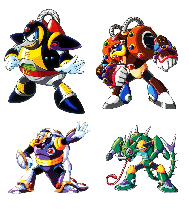
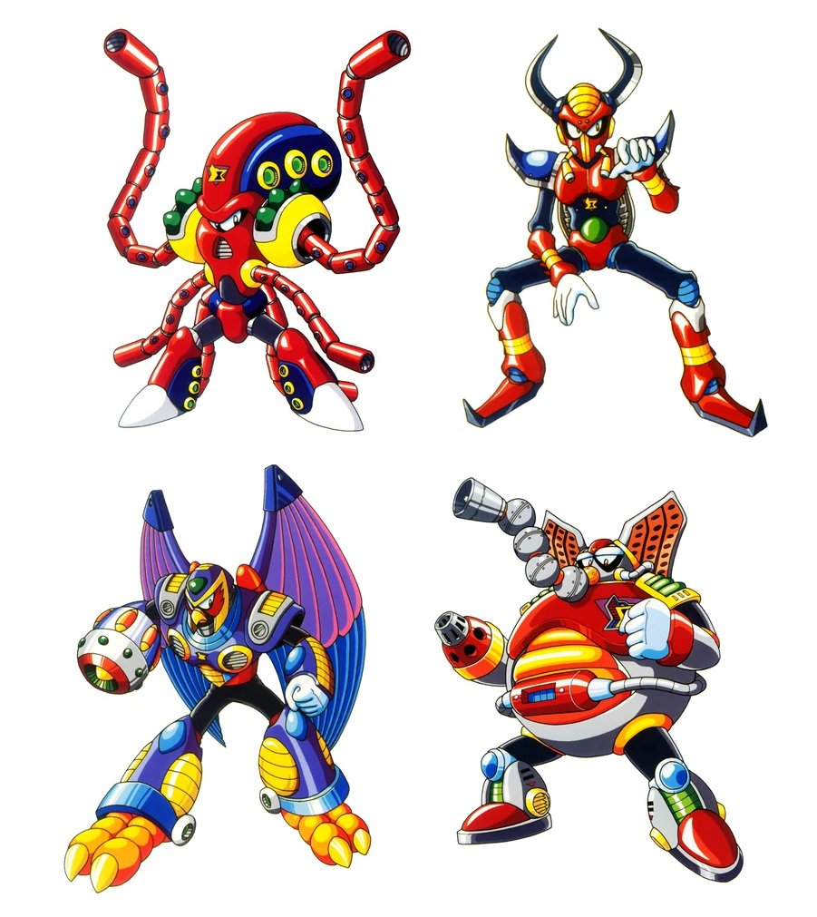
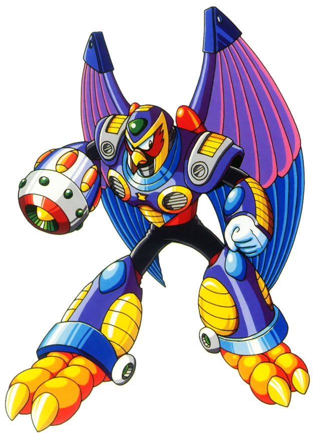
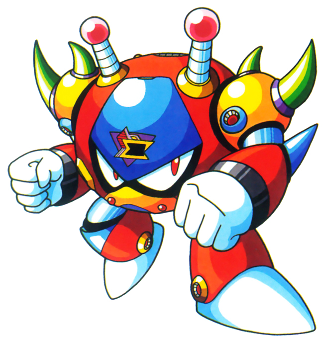
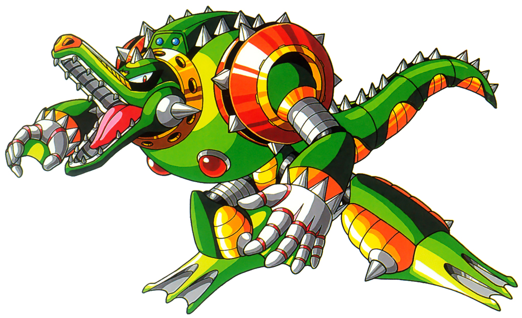
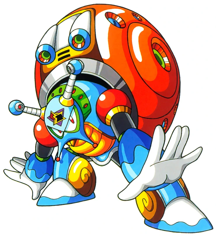
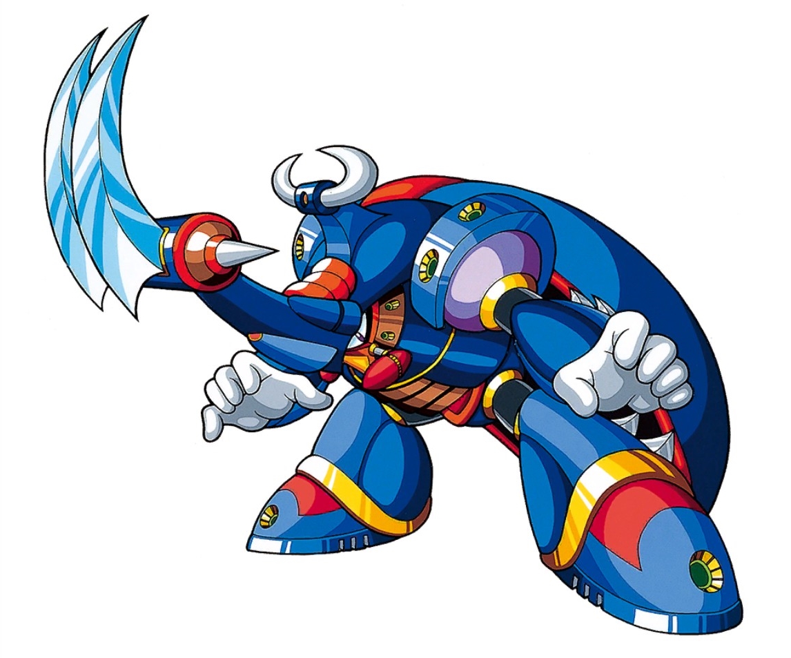
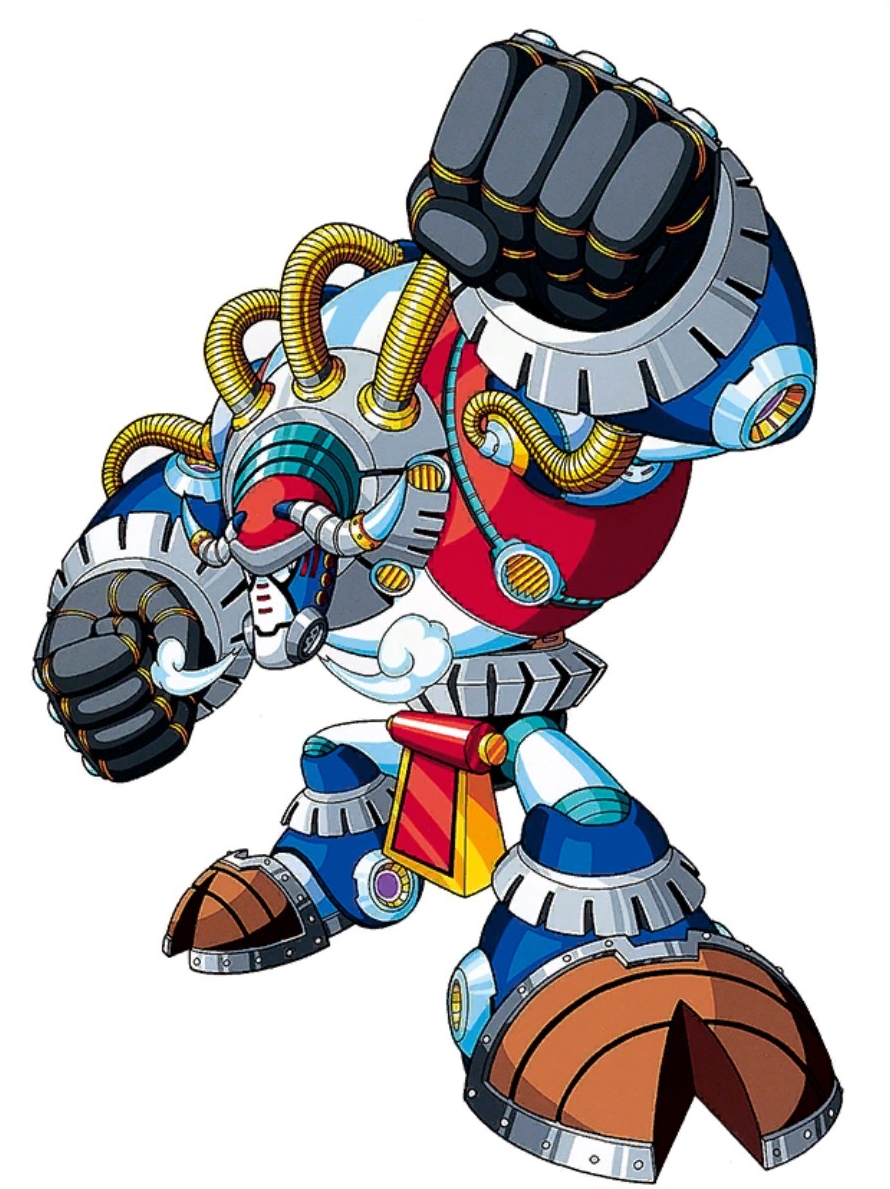
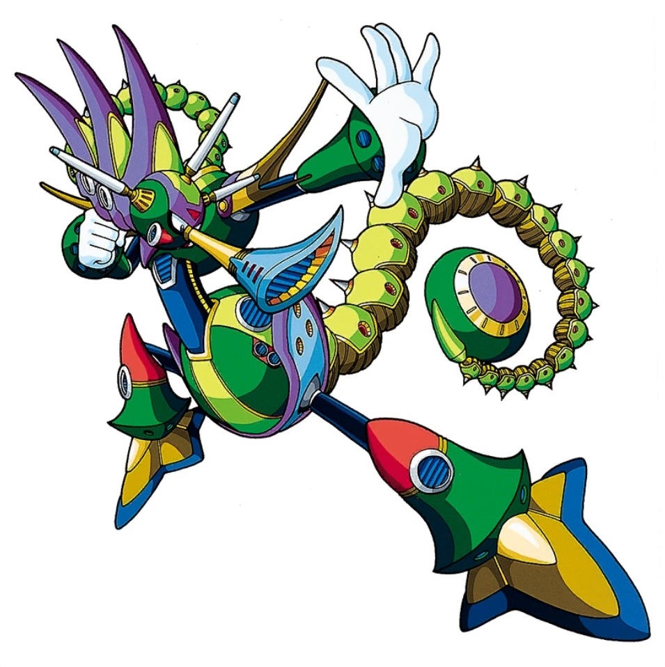
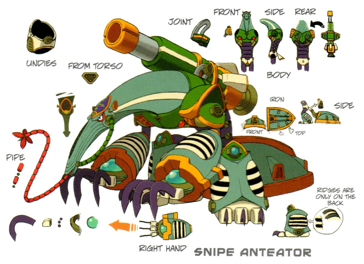
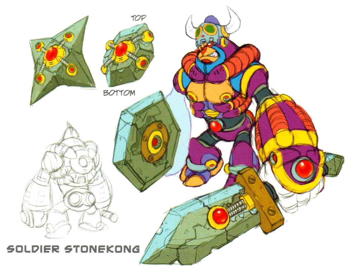
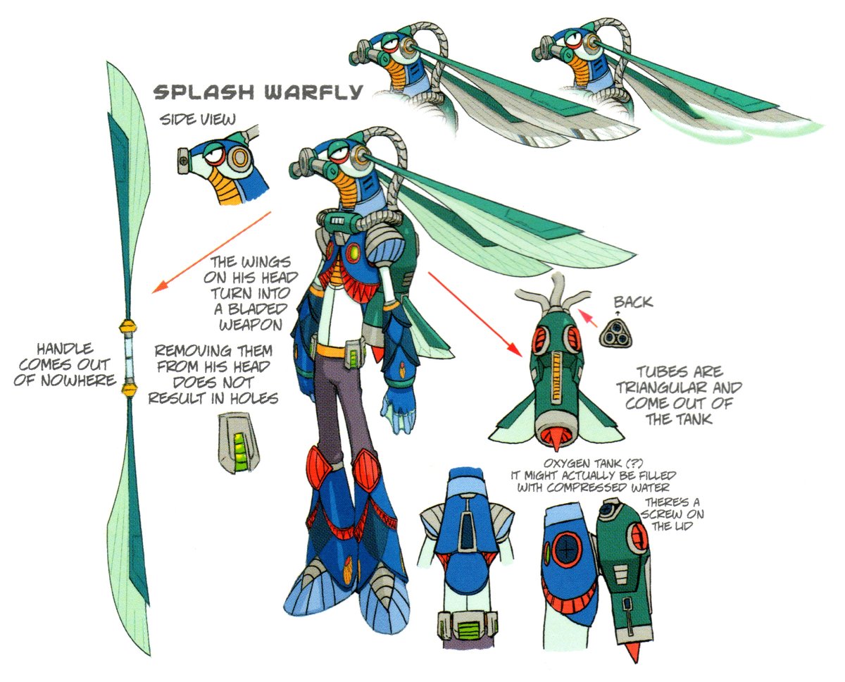
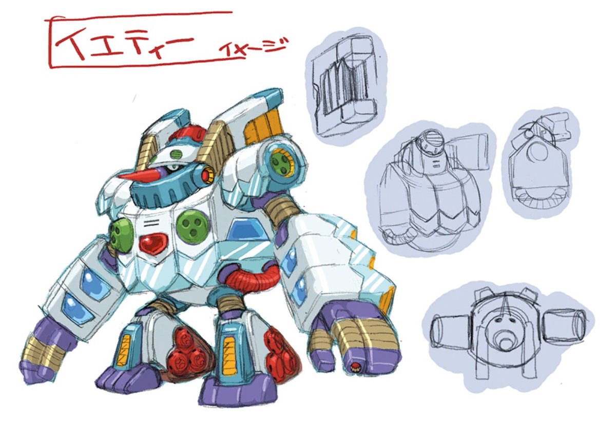
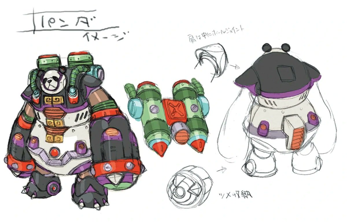
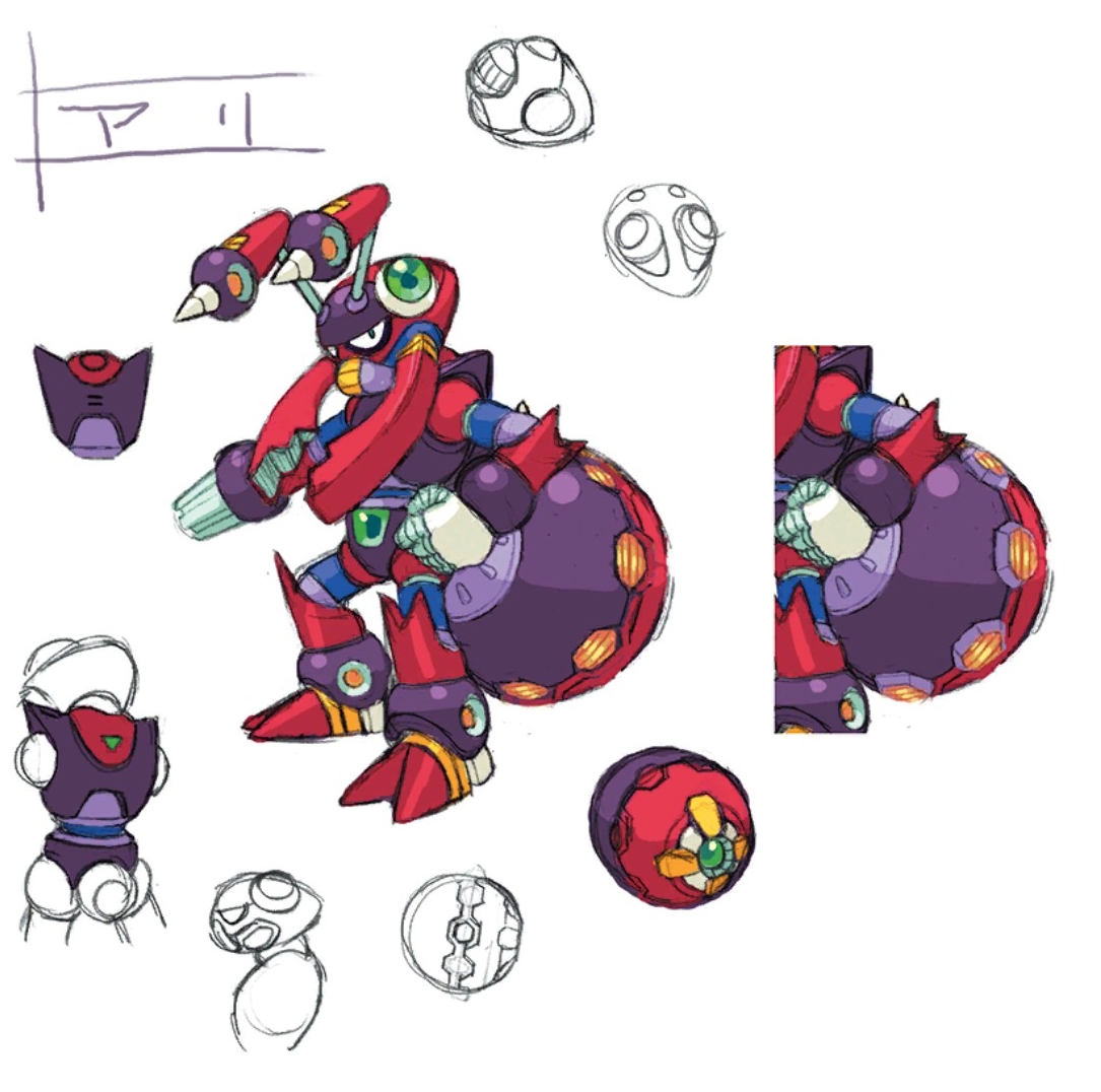
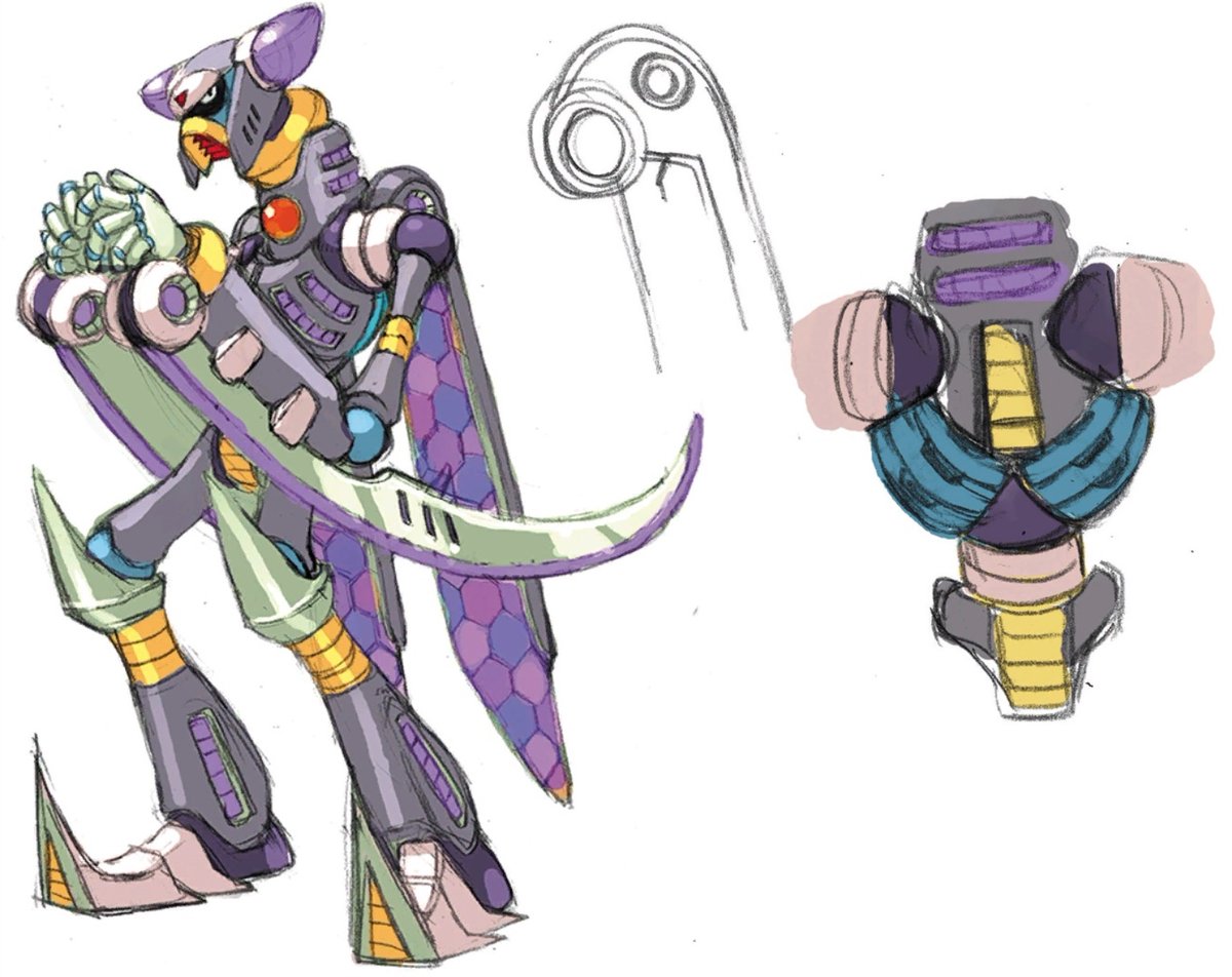
I want to talk about the Mavericks from Mega Man X and how their common design elements help unify a bunch of wild designs into something that feels coherent and Whole.
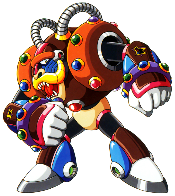
For starters, let's acknowledge how each one of these bastards is lit up like a christmas tree. If you were coloring Spark Mandrill, you'd need 12 different crayons. Everybody has at least 6 colors going on, and most of them have 7 or more. That's so many colors.
But, they're all the *same* colors! Every Maverick uses Black, Red, Blue, and Yellow. and all but 1 of them uses Grey, White, and Green. Orange and Purple are used by half the group, and only Spark Mandrill uses Brown and Pink.
Again, in most cases when you have a cast of boss characters like this, you'd want to give them their own thematic color, and their own element. But in MMX, which of these three are "the red one"?
They each get disparate elemental motifs, but not so much the colors.
They each get disparate elemental motifs, but not so much the colors.
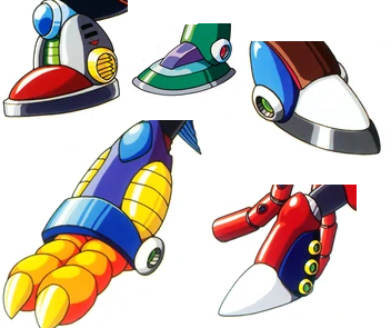
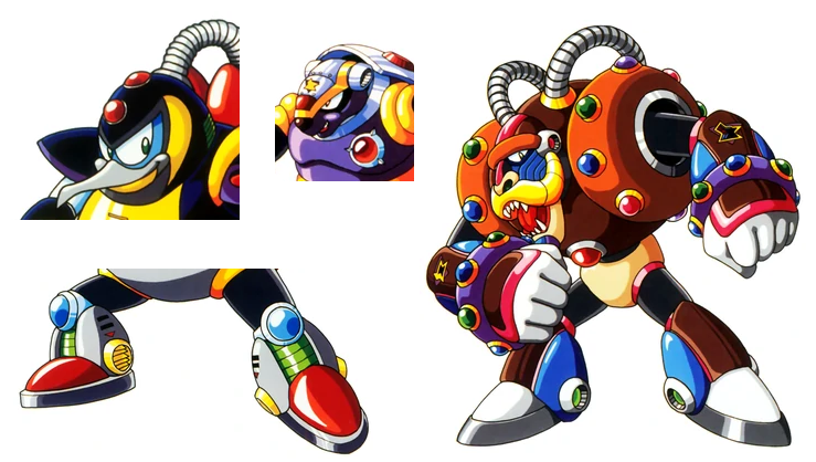
Now, to look at the repeated design elements, starting with the Mega Man house style boots. This started a long time ago, but the Mavericks keep it up. Yes, these are Megaman Feet, alright!
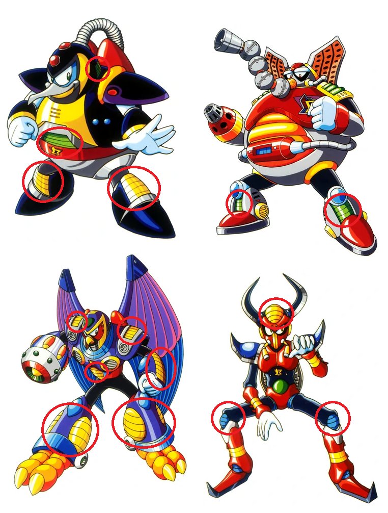
and also take note of how many of them have those weird inset things on their ankles. Sometimes they look like air vents, other times they're just kinda there. I don't know what they're for, either.
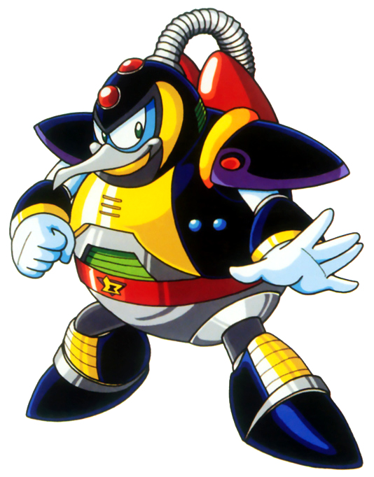
Chill Penguin's over-the-shoulder tubing is shared with Spark Mandrill, and his jetpack is shared with Storm Eagle.
another repeated element are these panels with parallel lines. They appear both inset and bulging outwards, usually in yellow but sometimes in green.
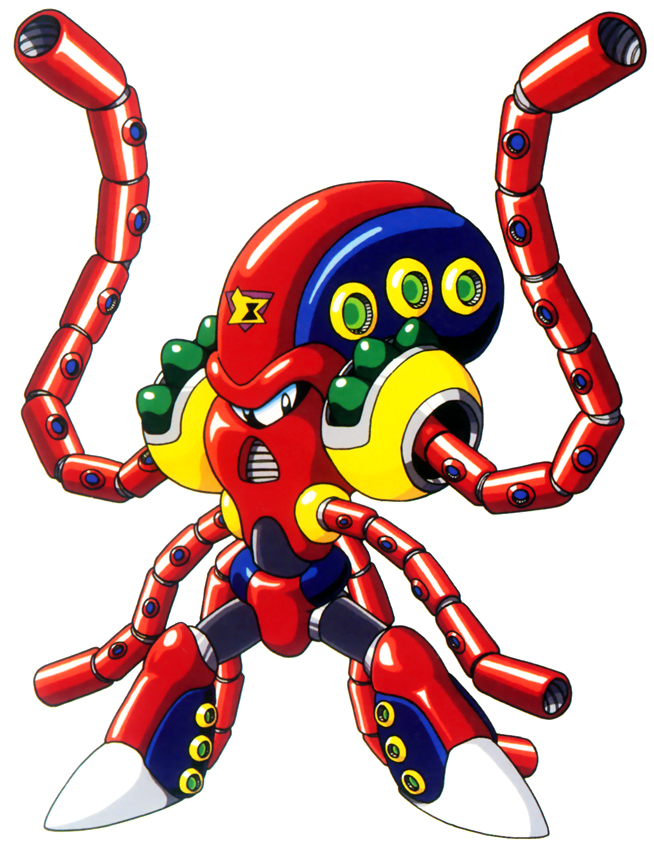
How about the way Launch Octopus's tentacles are clearly made with the same segmented design that forms Sting Chameleon's tongue and tail?
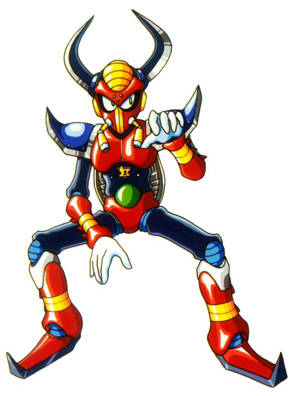
and sometimes it's as simple as white gloves, with black limbs, and colored connective tissue around the hips/knees/elbows. And their eyeshape and pupils are fundamentally the same, too!
Chill Penguin's head, Armored Armadillo's torso, Flame Mammoth's knees, and Spark Mandrill's... everything are festooned by what appear to be lights. The same ones that are installed in Zero's chest. Consistent design!
Much of these design motifs carry through to X2 and X3. Look at these designs and really count the number of colors, notice how often they use the whole damn box. See the repeated shapes of the arms and legs, the white gloves, connective bands, ankle insets, random lights...
X2 seemed to use more Pink and Orange, but color schemes are still crazy go nuts.
And, if it wasn't obvious - the Sigma logo! Adding an insignia is an easy way to make a group of enemies look contiguous.
And, if it wasn't obvious - the Sigma logo! Adding an insignia is an easy way to make a group of enemies look contiguous.
X3 starts to drift a bit - hardly anybody is sporting those Zero Boob Lights, and instead there's a lot more of these inset things. Not just on ankles, they show up on toes, claws, and shoulders as well.
Also, air vents are big. But the crazy color schemes remain, just look at Toxic Seahorse - you'd call him "green", right? Except he's using purple, blue, yellow, and ANOTHER shade of blue as accent colors. It's so much!
Between the three games, we can point out further areas of repetition, such as Flame Mammoth's trunk, and Magna Centipede's and Toxic Seahorse's tails. All using a series of orbs.
So what changed? Well X4 came out a few years later on the Playstation, after the original trilogy. And sure, some of these Mavericks feel right at home - Split Mushroom, Storm Owl, Web Spider, etc. We can see the familiar traits, and abundance of colors.
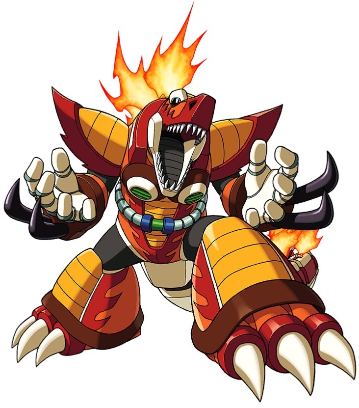
But then you got these other guys like Magma Dragoon and Slash Beast. They're trying, but like... something's not right.
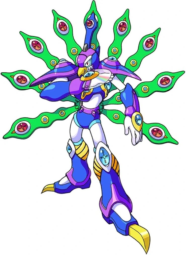
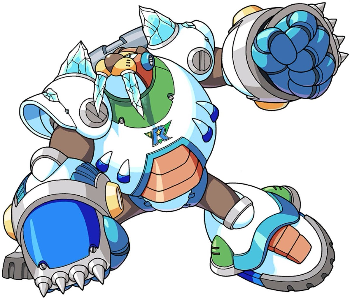
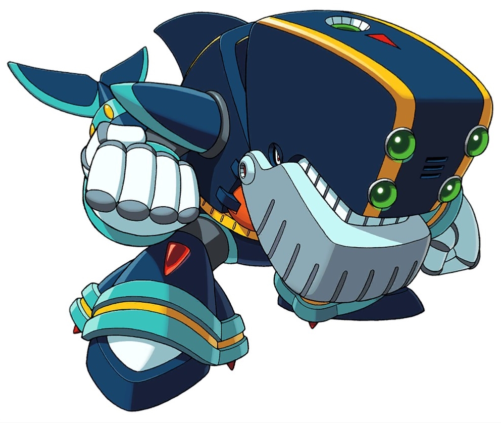
Cyber Peacock, Frost Walrus, Jet Stingray... the truth is, they're just too damn color coordinated. How come this Peacock has less colors than X3's Seahorse? These guys look like Mega Man Zero bosses, not the Mavericks of the original trilogy.
You come to X5, and the "problem" as gotten even worse. And I say that in quotations because these are GOOD DESIGNS. They just don't closely follow the principles of the first few X games.
Putting a classic design like Storm Eagle alongside these guys from X6 really shows the difference, I think.
Again, not to say that X4-5-6 are "worse", but they don't mesh in with the first 3 games.
Again, not to say that X4-5-6 are "worse", but they don't mesh in with the first 3 games.
I suppose it's worth mentioning that they certainly all blend in with each other just fine. And even as I call them heretics, you can see those classic lights, segmented panels, and black limbs. It's not totally removed.
Then in X7, things changed again. The designs got crazier than ever, and also started getting randomly colorful again! You wouldn't mistake these for X2 bosses anytime soon, but I think they follow similar color principles and share more design elements.
X8 continued in this vein, incorporating a lot more purple. These designs are busy and chaotic and a lot of fun.
In any case, it's interesting to look at the design evolution of a series over the course of a decade. I don't expect things to always stay the same, and it's probably good to change it up before it gets stale.
But I think many of the complaints people have towards modern Pokemon designs could be similarly examined - rather than just saying "the style has changed", it's that the "rules" of color use, and the specific repeated elements have changed.
But that's another thread!
But that's another thread!

 Read on Twitter