In the light of a misinformed tweet that sparked a discussion on materials used in early Qur'ans ( https://twitter.com/CellardEleonore/status/1208472643114012672), I thought I'd make a thread about such materials (inks and pigments), at least the ones I'm familiar with. This area is highly misunderstood,
mistranslated or taken for granted, because unless you have access to lab analysis of manuscripts, you need to have working knowledge of medieval art materials to navigate often misleading Arabic terminology, not to mention being able to make sense of them visually.
Natural and historic inks, dyes and pigments are an area I'm fully immersed in and very passionate about, so I hope to shed a bit of light here. It's also seriously exciting, so here we go.
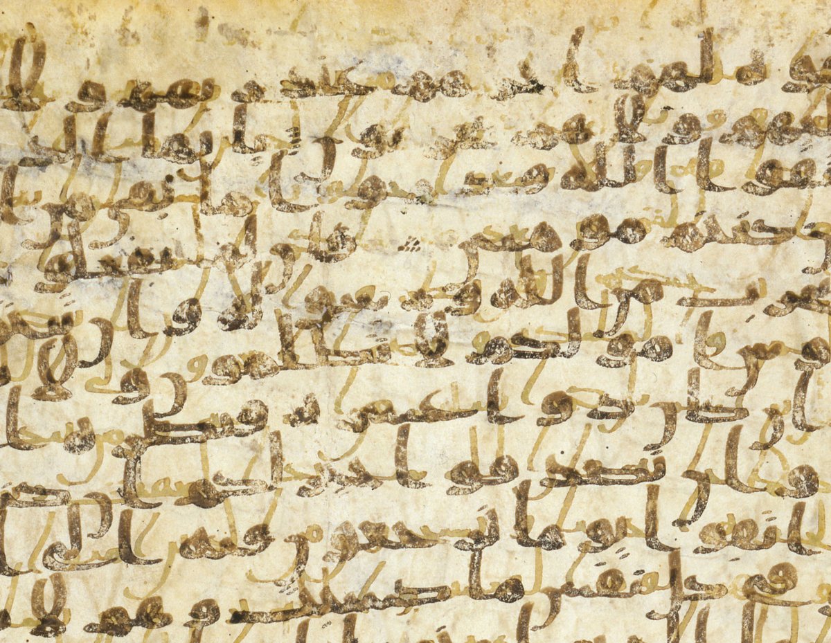
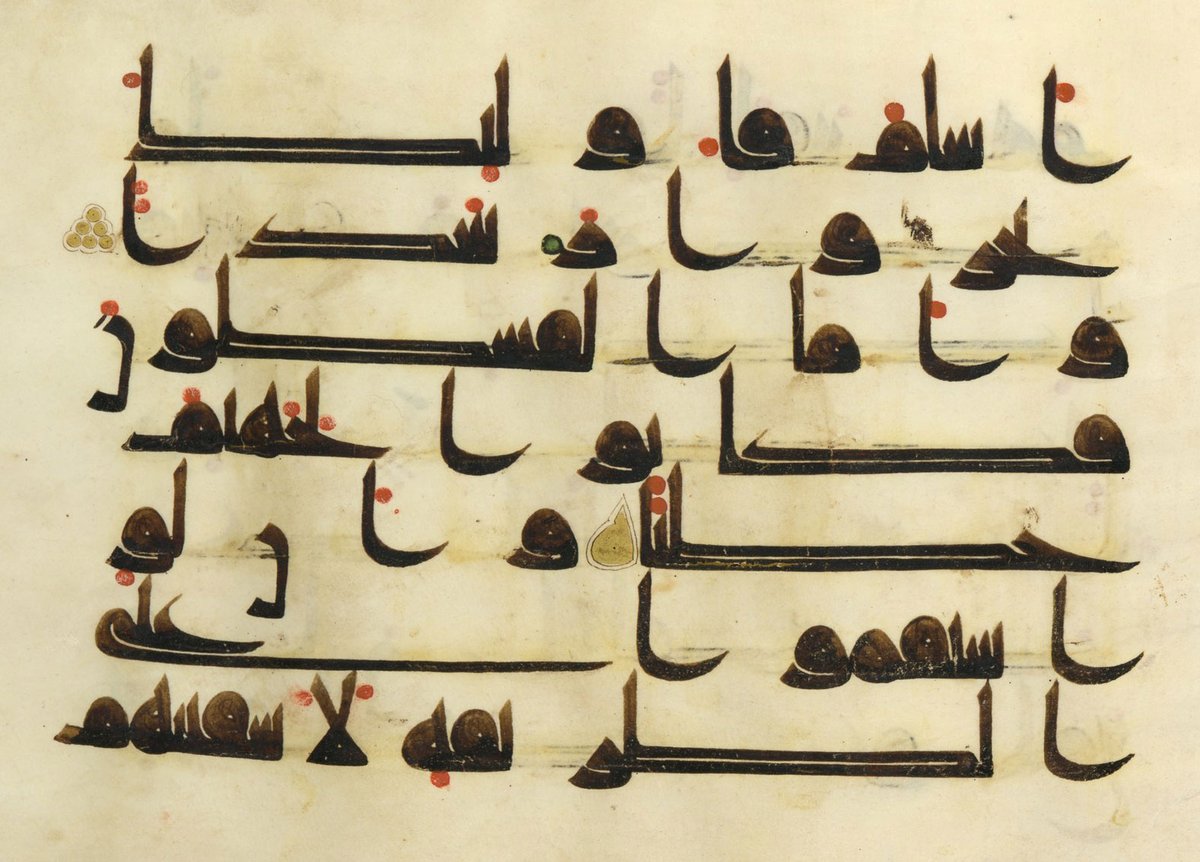
Starting with the most important: the ink! In the history of Arabic calligraphy, two types of ink have been used: tannin-based and carbon-based. There are several recipes for each, and some use both tannin & carbon, but this broad division is easy to observe.
Tannin-based ink was حبر proper, and necessary for writing on parchment, as the acid content bites into the surface (where carbon ink can be washed right off). It was and is still made from oak galls عفص البلّوط better known in Lebanon/Syria as كحل البلّوط , with the addition of
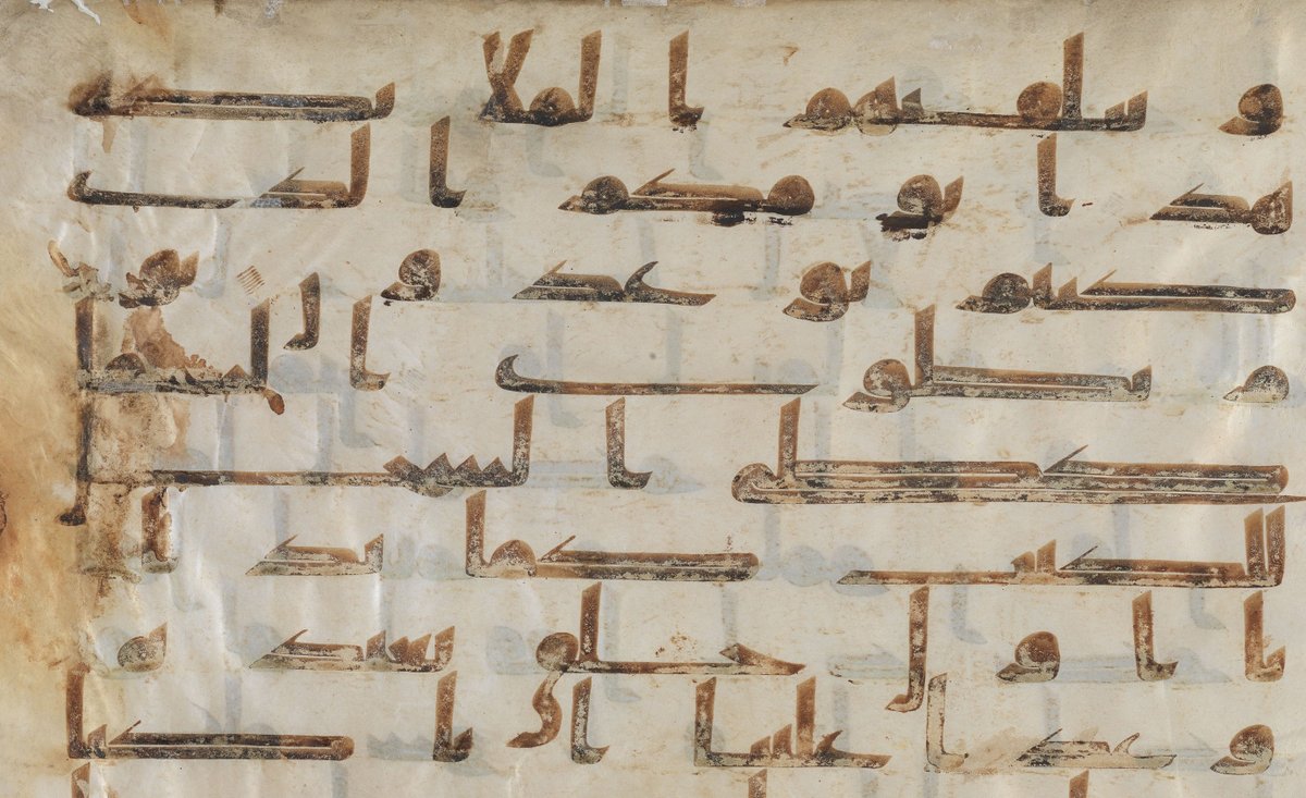
iron sulfate زاج أخضر to turn it black. Other ingredients may be present ( @CellardEleonore knows more about this) but this is the unchanging base. This is the ink of early Qur'ans in Kufic and Hijazi scripts.
If the ink is brown instead of black, that's purely the effect of time: the tannin/iron dosage is delicate, and if the mixture isn't balanced, the ink can eat through the parchment in time or fade to brown. But at the time of writing, it would have been a deep transparent black.
The introduction of paper brought carbon-based ink, originally known as مداد, to the fore, to the extent that completely superseded حبر and took its name. This ink is opaque black and is basically made of soot – originally the deposits on oil lamps (the artist's lamp black).
Counter-intuitively, opaque black appears less dark, so this ink requires a glossy finish in order not to look dull grey. Gum arabic صمغ عربي is an indispensable binder in ink. Oakgall ink (and any dye-based inks), being very watery, requires this "glue" to create surface tension
and carbon-based ink requires a larger amount of it in order to have the necessary glossy finish. This also makes the ink more viscous. If you're used to working with carbon ink, tannin ink is startling at first because it's so thin and transparent.
Now the real fun part is other colours. I should mention here that as part of my research (seriously), I've been poking around in traditional spice shops, the type that have operated in the Middle East for centuries.
I went armed with a list of ingredients found in historical ink recipes, and ALL of them can be found in these shops – indeed most of them are also food and/or medecine, including oak galls, provided you know the names and ask for them. This is worth bearing in mind because
I believe this can provide insight into what was available to calligraphers to prepare their materials (setting aside some special rare materials like blue pigment which I will discuss later). And it can also fill gaps where textual sources are misleading due to ambiguous words.
For instance, the recent "saffron water" debacle. There's no question saffron was not used that way. Saffron زعفران can be used to make a dye, and that can be made into an ink by adding gum arabic binder. However, being of botanical origin, such an ink would fade within
weeks or even days if exposed to sunlight. Between closed pages, it could last much longer, but certainly not keep its brightness for centuries. In western illumination, saffron mixed with blue to make green has faded from the mix, leaving only blue behind. Regarding Islamic
manuscripts, I know of one recipe to make "reddish-gold ink" that calls for saffron dye pressed against "red arsenic" زرنيخ, that is realgar رهل الغار , a classic, very toxic but stunning orange pigment. The effect would have been to highlight its hue with bright yellow, but
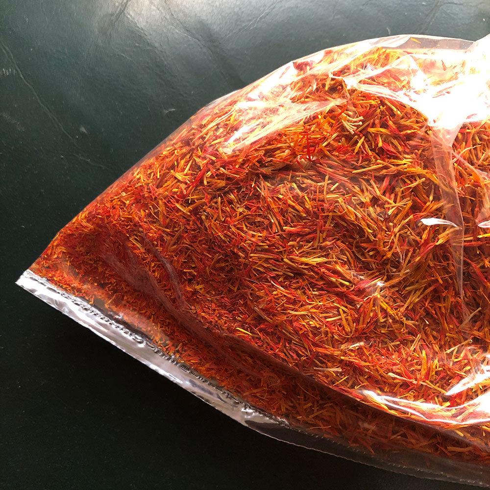
you can be sure that in time the "saffron" effect would have faded. Realgar is permanent, however, so the gradual loss of yellow wouldn't be noticeable. But why are we speaking of saffron in the first place? زعفران, as my explorations have confirmed, refers equally to safflower,
which is much cheaper but a famous source of red and yellow dyes. Saffron cannot be outdone for flavour, but has no particular superiority in terms of colouring power. I strongly suspect that when زعفران was used, this reffered to safflower and not saffron at all (unless some
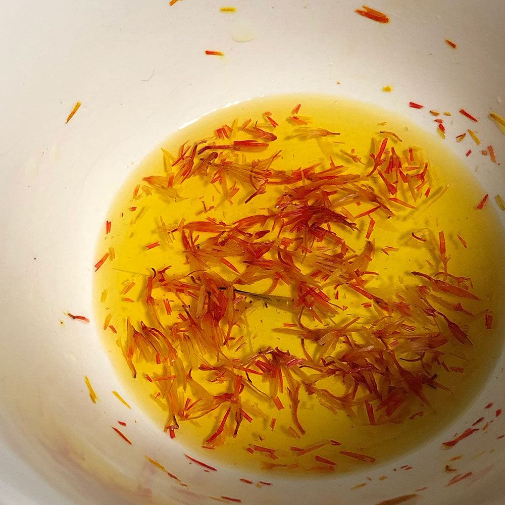
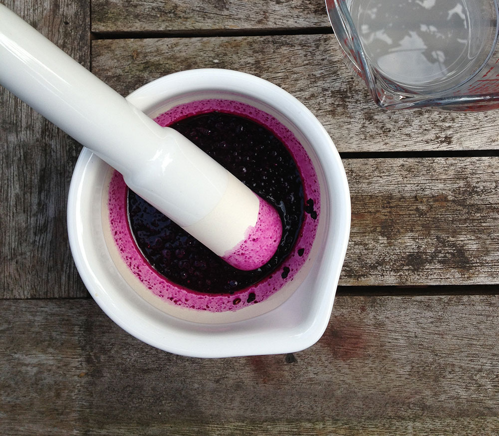
showing off of wealth was involved.) Here is safflower I bought today, & the dye it started releasing after a few seconds of steeping. It was labelled "saffron" in Arabic and English, & the buyer is expected to know from the price which is which. Old texts would be no different.
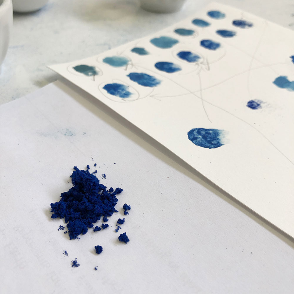
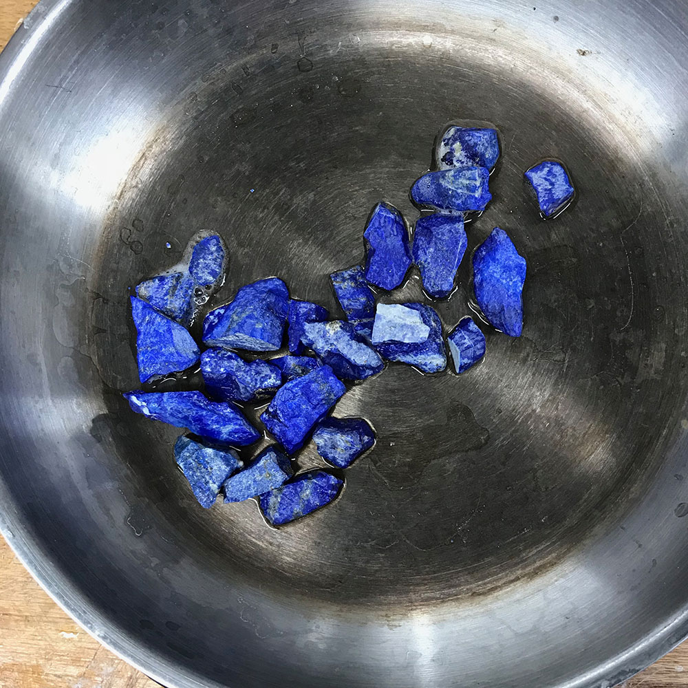
A similar and more serious confusion exists around lapis lazuli. All use of blue tends to be described as "lapis lazuli", and I even saw a mention of paper dyed with lapis  That's what happens when there's no hands-on experience. Let's look more closely at instances of blue!
 That's what happens when there's no hands-on experience. Let's look more closely at instances of blue!
Pre-modern Arabic only had the word لازورد , imported from Persian, to describe two different minerals: lapis lazuli proper, and azurite. Both beautiful blues, but NO chemical relation. Both expensive, but azurite less so, because it is found all over the world & quite simple to
process, while Lapis strictly came from Afghanistan and is the very devil to extract. I don't know if Islamic illuminators sourced & processed the raw material, or only sourced the ready-to-use pigment, in which case they might not even know (or care) they're different minerals.
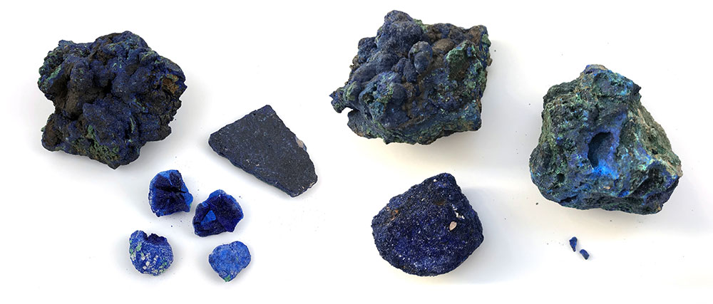
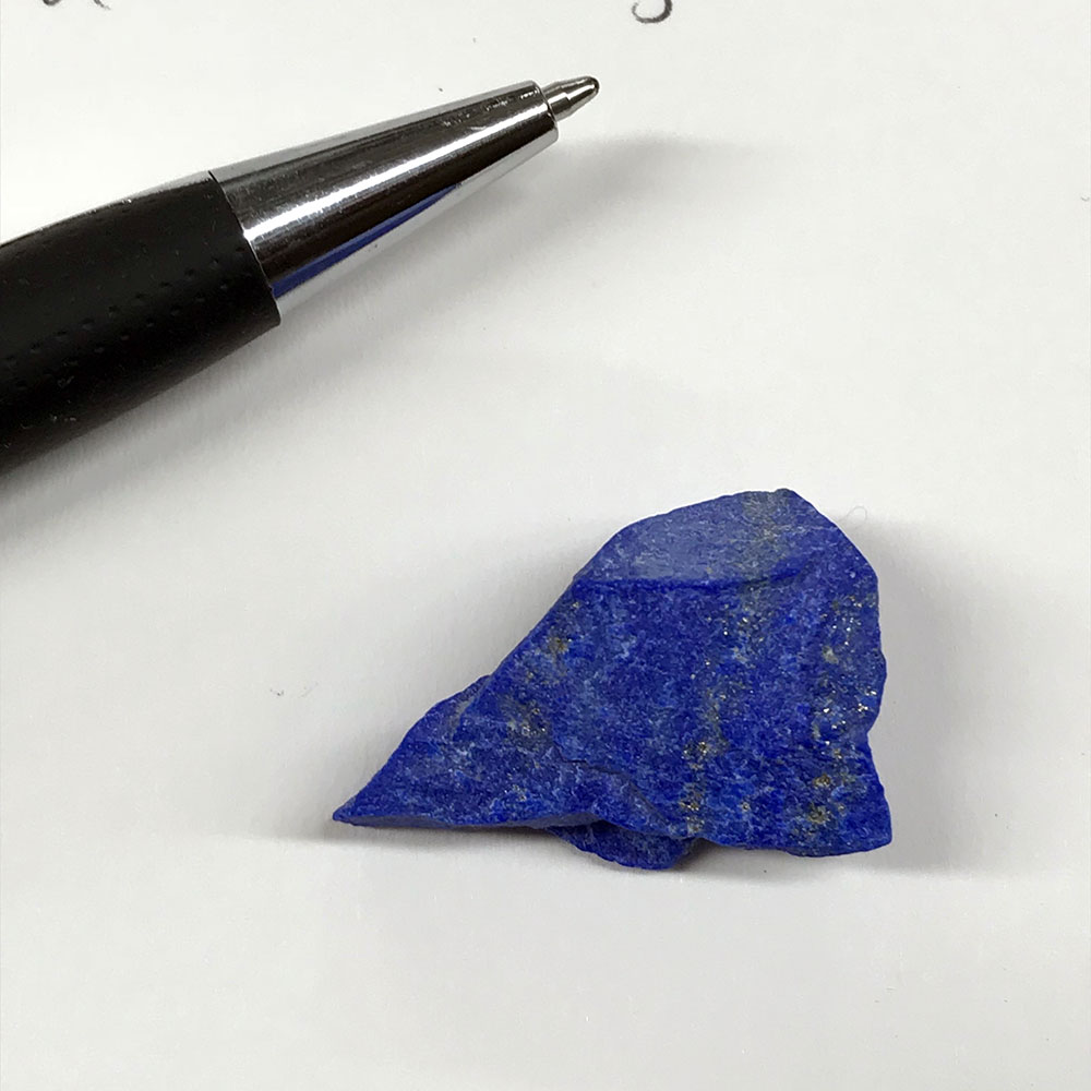
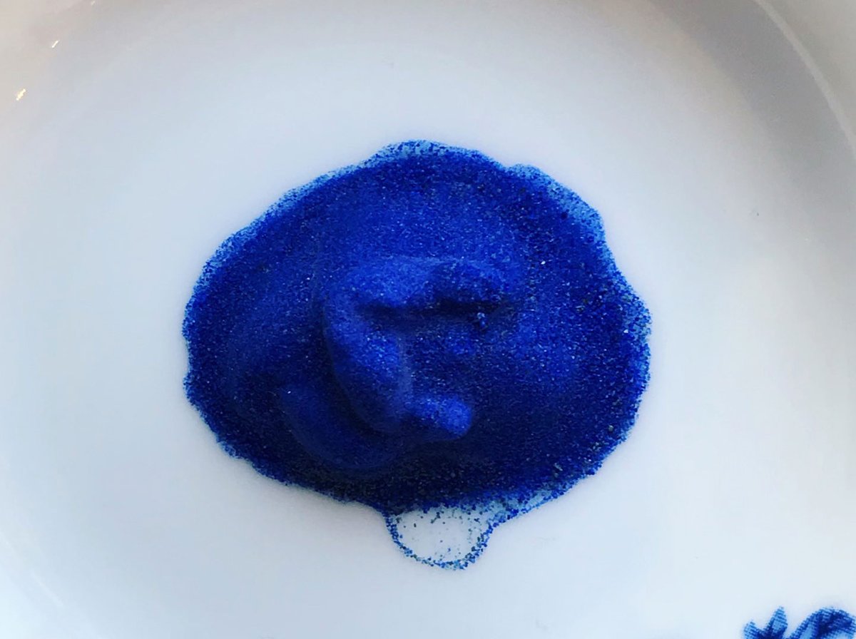
Either way, textual sources only referr to لازورد. But here's the essential difference, that anyone can spot with the naked eye: azurite is ALWAYS tinted green, no matter how slightly, and lapis is NEVER greenish, it's a red-hue blue. This because azurite is a copper carbonate,
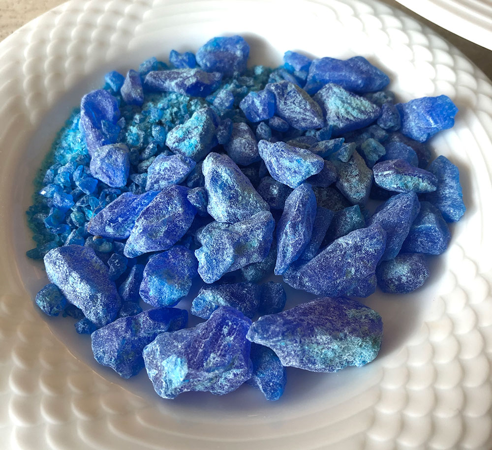
with the peculiarity that time (and water molecules in the air) slowly turns it to malachite, which is as green as anything. The older the azurite, the more obvious the green tint. Lapis suffers no such discolouration. Here are azurite samples: greenishness is evident.
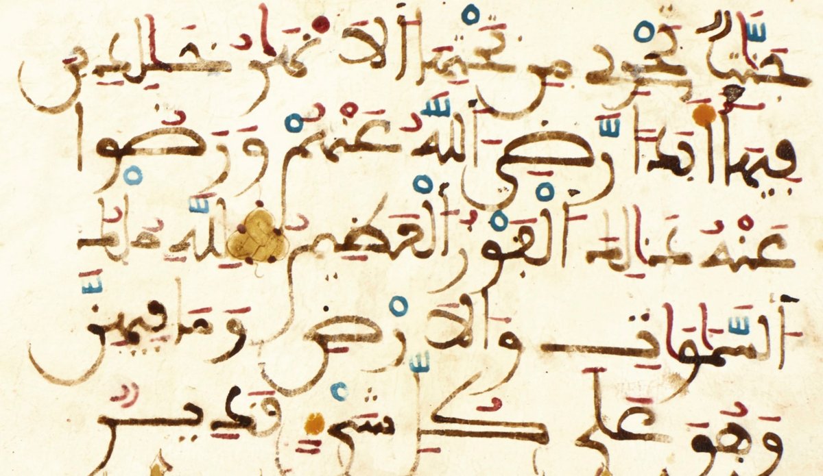
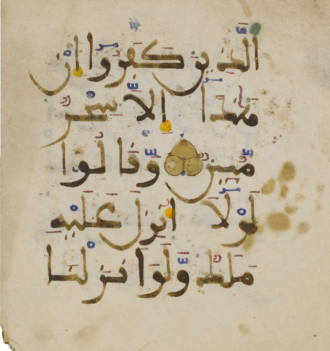
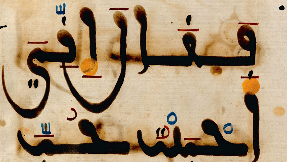
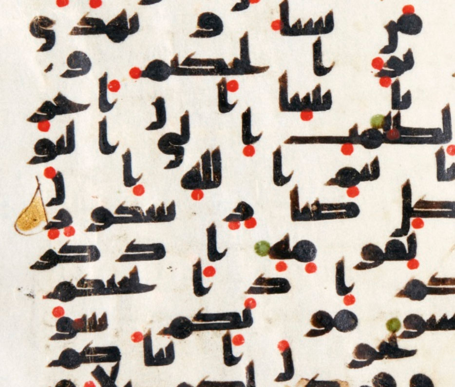
Now here's a detail from a Maghribi MS. The blue diacritics? Not lapis. Even with the likely colour inaccuracy due to looking at this on a monitor, this is most definitely azurite.
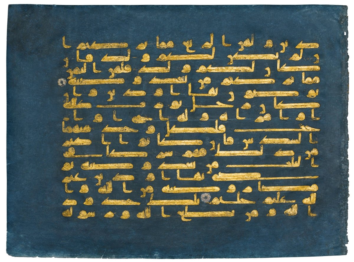
Here on the other hand, we are almost certainly in the presence of genuine lapis lazuli. I'm only uncertain because I don't know if the colours are quite true to life. But you can tell the difference, right?
True ultramarine (pure extracted lazurite, as opposed to just getting the purest possible mineral and grinding it up whole) did not appear in Europe before the 12th c. but was known to the Arabs earlier, as the first descriptions of the process come from Arabic alchemical texts.
However, it is incredibly labour-intensive, hence costly, & one shouldn't expect to see this pigment used in anything but the most special works. My personal opinion is that it'd be reserved to illumination, where the incredible blue can shine; harakat are rather a waste of it!
Some time ago I saw a post about a European MS on parchment "dyed with lapis lazuli". Yeah no. Even if someone had that kind of cash, it's physically not possible. So now I have to explain the difference between dye and pigment, which is not even clear to artists nowadays.
A dye (and ink = dye + binder) is colour in SOLUTION. It has no body whatsoever. If you boil it down, nothing will remain except a mere film of colour. When you dye something, the colour penetrates & becomes part of the dyed material. It's subject to fading but can't be removed.
A pigment (and paint = pigment + binder) is colour in SUSPENSION. It has body, often more body than water. Boil it down & you get a solid that can be ground into powder. You can't dye with it, you can only paint it on (using a binder). Without binder it can be brushed right off.
Nearly all dyes have an organic origin (plants or bugs). Nearly all pigments have a mineral origin. Lapis lazuli is certainly a pigment, not a dye. To create such a background colour using lapis, it'd have to be *painted* on. It's very transparent, so we're talking many layers.
And then what? I don't know any way you can paint a background and then write calligraphy over it. What binder would you use? Gum arabic remains water soluble. Egg tempera & egg glair create a substantial film. The idea of a lapis background is unfeasible any way you look at it.
There's only one way (speaking of premodern times) to achieve a dark blue page: indigo dyeing. Indigo is a wonderful dye that's been known to humanity since antiquity. It also spontaneously produces a pigment: the foam that forms while boiling hardens to a solid that can be
ground and painted directly with. So if we look again at this possibly-lapis Maghrebi page, it is actually possible that the blue is indigo. Only a larger painted surface would make it obvious (indigo is fairly opaque, and less vivid) other than a direct examination.
So we can’t dye with pigment, but can we write/paint with dye? As I brienfly mentioned above, an ink IS a dye. But the answer is, it depends. When you dye something, you plunge it into the dye bath and it absorbs all the colour particles in the bath. The strength of the resulting
colour depends on how concentrated the dye bath is. There’s almost always some kind of result. But when you’re writing with a dye, you're putting down a tiny amount of colour dissolved in a lot of water. It has to be extra strong to leave any kind of mark. That's why very few
time-honoured dyes ever translate into useful ink (and those that do are only suitable for casual use because, again, all botanicals fade). Those that pass the test are typically rich in tannin, such as oakgall and walnut inks, and dark, not bright-coloured. However...
... there is a way to turn dyes into pigment. This is done by precipitating the dye solution onto a solid (usually alum salt شبة). This can then be ground and used like a mineral pigment: such colours are called "lakes". This is how cochineal and madder can belong to the
artist's palette (while still remaining somewhat fugitive). But this is a western practice: I have not come across any use of lakes in Islamic manuscripts and have no data either way. So just mentioning that for general reference.
(I have lots more, but I need a break! To be continued.)
Since I just mentioned alum, now's a good time to introduce so-called "blue alum" شبة ازرق which I fortuitously discovered in the spice market. The name is misleading as it's actually copper sulfate زاج أزرق . @CellardEleonore discovered the presence of copper in the
oakgall ink of early Qur'ans on parchment: this is the form under which it would have been added, although right now we don't understand the reason for the addition. In dyeing, it is used as a mordant and colour modifier, brightening certain dyes and bringing out green hue. In
black ink it's unclear what it would do (I need to experiment). In the market I was told it's used as bait while fishing (it glitters) and as protection against the evil eye (via its otherworldly blue), which doesn't really advance us. Its contribution might not be a visible one;
for instance myrrh مرّ was added to ink recipes to add a pleasant smell and discourage insects. Perhaps the latter is key, as copper sulfate is insecticidal and in other contexts is added to book glue for this purpose. You would think tannin ink would by itself discourage
consumption but as oakgalls are soaked and this "tea" ingested as medecine, that seems not to be the case. Gum arabic is certainly edible, so is parchment. So perhaps, just perhaps, that was the reason for adding copper sulfate to the basic recipe. There's a useful list of its
uses here for reference and in case something else sparks an idea: https://www.copper.org/resources/properties/compounds/table_a.html
One more thing I should add on this particular substance is that copper sulfate and iron sulfate are sometimes both translated as "vitriol" which is NOT helpful. Their Arabic names are respectively زاج أزرق "blue vitriol" and زاج أخضر "green vitriol" but they have different
properties, are not interchangeable, and need to be differentiated properly. If the original text only mentions زاج (because it was obvious to the author which one was in question) then material understanding of these processes is essential to proper translation.
I looked closely at sources of blue but let's now look at the rest of the palette, the actual colour pigments used in Islamic manuscripts. All of them are also part of the western artist's historical palette, but the needs of the Qur'anic scribe or illuminator were simpler:
as naturalistic representation was irrelevant, and there was no taboo against mixing pigments (in the West, the reluctance to achieve colours by admixture lasted into the Renaissance, probably rooted in Old Testament interdicts; colours were layered, not mixed), only a few key
pigments were needed to create the desired range of hues. A major source mentions "12 substances" from which a total of 24 derived, but this strict numbering is symbolic. Reality isn't quite so neat but still, the list of named pigments is quite short.
For blues, we saw the use of lapis lazuli & azurite, both under the name لازورد and apparently considered to be the same pigment for all intents & purposes; and also indigo نيلة as both dye and pigment. For greens, verdigris زنجار is most often mentioned, but this is a bit
problematic. First, it is unstable in most mediums, and it's hard to believe the lovely greens seen here can be verdigris that has graciously survived centuries in nothing but gum arabic, when verdigris foliage in paintings by great masters has turned totally brown. Second,
it needs to be dissolved in a balsam before use - it is not the kind of pigment you just grind with binder like the rest. If you do, it doesn't behave well and is very transparent. I could be wrong on both counts, but it's my experience. I do wonder if the word translated as
verdigris doesn't in this context refer instead to malachite دهنج. Malachite is also copper-based, so the name sharing wouldn't be odd. But it's also abundant, supremely easy to grind and use, used in both jewellery and painting everywhere it's found, and is an everlasting
green colour that can be darker or lighter depending on how finely it's ground. It doesn't seem to ever be mentioned in the literature about islamic pigments, and this I simply cannot swallow. Surely it should appear at least as an alternative to verdigris. For my money, the
term زنجار should be understood to mean both verdigris and malachite at least, if not simply malachite.
Another means to achieve green was to mull together indigo and orpiment, for a bright pistachio green. For a darker, zaatar-green (wild thyme),
Another means to achieve green was to mull together indigo and orpiment, for a bright pistachio green. For a darker, zaatar-green (wild thyme),
a little cinnabar was added to that mixture. Which brings us to yellows and reds.
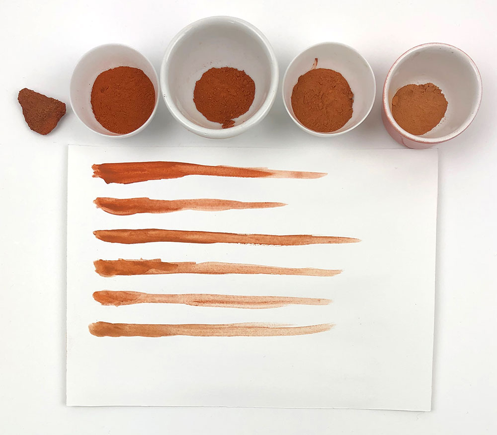
The most common reds and yellows are ochres مغرة . They are not bright, being rather reddish-brown and yellowish-brown, so they are never preferred, but they're adequate substitutes at a pinch. In many places you can step outside and gather your own, as I did with this red earth.
Yellow ochre can sometimes be spotted as an underpainting to gold leaf, as it blends well with the gold colour if small bits of leaf flake off. But even there it's not necessarily preferred to orpiment, زرنيخ أصفر which translates as “yellow arsenic” (the mineral itself is
referred to as رهج أصفر). This arsenic sulfide is the brightest, most permanent yellow possible, which is why it was so desirable despite its extreme toxicity (no comparison with poor reviled white lead). Bright yellow in a MS points straight to orpiment.
I noted above that orpiment+indigo was used for green. Orpiment would never be mixed with azurite because they'd react chemically and discolour. Lapis shouldn't react, but it was the king of blue, and costly, so it would make no sense to mix it and I'm not aware of it being done.
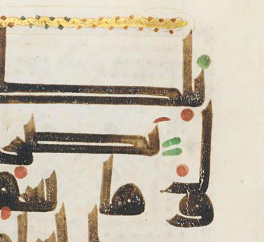
Orpiment is a by-product of realgar, from رهل الغار; the pigment itself is زرنيخ أحمر “red arsenic”. This is a unique, bright orange or yellow-orange. There's nothing like it in the mineral palette. E.g below, where its coverage precludes any confusion with a botanical ink.
I don't keep orpiment because I have no use for a lemon yellow hue, but I use realgar's gorgeous, transparent golden-yellow. That's how I remember which is which  Chemically they are practically the same.
 Chemically they are practically the same.
(I know it's Christmas but I have 3 hours to kill before dinner and if I don't put all this down asap I will never see it through – I can clean this up and make a proper post with colour samples later...)
For really bright red, (tending to orange rather than purple), there are two mineral pigments, both synthetised since antiquity: vermilion and minium (red lead). I couldn't tell you which of them is used from the photo below, but it can't be anything else.
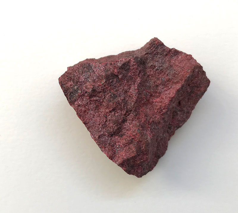
Vermilion is the synthetic form of a naturally occuring mercury sulphide: cinnabar زنجفر also called in Arabic "Chinese ochre" مغرة الصين due to its provenance. Vermilion is purer and much brighter than the pigment extracted from the natural rock, below. Either way, this compound
had alchemical significance as its mercury and sulphur composition supposedly meant it could transmute all metals. References to the Red King aka the Philosopher's Stone could have been to cinnabar. At any rate this was discussed by Arab alchemists as early as the 8th century.
Vermilion therefore was not just the finest red pigment available, it also had a special aura. It's not perfectly stable and can unpredictably revert to black when not protected, but being used inside the pages of a book, as opposed to exposed to atmospheric fumes, does help.
Minium سلقون or red lead إسرنج or أحمر الرصاص is made by heating lead white. Its abundant use in western MSs brought about the word "miniature" (which only later came to mean "small-scale"). Equally red but easier to make than vermillion, but also a bit unstable,& less glamorous.
(And now I really need to stop... Happy Christmas and more later!)
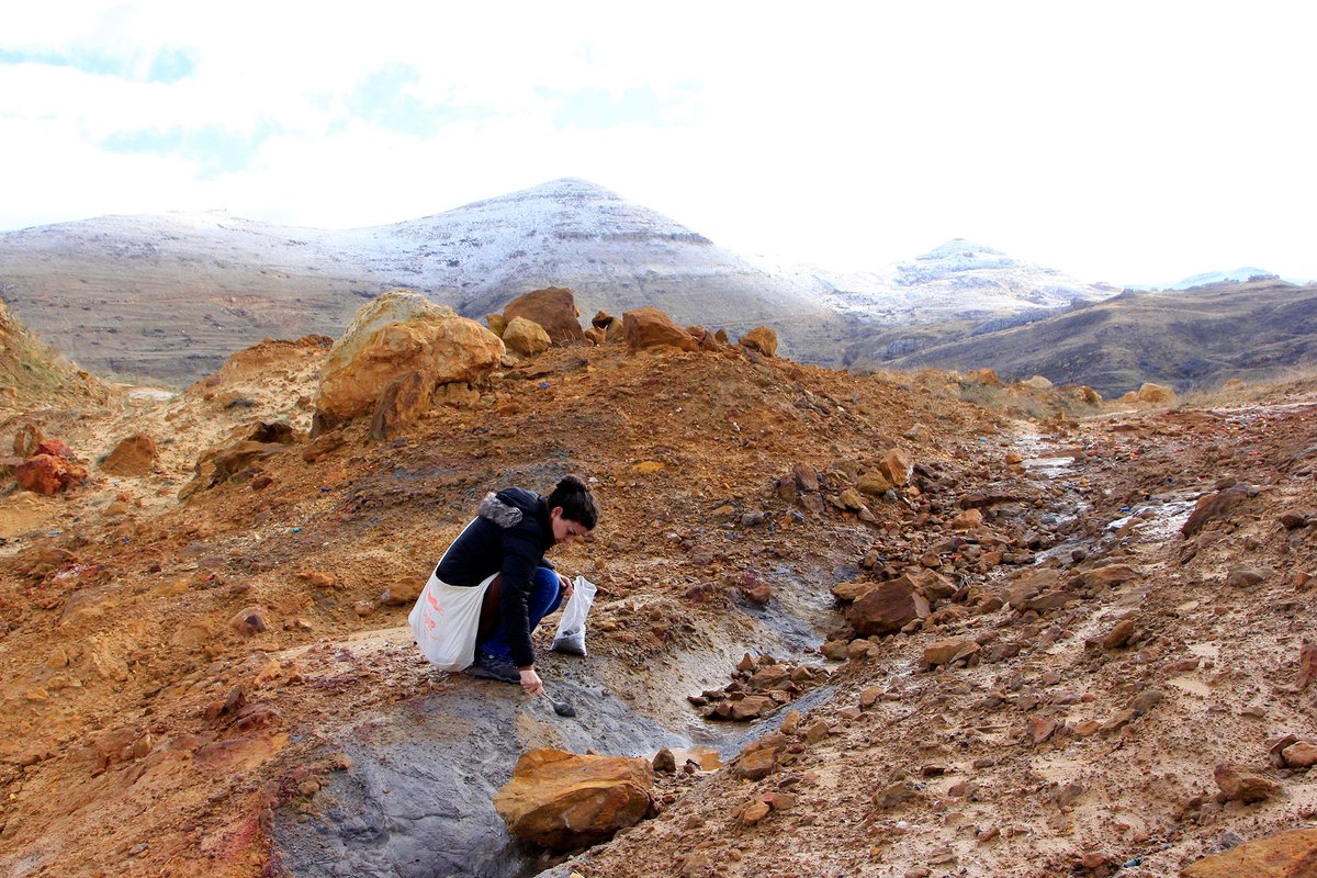
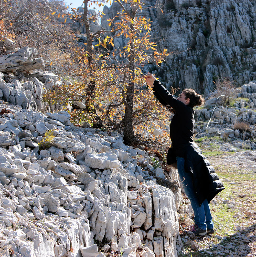
While I recover from the holiday fare (oh god) and retrieve my thought processes to continue this thread, let me illustrate my colourmaking-obsession with these pics of me collecting natural ochres for pigments and stopping mid-hike to gather oakgalls for ink.
Just a few more things to wrap up this thread! There are a couple more named pigments to discuss. Kermes قرمز or lac لكّ is what we would call carmine red, from the cochineal beetle — the proper history is a bit complex as local varieties produced a duller colour relative to
the carmine we know today, which comes from the South American variety and that obviously wasn't available until the 16th century. So it's hard to pinpoint the exact hue meant by قرمز at different points in time, but generally it's a purple-leaning red. Cochineal yields a dye,
but is commonly precipitated into a pigment for use in painting, for instance in Russian icons. It's relatively less fugitive than botanical dyes, and the precipitation makes it even less so, though nothing like mineral pigments. In the Russian school for instance, it's mixed
with a little vermillion to stabilize it more. In Islamic manuscripts I'm not terribly sure if it's used as a pigment (precipitate) or an ink (dye+gum arabic), as I haven't seen that colour in the early ones I focus on. It's likely that it was also used to dye whole pages.
Another named purple is a bit surprising: turnsole طرنشول or folium, one of very few medieval sources of purple, extracted from Chrozophora tinctoria (and therefore also a dye/ink). I've never seen it in person and don't know if it precipitates well. Outside its
being mentioned in a 13th century Islamic scribe's manual, I know nothing about it. There's one more possibility regarding the use of these botanicals: the dye itself could have been mulled with actual pigments (instead of water) to obtain an intermediate colour with body.
The colourist could not know at the time that the dye part of the mixture might fade over the years.

 Read on Twitter