1/ Holy crap. I tell anyone who listens that one of the greatest features of my W140 Mercedes S-Class was that you could navigate all major and sub control groups by touch alone. One of the most advanced cars in the world and all you needed was muscle memory and finger tips https://twitter.com/Tweetermeyer/status/1110347262230593536
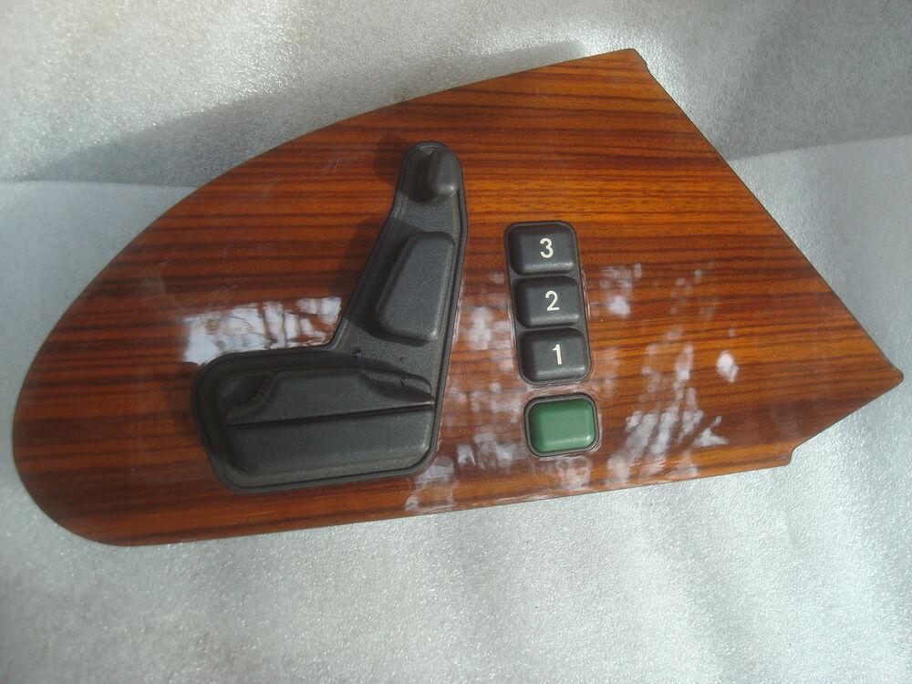
2/ My favourite example of the care Mercedes invested was the seat memory panel. Yes, there's the obvious, classic Mercedes moving seat representation. But what really delighted me was the configuration of the memory buttons.
3/ Note the spacing of the 3 memory positions, and the the separation by colour and space of the memory set button. Mercedes went one step further: the radius on the edge memory set button is different to the that of the position buttons. It *feels* different. *SQUEEEEEE*
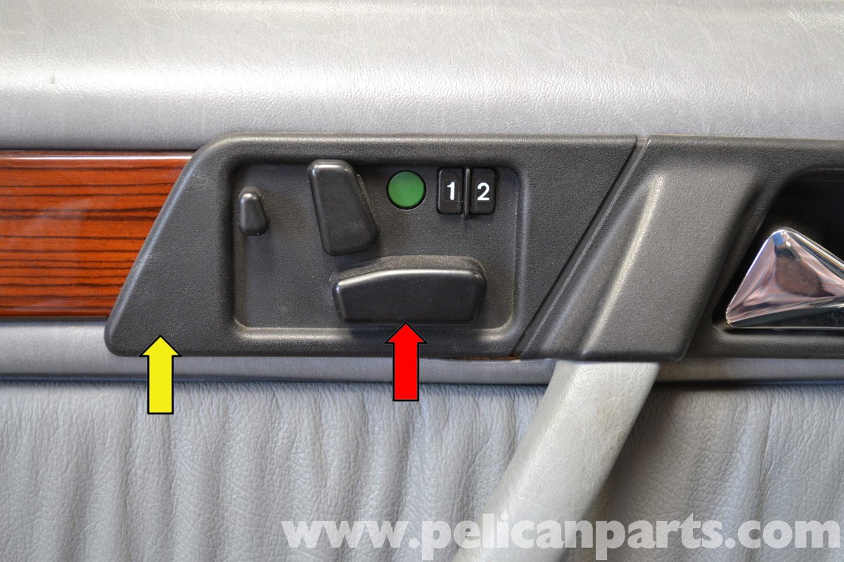
4/ Turns out that Mercedes of that era took a few different approaches to this panel, but all ensured that the by-touch-alone principle was adhered to. This is from a W201 190 E. Less refined than the panel from the 140, the buttons are still separated by size and shape.
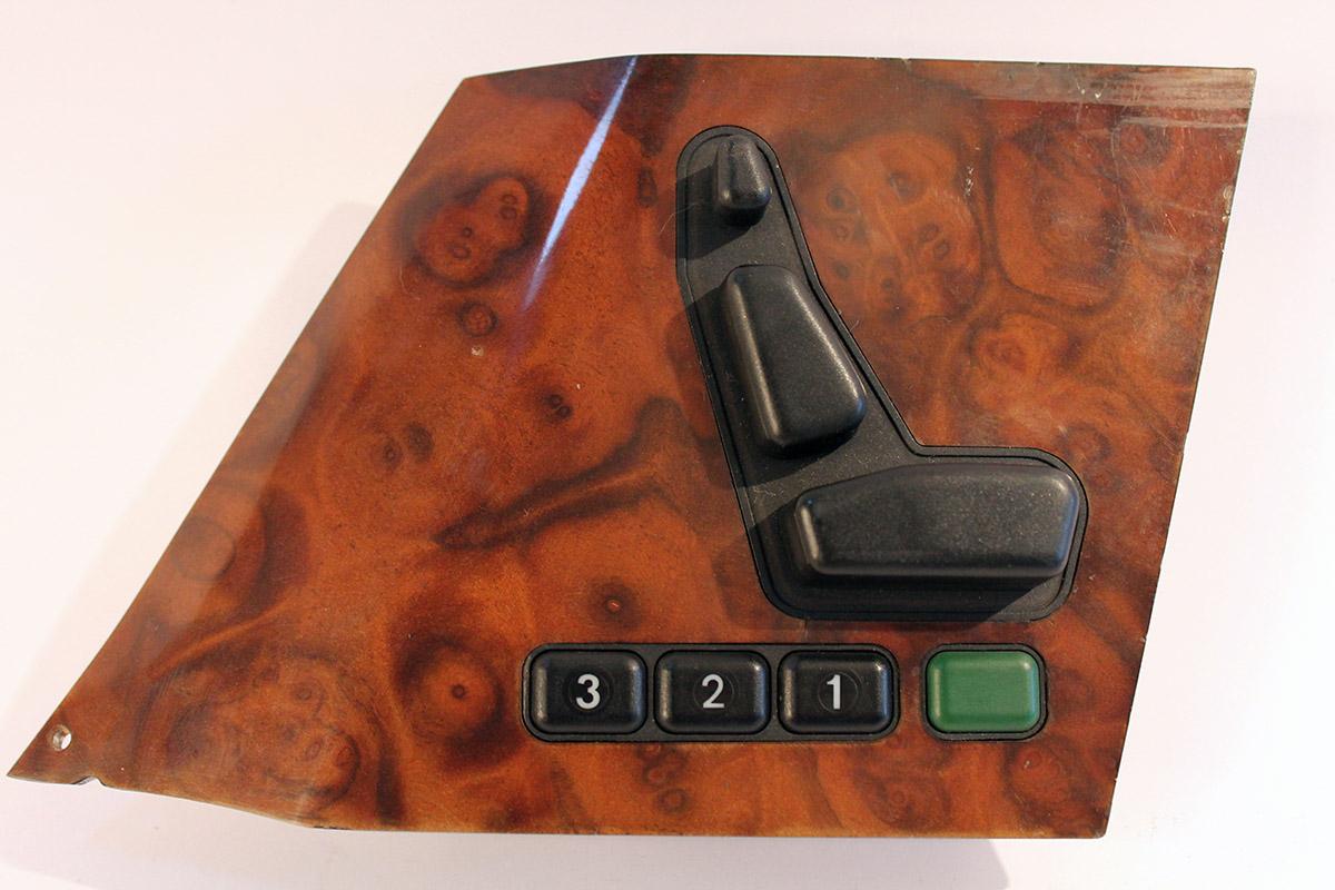
5/ And here's the panel from an R129 SL Roadster. So although Mercedes didn't have perfect cross-car consistency, the design principle of by-touch-alone was consistent.
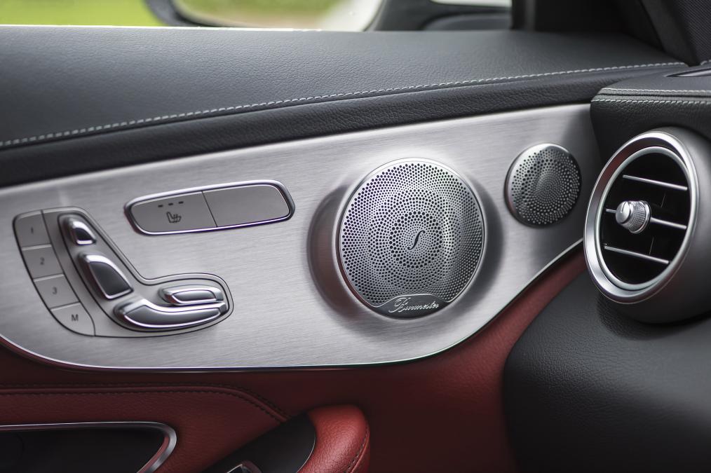
6/ Here's how Mercedes has dealt with this panel since losing any fucks it might have once given. Imagine closing your eyes and trying to navigate this seat memory panel. Sure, the moving seat is still there. But what of memory positions? This is from a W207 C-Class.
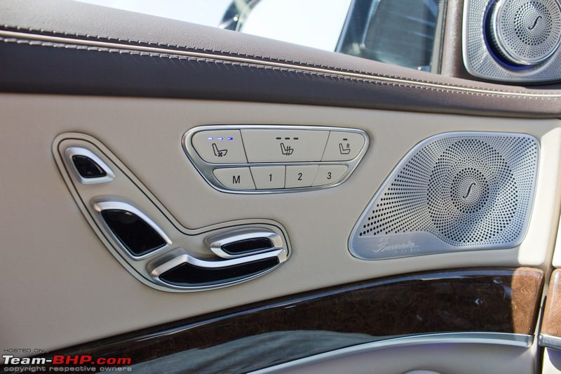
7/ And this, from a W222 S-Class. Again, close your eyes and imagine. Memory sits right next to seat climate functions, with no tactile definition between the buttons.
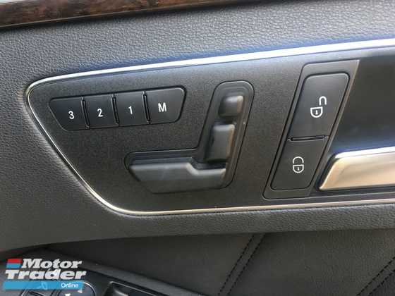
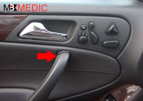
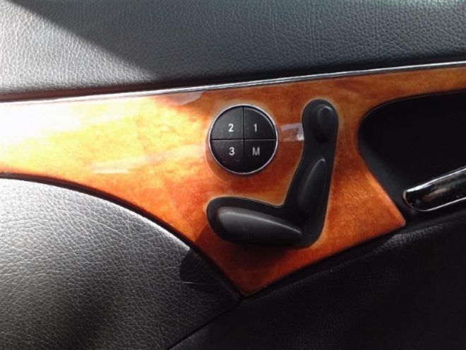
8/ This first monstrosity is found in a W212 E-Class. The W203 C-Class threw the baby out with the bath water for a rotary memory control. And the most angry-making of all is this cheap circle jerk, found in the W211 E-Class.
9/ Now you might argue that this is just a seat control panel. But that's just the point. Mercedes, for a time, valued ergonomics and human factors to such a degree that they ensured that you could navigate their seat memory controls by touch alone.
10/ Extrapolate up from that, to all the other, more major control groups in the car, and you have an idea of 1) how fanatical Mercedes was* and 2) the amount of supremely detailed work that is required to make cars easily-understandable to users.
11/ Here's the thing: in many car companies, the same designers that cut their teeth designing these buttons are the ones now leading/managing/approving the design of digital/touch/voice interfaces. These new interfaces, and their systemic significance, are a whole new ballgame.
12/ They demand different design skills, and a way of looking at the world that puts the needs of others ahead of your own. So, I'll wrap up with this: the reasons so many new-car interfaces suck are three-fold (there may be more-folds, YMMV).
13/ First, there's a diversity issue: automotive design is lead by folk that are largely white, male and "experienced" (old). There's a huge privilege at play, which means that length of tenure and political clout stands for more than depth of human understanding.
14/ The second leads from this: automotive design as managed by these type of men is designer-centric. The designer's job is to give birth to their aesthetic vision through battles with engineering & everybody else. It's a triumph of the individual over the org with human costs.
15/ The idea of starting with understanding human needs and behaviours through primary research is antithetical to their self-image, and is perceived as a threat to freedom of their expression. So it's either ignored, weaselled out of or actively undermined.
16/ The third reason is that cars are made from components, designed by the manufacturer, manufactured by suppliers and fitted by the manufacturer. It's not uncommon to have different suppliers for your digital gauge cluster, head-up display, and central screen.
17/ In many companies, UX design teams are split along these component lines, too, to say nothing of buttons being designed elsewhere again. As they say, the product you deliver reflects your org chart, and it's never been more true than in automotive companies.
18/ Is it any wonder that we're required to make so many cognitive leaps of faith when the burden is placed on us to orchestrate the mess before us? No. But here's the dark bit, these are the organisations responsible for ensuring that you can not just navigate seat memory...
19/ They are the organisations that are expecting us to be able to understand the limitations and capabilities of their inconsistently defined, and inconsistently implemented advanced driver assistance systems. The key here is driver assistance.
20/ The design of the systems that are about *assisting the driver* is being overseen in many cases by people who think understanding how someone else might see the world disrupts *their* vision of how the world should be. Yeah, no thanks.
21/ Open for questions, comments, criticisms. *Especially about Mercedes' one-stalk solution, By W140, it was *heaving*.
22/ But if you can't tell, I'm *really* passionate about this stuff, and a bunch of us are on the coalface trying to make this stuff better. cc @JoeSimpson @drewdraws2 @AutomotiveUX @machinehuman @auto_didakt and many, many more.
Fin/ Many of the underlying issues discussed in this thread surface in this week's episode of The Next Billion Cars, with @SallydeMinx and @mpesce, in which I interview Chris Bangle. So keep your eyes peeled for the link.
P.S.: as promised here's Episode 4 of The Next Billion Cars, where I dive in to some root causes with Chris Bangle, and @SallydeMinx and @mpesce talk to @ImmersivStories about designing in virtual reality, and reality reality: https://nextbillionseconds.com/2019/03/27/the-next-billion-cars-episode-4-the-next-billion-kilometers/

 Read on Twitter