Are you still shaking off the holiday? I know I am!
How about a #cartooncausalinference #tweetorial about casual graphs to ease us into the new year?
#epitwitter #DAGsfordocs #FOAMed #MedEd #statstwitter #econtwitter
How about a #cartooncausalinference #tweetorial about casual graphs to ease us into the new year?
#epitwitter #DAGsfordocs #FOAMed #MedEd #statstwitter #econtwitter
The most common type of causal graph (at least on #epitwitter) is the directed acyclic graph, or #DAG.
DAGs have two main components: variables (also called nodes), and arrows (also called edges).
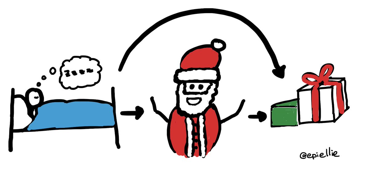
In the DAG below, there are 3 variables: sleeping, Santa, and presents.
DAGs have two main components: variables (also called nodes), and arrows (also called edges).
In the DAG below, there are 3 variables: sleeping, Santa, and presents.
The variables are ordered based on time — you have to go to sleep before Santa can come to your house & then he’ll leave presents!
Causation and time both flow in the direction of the arrows.
Causation and time both flow in the direction of the arrows.
To make sure our #DAG is a causal graph, we need to include all arrows we know or suspect might exist, and all variables we know or suspect might exist.
That includes known unknowns — if we think there might be a variable then we should add an “unknown” node.
That includes known unknowns — if we think there might be a variable then we should add an “unknown” node.
Okay, so those are the basic rules for making a DAG.
But why should we make one at all? The secret is that (unlike causation or time) association can flow upstream—against the direction of the arrows!
And association is (often) not causation!
But why should we make one at all? The secret is that (unlike causation or time) association can flow upstream—against the direction of the arrows!
And association is (often) not causation!
Let’s look at a classic example.
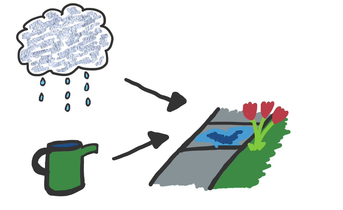
When it rains, the sidewalk gets wet.
When you water flowers, the sidewalk also gets wet.
Watering flowers doesn’t stop rain: if you randomly picked days to water or not, there’d be no difference in rain between days you do & don’t water.
When it rains, the sidewalk gets wet.
When you water flowers, the sidewalk also gets wet.
Watering flowers doesn’t stop rain: if you randomly picked days to water or not, there’d be no difference in rain between days you do & don’t water.
But, we can make it *seem* like rain and watering are related, because associations flow both ways along arrows. How? We look only at days when the sidewalk is wet!
Now, even if we randomly picked days to water, if you *arent* watering but the ground is wet then it *is* raining!
Now, even if we randomly picked days to water, if you *arent* watering but the ground is wet then it *is* raining!
This example is a type of bias called “collider” or “selection” bias, and happens whenever we restrict, or condition on, or control for a common effect of two variables.
I’ll give another example of that later, but first let’s talk about “confounding”
I’ll give another example of that later, but first let’s talk about “confounding”
Confounding happens when we have a common cause of two variables.
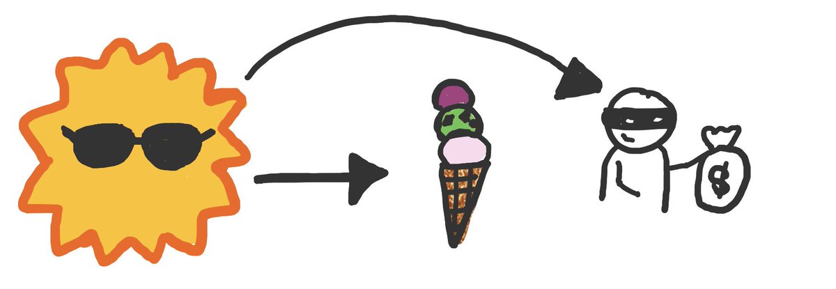
Here’s a classic example. In the summer, people eat more ice cream and crime rates increase.
Does eating ice cream cause crime? No! But it can look *associated* with crime in your analysis.
Here’s a classic example. In the summer, people eat more ice cream and crime rates increase.
Does eating ice cream cause crime? No! But it can look *associated* with crime in your analysis.
How do we see that on the #DAG? By reading the arrows.
The arrows flow from ice cream to summer (b/c association can flow upstream), & then from summer to crime.
Existence of this “path” tells us ice cream & crime will be related in an analysis that doesn’t control for summer
The arrows flow from ice cream to summer (b/c association can flow upstream), & then from summer to crime.
Existence of this “path” tells us ice cream & crime will be related in an analysis that doesn’t control for summer
So, now we’ve seen the basic rules of reading DAGs:
1) causation flows in the direction of arrows
2) if two arrow tails or a tail & a head meet, association can flow between them
3) if two arrow heads meet, association is blocked
4) rules 2 & 3 reverse when we restrict or control
1) causation flows in the direction of arrows
2) if two arrow tails or a tail & a head meet, association can flow between them
3) if two arrow heads meet, association is blocked
4) rules 2 & 3 reverse when we restrict or control
Let’s see some more examples.
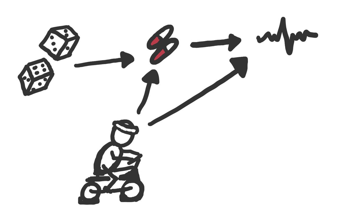
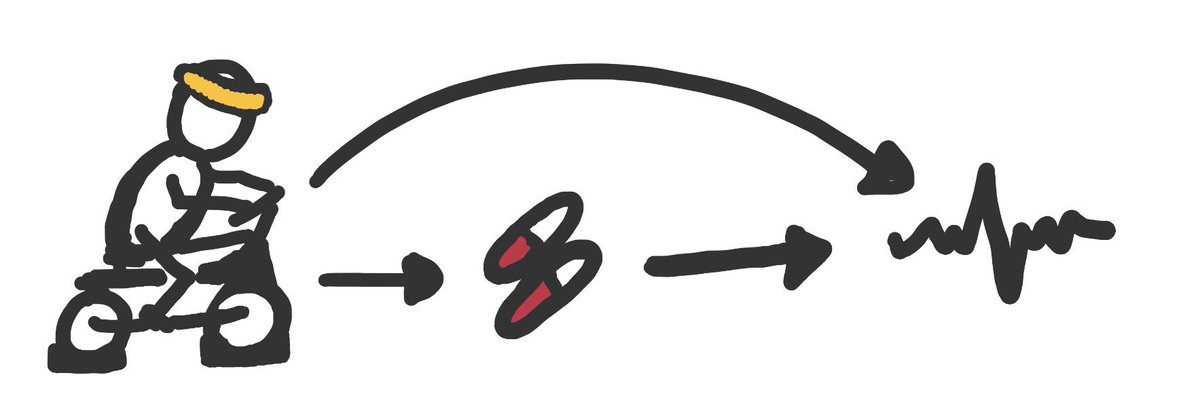
First, here’s a randomized trial or experiment. Randomization causes treatment choice, & treatment causes improved health.
Exercise also causes better health and might cause people to take their assigned medication regularly.
First, here’s a randomized trial or experiment. Randomization causes treatment choice, & treatment causes improved health.
Exercise also causes better health and might cause people to take their assigned medication regularly.
If we compare outcomes by randomization, this DAG tells us we can correctly estimate the causal effect (of *randomization* on health).
But, if we restrict to people who take treatment (without also adjusting for exercise) we mix up causation & association & get the wrong answer
But, if we restrict to people who take treatment (without also adjusting for exercise) we mix up causation & association & get the wrong answer
The randomized trial DAG shows us that we can expect no confounding because of random assignment but we *cant* guarantee no collider or selection bias.
That bias comes from what happens *after* random assignment.
That bias comes from what happens *after* random assignment.
Next let’s look at the same question but in an observational study.
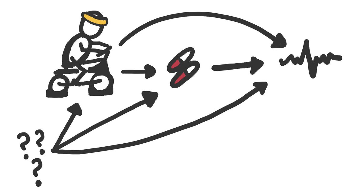
Now, we really want to know about the effect of treatment on health, but we probably have confounding by exercise.
If we know all the confounders, we can control for them.
Now, we really want to know about the effect of treatment on health, but we probably have confounding by exercise.
If we know all the confounders, we can control for them.
But, remember, we have to also add known unknowns to our #DAG.
If we think or know some other variable causes treatment & health, we have an association problem on our DAG.
There’s a path from pills to ??? to health that will muddle up our estimate even if we block exercise.
If we think or know some other variable causes treatment & health, we have an association problem on our DAG.
There’s a path from pills to ??? to health that will muddle up our estimate even if we block exercise.
So, that’s the basics of DAGs.
To wrap up, let’s go back to the very first problem of selection bias, and look at one last example that is often a problem in observational studies.
To wrap up, let’s go back to the very first problem of selection bias, and look at one last example that is often a problem in observational studies.
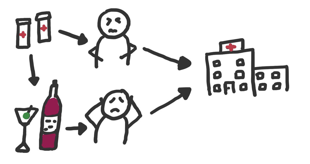
This #DAG shows what’s often called “Berkson’s bias”.
We want to know if a medication causes stomach pain, and we decide to do a case-control study.
We pick people with stomach pain and people with headaches from the local hospital. But being in hospital is a common effect...
We want to know if a medication causes stomach pain, and we decide to do a case-control study.
We pick people with stomach pain and people with headaches from the local hospital. But being in hospital is a common effect...
In our observational study, this DAG tells us that we might see an association between treatment and stomach aches, even if there’s no causation *because of the way we chose our controls*!
If those taking medication tend not to drink, then the headache patients are bad controls.
If those taking medication tend not to drink, then the headache patients are bad controls.
But if we had designed our study to enroll people taking & not taking pills, we wouldn’t have this problem!
Because the problem comes from selecting on a common effect: Pills aren’t confounder for alcohol use, but both alcohol & pills are causes of being eligible for the study.
Because the problem comes from selecting on a common effect: Pills aren’t confounder for alcohol use, but both alcohol & pills are causes of being eligible for the study.
Let’s recap.
There are 3 ways arrows can meet at variables:
•chains: A->B->C
•forks: A<-B->C
•colliders: A->B<-C
Chains indicate causal paths. Association can flow between A and C through forks when we don’t condition on B, and colliders when we do condition on B.
There are 3 ways arrows can meet at variables:
•chains: A->B->C
•forks: A<-B->C
•colliders: A->B<-C
Chains indicate causal paths. Association can flow between A and C through forks when we don’t condition on B, and colliders when we do condition on B.
We can use DAGs to help us design our studies and our analyses so that we can try to estimate causal effects.
We can also use DAGs to help us think through weird or unexpected study results, or conflicting findings from multiple studies.
We can also use DAGs to help us think through weird or unexpected study results, or conflicting findings from multiple studies.
Curious to know more?
The #bookofwhy gives a high-level introduction to causal inference & causal graphs.
The #causalinferencebook is a more detailed, but still accessible, primer on all things causal inference (plus its free!). You can access it here: https://www.hsph.harvard.edu/miguel-hernan/causal-inference-book/
The #bookofwhy gives a high-level introduction to causal inference & causal graphs.
The #causalinferencebook is a more detailed, but still accessible, primer on all things causal inference (plus its free!). You can access it here: https://www.hsph.harvard.edu/miguel-hernan/causal-inference-book/
And if you want more, this paper is a comprehensive technical primer to using causal graphs in epidemiology: https://cdn1.sph.harvard.edu/wp-content/uploads/sites/343/2013/03/causaldia.pdf

 Read on Twitter