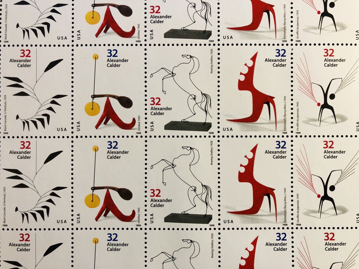
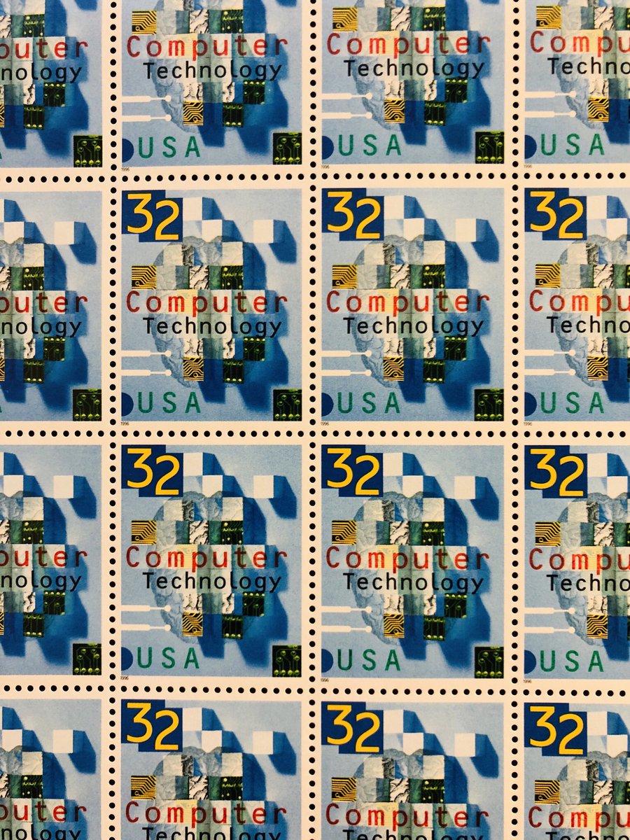
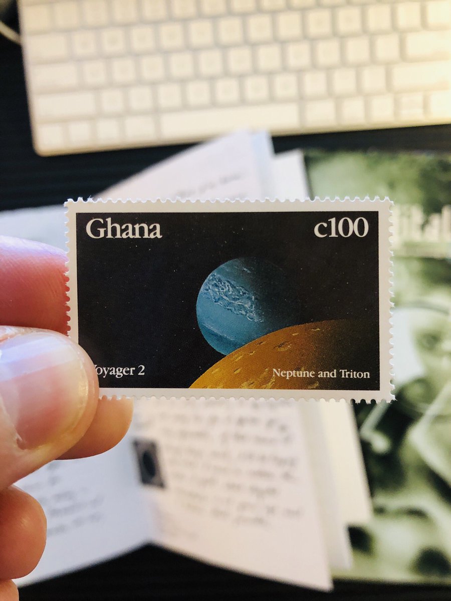
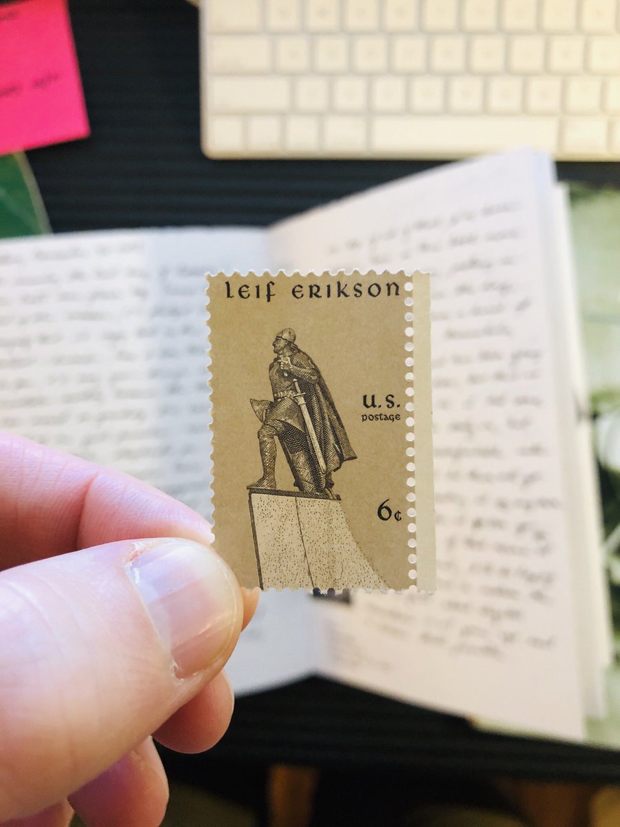
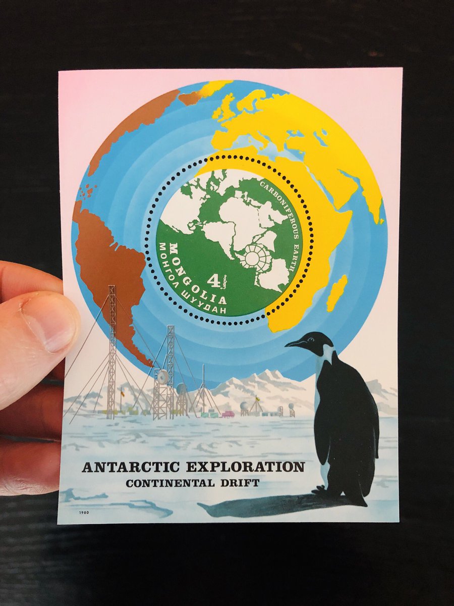
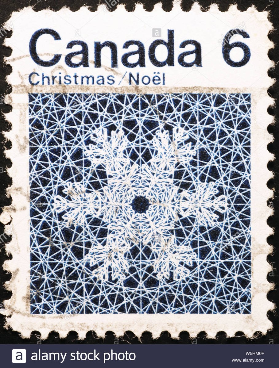
When I was at art school, I fantasized about making the following things - like, as a full-time job:
- postage stamps
- clocks
- maps
- wooden boxes
- handmade books
I quickly learned I was living in the wrong century for all that & would instead type for a living.
- postage stamps
- clocks
- maps
- wooden boxes
- handmade books
I quickly learned I was living in the wrong century for all that & would instead type for a living.
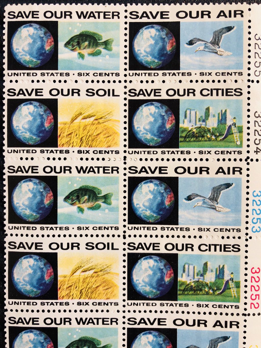
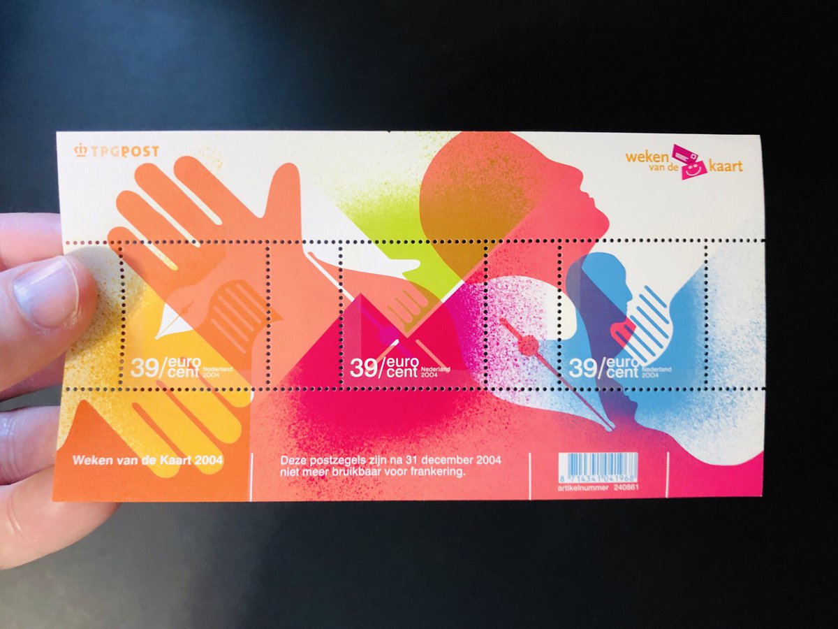
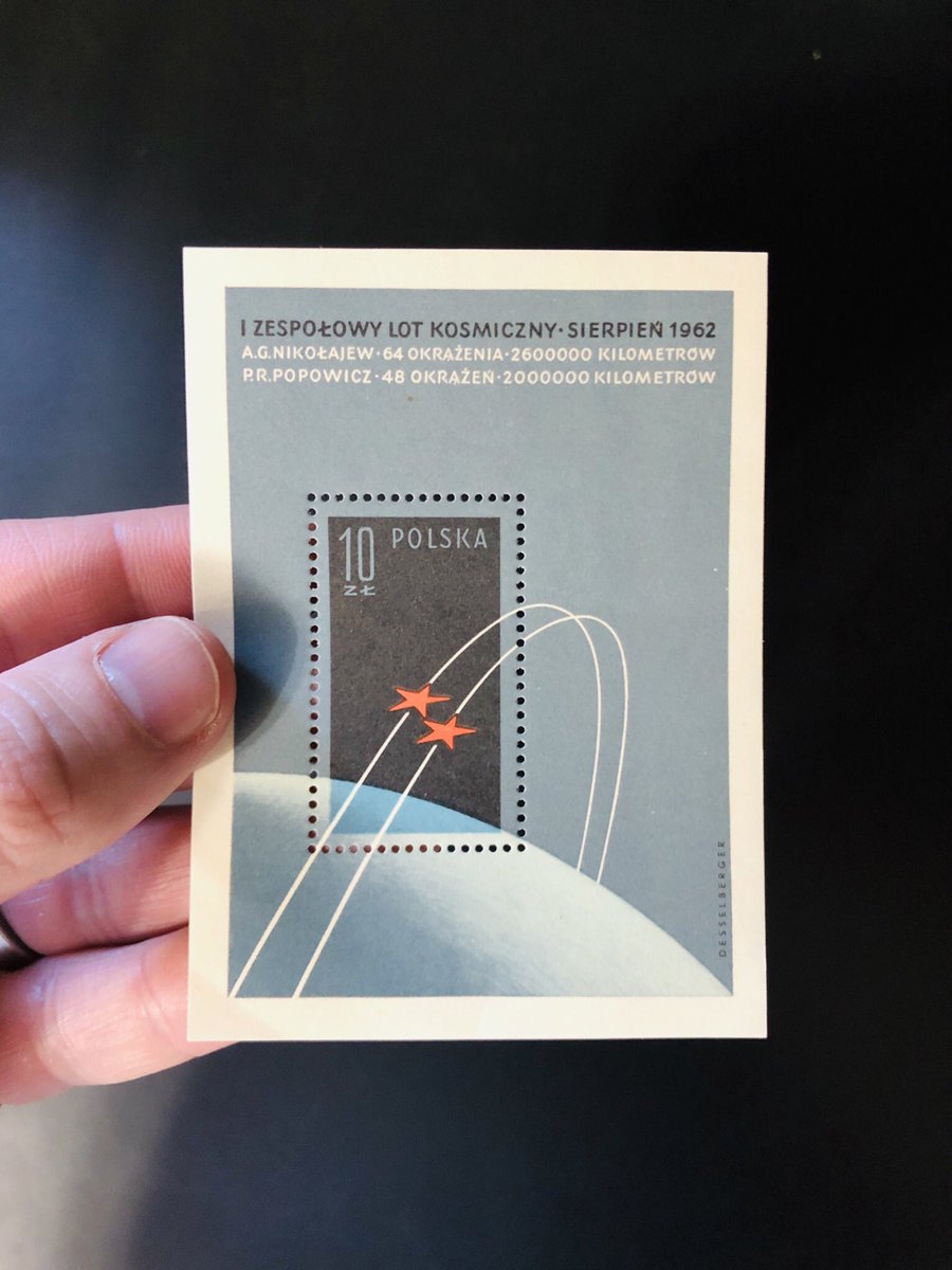
And finally, can you blame a 19 year old art kid for wanting to design stamps for a living when things like this used to get made?
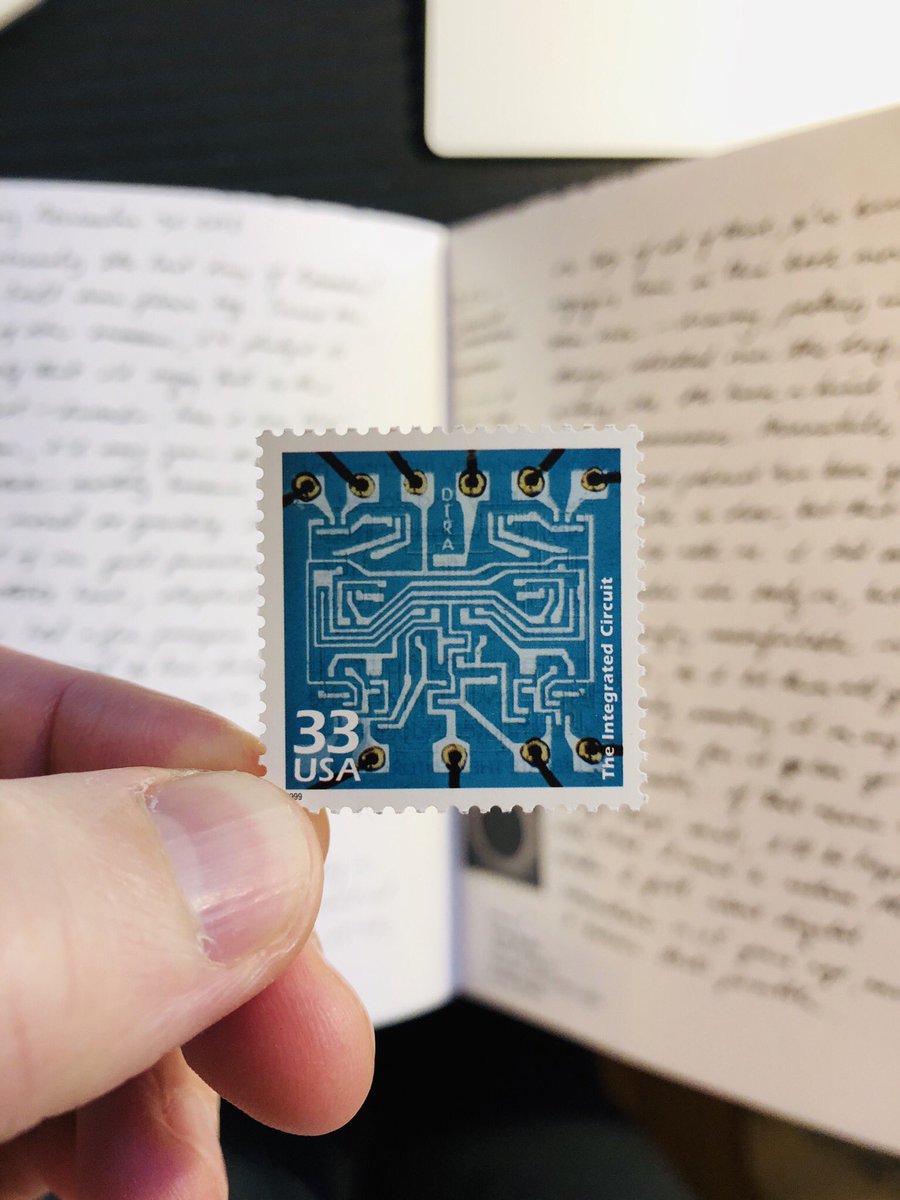
A few more from the collection for you. First, this gorgeous thing from 1960. The integrated circuit!
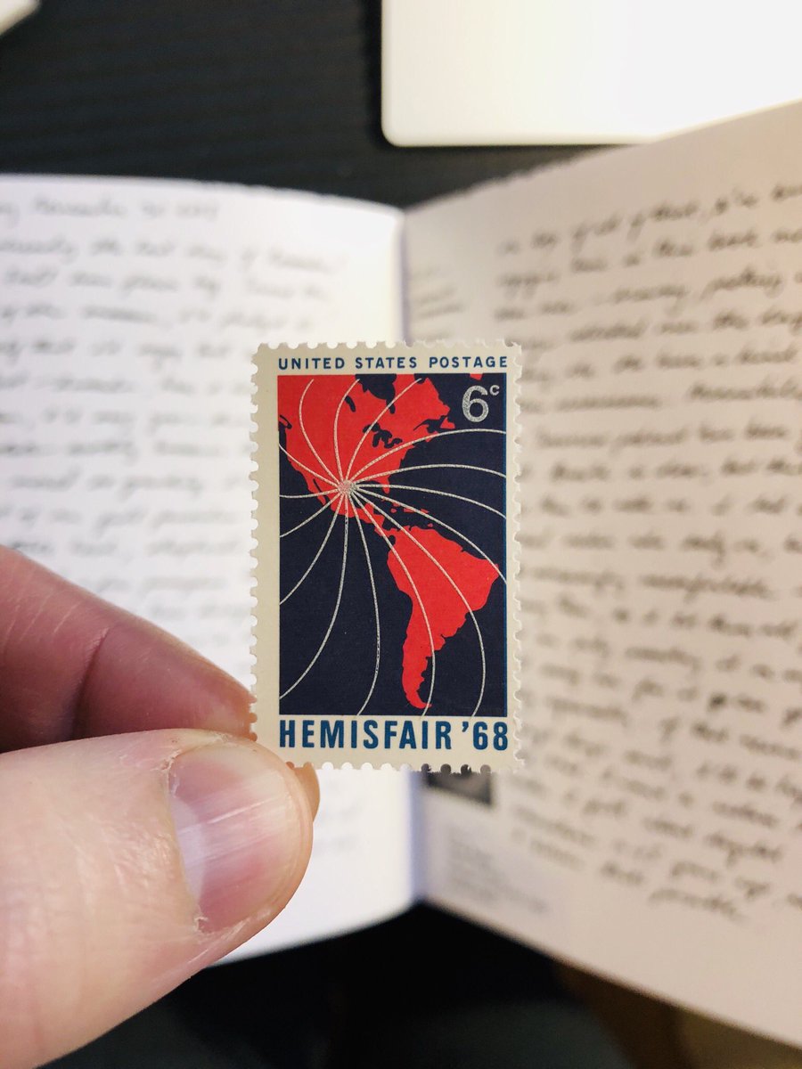
Next, one from the same decade. What you can’t see from this picture is that the white lines radiating out from the gulf are printed separately on top of the map image. You can feel them as you run your finger over the stamp!
Something that I love about stamps is/was their potential for population-wide edification. Obviously not as powerful today given how infrequently we communicate by written post, but the idea - of using postage as an idea currency - is a beautiful one.
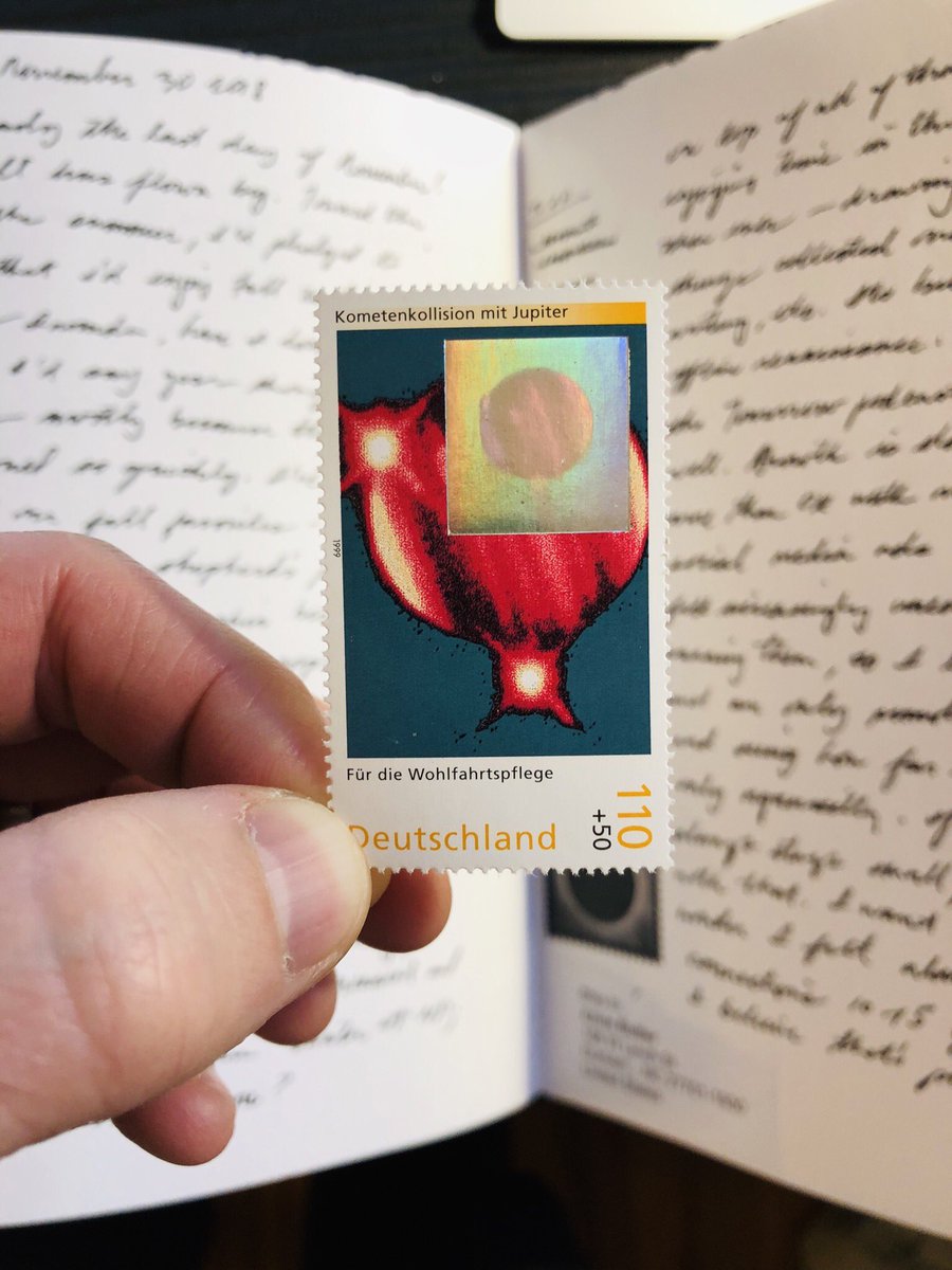
Obviously, the US doesn’t have a monopoly on beautiful postage. I’ve got a series of these holographic German stamps and they are 

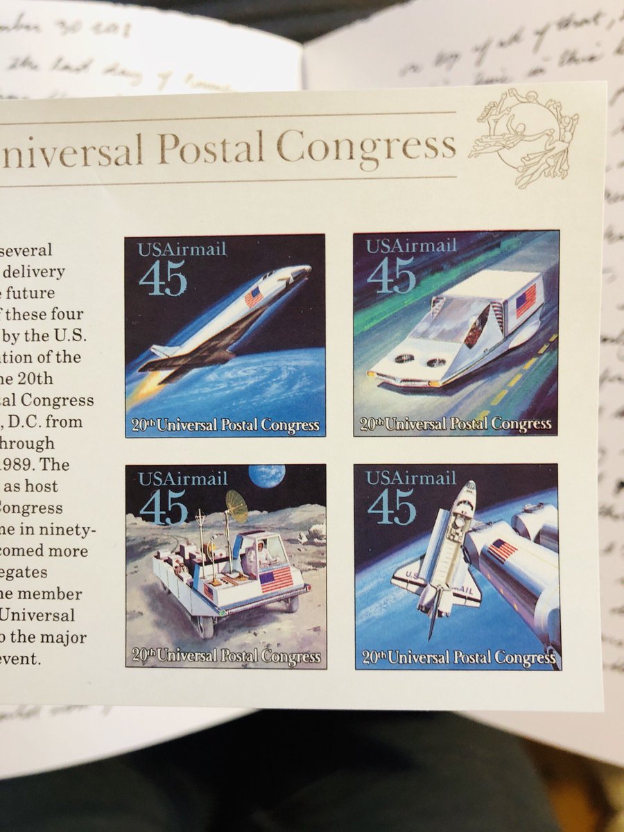
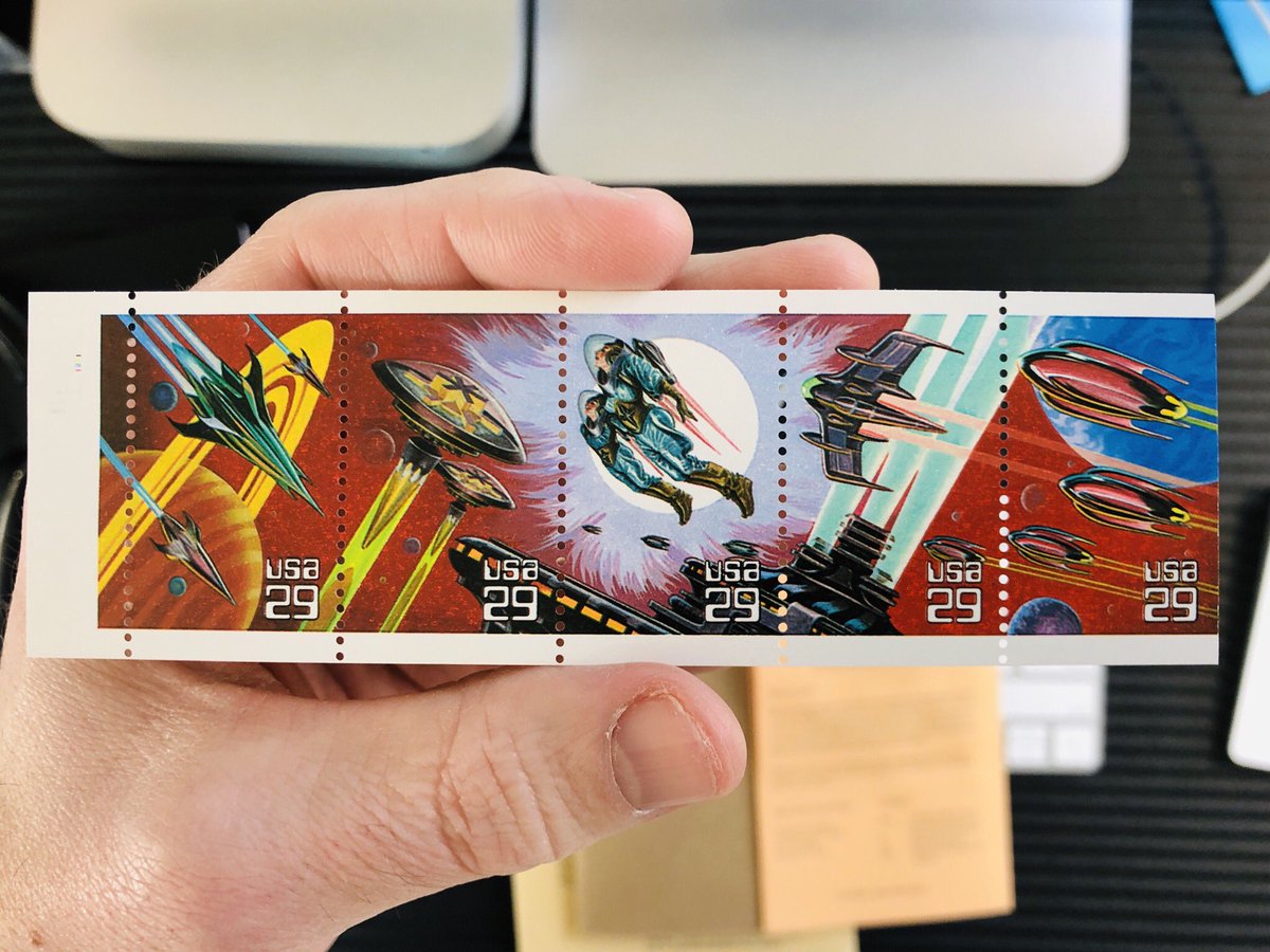
One last example for today. The end of the eighties might have been peak optimism of the overlap of space exploration and the US mail. These stamps depict future mail delivery off-planet. A nice idea straight out of Asimov.
I have decided I’m just going to keep this thread going indefinitely. So here’s another beautiful stamp. Can you believe this is 46 yrs old? It looks brand new! I love how aware the artist was of the experience of the sender in extending the art well beyond the perforations.
Here’s another one. Just gorgeous. I’m pretty in to all the advanced true imaging we’ve been able to do in the decades since stamps like this were made, but man, I also love a good painting :)
And yes, most of my collection are space-related. But not all.
And this one. The paper has a tooth to it, which makes the image feel like an engraving, not a print. A subtle illusion.
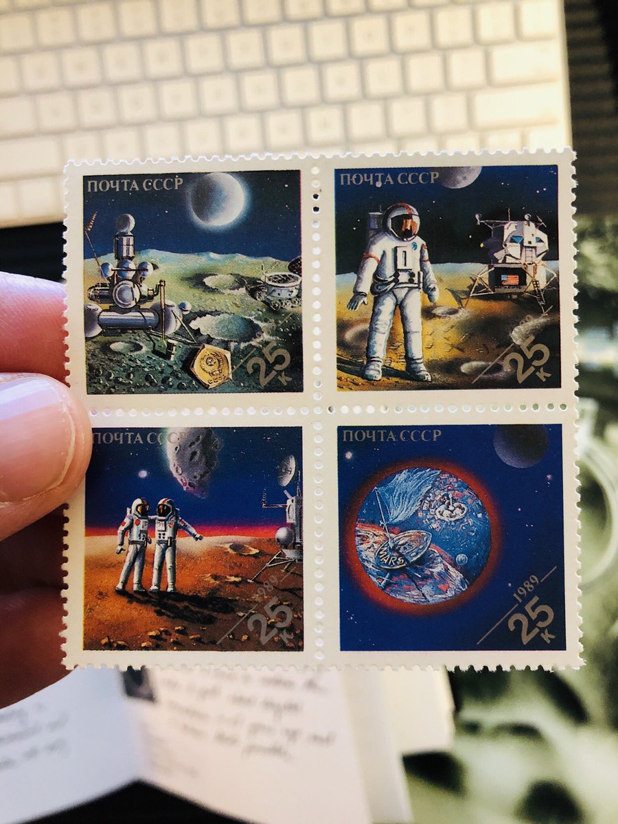
Last one for today; back to space. Here’s the thing, Russia may have always been our frenemy at best, but the space program has always risen above all that. So much of our exploration has been done in collaboration with Russia. It’s cool that Russian postage celebrates that too.
Ready for another round of oohing and ahhing at stamps?
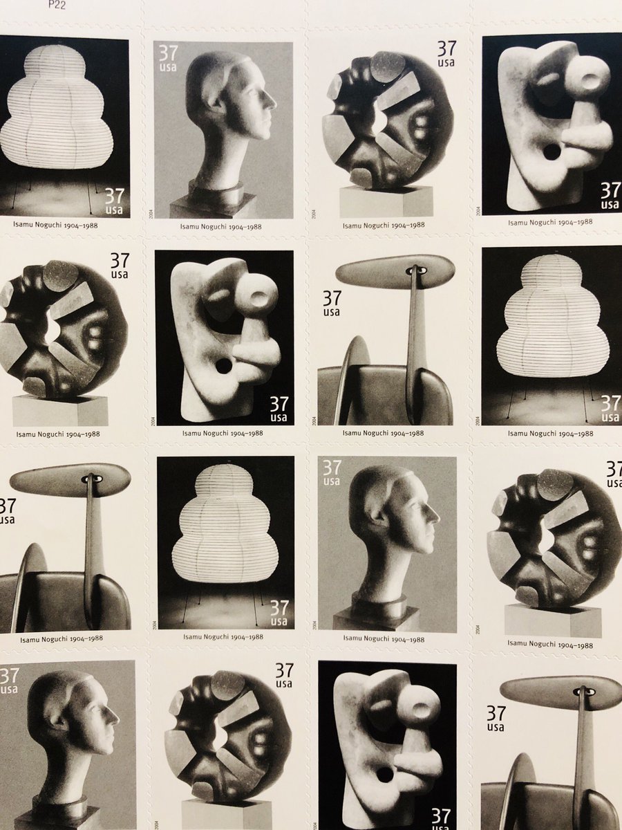
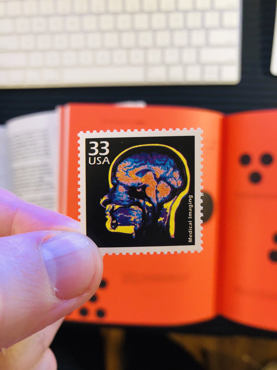
Let’s start here. There’s a series of industry prints from back when national postage was $0.33. This one is my favorite. I’m generally a sucker for human heads in profile. But check out the color in this one!
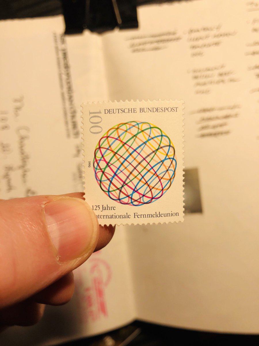
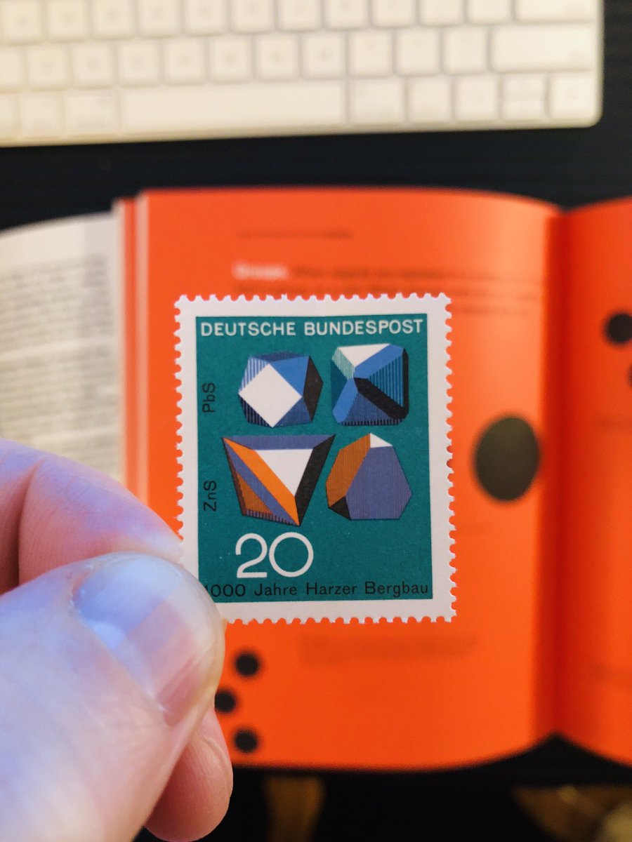
I mentioned earlier in this thread that Germany is where it’s at for rad stamp design. So here’s Exhibit “B.” Again, color is key here but the shapes are pretty great and the way the value becomes one of them that pushes on the edges of the space.
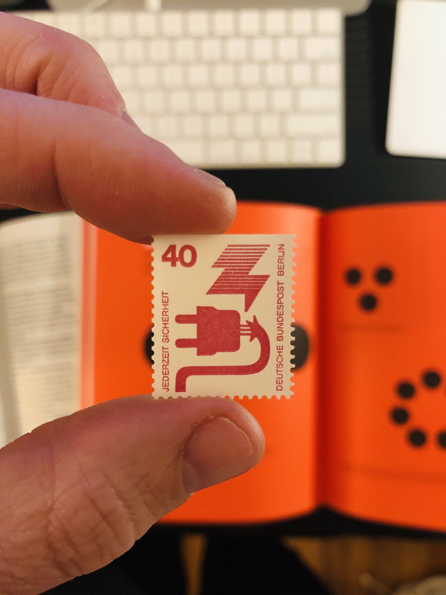
The cool thing about stamps is you can make them about really big, basic concepts. Like this one: it’s a stamp about electricity! Danke danke danke, Elektrizität!
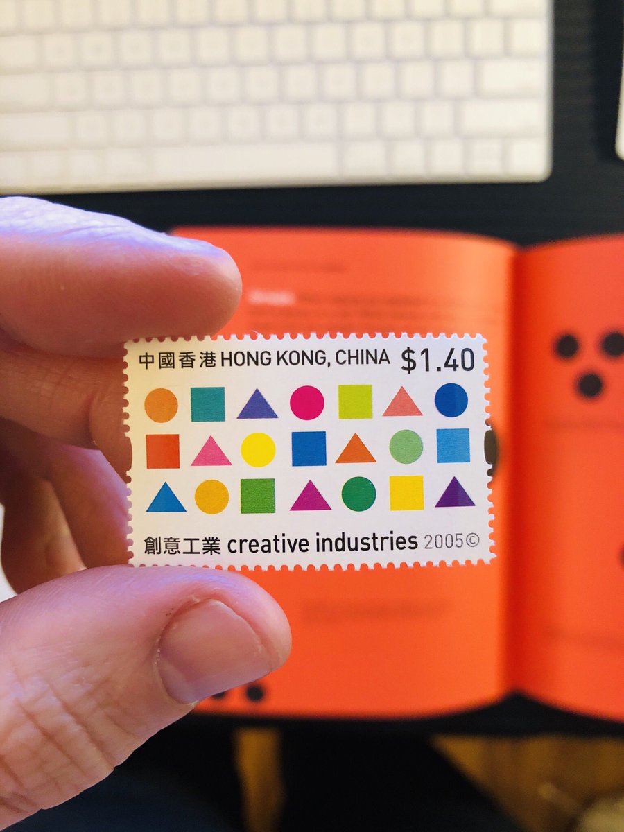
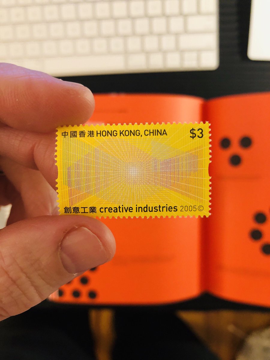
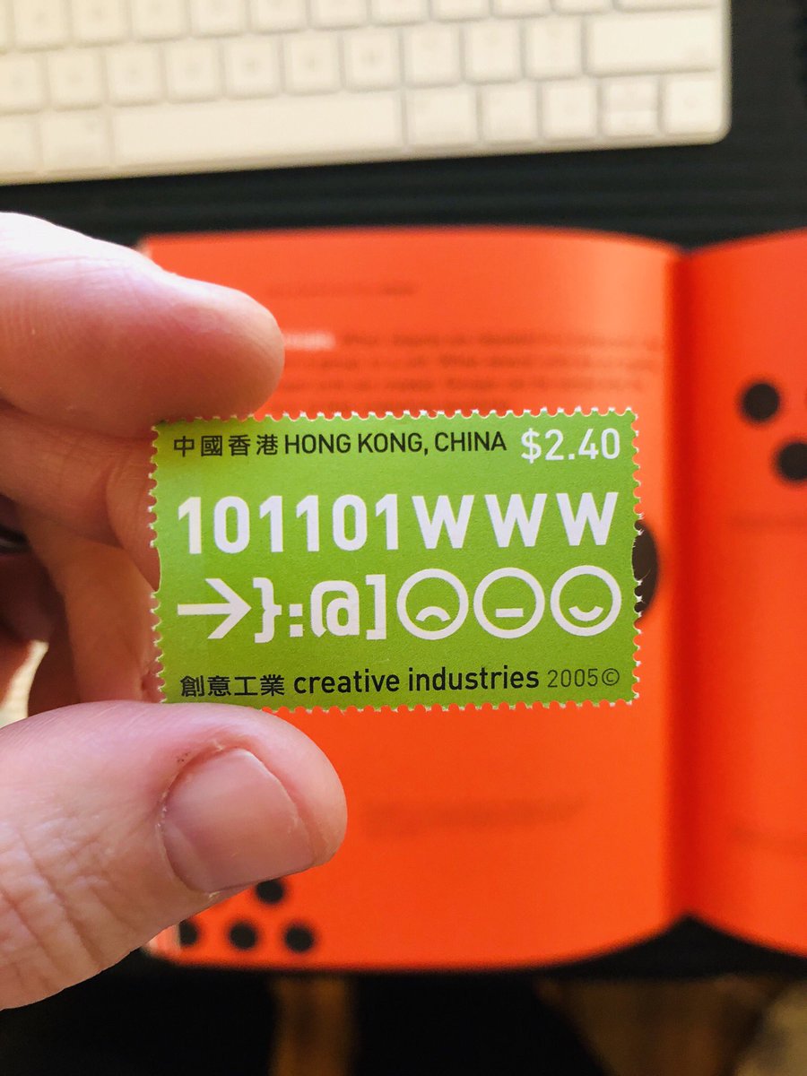
Ok, these last three are from China. Don’t listen to the trade war theater. We are economically dependent upon no country more than China, and they us. As far as world powers go, we’re kind of geminis. Anyway, look how beautiful!
Last one for tonight. Americans think they own the internet. Nope. We own pieces of it. And as it turns out, there really isn’t one Internet. There are many internet’s. China’s is becoming more and more distinct from the rest of the world’s. Here was their view almost 15 yrs ago.
I’m snowed in and the kiddo is napping so I pulled out a few more stamps to show you (this should be a thing, btw: show and tell threads).
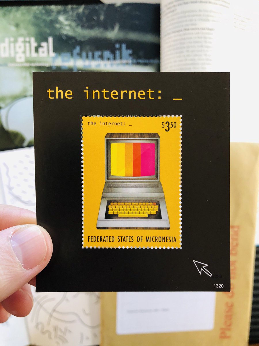
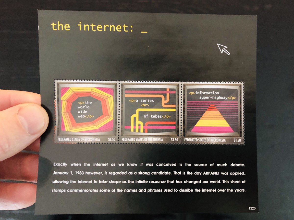
Here’s one from Micronesia in honor of the internet. You gotta love the choice of a pc that probably never even had a color monitor :)
Here’s one from Micronesia in honor of the internet. You gotta love the choice of a pc that probably never even had a color monitor :)
An amazing fact about Micronesia, btw, is that it’s a cluster of thousands of small islands! It’s an islandnet!
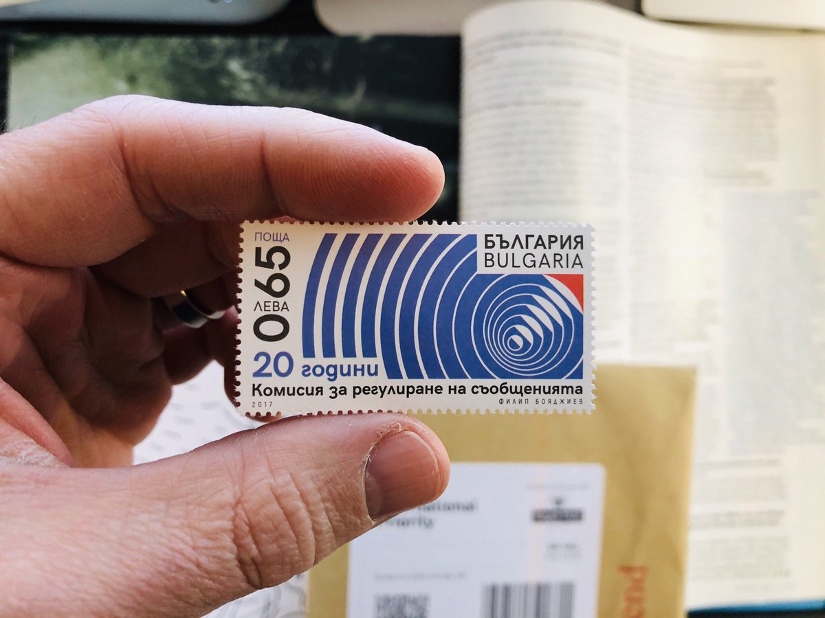
This one’s from Bulgaria. I’ll be honest - I have no idea what it says, but I’ll use my advanced understanding of semiotics to interpret the radiating lines as having something to do with technology ;)
This one is definitely about the internet ;)
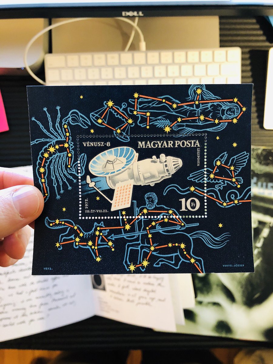
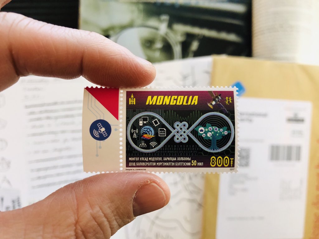
At the beginning of this thread (week’s ago), I said that stamps inspired me as a young designer. Here’s a great example of why: check out that satellite in the margin! It’s just there for the person tearing off the stamp!
At the beginning of this thread (week’s ago), I said that stamps inspired me as a young designer. Here’s a great example of why: check out that satellite in the margin! It’s just there for the person tearing off the stamp!
It’s such a small thing, but it’s exactly what inspires me about stamps as a visual form.
See? Design *can* be about problem solving but it can also just be about creating wonder and delight.
See? Design *can* be about problem solving but it can also just be about creating wonder and delight.
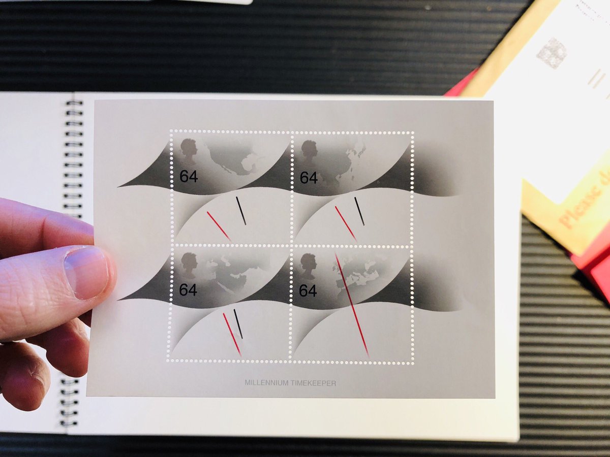
On that note, I’ll finish with these. UK stamps about time. Like TIME time. Like millennia.
Again, isn’t it lovely how stamps - despite being tiny, outmoded artifacts - so elegantly engage with big, important ideas?
Again, isn’t it lovely how stamps - despite being tiny, outmoded artifacts - so elegantly engage with big, important ideas?
Happy Friday! Wanna look at some stamps with me? 

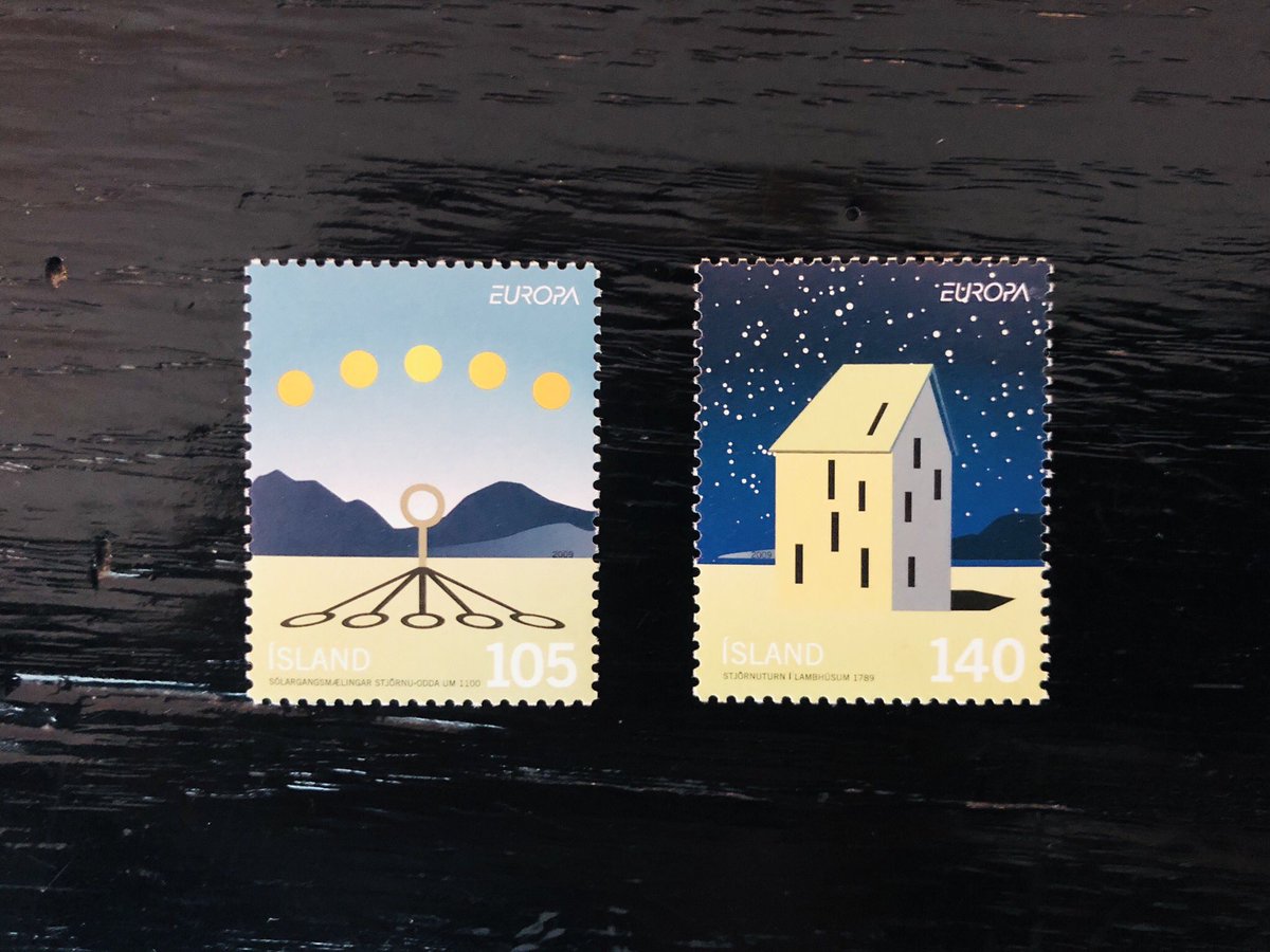
Let’s start with these from Iceland. First, look how beautiful! Any stamp that uses simple geometry and color this way gets a  from me. But the one on the right totally captures my heart. Look at that house. Look at its windows! Look how they echo the constellations in the sky!
 from me. But the one on the right totally captures my heart. Look at that house. Look at its windows! Look how they echo the constellations in the sky!
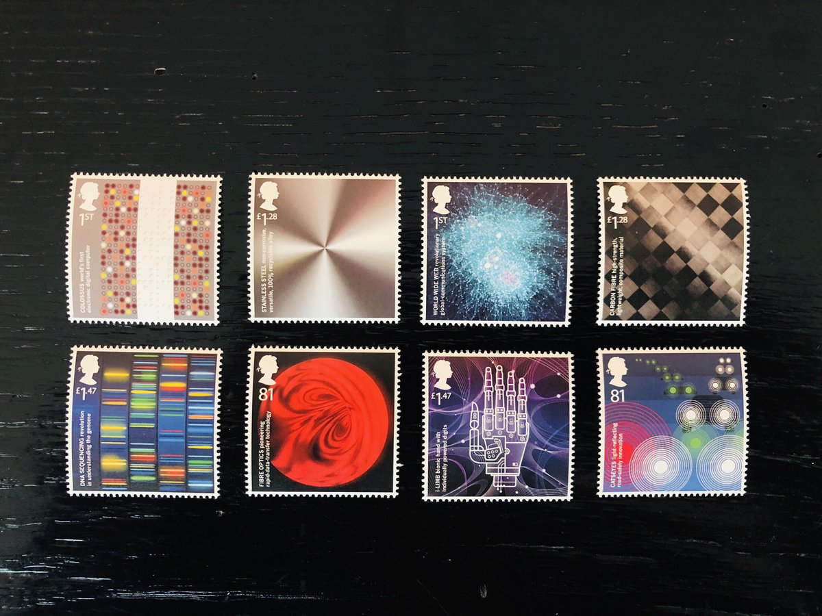
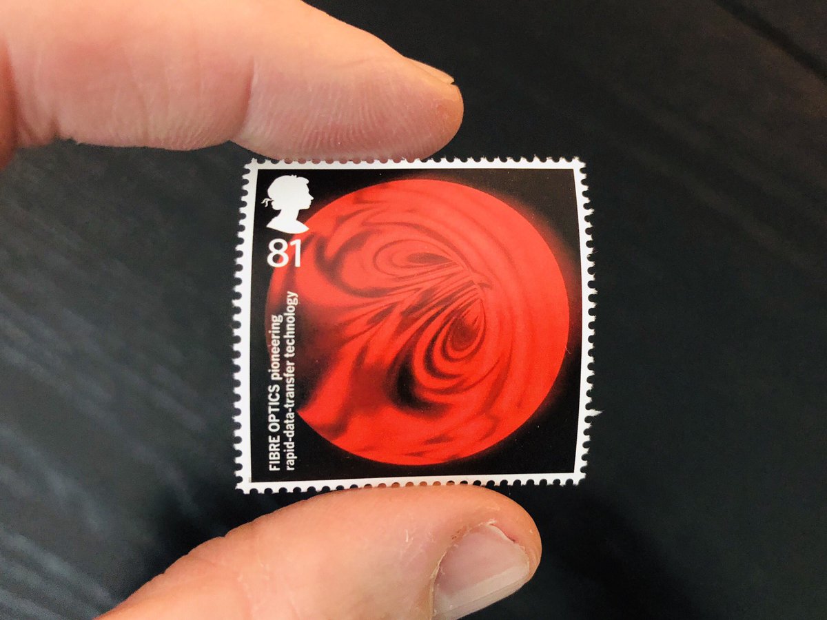
Ok. Let’s cross the pond now. This UK set is what I’m all about. Each one is about some idea, discovery, or material innovation. I’m going to zoom in on a couple, but as I’ve already said a few times, I love how stamps can celebrate ideas, not just memorialize.
Like this one. At first glance, it’s obviously some celestial body, right? A space stamp, which, cool! But no, it’s actually a cross section of a fiber optic stream. This is a stamp that celebrates using light to transmit information. 

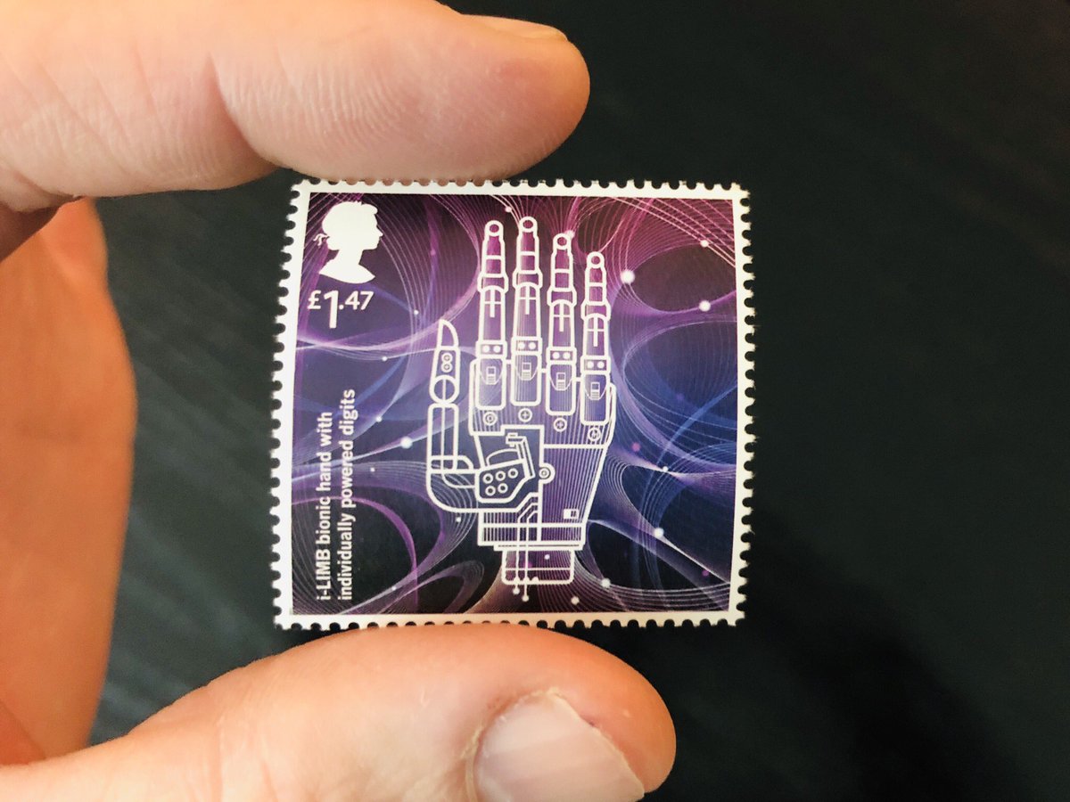
Zoom: Again, at 1st glance, it’s a cubisty  right? Looks awesome, and that’s more than enough for me sometimes. But no, this is an i-LIMB - the world’s first commercially available bionic hand. It uses myoelectric signals (muscle signals from remaining arm tissue) to operate.
 right? Looks awesome, and that’s more than enough for me sometimes. But no, this is an i-LIMB - the world’s first commercially available bionic hand. It uses myoelectric signals (muscle signals from remaining arm tissue) to operate.
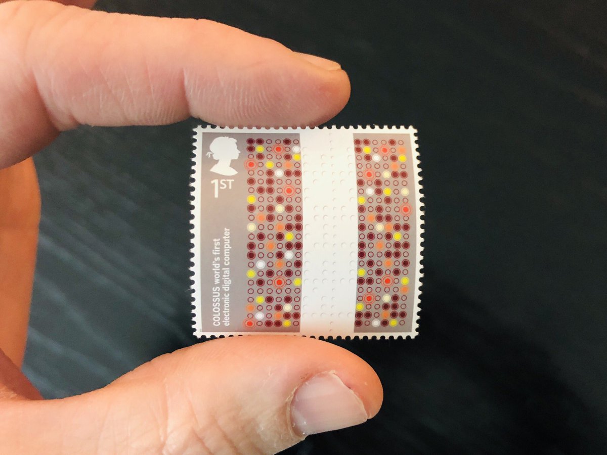
Zoom: ok, so this one is kind of a memorial stamp. It’s for the the Colossus computer, created at Bletchley Park to decode Nazi communications and kept secret until the 1970s. 

A few days back I showed a larger one of this set from Micronesia. Here are the rest. The World Wide Web. A series of tubes. Information super-highway. All wrapped in <p> tags. With a history lesson in the margin. It’s got it all :)
Here’s one that kind of breaks my heart. On the one hand, it seems devastating and wrong to punch a hole in this image. On the other, it seems wrong not to put this stamp on something and send it through the air to someone, someplace else. 

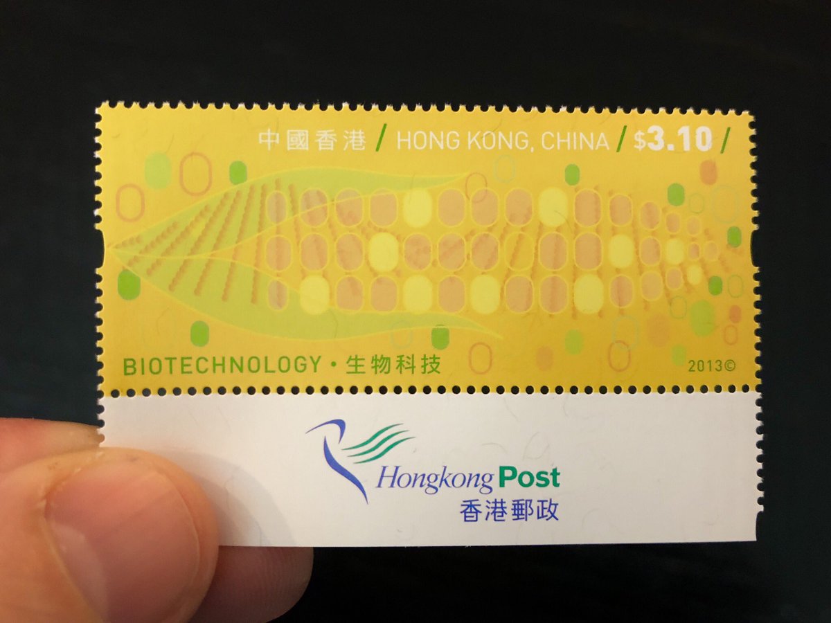
Last one for today. Corn! But for real, looking at this reminds me of pattern exploration assignments I had in 2-dimensional design courses at @risd and the joy of finding ways to embed simple images with meaning, and extract meaning from simple images. 

Oh one last thing: raise your hand if you'd like me to live-tweet the episode of Mister Rogers' Neighborhood where Fred visits the Postmaster General, gets a tour of a stamp production facility, and hangs out with a stamp artist.
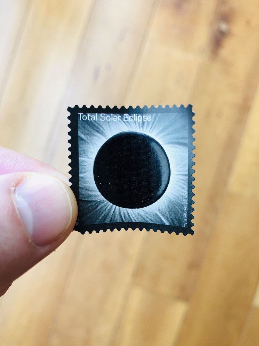
It’s easy to think that older things are somehow better than or have an integrity that newer ones lack (i.e. get off my lawn). This proves the fallacy. A 2017 stamp that uses thermochromatic ink (!) to reveal the full moon when exposed to UV light. How cool is that?
And, oh yeah, it’s time for some more stamps.
The thing I dig about the eclipse stamp is that while it does kind of follow the pattern of most modern stamps in being commemorative rather than just exploring or celebrating an idea, it also uses physical materials and chemistry to visualize the event it commemorates. 

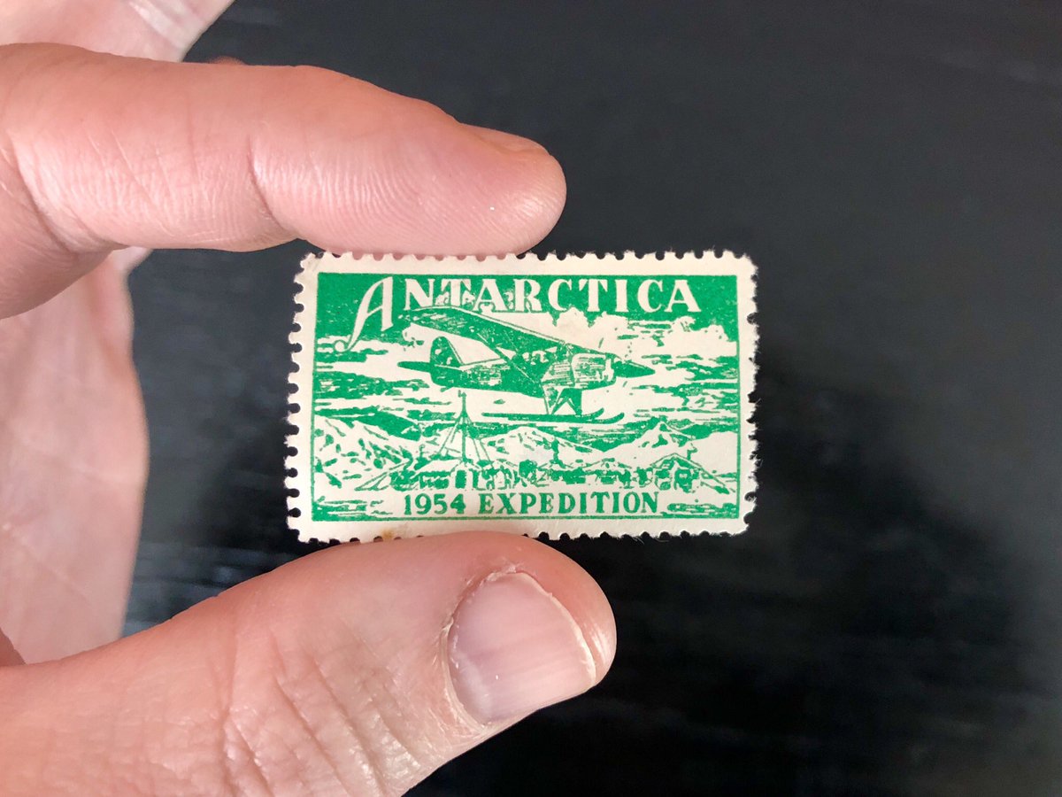
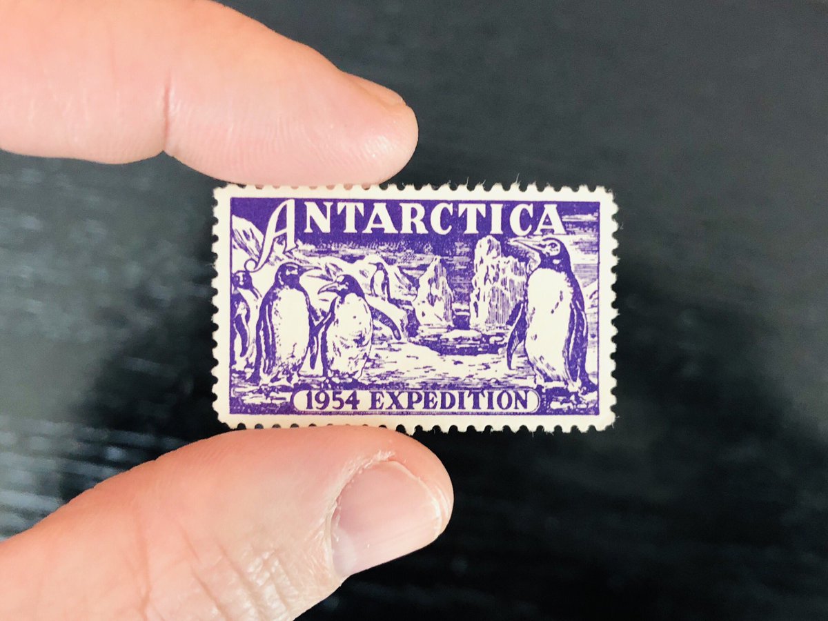
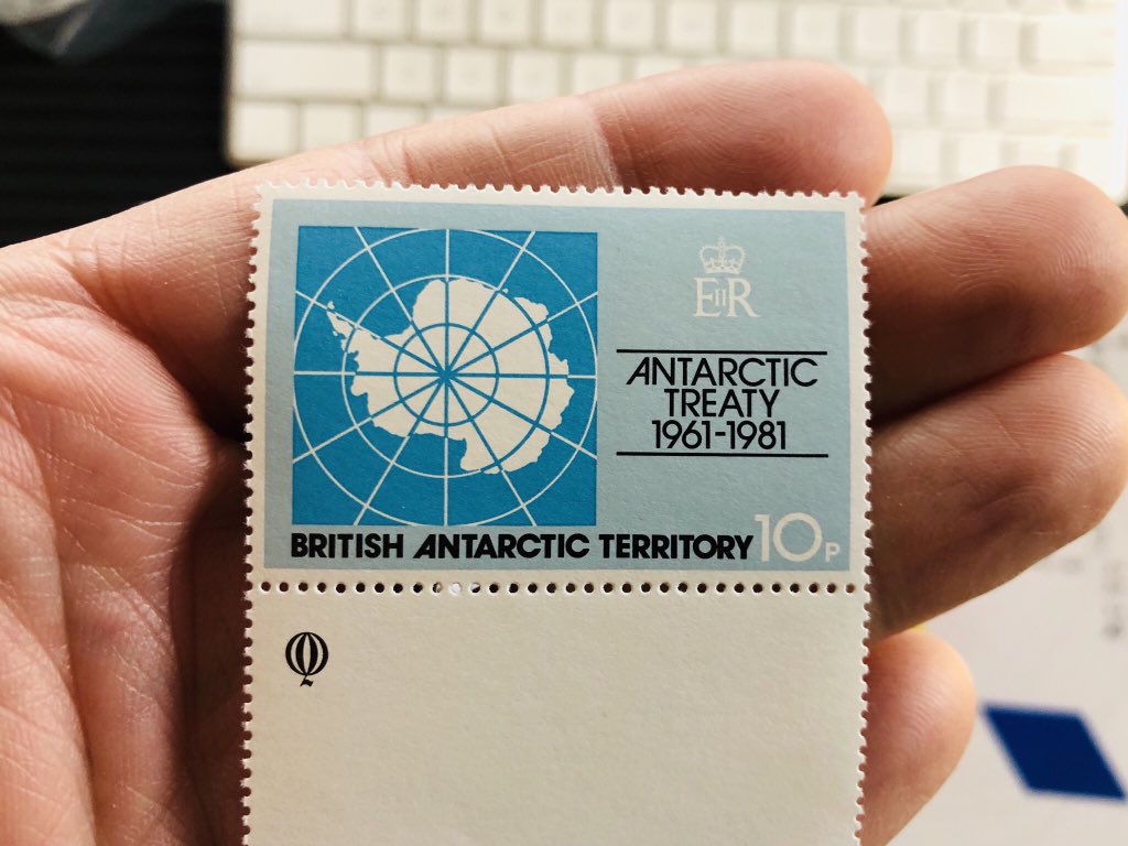
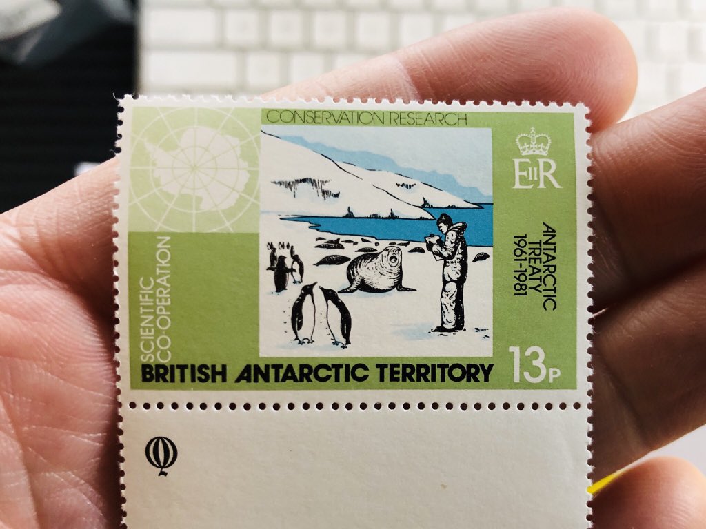
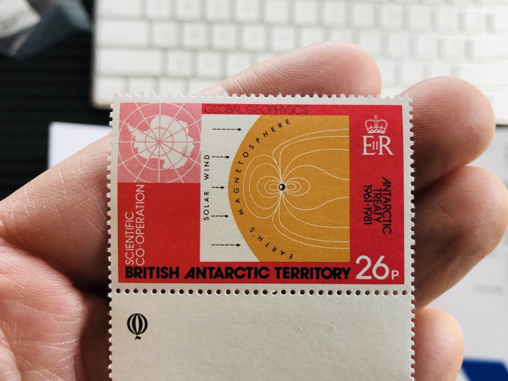
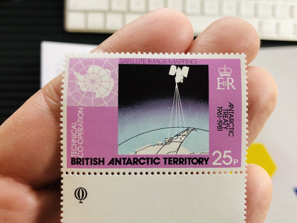
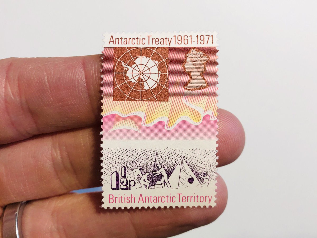
60-ish years ago, this is how we did commemorative stamps. The funny thing (to me) is that the better of the two is the stamp showing the Antarctic penguin sentinels, not the one with the humans and the technology.
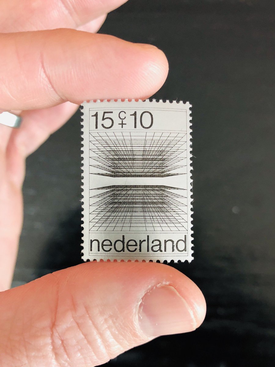
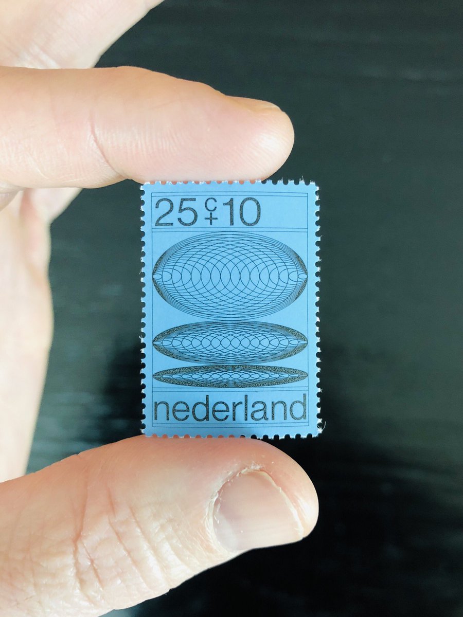
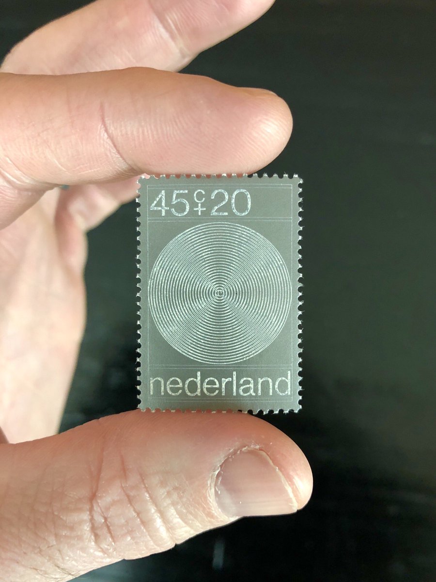
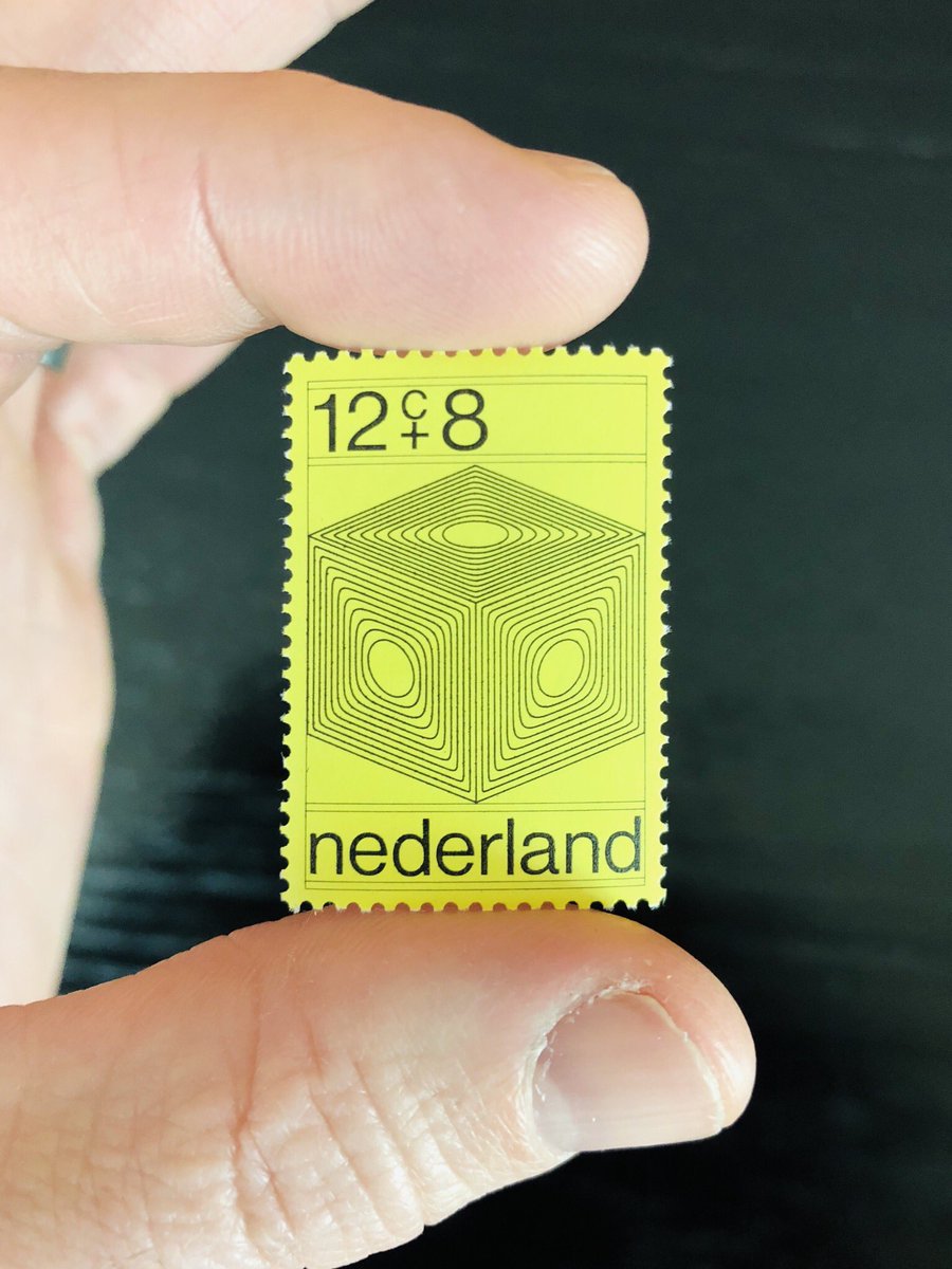
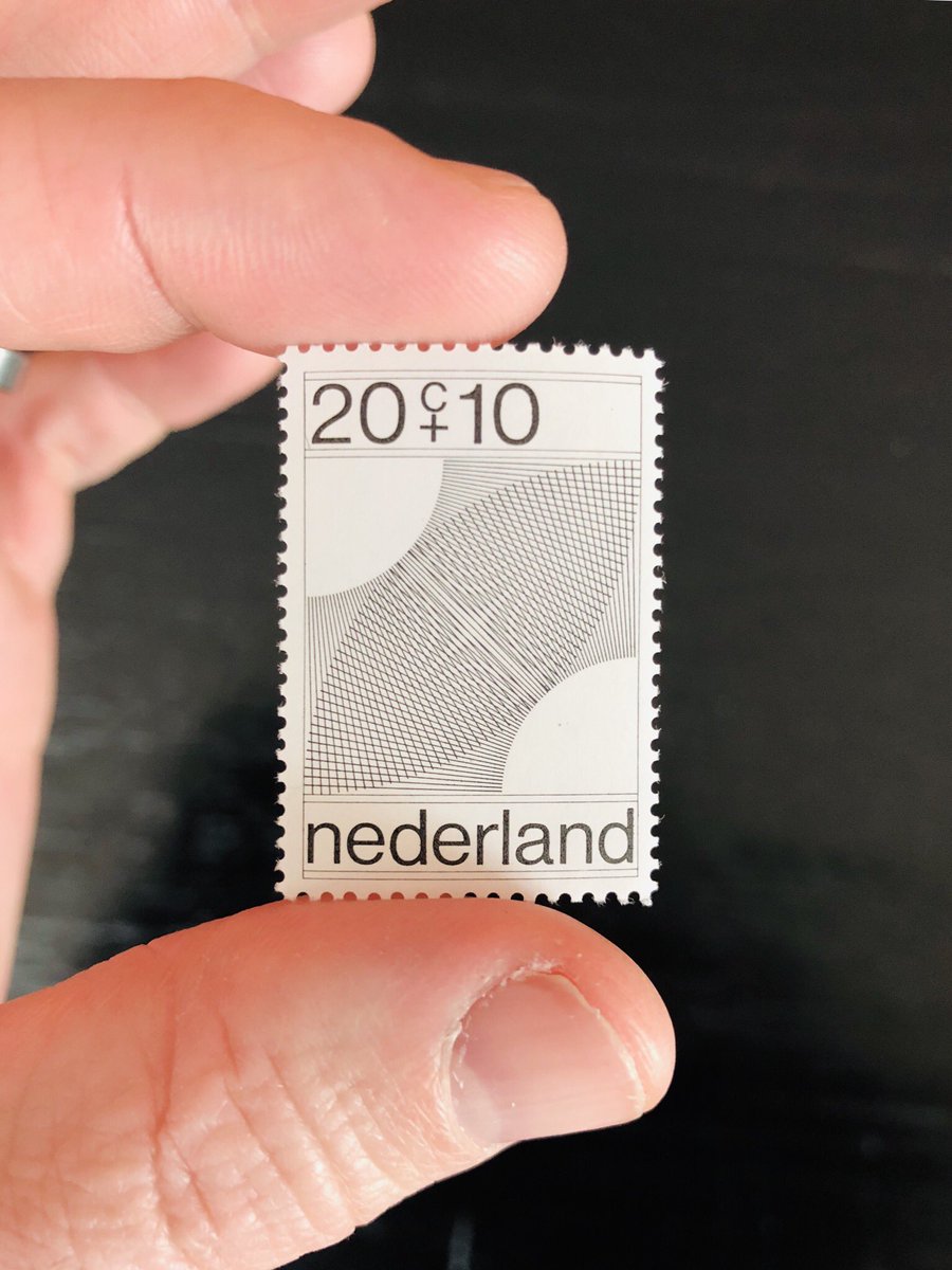
The Dutch have a long history of producing stamps that are simply about visual forms, like geometry and pattern.
This set is a great example of that. The second one, though, takes it to another level. The radial disc pattern is too close to a fingerprint to be an accident considering how an object like this would be handled and used.  So, so, so elegant.
 So, so, so elegant.
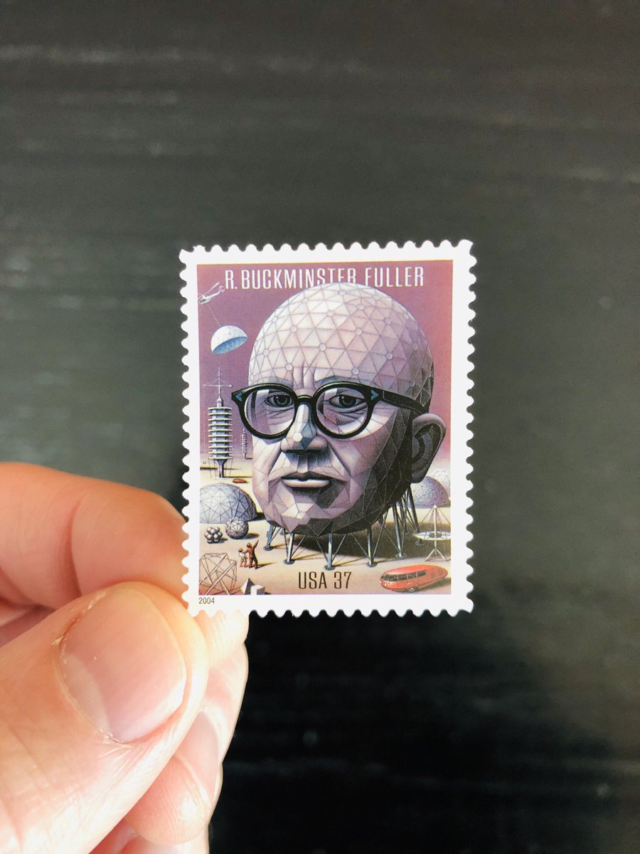
Last one for today is another relatively recent commemorative. But if you’re gonna do a classic face-on-a-stamp commemoration, this is how you do it. Honor what made that person who they are not just by showing them, but by showing them in *how* you show them.
Using postage as a means of creating broader awareness of ideas, inquiry, and wonder is an inherently optimistic act!
What I love about these English stamps is that they’re like seeds being scattered throughout the world - little nudges saying, “hey, here’s something to learn about!”
What strikes me today is that the thing that feels quaint about these isn’t that they’re an outmoded technology - that stamps have little to do in a wired world - but that their optimism has been overruled by a baseline political cynicism.
I just can no longer imagine people in power being anything but confused or annoyed by the idea of allocating funds to create things like this. This is why the memorial or nostalgic stamp is the norm now.
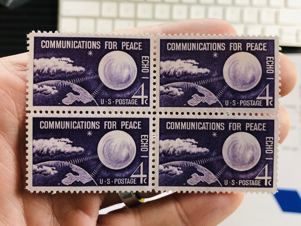
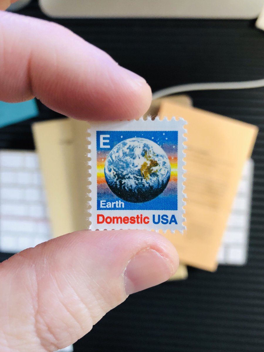
Here’s another one I love. First, of course, because it’s really about the idea that we are all of one community - the community of Earth - and that once you can see the curve of the planet (and use it) destructive and distracting differences blur and cooperation becomes obvious.
Although it also jogs to memory too many hours playing Civ 2 as a kid, and the fact that once your culture achieved satellite tech, war became unavoidable. That always made me sad, and almost always represented the end of my interest in the game.
But you may be interested to know that Echo-1 was the first communications  launched in 1960. It was a large plastic balloon, 90 feet in diameter, and coated in aluminum to better reflect radio waves back to Earth. These stamps were issued a few months later to spread the word.
 launched in 1960. It was a large plastic balloon, 90 feet in diameter, and coated in aluminum to better reflect radio waves back to Earth. These stamps were issued a few months later to spread the word.
One more for today. Again, imagine the meeting:
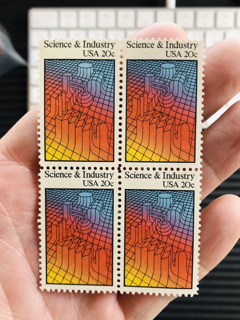
Postal Service middle manager: we’d like to do a run elevating awareness of our patriotic interest in science & industry. We think it will inspire people.
Postmaster General: that’s a fine idea. A fine idea! The funds are yours.
Postal Service middle manager: we’d like to do a run elevating awareness of our patriotic interest in science & industry. We think it will inspire people.
Postmaster General: that’s a fine idea. A fine idea! The funds are yours.
Just to make the point clear, today the meeting probably wouldn’t happen, but if it did, it would have ended like...
Postmaster General: we’ll allow it but ditch the illustration and use a picture of Jeff Bezos instead.
Postmaster General: we’ll allow it but ditch the illustration and use a picture of Jeff Bezos instead.
Ok ok, one more.
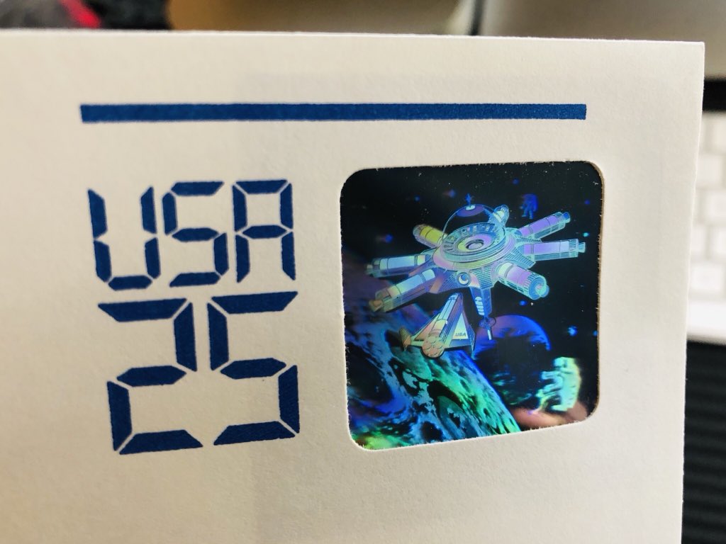
When I was 9 or 10, my grandmother worked at a law firm and would trash pick me all kinds of envelopes because she knew I liked stamps. What a lovely thing for an adult to do for a kid.
This is one of them.
When I was 9 or 10, my grandmother worked at a law firm and would trash pick me all kinds of envelopes because she knew I liked stamps. What a lovely thing for an adult to do for a kid.
This is one of them.
Having never seen (a) a hologram stamp or (b) a stamp embedded into an envelope before, my mind was completely blown.
Now, decades later, what blows my mind is again the incredible optimism at the root of producing an image like this.
The vernacular of postage is often nationalistic. Not in a bad way, but just in somewhat of a provincial cheerleading kind of way. That’s why images like this are so powerful when used on a stamp. They remind us that boundaries btw people are symbolic and ultimately artificial.
...and do so completely aware that they provide practical passage of information across those boundaries.
That’s so optimistic! And really, while the images I gravitate toward on stamps tend to be optimistic in nature - symbols of cooperation, exploration, discovery - the whole idea of a stamp is optimistic. A ticket entitling information to cross borders!
That’s too easy to take for granted in the internet age, but it’s just not a given that we would allow one another to freely communicate. In fact, it’s not even a reality. There are plenty of closed borders and walls information cannot pass through.
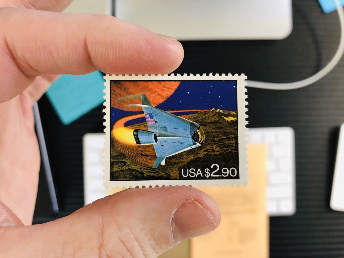
A while back, I shared a set of stamps depicting the future of the postal service - off-world, no less - and remarked at how charmingly naive the idea was. And yet, this: a future space shuttle. With NASA in the state it is, it’s hard to see this as anything but bittersweet.
And then there’s this. Pushing that optimism thing to the limit of contemporary imagination, I think.
Again, imagine today pitching a series of postal images depicting flagless vessels and orbiting communities among planets far from our own. These do have an element of kitsch to them - illustrated in a vintage style - but they’re not labeled as some kind of remembrance.
They seem to be intended sincerely - as an invitation to dream big: beyond country and culture, beyond the physical confines of Earth.
Cynically, I feel like the only way stamps like this would be made in 2019 would be if Elon Musk willed them to be so after a week’s-long work and twitter bender and then personally funded them to prove he wasn’t just suffering from some kind of mania.
That being said, if Elon Musk wants to make crazy-futurist stamps, I would support that venture.
...by buying such stamps ;)
The thing about a collection is that it’s always a reflection of someone’s point of view and preferences. That’s certainly true of my (little) collection of stamps, most of which share a certain aesthetic sensibility. This one, though, is a bit of an anomaly...
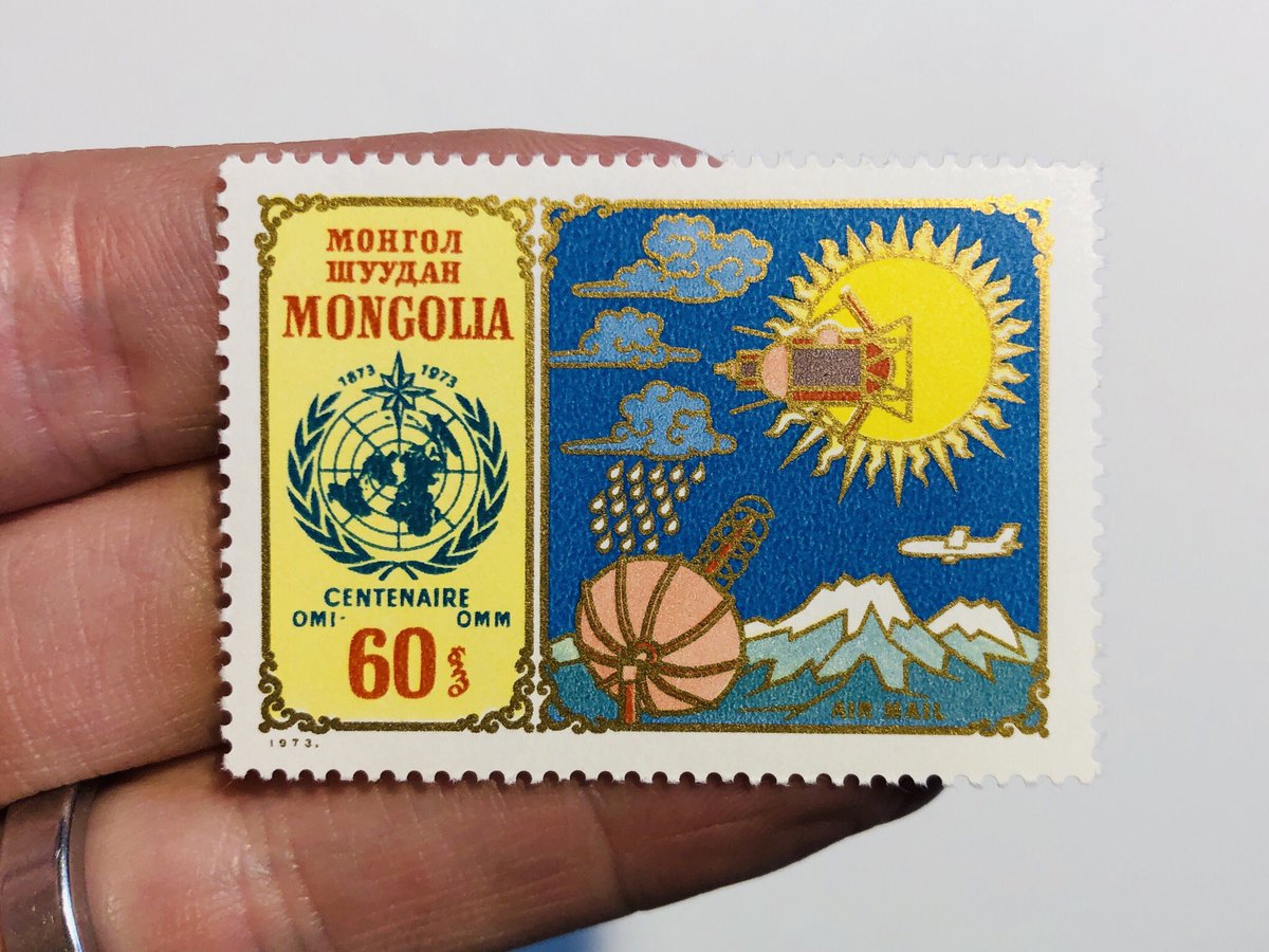
...not in terms of subject matter, of course. Space! But the aesthetics of the image are pretty far afield from what I normally find appealing. This one is like a medieval painting, and uses what was previously religious/spiritual iconography to represent scientific pursuit...
...kind of a gutsy thing to do. Almost punk in a way. Props to the Mongolian artist who decided to portray a space capsule like a scarab over the  .
.
 .
.
Here’s a another one - similarly visually busy. But this one is probably more within my sensibilities. First, the scene in the ground. So much there for so few lines! Second: the aurora - yellow over a pink sky! Be still my  .
.
 .
.
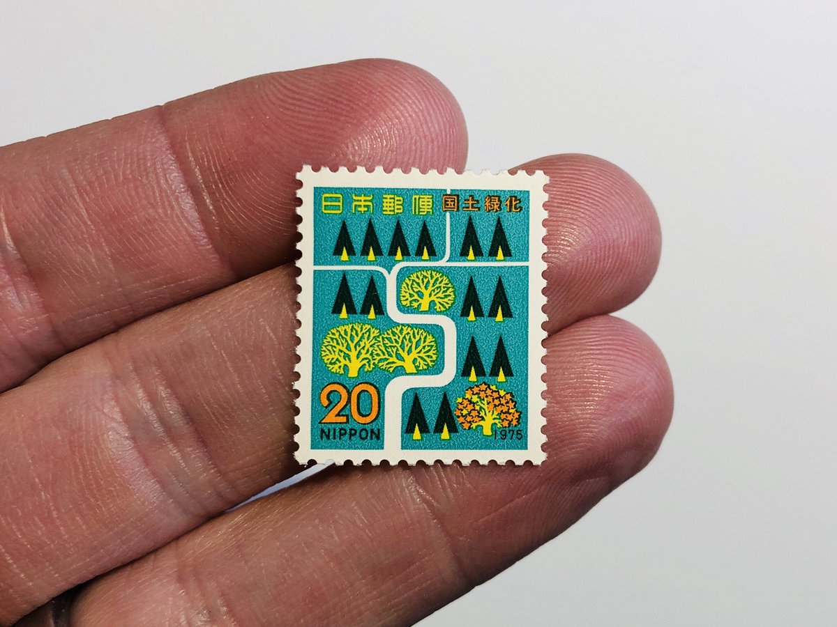
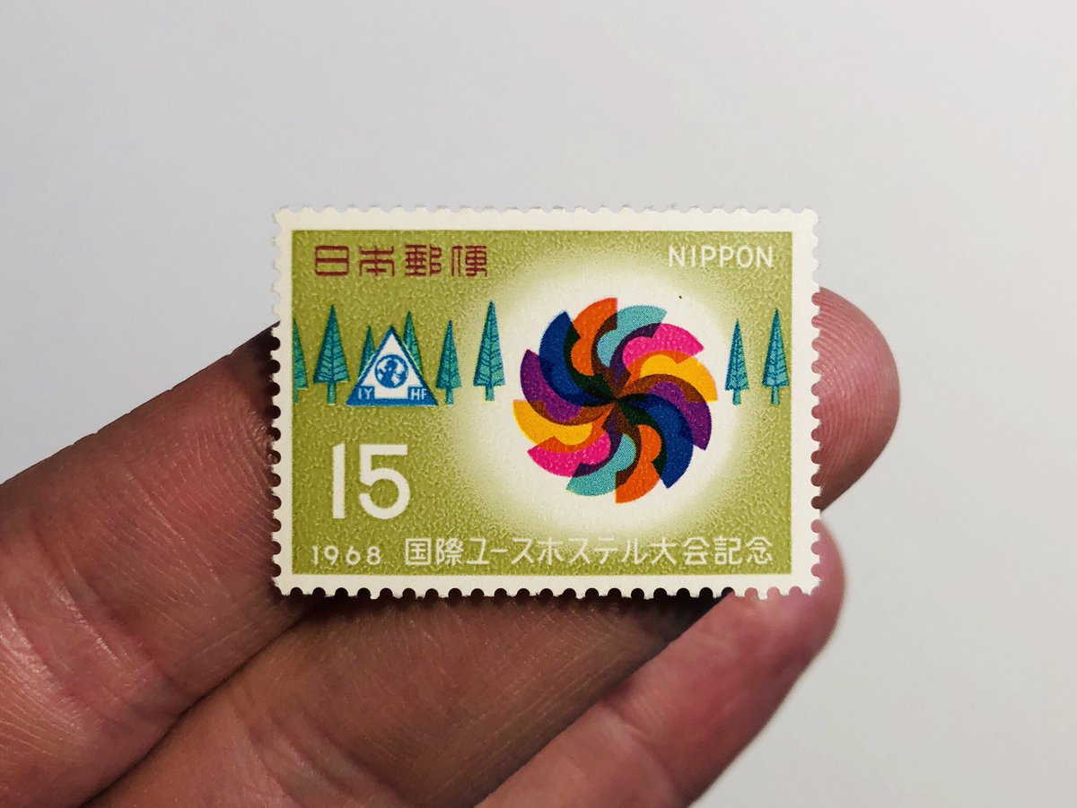
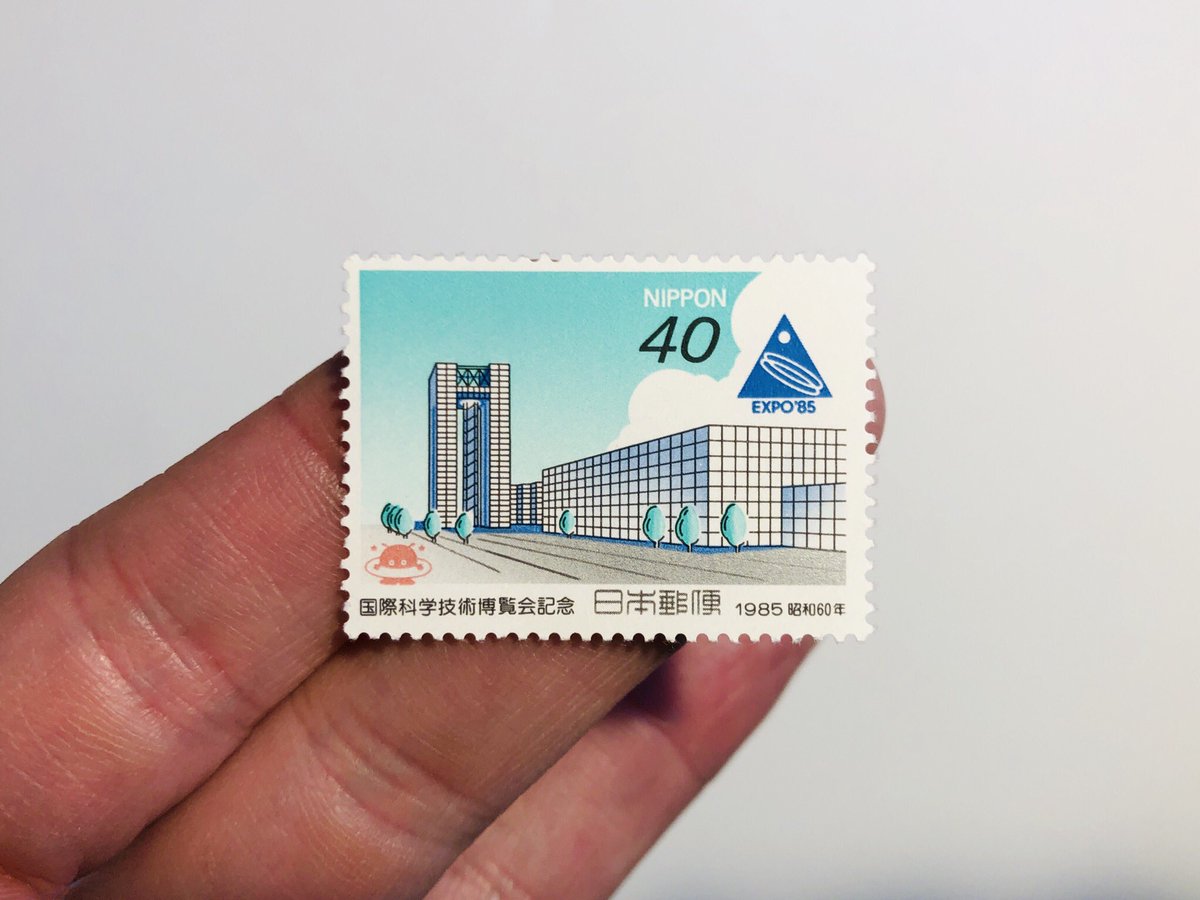
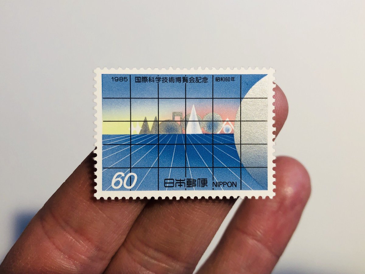
Japan  though, has made some of my favorite images. The best ones, as per my comment about a curator’s point of view, are about cooperation and the pursuit (or avoidance) of abstract ideas. These two are great examples, not about environmental initiatives.
 though, has made some of my favorite images. The best ones, as per my comment about a curator’s point of view, are about cooperation and the pursuit (or avoidance) of abstract ideas. These two are great examples, not about environmental initiatives.
It’s so easy to take something like this for granted in an image, but look at these and remember that they could have easily employed the typical symbols 
 but went with something that emphasizes the order and beauty of nature instead.

 but went with something that emphasizes the order and beauty of nature instead.
That’s an important decision because images like this are a waste if they don’t surprise and inspire the viewer. Without this kind of attention, they’re just a mark of transaction - incidental but not intentional.
There have been some interesting projects in the past about making shopping receipts and other “passive” canvases a context for the exploration of more meaning (e.g. @genmon @LittlePrinter @berglondon). Stamps have done this for a long time...
...but I don’t think we designers have drawn our full lesson from their example yet!
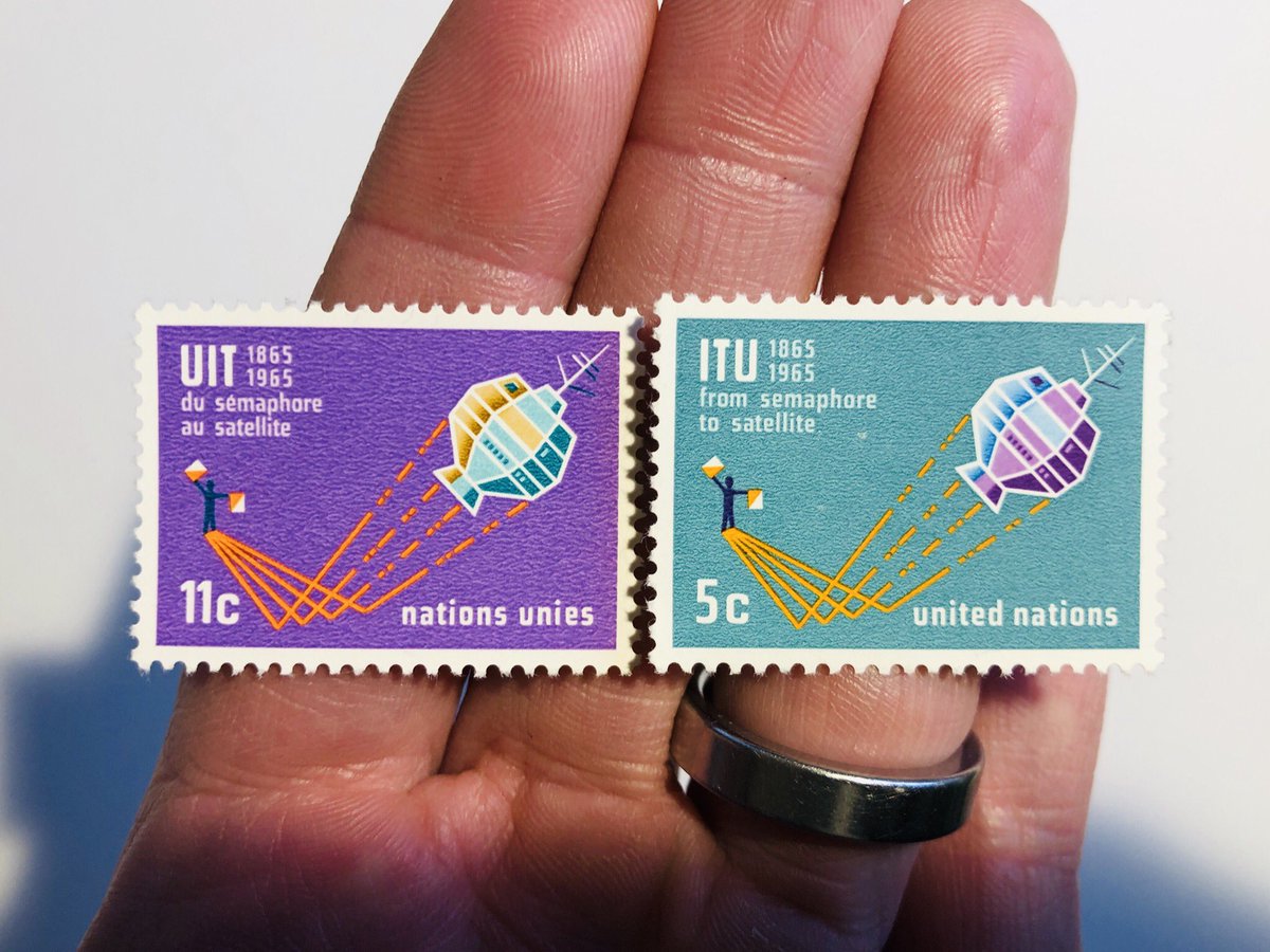
Last ones for today: these celebrating the UN’s role in using space for global communications (cool). First, hoo boy are they pretty. The colors! But second, this stamp series says “from semaphore to satellite.” Why is that cool?
Because the people responsible for this stamp respected the person who might use it - assuming, either, that they’d know what “semaphore” means or that they’d be capable of looking it up.
FYI: a semaphore is a variable in the code that enables multiple running software processes access a common resource.
Incidentally, does anyone know if there's a limit to how many tweets can be threaded together?
Instead of watching a bad man lie to me about our country, I’m instead looking at artifacts that celebrate the food in humanity and the general benefits of getting along: STAMPS
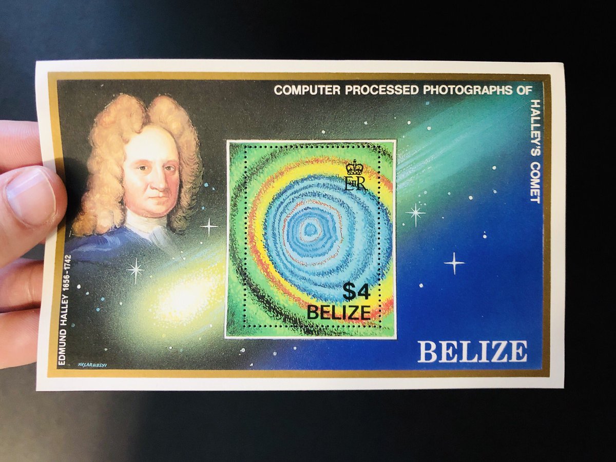
I mentioned many days ago in this thread that some of the most beautiful stamps are so because of what happens in the margins. Like this one. The stamp itself is totally Rad, but even more so when you get Halley and his hair juxtaposed with it.
The thing is, I have mixed feeling about these kinds of stamps. On the one hand, they’re designed to inspire the sender - the person removing the stamp to put it on a letter. On the other, they’re probably also designed for collectors.
And that’s fine. I’m not much of a collector (my stamp “collection” has fewer than 100 stamps in it at any given time because I like to use them), but I can think of few more benign things to horde than stamps :)
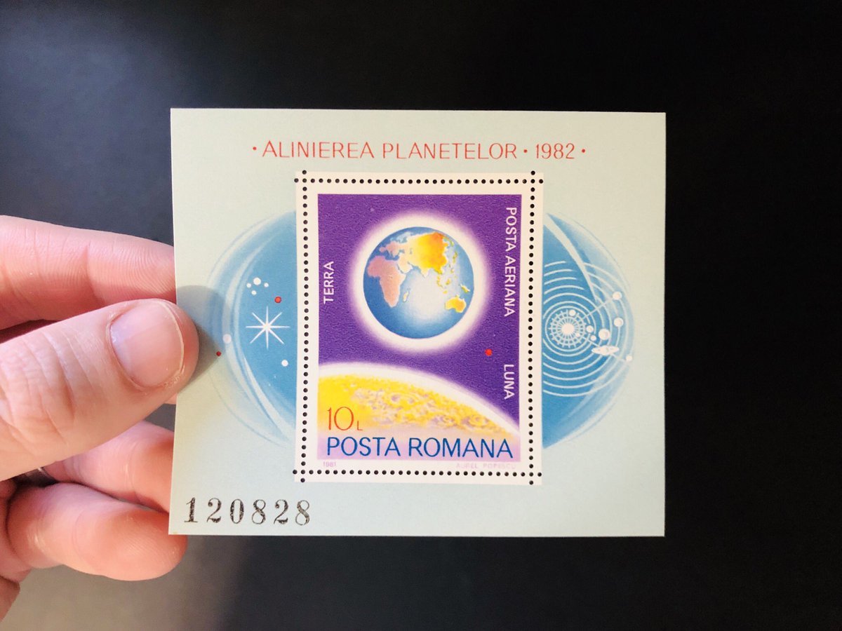
Here’s another. The image on the stamp is nicely done, of course, but it’s totally elevated by the imagery around it. It’s so lovely to think of that as a temporary - and therefore more beautiful and precious - relationship, rather than something to preserve forever.
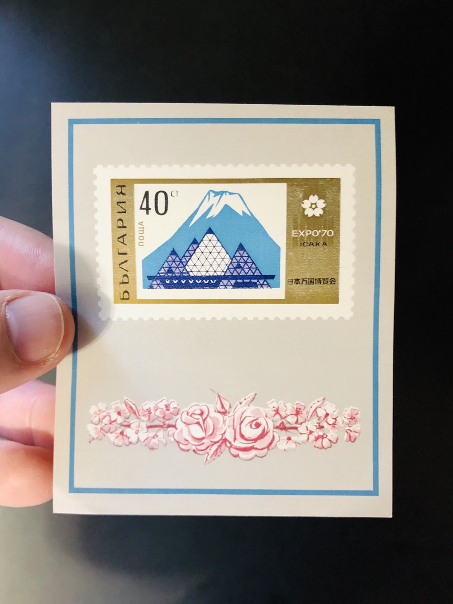
Fourth. Here’s what I love about this one: what you probably cannot tell from this picture is that the stamp doesn’t come out of this rose-gilded “frame.” The whole thing is the stamp. You were meant to cow-lick the entire back of this sucker and slap it on an envelope!
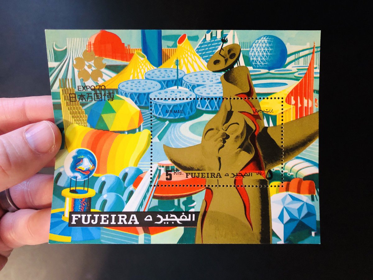
Fifth one. As little compositions, these three are 

 but then they’re part of this larger mural, which is so grand. Without it, you don’t know that some of the abstract shapes are actually symbols with meaning. And that’s ok, but seeing the whole is a treat.


 but then they’re part of this larger mural, which is so grand. Without it, you don’t know that some of the abstract shapes are actually symbols with meaning. And that’s ok, but seeing the whole is a treat.
Last one for tonight: so_damn_elegant. But again, it’s a bittersweet choice these stamps force you to make - to choose between preserving the beauty of an image or honoring the function of a thing.
But imagine that: every citizen being invited into dialogue, deeply enriched by symbolism and layers of history and meaning, by humble designers and artists who had this fleeting moment of government-sanctioned influence when we used sticky paper to communicate.
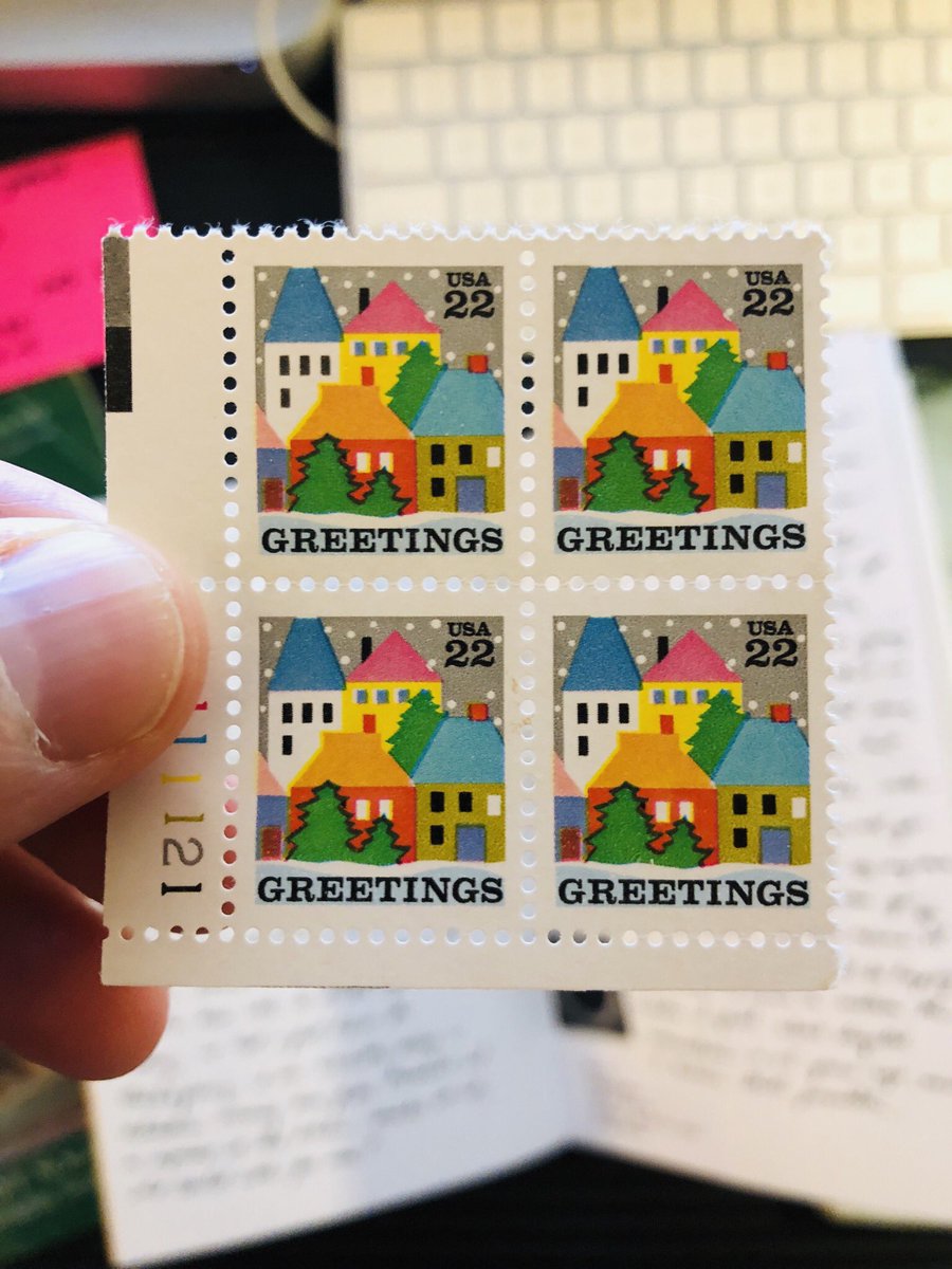
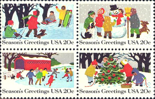
I've never especially loved holiday stamps, but these are pretty nice.
I'll admit they're quite idealistic, but they're also just happy scenes of people enjoying the season and one another. Hard to be a grinch about that :)
I'll admit they're quite idealistic, but they're also just happy scenes of people enjoying the season and one another. Hard to be a grinch about that :)
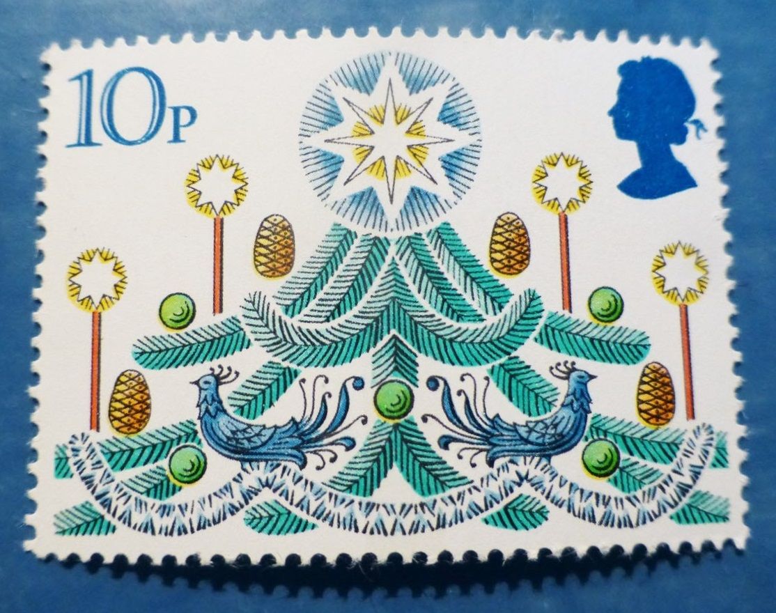
These are also nice.
I really love the hand in the English one. Just a beautiful combination of line and color <3
I really love the hand in the English one. Just a beautiful combination of line and color <3

 Read on Twitter